Department of Health and Human Services
Centers for Disease Control and Prevention
|
|
|||||||||||||
|
|
|
|
|
||||||||||
|
|
|
|
|
|
2008 Atlas of Stroke Hospitalizations Among Medicare Beneficiaries
|
||||||||||||||||||||||||||||||||||||||||||||||
|
||||||||||||||||||||||||||||||||||
This section documents the geographic patterns of stroke hospitalization rates for all strokes combined and for the following stroke subtypes: ischemic, hemorrhagic, and ill-defined. Maps of hospitalizations for late effects from stroke are not included because the numbers are too small to produce stable county-level rates.
An ischemic stroke is caused by a lack of oxygen to the brain due to a blocked or constricted blood vessel and is by far the most common type of stroke.
A hemorrhagic stroke results from a burst blood vessel and, although less common, is more likely to be fatal. A stroke is reported as ill-defined when there is not enough medical information to classify it as ischemic or hemorrhagic.
This section includes maps of stroke hospitalization rates by subtype for the total population as well as for each racial and ethnic group (black, Hispanic, white). For each map, frequency distributions of the stroke hospitalization rates by county are presented.
 Total
Population
Total
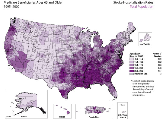
PopulationThe average annual stroke hospitalization rate for Medicare beneficiaries ages 65 and older was 17.2 per 1,000 during 1995–2002. The frequency distribution indicates that for the majority of counties, the stroke hospitalization rate was between 12 and 23 per 1,000 Medicare beneficiaries. Counties with the highest rates (i.e., counties in the top quintile, for which the rate was 20.1 per 1,000 or higher) were located primarily in the Southeast, with heavy concentrations of high-rate counties in Alabama, Mississippi, and Louisiana. Pockets of high-rate counties were also located in West Virginia, Kentucky, Tennessee, Arkansas, and Oregon and found along the coastal plains of North Carolina, South Carolina, and Georgia.
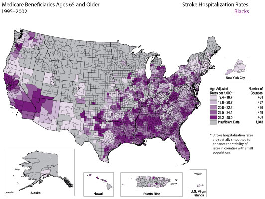
The average annual stroke hospitalization rate among black Medicare beneficiaries ages 65 and older was 21.8 per 1,000 during 1995–2002. The frequency distribution indicates that for the majority of counties, the stroke hospitalization rate was between 14 and 28 per 1,000 Medicare beneficiaries. Counties with the highest rates (i.e., counties in the top quintile, for which the rate was 24.2 per 1,000 or higher) were located primarily in California, parts of the Southeast, and West Virginia.
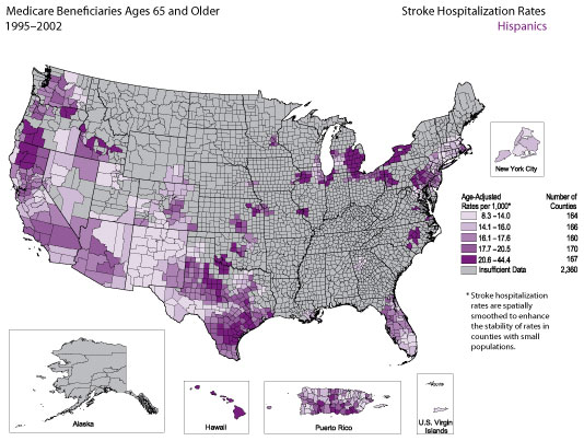
The average annual stroke hospitalization rate for Hispanic Medicare beneficiaries ages 65 and older was 16.0 per 1,000 during 1995–2002. The frequency distribution indicates that for the majority of counties, the stroke hospitalization rate was between 12 and 24 per 1,000 Medicare beneficiaries. Pockets of counties with the highest rates (i.e., counties in the top quintile, for which the rate was 20.6 per 1,000 or higher) were located primarily in Hawaii, Michigan, Texas, northern California, southern Oregon, and western New York.
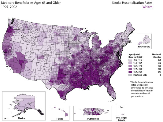
The average annual stroke hospitalization rate for white Medicare beneficiaries ages 65 and older was 16.8 per 1,000 during 1995–2002. The frequency distribution indicates that for the majority of counties, the stroke hospitalization rate was between 12 and 22 per 1,000 Medicare beneficiaries. Counties with the highest rates (i.e., counties in the top quintile, for which the rate was 19.7 per 1,000 or higher) were located primarily in the Southeast, with heavy concentrations of high-rate counties in Alabama, Mississippi, and Louisiana. Pockets of high-rate counties were also located in Pennsylvania, West Virginia, Kentucky, Tennessee, Arkansas, and Oregon and found along the coastal plains of North Carolina, South Carolina, and Georgia.
Stroke hospitalizations were defined as those for which the principal diagnosis on the Medicare hospital claim form was cerebrovascular disease, indicated by codes 430–434 and 436–438 according to the International Classification of Diseases, 9th Revision, Clinical Modification (ICD-9-CM). Hospitalizations for which the principal diagnosis was transient ischemic attacks (ICD-9-CM code 435) were excluded.
For each map, the counties are categorized according to quintile; the darkest color represents counties with the highest rates, and the lightest color represents counties with the lowest rates. All county-level rates have been spatially smoothed to enhance the stability in counties with small populations. Counties are categorized as having “insufficient data” if the sum of stroke hospitalizations in the index county plus the neighboring counties is less than 20 or if the Medicare population is less than 10.
The frequency distribution in the bottom right corner of each map shows the range of rates observed among counties on the corresponding map. The vertical dotted lines and the graded color bar along the x-axis illustrate the quintiles into which counties were divided on the basis of these rates. For a detailed explanation of the methods, see Appendix B.
In the Medicare data sets, the accuracy of codes for Hispanic race and ethnicity is limited because these codes are not reported separately. For example, a person who is white and Hispanic is reported as either white or Hispanic. This reporting practice can result in misclassification of race and ethnicity. According to 1996 data, the probability that the racial/ethnic designation on Medicare claim forms is correct is 96.6% for whites and 95.5% for blacks, but only 19.4% for Hispanics. At the same time, the probability that a person identified as Hispanic in the Medicare data set is actually Hispanic is 98% (Arday SL, Arday DR, Monroe A, Zhang MD. HCFA’s racial and ethnic data: current accuracy and recent improvements. Health Care Financing Review 2000;21[4]:107–16). Together, these data suggest that Hispanics are underreported in the Medicare data sets and that this underreporting could introduce bias into the results presented here.
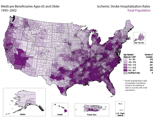
The average annual hospitalization rate for ischemic stroke among Medicare beneficiaries ages 65 and older was 11.5 during 1995–2002. The frequency distribution indicates that for the majority of counties, the stroke hospitalization rate was between 7 and 15 per 1,000 Medicare beneficiaries. Counties with the highest rates (i.e., counties in the top quintile, for which the rate was 13.0 per 1,000 or higher) were located primarily in the northern and eastern regions of Michigan, in Pennsylvania, West Virginia, North Carolina, Georgia, Alabama, parts of the Mississippi Delta, and sections of Texas and found near the common borders of California, Nevada, and Arizona.
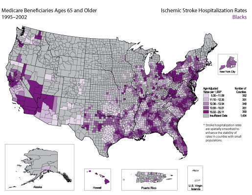
The average annual hospitalization rate for ischemic stroke among black Medicare beneficiaries ages 65 and older was 13.6 during 1995–2002. The frequency distribution indicates that for the majority of counties, the ischemic stroke hospitalization rate was between 8 and 18 per 1,000 black Medicare beneficiaries. Counties with the highest rates (i.e., counties in the top quintile, for which the rate was 15.0 per 1,000 or higher) were located primarily in the following states: Michigan, Pennsylvania, West Virginia, North Carolina, Alabama, California, Nevada, and Arizona.
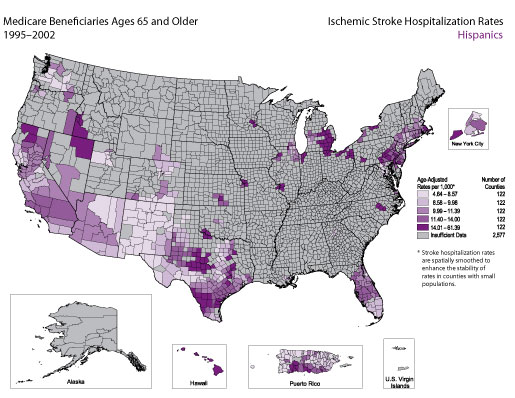
The average annual hospitalization rate for ischemic stroke among Hispanic Medicare beneficiaries ages 65 and older was 9.8 per 1,000 during 1995–2002. The frequency distribution indicates that for the majority of counties, the stroke hospitalization rate was between 7 and 18 per 1,000 Hispanic Medicare beneficiaries. Pockets of counties with the highest rates (i.e., counties in the top quintile, for which the rate was 14.0 per 1,000 or higher) were located primarily in Michigan, Pennsylvania, Texas, and Hawaii.
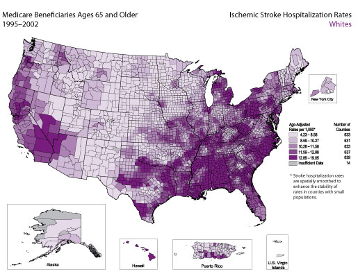
The average annual hospitalization rate for ischemic stroke among white Medicare beneficiaries ages 65 and older was 11.6 per 1,000 during 1995–2002. The frequency distribution indicates that for the majority of counties, the stroke hospitalization rate was between 6 and 15 per 1,000 white Medicare beneficiaries. Pockets of counties with the highest rates (i.e., counties in the top quintile, for which the rate was 12.9 per 1,000 or higher) were located primarily in Michigan, Pennsylvania, West Virginia, North Carolina, Georgia, Alabama, Mississippi, Hawaii, parts of the lower Mississippi River Basin, and parts of California and Nevada.
Ischemic stroke hospitalizations were defined as those for which the principal diagnosis on the Medicare hospital claim form was coded as 433–434 according to the International Classification of Diseases, 9th Revision, Clinical Modification (ICD-9-CM).
For each map, the counties are categorized according to quintile; the darkest color represents counties with the highest rates, and the lightest color represents counties with the lowest rates. All county-level rates have been spatially smoothed to enhance the stability in counties with small populations. Counties are categorized as having “insufficient data” if the sum of ischemic stroke hospitalizations in the index county plus the neighboring counties is less than 20 or if the Medicare population is less than 10.
The frequency distribution in the bottom right corner of each map shows the range of rates observed among counties on the corresponding map. The vertical dotted lines and the graded color bar along the x-axis illustrate the quintiles into which counties were divided on the basis of these rates. For a detailed explanation of the methods, see Appendix B.
In the Medicare data sets, the accuracy of codes for Hispanic race and ethnicity is limited because these codes are not reported separately. For example, a person who is white and Hispanic is reported as either white or Hispanic. This reporting practice can result in misclassification of race and ethnicity. According to 1996 data, the probability that the racial/ethnic designation on Medicare claim forms is correct is 96.6% for whites and 95.5% for blacks, but only 19.4% for Hispanics. At the same time, the probability that a person identified as Hispanic in the Medicare data set is actually Hispanic is 98% (Arday SL, Arday DR, Monroe A, Zhang MD. HCFA’s racial and ethnic data: current accuracy and recent improvements. Health Care Financing Review 2000;21[4]:107–16). Together, these data suggest that Hispanics are underreported in the Medicare data sets and that this underreporting could introduce bias into the results presented here.
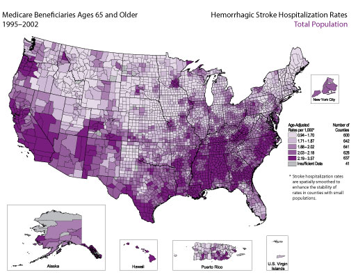
The average annual hospitalization rate for hemorrhagic stroke among Medicare beneficiaries ages 65 and older was 2.0 per 1,000 during 1995–2002. The frequency distribution indicates that for the majority of counties, the hemorrhagic stroke hospitalization rate was between 1.5 and 2.5 per 1,000 Medicare beneficiaries. Counties with the highest rates (i.e., counties in the top quintile, for which the rate was 2.2 per 1,000 or higher) were located primarily in West Virginia, Kentucky, Tennessee, North Carolina, Georgia, Alabama, Mississippi, Hawaii, the southern part of Texas, large sections of California, and the northwestern section of Oregon and found along the lower Mississippi River Valley.
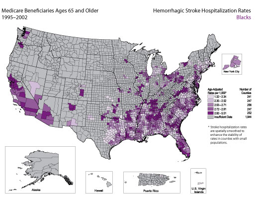
The average annual hospitalization rate for hemorrhagic stroke among black Medicare beneficiaries ages 65 and older was 2.6 per 1,000 during 1995–2002. The frequency distribution indicates that for the majority of counties, the hemorrhagic stroke hospitalization rate was between 2.3 and 3.3 per 1,000 black Medicare beneficiaries. Counties with the highest rates (i.e., counties in the top quintile, for which the rate was 2.9 per 1,000 or higher) were scattered primarily among the following states: Virginia, Tennessee, Georgia, Alabama, Florida, Arkansas, California, New Mexico, and Oregon.
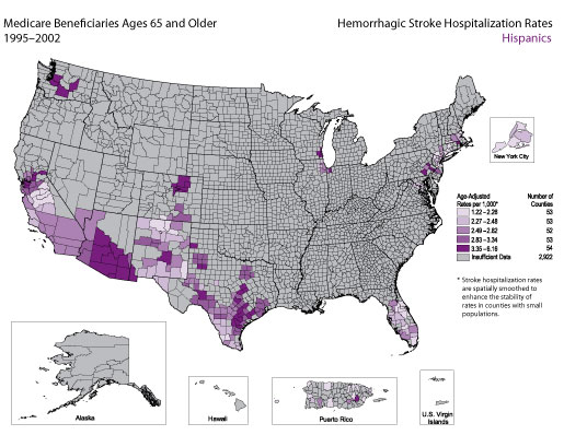
The average annual hospitalization rate for hemorrhagic stroke among Hispanic Medicare beneficiaries ages 65 and older was 2.3 per 1,000 during 1995–2002. The frequency distribution indicates that for the majority of counties, the hemorrhagic stroke hospitalization rate was between 2.1 and 3.5 per 1,000 Hispanic Medicare beneficiaries. Pockets of counties with the highest rates (i.e., counties in the top quintile, for which the rate was 3.4 per 1,000 or higher) were located primarily in Texas, Arizona, Colorado, and Washington.
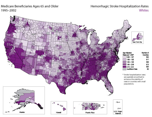
The average annual hospitalization rate for hemorrhagic stroke among white Medicare beneficiaries ages 65 and older was 1.9 per 1,000 during 1995–2002. The frequency distribution indicates that for the majority of counties, the hemorrhagic stroke hospitalization rate was between 1.5 and 2.3 per 1,000 white Medicare beneficiaries. Pockets of counties with the highest rates (i.e., counties in the top quintile, for which the rate was 2.1 per 1,000 or higher) were located primarily in West Virginia, Kentucky, Tennessee, North Carolina, Georgia, Alabama, Mississippi, the southern part of Texas, large sections of California, and the northwestern section of Oregon and found along the lower Mississippi River Valley.
Hemorrhagic stroke hospitalizations were defined as those for which the principal diagnosis on the Medicare hospital claim form was coded as 430–432 according to the International Classification of Diseases, 9th Revision, Clinical Modification (ICD-9-CM).
For each map, the counties are categorized according to quintile; the darkest color represents counties with the highest rates, and the lightest color represents counties with the lowest rates. All county-level rates have been spatially smoothed to enhance the stability in counties with small populations. Counties are categorized as having “insufficient data” if the sum of hemorrhagic stroke hospitalizations in the index county plus the neighboring counties is less than 20 or if the Medicare population is less than 10.
The frequency distribution in the bottom right corner of each map shows the range of rates observed among counties on the corresponding map. The vertical dotted lines and the graded color bar along the x-axis illustrate the quintiles into which counties were divided on the basis of these rates. For a detailed explanation of the methods, see Appendix B.
In the Medicare data sets, the accuracy of codes for Hispanic race and ethnicity is limited because these codes are not reported separately. For example, a person who is white and Hispanic is reported as either white or Hispanic. This reporting practice can result in misclassification of race and ethnicity. According to 1996 data, the probability that the racial/ethnic designation on Medicare claim forms is correct is 96.6% for whites and 95.5% for blacks, but only 19.4% for Hispanics. At the same time, the probability that a person identified as Hispanic in the Medicare data set is actually Hispanic is 98% (Arday SL, Arday DR, Monroe A, Zhang MD. HCFA’s racial and ethnic data: current accuracy and recent improvements. Health Care Financing Review 2000;21[4]:107–16). Together, these data suggest that Hispanics are underreported in the Medicare data sets and that this underreporting could introduce bias into the results presented here.
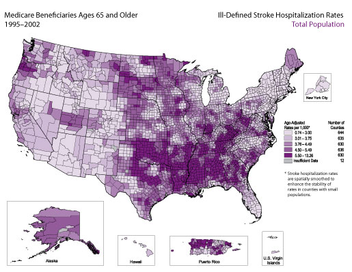
The average annual hospitalization rate for ill-defined stroke among Medicare beneficiaries ages 65 and older was 3.5 per 1,000 during 1995–2002. The frequency distribution indicates that for the majority of counties, the ill-defined stroke hospitalization rate was between 2 and 7 per 1,000 Medicare beneficiaries. Counties with the highest rates (i.e., counties in the top quintile, for which the rate was 5.5 per 1,000 or higher) were located primarily in Kentucky, Tennessee, Alabama, Mississippi, Louisiana, Arkansas, Oklahoma, Puerto Rico, and central Texas.
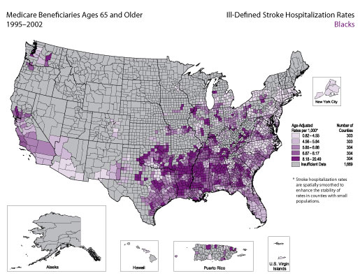
The average annual hospitalization rate for ill-defined stroke among black Medicare beneficiaries ages 65 and older was 5.3 per 1,000 during 1995–2002. The frequency distribution indicates that for the majority of counties, the ill-defined stroke hospitalization rate was between 3 and 10 per 1,000 black Medicare beneficiaries. Counties with the highest rates (i.e., counties in the top quintile, for which the rate was 8.2 per 1,000 or higher) were located primarily in the following states: Georgia, Alabama, Mississippi, Louisiana, Arkansas, and Oklahoma.
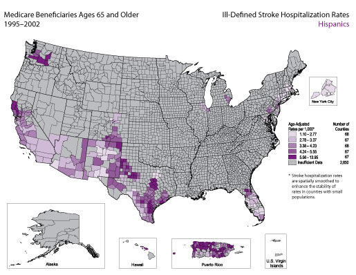
The average annual hospitalization rate for ill-defined stroke among Hispanic Medicare beneficiaries ages 65 and older was 3.6 per 1,000 during 1995–2002. The frequency distribution indicates that for the majority of counties, the ill-defined stroke hospitalization rate was between 2 and 8 per 1,000 Hispanic Medicare beneficiaries. Pockets of counties with the highest rates (i.e., counties in the top quintile, for which the rate was 5.6 per 1,000 or higher) were located primarily in Washington, Texas, and Puerto Rico.
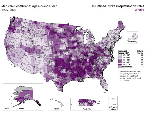
The average annual hospitalization rate for ill-defined stroke among white Medicare beneficiaries ages 65 and older was 3.4 per 1,000 during 1995–2002. The frequency distribution indicates that for the majority of counties, the ill-defined stroke hospitalization rate was between 2 and 7 per 1,000 white Medicare beneficiaries. Counties with the highest rates (i.e., counties in the top quintile, for which the rate was 5.3 per 1,000 or higher) were located primarily in Kentucky, Tennessee, Alabama, Mississippi, Louisiana, Arkansas, Oklahoma, Puerto Rico, and central Texas.
Ill-defined stroke hospitalizations were defined as those for which the principal diagnosis on the Medicare hospital claim form was coded as 436–437 according to the International Classification of Diseases, 9th Revision, Clinical Modification (ICD-9-CM).
For each map, the counties are categorized according to quintile; the darkest color represents counties with the highest rates, and the lightest color represents counties with the lowest rates. All county-level rates have been spatially smoothed to enhance the stability in counties with small populations. Counties are categorized as having “insufficient data” if the sum of ill-defined stroke hospitalizations in the index county plus the neighboring counties is less than 20 or if the Medicare population is less than 10.
The frequency distribution in the bottom right corner of each map shows the range of rates observed among counties on the corresponding map. The vertical dotted lines and the graded color bar along the x-axis illustrate the quintiles into which counties were divided on the basis of these rates. For a detailed explanation of the methods, see Appendix B.
In the Medicare data sets, the accuracy of codes for Hispanic race and ethnicity is limited because these codes are not reported separately. For example, a person who is white and Hispanic is reported as either white or Hispanic. This reporting practice can result in misclassification of race and ethnicity. According to 1996 data, the probability that the racial/ethnic designation on Medicare claim forms is correct is 96.6% for whites and 95.5% for blacks, but only 19.4% for Hispanics. At the same time, the probability that a person identified as Hispanic in the Medicare data set is actually Hispanic is 98% (Arday SL, Arday DR, Monroe A, Zhang MD. HCFA’s racial and ethnic data: current accuracy and recent improvements. Health Care Financing Review 2000;21[4]:107–16). Together, these data suggest that Hispanics are underreported in the Medicare data sets and that this underreporting could introduce bias into the results presented here.
| Back to Top |
Page last reviewed: April 9, 2008
Page last modified: April 9, 2008
Content source: Division for Heart Disease and Stroke
Prevention,
National Center for Chronic Disease Prevention and
Health Promotion
|
|
|
||||||||||||
|
 Section
Two: Maps
of Stroke Hospitalizations, by Stroke Subtype and Race/Ethnicity
Section
Two: Maps
of Stroke Hospitalizations, by Stroke Subtype and Race/Ethnicity