|
|
 |
How To... - Read A Data Table - Prevalence Tables
Geographic Comparison of Health Indicators
Use
Use the Geographic Comparison Tables to compare overall
prevalence for health indicators from one geographic area (clinic, county,
contributor, etc.) to the overall prevalence for the same indicators for
another area.
Only the geographic tables for health indicators are produced at all levels:
- A=Clinic
- B=County
- C=Contributor (state, District of Columbia, U.S.
territory, or tribal government)
- D=Nation
- E=Region
- F=Local Agency
- G=Metro Area
The report for the Nation (D) includes the overall
prevalence for each contributor included in the national report.
PedNSS Geographic Comparison of Health Indicators tables include:
- Table 6, Comparison of Growth and Anemia Indicators
- Table 7, Comparison of Breastfeeding, TV Viewing, and Smoking in
Household
PNSS Geographic Comparison of Health Indicators tables include:
- Table 5, Comparison of Maternal Health Indicators
- Table 6, Comparison of Maternal Behavioral Indicators
- Table 7, Comparison of Smoking Indicators
- Table 8, Comparison of Infant Health Indicators
These tables can be used to answer questions such as:
- What is the prevalence of overweight in one county compared to
another county?
Interpreting the Data
The following paragraphs provide general information about the table
data that will help you with interpretation.
Title
For PedNSS, the table titles show the health indicators that are analyzed in
the table.
For PNSS, the table title includes a group of health indicators but only
selected health indicators are included in the group.
Review the
PNSS table titles.
Ranking
The prevalence of the health indicator is ranked numerically from best to
worst to simplify identification of the geographic area with the best or
worst ranking. The numerical ranking is shown in parentheses next to the
prevalence. A ranking of (1) always indicates the geographic area with the
“best” (or most desirable) prevalence. For some indicators, the most
desirable prevalence is the highest value; for other indicators, the most
desirable prevalence is the lowest value. For example:
- For breastfeeding (a high prevalence is desirable). The geographic
area with the highest prevalence would be ranked (1).
- For birthweight (a low prevalence is desirable). The geographic area with
the lowest prevalence would be ranked (1).
Sample: PedNSS Table 6B, Geographic Comparison of Health Indicators
We're going to look at sections of the PedNSS Table 6B Geographic
Comparison of Health Indicators. You can click on the View
Sample Table link below each portion to review the entire table. The sample
table is numbered to match the portions shown below.
Ranking and Prevalence
 |
This “B” or county-level table includes the prevalence
of birthweight for each county in the state.
The number in parentheses next to the prevalence is the numerical
ranking. In this instance, a ranking of (1) indicates the geographic
area with the “best” prevalence.
For example, in Adams county, 188 records are included in the analysis for
Birthweight; the prevalence of Low for this age group is 4%. Adams
county is ranked as (1).
An * (asterisk) for the prevalence of Low and High Birthweight in
Alexander county indicates that fewer than 100 records are available
for analysis after exclusions. Prevalence is not calculated for health
indicators with less than 100 records. |
Review the definition of
Birthweight and
its prevalence calculation.
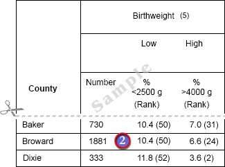
Equal Ranking
 |
If multiple geographic areas have the same prevalence, they are
ranked equally. For example:
- Two geographic areas above have the same prevalence, 10.4%. They are ranked
equally at (50) or 50th and not 50th and 51st.
- The geographic area with the next highest prevalence, 11.8%, is ranked
52nd, not 51st.
|
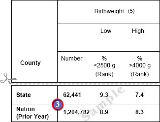
State and National Comparison
 |
The last two rows of the report provide a state and
national PedNSS comparison. |
back to top
|
|