| Visualizations
Investigation Tests
Download Visualizations
investigation tests in either Microsoft Word or Adobe pdf formats
for high school:
| Grade
Level |
Student
Version
(formatted to hand out to students)
|
Teacher
Version
(includes sample answers)
|
| High
School |
|
|
|
Check
out the Templates section to see how to design your own investigation
problems
|
Check
out the Rubrics section to see how investigation scoring rubrics
are developed
|
|
|
|
You can also view the teacher version of the assessment
here:
(Given visualizations
from the GLOBE data archives)


(Present problem requiring
use of GLOBE visualizations) During a recent web chat with other
GLOBE schools, a student was confused as to why you have to take
minimum and maximum temperature measurements each day. "Why not
just take the temperature a few times on a given day and average
them together?", the student asked. One of the GLOBE scientists
who was part of the chat thought it was an excellent question. "We
should make an activity about this!", she exclaimed.
In this activity your
goal is to analyze several GLOBE visualizations and to report your
findings on why maximum and minimum temperature are part of the
GLOBE database.
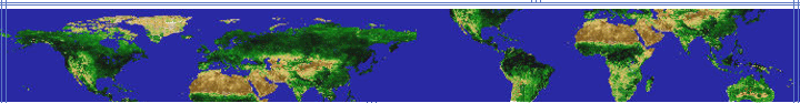
The GLOBE visualizations
contain many sub-elements that together form a useful tool for uncovering
patterns in GLOBE data. Above are two visualizations generated for
the same day. One is for the minimum temperature and the other is
for the maximum temperature.
1) (Plan Investigations:
Pose relevant questions) Pick one of the GLOBE visualizations
shown on the previous page. Think of two questions you might ask
regarding the visualization. A sample question might be "What regions
of the world have the highest temperatures?"
Although questions
will vary, both questions should be related to the same visualization.
Examples include but
are not limited to:
- How much do the
regional patterns of temperature vary from day to day?
- What would the
visualization look like if the regional landforms (mountains,
rivers, valleys, deserts, volcanic activity, ocean currents etc.)
were also shown?
- What would the
visualization look like if land cover patterns (vegetation, fires,
biomes etc.) were also shown?
- What would the
visualization look like if human-related activities & patterns
(cities, population, manufacturing, clear-cutting, fires etc.)
were also shown?
- Do the ocean temperatures
have any relationship to the ocean depths?
- Is it possible
to see El Nino effects on this type of visualization?
- Why is it colder
at the South Pole than at the North Pole?
- How many data points
were used to make these visualizations?
- Why do the temperature
variations show such an uneven pattern (non-straight line)?
2) (Plan Investigations:
Pose relevant questions) From previous visualizations you have
studied in your class, you've noticed that the colors change as
you go from one location on the visualization to the other. Choosing
one of the visualizations given and starting at the bottom of it,
what trend(s) do you see regarding temperature as you move to the
top of the visualization?
3) (Take GLOBE Measurements:
Use quality assurance procedures) A student in your science
class, Tim, has collected GLOBE data before and has always been
very careful when taking measurements. Are there any data in the
images that you suspect might be due to measurement errors? How
can you tell? What are some possible errors that might occur in
creating a visualization?
Possible errors that
can occur when visualizations are created include but are not limited
to: too few data points used to calculate average temperature; not
all data points collected at same time; measurement inaccuracies
due to operator or instrument errors.
4) (Interpret GLOBE
Data: Explain data & relationships) In what unit is the temperature
given? Do you think the color attribute that is used in the visualizations
is appropriate for representing temperature? Why or why not? Pick
one of the visualizations. What is the temperature range for the
Southern hemisphere?
Temperature is shown
in degrees C.
Answers about the
preferred color scheme will vary. The key feature to the answer
is the explanation given for the color scheme. Two examples are
shown below:
The colors are okay.
Purples "feel" very cold and reds "feel" hot. OR Purple is at one
extreme of the color spectrum and red is at the other extreme.
Personally, I'd omit
the purple tones and begin with dark blue for the coldest. I'd also
omit the green shades and go to more yellows. In other words I'd
use dark blue, blue,
sky blue, light
blue, pale yellow, yellow,
golden yellow,
light orange, orange,
red orange, red,
brown-red. I chose these colors
because when you get very very cold, your skin can turn bluish color.
When you get too much sun your skin can get sunburned and turn red
or you can get "tanned" which is like the brown-red color that I
chose.
The temperature range
for the Southern hemisphere in the "minimum temperature" visualization
is: approximately 25 degrees C - less than -40 degrees C. (note:
It is important that the student does not attempt to identify as
specific temperature value at the lower end of the temperature range
because no indication is given that the color variation at the extremes
continues to be linear.)
The temperature range
for the Southern hemisphere in the "maximum temperature" visualization
is: above 40 degrees C - less than -40 degrees C. (note: It is important
that the student does not attempt to identify as specific temperature
value at either end of the temperature range because no indication
is given that the color variation at the extremes continues to be
linear.)
5) (Interpret GLOBE
Data: Explain data & relationships) Pick three countries on
the visualizations that are on different continents. What is the
range in temperature for each of these countries? Are the temperature
ranges for the countries you chose similar (within about15 degrees
of each other) or are they different? Explain you answer.
Answers will vary
depending on the countries chosen.
6) (Interpret GLOBE
Data: Explain data & relationships) Using your answer to the
question above, how do you think the temperature range is related
to its location on the planet? For example, what could you say about
a country in the northern hemisphere when compared to a country
in the southern hemisphere or on the equator? If you were given
a visualization that had only average temperature for the same day,
would it provide more or less information than having the minimum
and maximum visualizations? Explain you answer.
Answers will vary
depending on the countries chosen, but should include information
related to landforms, proximity to oceans, etc. Generally, countries
in the Northern Hemisphere have higher minimum and higher maximum
temperatures compared to countries in the Southern Hemisphere.
A visualization with
only average temperature might provide the same amount of information
since the question asks for information that compares the temperature
ranges for two different countries which can cover a large area.
If small countries were being compared and the visualization included
greater detail than is shown on the global map then the max & min
temperature visualizations would provide more comparison information.
7) (Plan Investigations:
Set up another problem) Using the GLOBE database, choose minimum
and maximum temperature visualizations for another date in 1998.
Repeat questions #5 and #6 above for these new visualizations, using
the same countries. How does help you support the argument that
it is important to study both maximum and minimum temperature measurements?
Answers will vary
depending on the visualizations created from the database.
8) (Communicate: Compose
reports to explain or persuade) Create a 10 minute presentation
that supports the collection and use of maximum and minimum temperature
data. Be sure to include what a visualization is, how you read a
visualization, and how you might find patterns in the data. Use
specific examples that you have from this investigation to support
you argument.
Answers will vary but
should include the specifics asked for within the question, for
example:
- definitions of maximum
temperature, minimum temperature, visualization;
- explanations of using/reading
a visualization, how to find patterns in data;
- a clearly stated argument
for or against use of average vs. max/min temperature data;
- use of specific examples
to support the chosen argument
|