  |
||
|
|
Color Me Happy: Color, Mood, and ToneLesson Two of the Curriculum Unit: Horse of a Different Color: An Introduction to Color in the Visual ArtsIntroductionThis lesson will introduce students to the ways artists use color to set the tone of a painting or to convey a particular mood to the viewer.Guiding QuestionHow does color affect the impression that a work of art makes on the viewer?Learning ObjectivesUpon completing this lesson, students will be able to:
Preparing to Teach this Lesson
Suggested Activities1. Setting the Tone2. Red as a Rose1. Setting the ToneIn this activity, students will investigate how artists often use color to set the tone or the mood of an image. Remind students of the definition of color scheme in the "Preparing to Teach this Lesson" section in the curriculum overview before introducing this activity.Note: If you have time you can have the entire class complete investigations of both of the paintings in this activity. If, however, you are pressed for time, you can assign half of the class to work on the Picasso while the other half works on the Matisse, bringing the class together at the close of the assignment to compare and contrast their findings. Have students view the following image before telling them the name of the painter or the painting's title.
Students may note such elements in the painting as the figures' positions in the composition- the woman's dropped head and turned back, the man's crossed arms—which imply a sense of resignation and unhappiness. But how does the color scheme Picasso chose affect the message conveyed in this image? Note that artists often include colors and color schemes in their composition to convey a particular mood or tone to reflect (and sometimes in contradiction to) the subject, contents, or composition of the painting. What kinds of messages do students think colors can convey? In Picasso's painting, his color scheme supports the idea of tragedy that pervades the figures through the blue tones dominating the painting. Students should note that not only is the sea behind the figures blue, but blue tints seep into the sand beneath their feet, their clothes, their hair, even their skin. How would this painting have changed if, instead of blue, the painting was composed entirely in shades of red and pink? Would it have conveyed the same mood? Next, have students view
"Despite the wealth of pictorial elements, a curious, calm order of structured harmony prevails. Pianist and Checker Players is suffused with a warm glow made up of complementary tones of yellow and red." 2. Red as a RoseNote that although some colors seem to suggest a distinct mood or meaning such as the blue in Picasso's painting above- those same colors will not always convey the same mood or message.Note: If you have time you can have the entire class complete investigations of both of the paintings in this activity. If, however, you are pressed for time, you can assign half of the class to work on the Anshutz while the other half works on the van Dongen, bringing the class together at the close of the assignment to compare and contrast their findings. Have students view:
"The woman at leisure and the likening of a beautiful woman to a flower are common themes in late-nineteenth-century American painting. They reflect the contemporary definition of a woman's proper sphere: the realm of leisure, beauty, and the aesthetic, harmonious domestic environment."Ask students the following questions:
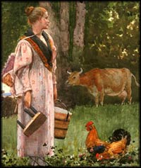
AssessmentOnce students have completed the activities in this lesson assign each student one painting from group A and another painting from Group B. They may write two or three paragraphs explaining the ways in which the artists' color choices draw the viewer's attention, create a sense of depth, and convey mood or tone in each of the two paintings. They should also compare and contrast the two images. These images are found in the collections of The Metropolitan Museum of Art, The National Gallery of Art, or The Smithsonian American Art Museum.Group A
Group B
Return to curriculum unit overview-Horse of a Different Color: An Introduction to Color in the Visual ArtsPrevious LessonSelected EDSITEment Websites
Standards Alignment View your state’s standards |
||||||||||||||||||||||||||||||||||||||||||||||||||||||||||||||||||
  |
||
| EDSITEment contains a variety of links to other websites and references to resources available through government, nonprofit, and commercial entities. These links and references are provided solely for informational purposes and the convenience of the user. Their inclusion does not constitute an endorsement. For more information, please click the Disclaimer icon. | ||
| Disclaimer | Conditions of Use | Privacy Policy Search
| Site
Map | Contact
Us | ||