Sixteenth Century
Influence of Dürer
Strasbourg:1506?
This first edition of a commentary on the Passion of Christ is
illustrated with twenty-six full-page woodcuts designed by the
Swiss artist, Urs Graf. All but three of the woodcuts carry his
initials "VG" cut into the block. This woodcut, "The Raising of
Lazarus," is one of the more important in this remarkable series.
It displays Graf's ability to design a composition combining numerous
characters and events on a single woodblock. He organizes the Gospel
story in a "Z" pattern that weaves its way through the image and
leads the viewer from Jerusalem to the tomb of Lazarus. Graf creates
balance in his woodcut design by integrating architectural elements
and landscape motifs into this complex narrative image. Graf's
scheme for shading is another important element in his style. The
parallel lines he uses to model his figures are thinner than the
outline contours, giving his forms a complexity that emphasizes
physical dimensions. Also, his heads show individual characteristics,
and his method of using short accents to further define facial
features is a technique reminiscent of the work of Albrecht Dürer.
Renaissance Influence on Venetian Woodcut Design
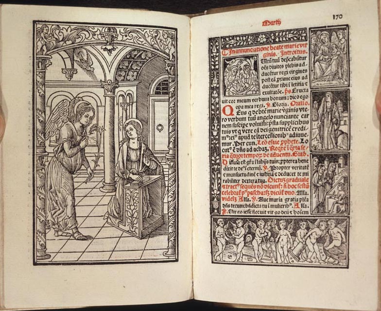
Venice, 1501
LucAntonio Giunta's missal is illustrated with eighteen full-page
woodcuts devoted to the life of Christ and numerous historiated
initials and column cuts depicting Biblical scenes and the lives
of the saints. This woodcut, "The Annunciation," recalls the image
used in the editions of the Meditations printed in Rome
by Stephan Plannck (nos. 9 and 25). The overall composition
of the cut, its three architectural columns, the ornamental designs
on the kneeler, and the floor pattern are similar in both woodcuts.
However, in the 1501 design, the perspective, the complexity of
the interior ornamentation, and the modeling of the figures is
more highly developed than in the cut used by Plannck. The shading
alone varies in the thickness and direction of the parallel lines,
which give greater dimensionality to the physical forms and a better
sense of perspective in the interior view. This detailed shading
technique results in a sensitive rendering of the story of the
Annunciation and reflects an important characteristic of Italian
Renaissance style that emerged in the late 1490s
Emerging Classical Style
Venice, 1501
This woodcut demonstrates the unique effect produced by combining
the circle and the square as design elements. The image on the
left depicts the capture and enslavement of Malchius by the Bedouins.
The design is spacious, all the figures are clearly differentiated,
and the drama of the forced march is clearly depicted. However,
the roundel creates a telescopic effect, leaving the viewer with
the impression that he is spying on the caravan as it moves across
the landscape. The event becomes timeless, and the woodcut takes
on a quality of immediacy that was an important characteristic
of Renaissance imagery. The woodcut on the right depicts a series
of events from the life of Saint Paul the Hermit. It is enclosed
by a monumental border, decorated with classical motifs, an ornamentation
that exemplifies the stylistic changes that took place in Venice
during the late 1490s. These classical design elements, along with
the high-density shading techniques, forecast the emergence of
the classical style that dominated Venetian woodcut during the
first decades of the sixteenth century. Colored woodcuts were unusual
in Italy during the Renaissance period.
Variation on Venetian Style
Ferrara, 1503
This rare missal appears to be only book printed at the Carthusian
Monastery in Ferrara during the sixteenth century. It is illustrated
with a large woodcut of "Saint Christopher and the Christ Child" on
the title leaf, a full-page cut of the Crucifixion, and more than
150 initial letters. The missal is rubricated throughout in red
ink, and the musical notations and lyrics are printed in black
on red staves. The woodcuts have been attributed to an anonymous
Ferrarese designer, who demonstrates the influence of Venetian
design. This "Crucifixion" is framed by a four-part border in the
Venetian style. This highly sculpted background in which the contrast
of black and white is so effectively applied is an interesting
variation on the solid black with white of the black-ground style
that was so popular in Venetian woodcuts. The border gives the
woodcut a lightness--almost a feathery quality--that is enhanced
by incorporating the new shading techniques of the Venetian style
for the modeling of the human form.
Most Important Woodcut-Illustrated Book Printed in Pavia
Pavia,1505
Jacobus Gualla's lives of the saints of the city of Pavia is illustrated
with a woodcut portrait of the author and twenty-seven small woodcuts
in the Pavian style. The composition of this woodcut figure combines
the influences of Milanese portrait painting with the thinly cut,
outline border designs of the Ferrarese masters. The portrait is
delicately cut with lines of varied thicknesses, resulting in a
figure of individual character. The folds of the cloak incorporate
curved lines, with loop and angle cuts, highlighted with parallel
lines of varied lengths, cut in different directions. The border,
cut in outline without shading, is distinguished by the thinness
of the line and the clarity of the image. The use of roundels and
curved-line designs for flowers and the figures of the putti and
satyrs are in the "popular" style of Venetian design. The eyes
of the figures in the roundels are quite large, with lids half
closed and dark centers. The overall effect is a light, airy border
of original character. This border first appeared in Laurentius
Rubeis's edition of Francesco Negri's Pullata, printed
in Ferrara earlier in 1505.
The "Classical" Style of Venetian Woodcut
Venice, 1505
This volume appears to be the first Italian edition of a very
popular commentary on the Epistles and Gospels by Guillermus Parisiensis,
a mid-thirteenth-century bishop of Paris. Printed by LucAntonio
Giunta, it is illustrated with one large woodcut and twenty-three
original woodblock designs in a smaller format. "Mary Magdalene
and the Other Marys at the Tomb" is typical of the smaller cuts
that illustrate the Postilla. This well-organized scene
includes very delicately cut figures with thicker contour outlines
and thinner parallel lines modeling the figures. The mountain and
city view in the background are in proper perspective, and the
artist has introduced black space to define denser shaded areas
and create contrasts. The woodcut is set within a frame of text,
the commentary in the smaller type size and the Gospel story in
larger, bolder type. The integration of the image and text is extremely
well executed. The double-page spread is a highly satisfying typographical
presentation, one of the hallmarks of Giunta's liturgical publications.
This is the only copy of the book recorded in an American library.
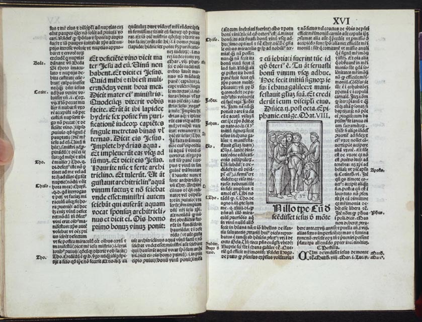
Influence of Mantegna on the Classical Design
Venice, 1507
This later edition of Giunta's Breviary for the Use of Rome includes
8 full-page cuts and 375 small woodcuts of Biblical stories set
throughout the text. This woodcut of "The Calling of Peter and
Andrew," recreates the moment when Andrew recognized Christ as
the Messiah, dedicated himself to Christ, and became the first
apostle. Peter, witnessing his brother's commitment, soon followed
as a disciple of Christ. The woodcut uses highly developed shading
techniques to model the figures and background. The sea is equally
well defined by the use of sculptured lines indicating the motion
and direction of the water. The forward tilt of the boat and the
bend in the knees of the oarsmen contribute to this sense of moving
water. The powerful composition, classical costume, recognizable
heads of the figures, and the use of a new, shaded style all point
to the influence of the artist Andrea Mantegna and his circle on
the emerging classical design of the Venetian woodcut at the end
of the fifteenth century.
Wheels of Fortune and Games of Chance
Milan, 1508
This 1508 Milan edition of Lorenzo Spirito's Book of Chance is
illustrated with numerous full-page woodcuts, four-part border
designs, portraits, and images of the signs of the zodiac. Many
of the designs are very well done, especially those that appear
in the center of the wheels of fortune and in the woodcut borders
below the wheels. In this opening, the leopard (left) is
cut in a thick outline and modeled with precise curved lines. The
leopard's formal pose is particularly appealing because it projects
a dignity commensurate with the animal's position in the hierarchy
of the animal kingdom. The dolphin (right) is similarly
cut and set within a sea of curved lines against a well-defined
architectural background. The dolphin's design reflects classical
origins. The animal projects an aggressive attitude, suggesting
the dolphin's importance as protector of the city of Venice. The
well-designed woodcut borders of the hunt (left) and the
putti at play (right) are symbols of the vagaries of life,
in which good fortune and calamity are equally possible.
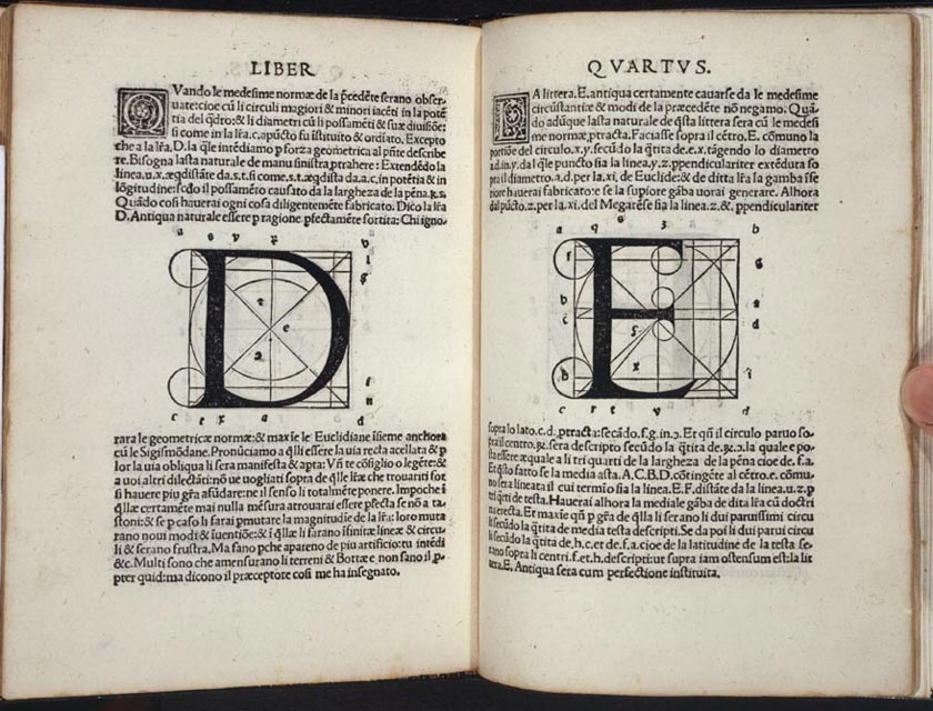
Exposition on the Art of Calligraphy
Venice, 1514
This first edition of the first Italian writing manual is illustrated
with woodcut borders, initial letters, diagrams, and letterforms,
accompanied by an instructional text on the art of handwriting
by Sigismondo Fanti, a mathematician and astronomer from Ferrara.
Fanti published this work so that secretaries, copyists, merchants,
and artisans could learn techniques of applying geometry to the
construction of letterforms. These woodcuts of the capital letters "D" and "E" are
examples of how Fanti used geometric patterns in the design of
his letters. The circle and the square, the building blocks of
classical architecture and the basis for letter designs that appeared
in Luca Pacioli's Divina proportione, published in Venice
in 1509, provide a starting point for Fanti. He, however, pushed
past the limits of Pacioli's theory of proportion by applying principles
of geometry to extend the lines of his letterforms beyond the limits
imposed by the proportionality of the circle and the square.
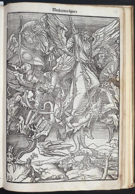
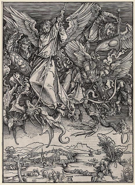
Italian Translation of Dürer Design
Venice, 1515-16
This rare edition of Alexandro de Paganini's Apocalypse (left
below) is illustrated with fifteen full-page woodcuts inspired
by Albrecht Dürer's monumental images illustrating the text
first printed for Dürer in 1498 and reissued in 1511. This
woodcut of "Saint
Michael fighting the Dragon" is about a third smaller than Dürer's
original (right below) and is cut in reverse. The landscape
at the bottom of the cut looks more Italian than German, and the
figures in the image are more forward in the frame than they are
in the original design. Whereas Dürer used very little cross-hatching
to shade his figures, the designer of the Italian woodcut uses
cross-hatching to darken his backgrounds, in the classical style.
Otherwise the Italian cut follows Dürer's composition closely.
The Italian version, though successful in many respects, suffers
from an application of uniform lines that fill in space rather
than clearly defining it. The Dürer woodcut also reflects
the skills of the Nuremberg blockcutter. He translated Dürer's
flicks and dashes by exquisitely fine cuts, producing an exciting
rendering of Dürer's image.
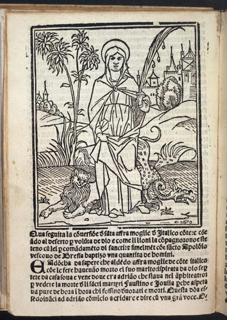
Influence of Milanese Portrait Style
Brescia, 1534
This second edition of the story of the martyrdom of Faustino
and Jovita, two saints from Brescia put to death in 120 A.D.,
is illustrated with cuts that show the influence of Milanese portrait
style. In this image of Saint Afra with a lion and dragon at her
feet, the saint is well proportioned and sensitively portrayed.
Particular skill is exhibited in the detailing of her eyes and
nose, creating a very distinctive image of the early martyr's face.
A cityscape, designed in proper perspective and balance, contributes
to the overall effectiveness of the composition. Simply cut with
thick contour lines and some shading, the woodcut of Saint Afra
was executed by a very skilled hand. The cutter was most likely
different from the cutter of the other woodcuts in the book.
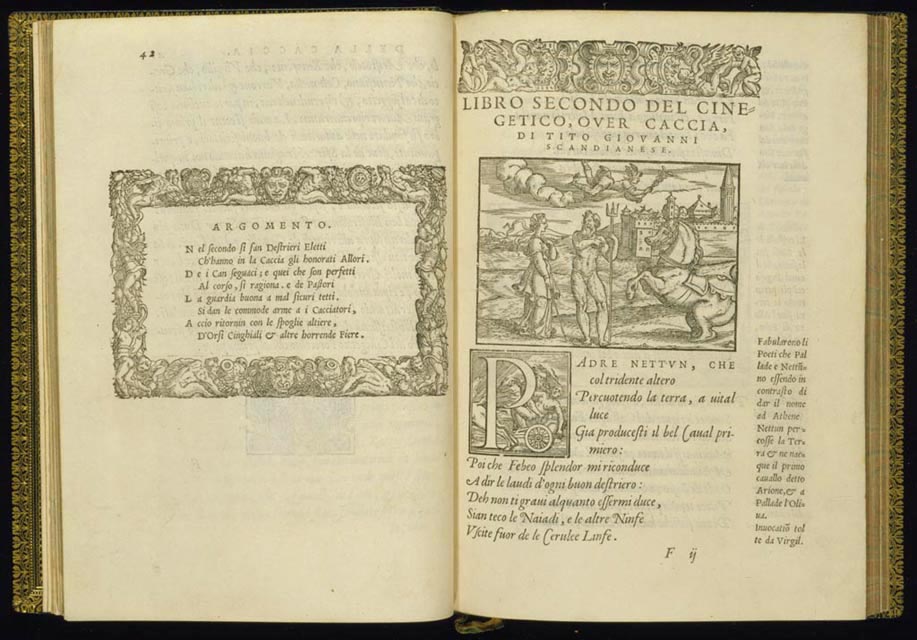
Classical Motifs in Mid-Sixteenth-Century Italian Woodcut Design
Venice, 1556
Tito Scandianese's didactic poem idealizing the sport of hunting
was first published in 1556. It is illustrated with fifteen woodcuts
in the text and includes woodcut head and tail pieces and foliated
and historiated initial letters. In this example, the large cut
is a well composed and balanced image, set in classical times and
illustrated with classical motifs. The woodcut shows the goddess
Minerva listening to Neptune, who gestures toward Arion, as he
tells her the story of the creation of the first horse. Athena's
costume and the figures of both Neptune and Arion are clearly articulated
and expertly modeled by heavy shading. With the exception of the
figure of Hermes winging his way across the sky, this woodcut is
pleasing in both composition and detail. The large historiated
woodcut initial letter was designed to echo the story of Neptune
and Demeter and is cut in the same style and is of the same quality
as the larger narrative woodcut. This two-page opening is beautifully
balanced, demonstrating the sensitive integration of text and image
that is the strongest characteristic of the book.
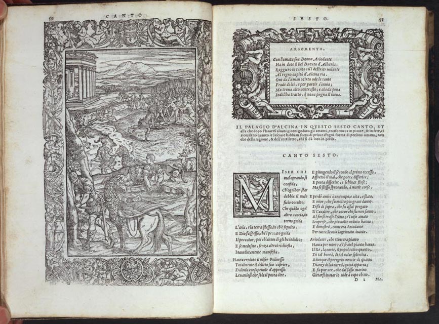
Woodcut with Intricate Designs
Venice, 1562
All the editions of Orlando Furioso printed by Vicenzo
Valgrisi are illustrated with forty-six full-page woodcuts set
within a border decorated with putti or grotesques. The "argomento," or
theme, that introduces each poem is also set with a classical-style
border. The border is followed by a large historiated initial letter
and a two-column text set in a small italic typeface, creating
a balanced and attractive typographical layout. All the images
made for Valgrisi are cut in outline, with thicker lines used for
contour and thinner lines and varied patterns of parallel lines
for shading. In this image, five separate events are depicted in
the block, but, unlike the clear narrative presented in the images
created by earlier printers, the designs made for Valgrisi are
difficult to decipher. Shaded areas dominate the cuts, and the
meaning of the narrative is obscured under the weight of the muddied
figures and crowded spaces. Over time, the problem of discerning
meaning was compounded by the wearing of the woodblocks because
of multiple use. Such wear is apparent here in the border enclosing
the large block.
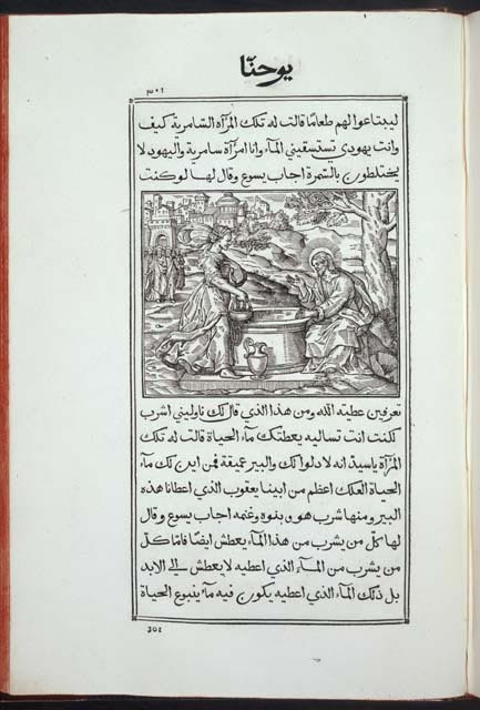
First Edition of the Gospels Printed in Arabic
Rome, 1591
This volume is the first edition of the Gospels printed in Arabic.
It is illustrated with 149 woodcuts, some of which are signed with
the monograms of the Florentine artist Antonio Tempesta and the
block cutter Leonardo Parasole. Tempesta was trained by the Flemish
artist Joannes Stradanus, whose influence can be seen in his choice
of everyday subjects and in his sweeping landscapes. This image
of "Jesus at Jacob's Well Talking to the Samaritan Woman" is filled
with Netherlandish characteristics, the most important of which
is the artist's decision to make the Samaritan woman the focus
of the woodcut. The casual setting and attitude of the figures,
the flowing garments, the well-defined landscape and the clearly
delineated cityscape all demonstrate Tempesta's training and experience.
The artist has created a brilliantly crafted woodcut--extremely
well balanced in its composition and its well-defined and uncluttered
space The perspective sweeps from right to left, taking the viewer
through all the elements of the Gospel story in a clear and complete
manner. Leonardo Parasole's ability to match in cutting the quality
of Tempesta's design lifts the woodcut from the realm of craft
into that of fine art.
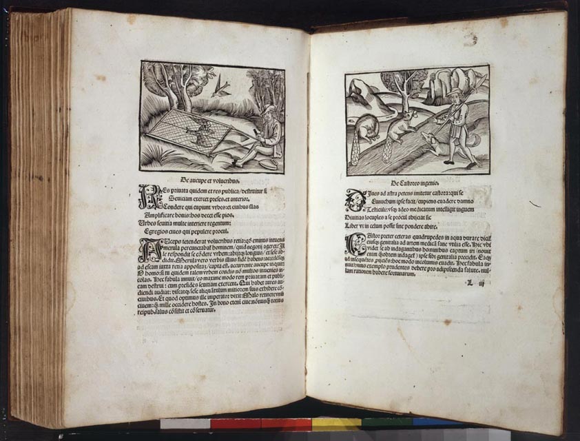
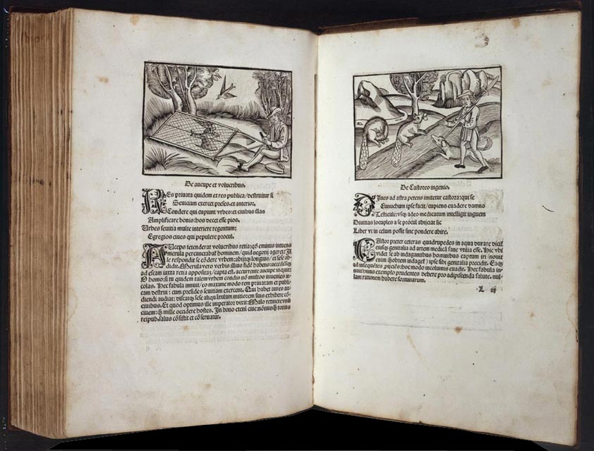
Woodcut in the Style of a Metalcut
Basel, 1501
Jacob Wolff's edition of Aesop's life and fables is in two parts.
Part I contains woodcuts in the medieval style, copied in reverse
from original designs that appeared in Ulm in 1476-77. Part II
is illustrated with woodcuts designed in the early 1490s that are
more fully developed than the ones in Part I and represent the
life and customs of the late fifteenth century. "The Bird Catcher" (left) depicts
a figure dressed in contemporary costume, from the hat on his head
to his britches and knee socks. The woodcut shows a trap and its
construction, its placement in a clearing near a stand of trees,
and the method used to control the trap by pulling two ropes. "The
Ingenious Beavers," (right) illustrates a different contemporary
scene, including an allegorical representation of the problem of
river management that affected rural life at the time. Each woodcut
is carefully executed with thin, closely spaced parallel lines
that shade the figures and the landscape. They appear at first
glance to shimmer with movement, an effect usually associated with
metalcuts.
Only Known Copy
Paris, 1510
Popular literature of the late fifteenth and early sixteenth centuries
is notoriously scarce, and the works of Pierre Gringore, noted
for his satire and humorous accounts of domestic relations, are
no exception. This edition of Gringore's Castle of Labor includes
designs that illustrate domestic life and labor in late medieval
France. "The Workroom" (left) is a good example of the
half-dozen images that depict working conditions of early modern
tradesmen. Cut in outline and highlighted with shading, this interior
image is filled with information about the activities and division
of responsibilities in an artisan's shop. Tools are displayed,
work stations are defined, and the craftsmen's skills at pattern
design, burnishing, and assembly are clearly articulated. The workroom
is a well-defined interior space. The craftsmen, each given an
individual facial expression, are attired in contemporary costume.
The black-ground woodcut (right) is from another series
of images that represent the battles of virtues over vices, in
this case "Sobriety versus Gluttony." The white-on-black style
of these cuts, highlighted with dots, shading, decorated columns,
and a floral foreground, creates a powerful contrast for representing
the combat of good and evil.
Late-Fifteenth-Century Image of Peasants at Work
Paris, 1510
Simon Bougouyn's poem written in the form of a dialogue that describes
the education of a prince is illustrated with fifty-two woodcuts.
This image of "The Cultivators" is distinguished by finely carved
figures placed in a clearly defined rural setting. This image first
appeared in Jean Bonhomme's 1484 edition of Ruraulx Prouffitz. Like
so many French woodcuts, it captures a contemporary view of everyday
life where sowing seeds, tending the young growth, and harvesting
the crop comprise the cycle of the growing season and set the pace
of life in the countryside. The woodcut contains significant contemporary
content, from the style of medieval costume and farm architecture,
to the tools of the farmer's trade and the method of controlling
root growth of a fruit tree. The 1514 edition of L'espinette
du jeune prince are extremely rare, and this is the only copy
in an American library.
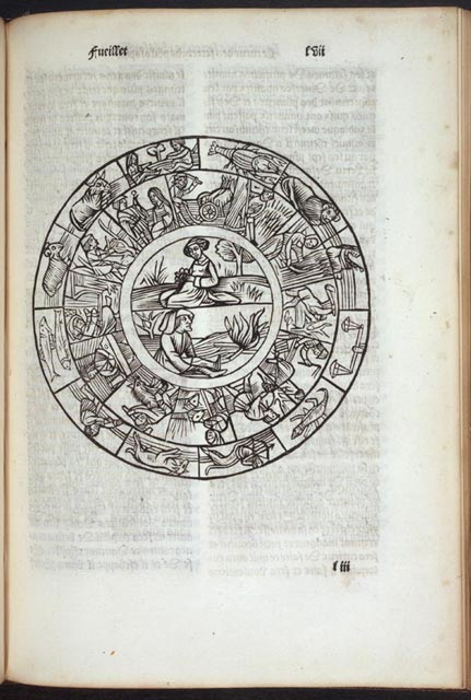
Depiction of the Cycle of Life
Paris, 1515
Jean de la Garde's The Heart of Philosophy is a compilation
of astrological and hermetic texts, originally printed in 1504.
It is illustrated with sixty-two woodcuts and diagrams, including
a series of foliated and calligraphic initial letters in various
sizes, many decorated with grotesque faces. This woodcut of the "Cycle
of Life" is one of the more complex images in the book. In a series
of small spaces, the designer and cutter were able to present a
complicated message, from the depiction of the zodiac signs in
the outer ring to the inner ring, where more elaborate renderings
illustrate the seasonal labors of man. The central image of the
woman holding flowers against her womb represents fertility. In
the lower half of the circle a man is placed in a barren landscape,
comforted by fire alone. The clarity of each ring of the woodcut
is enhanced by the amount of white space used to delineate the
finely cut black lines. This black-on-white effect allows the parallel
lines of the landscape and the scant shading of the garments to
stand out and gives a dimensionality to the figures, especially
those in the central roundel.
Monumental Design Probably by Vérard's "Chief Designer"
Paris, 1517
This rare edition of the 1517 French Bible contains 215 woodcuts,
many originally designed for Antoine Vérard's earlier publications.
This large "Adam and Eve in the Garden" was created for his 1498
edition of La Bible historiée, and used to illustrate
the opening book of Genesis in all of his folio editions of the
Bible. "Adam and Eve" is a complex image that symbolizes the root
of human existence and the fall from grace that marked humankind.
The circular composition of the woodcut set at the base of the
Tree of Life is an effective device connecting the story of the
Fall of Adam to future generations of humanity. The bodies of
the figures are well proportioned and expertly modeled in pre-Renaissance
style, with thick contours and some shading to give definition
to the physical form. The heads of the animals in the foreground
are well defined and sympathetically carved. The background, alive
with activity, is an amalgam of plants, trees, and birds. No line
or contour seems to be wasted or lost in the complexity of the
image.
Woodcut in Second Quarter of the Sixteenth Century
Paris, 1530-31
This is the second edition of Raoul de Presles's French translation
of Saint Augustine's City of God. This original full-page
woodcut of "God Enthroned" is an excellent example of a woodcut
from the second quarter of the sixteenth century. The border, decorated
with a leaf-and- branch motif and grotesques, is cut in a simple
outline with a few flicks and parallel lines to heighten the forms.
This simple pattern lacks the detail of the complex border structures
that evolved from the manuscript tradition of the medieval period.
The central panel of the woodcut, with God on the throne surrounded
by the symbols of the four Evangelists and a choir of angels, is
well designed but its composition is formulaic. The image in the
upper right, where the angel holds the banner of Matthew, is likewise
well designed and executed. However, the presentation of the overall
composition is flat and devoid of many of the artistic impulses
that characterize French woodcuts from earlier in the century.
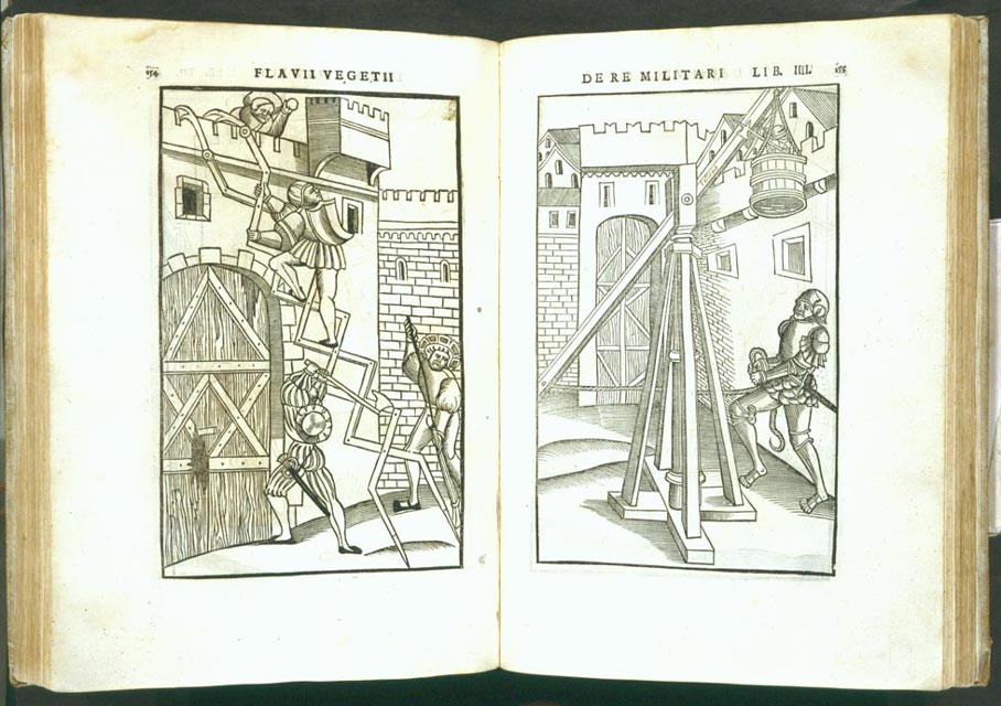
Book on War
Paris, 1532
This later edition of Christian Wechel's printing of De re
militari, sometimes listed under the title Scriptores
re militaris, is illustrated with 119 full-page woodcuts
depicting the art of war, the machinery of war, and some fantastic
concepts for underwater assault. These two full-page woodcuts
are typical of the images that complement these texts. Their
designs purposefully depict the methods of war and provide significant
content for the viewer. They show military machinery, inventions,
assault tactics, weapons, and costumes of various orders of the
military. The thick lines used for contours and shading and the
liberal use of white space resemble the techniques of the late
medieval style and demonstrate that these images are copies of
much earlier designs. The woodcutter is not innovative in this
1532 edition but instead shows his ability to translate earlier
designs in an efficient and predictable manner. Many mid-sixteenth-century
woodcuts followed this formula, especially as more scientific
and technical texts demanded clear and precise images
[No image available]
Publius Terentius Afer.
[Comoedia.] Le grant therēce en francoys tāt
En Rime que en Prose.
Paris: Guillaume de Bossozel for
Guillaume le Bret, 1539.
Rosenwald Collection
Rare Book and Special Collections
Division (59) |
Important Source of Historical Information
This well-illustrated French language edition of the Comedies of
the Roman playwright Terence contains a large woodcut and 155 half-page
cuts, originally used in the 1493 edition of Terence printed in
Lyon by Jean Treschel. This large woodcut shows a late medieval
theater, complete with an interior view and a street scene in front
of the theater where courtesans ply their trade. The interior view
shows the stage with a lone musician to represent the orchestra,
box seats, and three tiers of seats filled with theatergoers of
various classes. The costumes are medieval in style, and their
design demonstrates skill at creating contour, shading, and motion,
especially in the figures in the foreground. Some of the facial
characteristics are repetitive but the designer varies the figures
by emphasizing an individual's eye or nose and differentiating
them by adding beards and varying hairstyles or headdresses. The
architectural component of the composition is equally well executed
and demonstrates the designer's ability to use perspective as a
tool. The designs demonstrate northern European characteristics
and may be of German or Dutch origin.
A Masterpiece by Geoffrey Tory
Paris, 1542
This copy of Mallard's 1542 printing of this Tory Book of Hours
is the only copy in an America library. It is illustrated with
eighteen large woodcuts, five small woodcut, woodcut borders and
initial letters after designs by Geoffrey Tory and first used in
1529. A few of the woodcuts are highlighted with light watercolor,
now dulled by cleaning. The artistic rendering of the borders and
the pair of woodcuts of the "Annunciation," are defined by an exceptional
clarity of line, the precise use of shading, and by a skill at
translation that transforms a well-known image into a tiny masterpiece.
Tory created at least three other pairs of images of the Angel
Gabriel and the Virgin Mary for his various editions of the Book
of Hours. But in this rendering the compositional structure, the
physical representation of the figures, and the beauty of the two
portraits, present refinements that are only hinted at in his other
designs. Here, Tory combines characteristics of Renaissance painting
learned during his tours of Italy at the beginning of the century
with the French manuscript tradition of animated borders decorating
missals and prayer books.
Painterly in Composition, Correct in Anatomical Rendering
Paris, 1545
This first edition of Estienne's monumental work on the human
body is illustrated with fifty-six full-page woodcuts attributed
to the workshop of Geoffrey Tory and numerous smaller cuts and
initials. The two full-page woodcuts of the female form are characteristic
of the Renaissance woodcut during the middle of the sixteenth century
in combining an emphasis on the artistic rendering of the human
body with an exactitude demanded by modern scientific investigation.
The sensual, almost erotic poses of the female figures highlight
the influence of Italian Renaissance style on French design of
the period. The woodcuts are painterly in their conception and
suggest a sensitivity to portraiture. The shading and cross-hatching
that defines these figures is highly detailed, and, along with
the white space that illuminates the muscles of the legs and torso,
the image beams with color and tone in the manner of an engraved
print.
Bernard Salomon and the Mannerist Style
Lyon, 1557
This edition of Ovid's Metamorphoses is illustrated with
176 woodcut designs by Bernard Salomon. These woodcut images depict
the "Creation of Man" and the "Golden Age." The designs are fully
realized in a small space and illustrate clearly defined figures
created by freely drawn contour lines and heavy shading. The focus
of each, the laying of hands by the Creator on the left and the
Tree of Life on the right, are surrounded with classical references,
as are all of the woodcuts Salomon designed to illustrate Ovid's
world view. One of the most distinctive design elements visible
in these two pages is the ornamental border that Salomon designed
for this book. The parade of actors and grotesques illustrated
at the top and bottom of the border on the right and the use of
decorative motifs of the candelabra and the vase on the left are
certainly French in character and tradition, but the style is new.
Overblown ornamentation, exaggerated heads, hanging crabs and fish,
and the jeweled quality of the interlocking pieces represent a
formalization of the Renaissance style and reflect an aspect of
the developing school of Mannerism.
Poor Use of Perspective and Proportionality
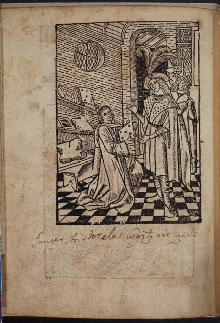
Antwerp, ca. 1505
This is the first edition of Govaert Bac's printing of this collection
of works by Aristotle, Hippocrates, and Theophrastus. The image
that is illustrated here, "The Writer Offering His Book to the
Prince," is a common motif, used all over Europe by artists offering
their work to a patron. This one was first used by Bac for his
edition of Albertus Magnus's Liber aggregationis, printed
in 1498. This cut offers an important reminder of the difficulty
both designers and woodcutters faced in creating perspective before
Renaissance techniques revolutionized the art form. In this woodcut,
all the architectural elements of the interior are askew. The bookshelves,
the circular window, the ceiling arch, and the windows to the right
are all hastily cut without attention to detail. The woodcutter
attempted to create proper relationships but was simply not able
to successfully calculate the proportional space effectively. Yet
if one looks at the floor design it moves gracefully from front
to back, and the lines of the two central figures are drawn and
shaded in an adequate manner, though their facial features are
not well delineated.
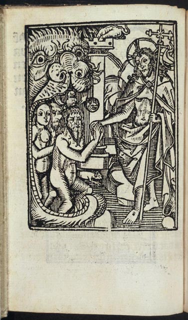
Netherlandish Design from Block Book Tradition
Antwerp, ca. 1510
Henrick Eckert's printing of the first edition of Henricus van
Santen's rare little devotional work is illustrated with a medieval
design of the risen Christ reaching into the mouth of hell and
offering salvation to the repentant, represented by Adam and Eve.
The large opening of the mouth is well crafted, with piercing eyes
and a large bulbous nose, and fills nearly half the space of the
block. This motif is copied with variations from the block book
tradition, especially the woodcut visions of hell that appear in
editions of the Apocalypse. The image also displays
a few of the stylistic advancements that Netherlandish woodcuts
were
undergoing at the beginning of the sixteenth century. The
introduction of an architectural element in the background, the
limited use of white space, and the distinctive facial characteristics
of Christ and the figures of the saved are sixteenth century artistic
elements that enhance this well-known medieval image. The addition
of the rat running out of the mouth of hell adds a playful touch.
Remarkable Portrait of St. Stephen
John of Hoveden's poem recounting the life of Christ is illustrated
with a stunning portrait of Saint Stephen holding the palm of martyrdom
and a stone, the instrument of his death. This remarkable work
of originality and craftsmanship is designed and cut with such
delicacy that it appears to be cut on metal. The design of the
sleeves of the tunic, the blouse, and the folds at the neckline
are rendered with the style and grace of a painter. The white oval
of Saint Stephen's face
with its deep brows and contoured mouth and chin
contrasts beautifully with the black and white lines of hair that
seems to be woven and perfectly set in place. The architectural
background and the starry space behind the saint is cut in white
on black and introduces a dreamy quality to the portrait. All these
effects are heightened by the applied red wash that decorates the
costume and lends a dramatic touch a wonderful woodcut portrait.
Bound with Hoveden's poem is a calendar of feast days, illustrated
with a woodcut cut in outline of Saint Francis receiving the stigmata.
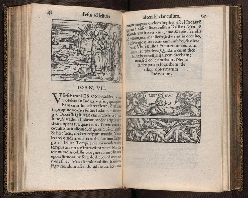
Italian Influence on Flemish Style
Antwerp, 1537
This first edition of Guilielmus de Branteghem's compilation of
stories from the New Testament is illustrated with woodcuts designed
by Lieven de Witte, a painter, architect, and designer of woodcuts
and stained glass. "Christ with His Doubting Brothers in Galilee," the
woodcut used for the opening of John:7, illustrates De Witte's
skill at creating a fully realized composition that combines a
highly detailed background with the central passage of John's Gospel
story. This woodcut captures a world in motion around Christ as
he preaches to those who are about to judge him. This picture of
a world rich in landscape and architectural detail portrays a city
on the sea and evokes the lives of its inhabitants. On the right
are two border blocks representing the "Soul of Lazarus" and the "Chains
of Hell." The lower block is an image of some originality. It its
design, with a contorted, oversized figure dominating the space
and a fan of fire splayed in the background, almost presages the
work of the eighteenth-century artist William Blake. The grotesque
figures pulling at the chains are as muscular as the central figure,
and the positions they hold reveal a sensitive understanding of
the human form in motion.
Artistic Possibilities of Engraving
Antwerp, [1572]
This edition of stories of the life of Christ is one of two books
with engravings that Rosenwald purchased at the Dyson Perrins sale.
It contains seventy-two engraved plates, with designs by Pierre
van der Borcht IV and Crispin van den Broeck. The image of the "Virgin
and Elizabeth" captures the emotional meeting of the two women
and focuses on their rush to embrace. The design is enhanced by
the heavily shaded garments and the detailed view of the city in
which their meeting takes place. Though the subject is classical,
the view resembles a mid-sixteenth-century townscape and reflects
the Dutch and Flemish tendency to use contemporary content to embellish
their pictorial narratives. This plate is a wonderful example of
how engraving images on metal offers the artist the opportunity
to create details and tones not possible when working with wood.
The enormous amount of detail, the richness of the tones and colors,
and the ability to create very fine lines to emphasize a form or
a facial feature drew sixteenth artists to the intaglio process.
Engraving on copper plates remained the dominant medium of book
illustration for three centuries.
Impact of the Intaglio Process on the Woodcut
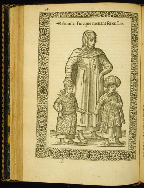
Antwerp, 1586
The first edition of Nicolay's travels to Turkey is illustrated
with sixty full-page woodcuts designed by the author. Nicolay's
designs concentrate on the dress of various Turkish, Armenian,
Greek, and North African peoples. The "Turkish Mother and Her Children" is
typical of the quality of his designs. The figures are well proportioned
and spaced so that the costumes of the mother and children could
be fully developed. The costumes of the young girl and boy demonstrate
the high quality of the woodcut during the last quarter of the
sixteenth century. The complex floral patterns are delicately cut
and highlighted with an over layer of parallel lines that bring
texture to the garments. This technique, along with the amount
of cross-hatching used by the cutter, resembles the intaglio process
and suggests that the woodcutter is applying methods developed
on copper to embellish his woodblock. By 1576, when this block
was made, the intaglio process was beginning to supersede the woodcut
as the preferred method for creating images. This example shows
the high degree of skill of the block cutter who executed this
very detailed image.
Stylized Initial Letter
Salamanca, 1506
Monumenta ordinis minorum contains documents, rules,
and privileges regulating the Franciscan Order in Salamanca, Spain.
This woodcut of the initial letter "S" is a variation on similarly
styled letters used by Pedro Brun and Juan Gentil in Seville in
the 1490s. They differ in that the two segments of the letter "S" are
in the form of fish meeting at the center of the initial, rather
than half-round designs cut in outline without embellishment. This
highly stylized letter form is cut in black ground and decorated
with acanthus leaves that mimic the shape of the fish. The deep
black of the contours and central ovals are set against the translucent
white of the vellum, creating a richness in the image that illuminates
the finely cut lines and shading of the fish scales. As do some
other Spanish woodcuts of the period, this distinctive image reflects
the influences of Arabic patterns and designs.
Northern European Influence on Early Spanish Printing
Saragossa, 1506
This rare Saragossa edition of Guillermus Parisiensis's commentaries
on the life of Christ is illustrated with sixty-six woodcuts. The
small woodcut "Jesus Presented at the Temple" is cut in simple
outline with some parallel lines used for shading. The simplicity
of its design and the uniformity with which the figures are rendered
reflects a northern style based on medieval models. The contours
of the image are clearly cut, and the garments of the high priest
and Mary are well defined, but this image lacks the detail, flourish,
and individual characteristics that appear in many Spanish woodcuts
of the same period. In addition to reflecting its origins, the
quality of the image suggests that its purpose was as a marker
to the text rather than as an artistic element meant to enhance
the narrative.
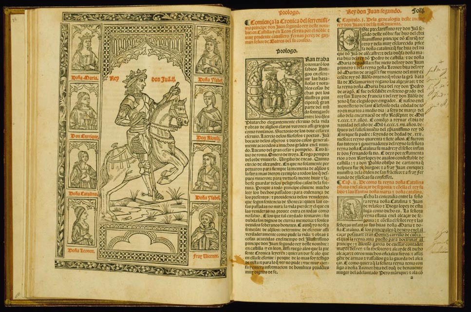
Printed by one of Spain's Most Important Early Printers
Logroño, 1517
This is the first edition of one of the masterpieces of early
Spanish printing, a work that chronicles the reign of Juan II (1406-54).
The image is a monumental rendering of the king, with portraits
of his family designed as part of the border. The care taken in
depicting
the horse and rider in motion suggests a skilled designer and cutter
at work. Although the proportion of the rider to the horse is not
quite right, the anatomy of the horse is well rendered, and the
depiction of reins, harness, saddle and stirrups indicates a knowledge
of equestrian equipment. Equally well executed are the king's facial
features and his posture on the horse, as well as the rendering
of his crown,
gloves, and armor. The various costumes worn by his family provide
significant information on the dress of the Spanish court in the
early sixteenth century. The placement of the illustration opposite
the two-column text printed in red and black, embellished with
a woodcut initial letter showing Juan II on his throne, creates
a well balanced and pleasing typographical arrangement.
Rare Edition of Aesop Printed by Jacob Cromberger of Seville
Seville, 1521
This volume is the only known copy of Jacob Cromberger's 1521
edition of Aesop. It is illustrated with 192 woodcuts, woodcut
initial letters, and woodcut scrolls that appear in the margins.
These illustrations of Fables 9 through 12 from Book I provide
a good example of the woodcuts that appear throughout the volume.
All are simply designed narratives, cut with thick contour lines
and repetitive parallel lines for shading but with little embellishment
in the form of background or borders. The dominant use of white
space for background and the flat white of the architectural structures
recall the late medieval style of German woodcuts. The lack of
detail suggests the work of a local cutter working from earlier
designs. Fable 12, "The Country Mouse and the City Mouse," at the
bottom of the right-hand page, shows a familiar image of the steward
entering his larder. While the figure of the steward and the architectural
design of the larder are adequate, the interior of the larder and
the figures of the two mice are very poorly designed and cut, suggesting
the work of an inexperienced hand.
Image of "Mary of the Apocalypse"
Toledo, 1526
This image of "Mary of the Apocalypse" is based on the vision
recorded by Saint John in Revelation 12:1, a passage that took
on great significance as the cult of the Virgin Mary emerged during
the late medieval period. In the revelation, a woman holding a
child in her left arm appears to Saint John. She is wearing a crown
surrounded by twelve stars and is standing on a crescent moon with
the sun at her back. The rays of the sun burst forth to create
a circle of light around the woman and child. The cutting in this
woodcut of "Mary of the Apocalypse" is very well executed. The
motifs described by Saint John of the crown, stars, moon, and sun
are clearly defined. The most striking aspect of the woodcut, however,
is the precise and expressive facial characteristics given to the
two figures. These details, combined with the sensitively formed
hands of the Virgin and her flowing gown, highlighted with parallel
lines and cross-hatching, reveal the hand of a highly capable cutter,
skilled at translating the details of an intricate drawing into
wood. This first edition of The Life of the Virgin printed
in Catalan was translated by Juan de Molina from the Valencian
dialect.
Woodcuts Showing a Young Man's Education
Seville, 1526
Alfonso de la Torre wrote this allegorical work about the nature
of knowledge and a liberal education in the 1440s, and the first
printed edition was published in Barcelona in 1484. This edition,
printed by Jacob Cromberger and his son Juan, is illustrated with
118 woodcuts and numerous black-ground and fine-line initial letters.
The woodcuts trace the progress of a young man's education and
illustrate the academy where a young boy is taught lessons in the
mysteries of the natural world. The remaining series of woodcuts
illustrate the lessons the boy may learn in music, rhetoric, and
astronomy. Each illustration is cut with thick contours and highlighted
with heavy shading. These woodcuts are not distinguished by skillful
cutting but by their detailed designs, backgrounds, architectural
settings, interiors, and costumes. This copy is one of two in the
United States.
|


![Vita di sancti padri vulga[m] historiada](images/rw0040s.jpg)
![Missale secundu[m] ordinem carthusiensium](images/rw744s.jpg)


![La premier [-second] volume de la bible en francoiz](images/rw967s.jpg)


