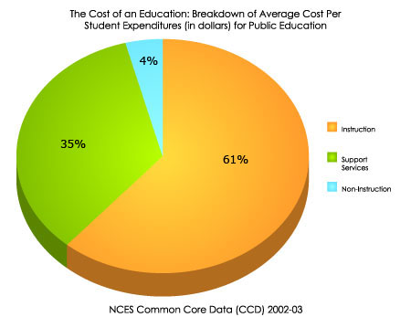
Perfecting Pie ChartsPie charts can be used to show percentages of a whole, and represents percentages at a set point in time. Unlike bar graphs and line graphs, pie charts do not show changes over time. The following pages describe the different parts of a pie chart.
The Title The title offers a short explanation of what is in your graph. This helps the reader identify what they are about to look at. It can be creative or simple as long as it tells what is in the chart. The title of this chart tells the reader that the graph contains information about how money is spent for public education for the average student. The Legend The legend tells what each slice represents. Just like on a map, the legend helps the reader understand what they are looking at. This legend tells us that the green slice represents money spent on instruction, the blue slice represents money spent on support services, and the orange slice represents money spent on non-instruction activities. The Source The source explains where you found the information that is in your graph. It is important to give credit to those who collected your data! In this graph, the source tells us that we found our information from the NCES Common Core of Data. The Data The most important part of your chart is the information, or data, it contains. Pie charts represent data as part of 100 (a percentage). Each slice represents a different piece of data. |