Demetra Lytras, U.S. Census Bureau
Primary Developer: Catherine C. Harvill Hood
January 11, 2006
This document explains how to use the Batch Version of the X-12-Graph application. It includes the following topics:
Version 1.4 contains new graphs: ACF/PACF graphs, outlier t value graphs, first difference graphs, year on year graphs, and power graphs. There are also overlay graphs, component graphs, and SI Ratio Graphs to compare two series.
Version 1.4 now has many new global
options, allowing users to graph subspans
of the series and change the colors, line types and widths, subtitle, and fonts and font
size of the graphs. Users can also change the y-axis and horizontal
reference gridlines of most graphs, and can include X's to note trend uncertainty or change the format of certain component
graphs. This version also allows users to output the graphs in many formats,
including html, postscript, gif, jpeg, etc.
Return to contents.
X-12-Graph Batch is a SAS® program using
SAS/GRAPH®. It requires SAS Version 8 or
higher. The program also requires Version 0.2.8 or higher of
X-12-ARIMA; it may work for subsequent releases, but some graphs
may not be created.
No knowledge of SAS is required to use X-12-Graph.
Return to contents.
Before you can use X-12-Graph, you must copy it to your computer:
X-12-Graph Batch consists of a SAS program, a subdirectory with three SAS files, and an images subdirectory, as well as this document. After uncompressing x12gbat.zip, the following files should be in the c:\x12graph directory:
x12gbat.sas
x12gbat.htm
The c:\x12graph\appl directory should contain the following files:
namelist.sas7bdat
sasmacr.sas7bcat
templt.sas7bcat
There should also be a directory, c:\x12graph\images, containing examples of the graphs that can be created.
The three SAS files in the appl subdirectory must be in that directory for the program to run. The SAS program x12gbat.sas can be stored in any directory.
SAS and SAS/GRAPH software are registered trademarks of the SAS Institute Inc. in the USA and other countries. ® indicates USA registration.
Return to contents.
Before you can create any graphs with X-12-Graph, you must run X-12-ARIMA in graphics mode to produce the necessary output files. Running X-12-ARIMA in graphics mode creates graphics files corresponding to the X-12-ARIMA options you specified in the .spc file. X-12-ARIMA also creates a graphics metafile, identified by the extension .gmt, which contains a list of all the graphics output files produced during the X-12-ARIMA run.
To run the program in graphics mode, you must provide the name
of an existing directory after the flag -g; X-12-ARIMA will store
all graphics files in this specified directory. Because of output
filename conflicts, this must be a different directory from where
the .out file is stored. For example, when running X-12-ARIMA with
the command
x12a bshors -g c:\x12a\graphics,
the graphics output files for the series bshors will be stored
in the directory c:\x12a\graphics. (For more
information, see Section 2.7 of the X-12-ARIMA Reference
Manual.)
If you have an interface for X-12-ARIMA, make sure to select the
option to run the program in graphics mode.
To obtain graphs for several different series from a single run of this batch program, you must run X-12-ARIMA in graphics mode with the same directory after the -g option for each series.
Note: The SAS program uses the title statement from
the X-12-ARIMA run to assign secondary titles to the graphs. This
allows you to assign meaningful titles to the graphs within the
X-12-ARIMA .spc file. If you are creating graphs for one series at
a time, you can also use the subtitle
option to assign a subtitle to the graph.
Return to contents.
You will need two additional files to run X-12-Graph: a graph list file, identified by the extension .gls, and a graphics metafile list, identified by the extension .mls. Both files must have the same filename. (The default input filenames in the batch program are x12g.gls and x12g.mls, but these can be changed.)
The graph list file and the graphics metafile list file both must be in the directory specified after the -g option in the X-12-ARIMA runs.
The graph list file is a list of commands telling the program which graphs to produce.
The basic format of a command in the graph list file is
keyword: element1 <element2 <element3 <element4>>>
The keyword tells the program which type of graph to produce and the elements tell the program which graphical elements to include in the graph.
Important: The keyword must be followed by
a colon.
The current version of the program can produce eleven types of graphs for each series, and four types of graphs to compare two different series or adjustments.
| Graph Type | Keyword |
|---|---|
| Overlay graphs | overlay |
| Spectrum Graphs | spectrum |
| Component Graphs | cmpnent |
| Special Seasonal Graphs | seas |
| Forecast Graphs | forecast |
| History Graphs | history1 |
| ACF/PACF graphs | acfpacf |
| Outlier T-Value Graphs | tvalue or abtvalue |
| First Difference Graphs | fstdiff |
| Year on Year Graphs | yronyr |
| Power Graphs | power |
| Overlay Graphs for Two Series | overlay2 |
| Component Graphs for Two Series | cmpnent2 |
| History Graphs for Two Adjustments | history2 |
| SI Ratio Graphs for Two Adjustments | rsi2 |
Examples of graphical elements are the original series, the trend components, the seasonal factors, etc. A list of all possible elements for each type of graph is given in the Details section. With a few exceptions, they have the same abbreviations used by X-12-ARIMA in the graphics metafile (.gmt). These exceptions are given in Appendix A.
You must give at least one element for each keyword specified, but no more than four elements for each line. The keywords and elements must be on the same line.
You can put many different commands in the graph list file, but each command must be on a separate line. You can ask for a certain type of graph more than once with different elements each time.
For example, to graph the original series by itself, the seasonally adjusted series superimposed with the trend, spectrum plots of both the original series and the seasonally-adjusted series, the seasonal factors by month, a component plot for the seasonal factors and the irregular, and a forecast graph on the transformed scale, you would need the following seven commands in the graph list file.
overlay: ori
overlay: sa trn
spectrum: spcori spcsa
seas: sf
cmpnent: sf irr
forecast: ftr
You can add comment lines, or comment out keywords and the associated options, by putting a pound sign (#) in the first column of the line.
The elements you choose should correspond to elements that are available for every series you want to graph. For example, if you ask for a graph of the outlier-adjusted series, there will be an error for every series that does not have an outlier-adjusted series.
The format of the command for overlay graphs for comparing two series is slightly different. See Section 4.12 for details.
The graphics metafile list file is a list of the series you want to graph. Each series should be listed at the beginning of a separate line, except when comparing two models.
If you want to compare two models using the overlay, component, history, or rsi graphs for two adjustments, then you must enter the names of the two series on the same line in the .mls file. (See Example 3.) This will produce the comparison graphs you request in the .gls file; additionally, all the remaining graphs you request will be produced for each series as if they had been entered on separate lines. Again, you can add comment lines or comment out series by putting a pound sign (#) in the first column of the line.
Return to contents.
Once X-12-ARIMA has been run in graphics mode and the .gls and .mls files have been created, you can run X-12-Graph:
Note: SAS uses semicolons to end commands. Each line must end with a semicolon.
Enter the full path of the directory where three X-12-Graph SAS files are installed where the program reads:
%let x12gappl = c:\x12graph\appl;
Typically, the directory would be c:\x12graph\appl on a PC.
Enter the filename of the graph list file and the graphics metafile list file where the program reads:
%let inptfile = x12g ;
For example, if you have named the input files allx12g.gls and allx12g.mls then this line should read:
%let inptfile = allx12g ;
Enter the name of the graphics directory where the program reads
%let inptdir = c:\x12a\graphics\ ;
The graphics directory is the directory that was specified after the -g option in the X-12-ARIMA runs.
Return to contents.
Graphs can be displayed or saved in various ways. You can choose to:
This choice is made using the variables devname, perpage, graphfilename, graphoutdir, graphoutfolder, and psappend.
To view all the graphs on screen without saving them, change the value of devname to 'win' where the program reads:
%let devname = win;
You can also choose whether one, two, or three of the graphs are displayed on each page by changing the value of perpage:
%let perpage = 1;
The only values allowed are 1, 2, or 3; any other
choices will default to 1.
If you choose to view 2 or 3 graphs per page, then
the intermediate graphs will not be included. The intermediate
graphs are those graphs that are created so they can be used to
create a composite graph. This final composite graph will be
included. Intermediate graphs are found in the SI ratio graphs from
the special seasonal graphs, the first difference graphs for
monthly series, and component graphs.
Note: All the graphs for one series print, then all the graphs for the next, and so on. If you specify two graphs to print per page, but ask for three graphs for each series, then the third graph for the first series will be on the same page as the first graph for the second series. You can change this only by running the program separately for each series.
Return to contents.
To send the graphs directly to the default SAS printer without saving them, set the variable devname to winprtc, so the program reads
%let devname = winprtc;
You can change the SAS default printer for the
current SAS session by using the Print Setup... option in the
File menu.
If you are running the program in batch mode (and so do not have the option of setting the printer using the File menu), you can change the printer by setting the devname variable to the printer device name. Printer device names depend on the printer used. For example, the SAS device name for a LaserJet 5SI PostScript printer is LJ5SIPS. So to print the graphs on a LaserJet 5SI PostScript printer, this line should read
%let devname = LJ5SIPS;
To see a list of available SAS devices:
Note: If you are sending the output to a printer, you should disable banner pages before you begin if possible. SAS sends each graph to the printer separately.
You can also choose whether to print one, two, or three graphs per page, as instructed in the previous section.
Return to contents.
You can save all the graphs created in a single
PostScript file or HTML file. When you request an HTML file, all
the graphs are saved individually as .gif files, and a .html file
is created to collect and display these GIFs in one document.
To save the graphs:
To save the graphs as a black and white PostScript file, change this line to read
%let devname = ps;
To save the graphs as a color PostScript file, change this to
%let devname = pscolor;
To save the graphs as an HTML file, change this to
%let devname = html;
%let psappend = append;
Note: If you are creating an HTML file, perpage = 3 is not recommended, as graphs generally come out too cramped to be legible.
The intermediate graphs are those graphs that are created so they can be used to create a composite graph. Intermediate graphs are found in the SI ratio graphs from the special seasonal graphs, the first difference graphs for monthly series, and component graphs.
The default action is to not include these graphs, and save only the final composite graph. If you would like to save the intermediate graphs as well, in order to see these individual graphs in greater detail, then set graphall to 'yes', so that the program reads
%let graphall = yes;
IMPORTANT: SAS will not create folders on your computer. If the directory you specify does not exist, your graphs will not be saved.
To specify the full directory, enter the path of an existing directory as graphoutdir. For example, to save the graphs to c:\X12Graph\MyGraphs, let this line read
%let graphoutdir = c:\X12Graph\MyGraphs;
To minimize typing, if you want the graphs saved to a subdirectory of the folder containing the graphics files, then you can leave graphoutdir blank:
%let graphoutdir = ;
and change graphoutfolder to the folder name. For example, if your graphics files are located in c:\x12a\graphics, then to save the graphs to c:\x12a\graphics\MyGraphs, change the program to
%let graphoutfolder = MyGraphs;
Leaving both graphoutdir and graphoutfolder blank will default to the graphs subdirectory of your graphics directory, if it exists; otherwise no graphs will be saved.
To save the file as MyX12Graphs, change the program to read
%let graphfilename = MyX12Graphs;
This filename cannot be more than 14 characters, and should contain only letters, numbers, and underscores. If it is left blank, then the default filename X12Graph will be used.
Warning: If the PostScript file you are trying to output already exists, then the graphs created during the current run of the program will be appended to the existing file. However, if the HTML file you are trying to output already exists, the graphs will be appended to the file only if the file was created during that session of SAS. If you create the HTML file, close and reopen SAS, and run the program again, the new graphs will overwrite the old ones.
Return to contents.
You can create a separate PostScript or HTML file for each series. To do this, follow the instructions for creating a single file to hold all graphs, with two changes:
%let psappend = series;
You can save each graph created as an image file in a number of formats, including GIF, JPEG, bitmap, etc. The program will generate an individual file for each graph (or, for each 2 or 3 graphs) that is created, and will also produce a text file, GraphKey.txt, to serve as a key to finding a particular graph. GraphKey.txt gives the file name of the graph and indicates the series and title of that graph.
To save the graphs:
| Image Type | devname value |
|---|---|
| Bitmap | bmp |
| DIB | dib |
| GIF X-Large (SAS 9) | gif |
| GIF Large | gif733 |
| GIF Medium | gif570 |
| GIF Small | gif373 |
| JPEG | jpeg |
| PDF Black and White | |
| PDF Color | pdfc |
| PNG | png |
| PostScript Black and White | ps |
| PostScript Color | pscolor |
So to save all files as medium-size (570x430) GIF files, change the program to
%let devname = gif570;
%let psappend = ;
For all other image types, the value of psappend does not matter.
Not all options are recommended for each file type. If you are creating Bitmap, JPEG, PNG, DIB, or small or medium GIF files, it is best to ask for only one graph per file; otherwise the graphs are too cramped to be legible. Large and extra-large GIF files can usually show two graphs per file and have both graphs legible. PostScript and PDF files can handle up to three graphs per page.
IMPORTANT: SAS will not create folders on your computer. If the directory you specify does not exist, your graphs will not be saved.
To specify the full directory, enter the path of an existing directory as graphoutdir. For example, to save the graphs to c:\X12Graph\MyGraphs, let this line read
%let graphoutdir = c:\X12Graph\MyGraphs;
Alternately, if you want the graphs saved to a subdirectory of the folder containing the graphics files, then leave graphoutdir blank:
%let graphoutdir = ;
and change graphoutfolder to the folder name. For example, if your graphics files are located in c:\x12a\graphics, then to save the graphs to c:\x12a\graphics\MyGraphs, change the program to
%let graphoutfolder = MyGraphs;
Leaving both graphoutdir and graphoutfolder blank will default to the graphs subdirectory of your graphics directory, if it exists; otherwise no graphs will be saved.
The name of the graph will consist of this base name, a unique number, and the extension. If more than one graph is saved per page, there will also be an underscore between the base name and the number. Intermediate graphs saved with one graph per page will have the same number as the final composite graph, but also include a letter to differentiate them.
The program will use the series name as the base name if you specify
%let graphfilename = series;
in the program. Then if your series is named MySeries, graphs such as MySeries1.jpeg and MySeries2.jpeg will be produced. If a graph comparing MySeries and MyOtherSeries is requested, MySeries_MyOtherSeries3.jpeg will be produced.
To choose another base name, set this variable equal a string containing letters, numbers, and underscores, and no more than 14 characters. If graphfilename is left blank, then the default base name X12Graph will be used.
The intermediate graphs are those graphs that are created so they can be used to create a composite graph. Intermediate graphs are found in the SI ratio graphs from the special seasonal graphs, the first difference graphs for monthly series, and component graphs.
The default action is to not include these graphs, and save only the final composite graph. If you would like to save the intermediate graphs as well, in order to see these individual graphs in greater detail, then set graphall to 'yes', so that the program reads
%let graphall = yes;
Warning: When X-12-Graph is run multiple times in the same SAS session, new graphs will be saved each time, and the new information added to GraphKey.txt. However, if the SAS program is closed and reopened, and the program set to create graphs in the same directory with the same file names, the old graphs will be replaced with new ones, and the old GraphKey.txt file will be replaced with a new one. To prevent this, rename the GraphKey.txt file, and request a different base name for the new SAS session using the graphfilename option.
Return to contents.
There are many options available to customize the appearance of the graphs. This is done by changing the value of certain variables which appear at the top of the program. Many of these variables are case-sensitive, so follow the instructions for setting them carefully. Also, make certain that each variable definition is followed by a semicolon; the SAS program will not run correctly if there is a missing semicolon.
By default, the batch program graphs all available years. To see a shorter span of the series, change the values of substart and subend in the x12gbat.sas program, which read:
%let substart = year.mon;
%let subend = year.mon;
Substart is the year and month (or quarter) of the beginning of the desired subspan; subend denotes the end of the subspan. If the value entered is blank or outside the span of the series, the program will default back to the original dates. All dates are in X-12-ARIMA date format, yyyy.mon, yyyy.mm, or yyyy.q (that is, 2006.Feb, 2006.02, or 2006.1).
Return to contents.
To change the colors of the graphs and the labels, use the color0 through color6 and colorg variables in the program, which read:
%let color0 = black;
%let color1 = blue;
...
%let color6=red;
%let colorg = black;
Color0 is the color of the graph text: that is, the titles, subtitles, labels, graph values, and footnotes. The default color is black. Color1 through color6 give the colors of the graphs. In graphs with more than one element superimposed, the first is assigned color1, the second color2, and so on. In some graphs, certain gridlines are also assigned these colors. The remainder of the gridlines are assigned the color specified in the variable colorg.
Some options for colors are black, blue, green, red, orange, yellow, pink, purple, magenta, gray, brown, or cyan.
Return to contents.
The line types and widths of the graphs can be
changed using the variables ltype1 through
ltype6 and lw1 through
lw6; the line type of most gridlines can be
changed using ltypeg. In graphs with more than one
element superimposed, the first is assigned line
ltype1 with width lw1, the second
ltype2 with width lw2, and so on.
Needle-style graphs (the spectrum and acf/pacf graphs) use the
variable lwn to change the
needle width.
Line types are assigned using a number between 1 and 46; each number requests a specific pattern. The X-12-Graph Batch program supports the following line types:

Other line types available in SAS can be used, but the footnotes in the overlay, forecast, and spectrum graphs will not show the correct line when they are used.
The width of the line is a number, usually 1 or 2. The line becomes thicker as the number increases. When outputting graphs as a small sized image, such as gif373 or bmp, narrower lines are more clear.
The default setting for line types and widths is:
%let ltype1 = 1;
%let ltype2 = 21;
%let ltype3 = 41;
%let ltype4 = 14;
%let ltype5 = 20;
%let ltype6 = 26;
%let ltypeg = 35;
%let lw1 = 2;
...
%let lw6 = 2;
%let lwn = 2;
Return to contents.
The main title of each graph denotes what is being plotted; the graph's subtitle tells which series is being plotted. By default, the subtitle is the title given in the series spec of the .spc file before it is run with the X-12-ARIMA program. If a title is not supplied, the default subtitle is the series name. However, the subtitle can be changed using the variables subtitle and subtitle2.
If these variables are left blank, the default subtitles will be used. Otherwise, the value of subtitle is used for the first series plotted and the value of subtitle2 is used for the second series for the overlay, component, history, and SI ratio graphs for two adjustments. The subtitle requested should be between the equal sign and the semicolon; quotation marks are not needed. The following is a valid assignment:
%let subtitle=Construction Starts Through 2005;
Use printfootnotes to instruct the program not to print footnotes for overlay, forecast, seasonal, spectrum, tvalue, and history graphs, and not to print axis labels for all graphs. When this variable is set to
%let printfootnotes=no;
the footnotes and graph labels are not printed; otherwise, they are.
Return to contents.
The font used for the title and subtitle can be changed using the variable font1, and that of the labels and footnotes can be changed with font2. There are not many fonts available in SAS; a complete list can be found in the catalog Sashelp.Fonts, or using the SAS Help. Some available fonts are:

The default font, used if no font is entered or if the font chosen is not valid, is swiss.
Note: When outputting graphs as pdf or PostScript, the swiss font may not work well.
The size of the text can be changed using the variable fontsize. To use the program's default font size, leave this variable blank or set it to 100:
%let fontsize = 100;
The size can be changed by setting fontsize equal to some percentage of the default size. That is, to increase the font size by 20%, have the program read
%let fontsize = 120;
Similarly, to decrease the text size by 10%, set
fontsize equal to 90.
The labels in spectrum graphs, which note the
median, range of visual significance, and significant seasonal and
trading day frequencies, are controlled with a different variable,
spectsize. The size
of these labels can be changed just as fontsize is, by increasing or
decreasing the default value of 100. You may have to experiment to
find the best size for your graph, as these labels can change due
to a variety of factors, including the device used to output the
graph and the size of the graphing region.
Return to contents.
The values on the y-axis can be changed in two ways: the range of values can be specified, and the values can be scaled by a requested divisor.
To change the range of the graph, a value must be supplied for both the variables yaxmin and yaxmax, the minimum and maximum y-value to be plotted. If desired, a value can also be provided for yaxby, which is used to increment the values. If this variable is left blank, the program will create the increment automatically. If these variables are set to:
%let yaxmin=2000;
%let yaxmax=8000;
%let yaxby=2000;
then the y-axis will have tick marks at values
2000, 4000, 6000, and 8000. Note that if no tick mark created with
yaxby falls on yaxmax, then the
maximum y-value will be the largest tick mark less than
yaxmax. That is, if yaxmin is
2000, yaxmax is 8000, and yaxby
is 2500, the y-axis will have tick marks at 2000, 4500, and 7000.
The y-axis will not go all the way to 8000.
To scale the y-axis by a divisor, change the value of the variable ydivisor. For example, if the data ranges from two million to six million, then
%let ydivisor=1000000;
will divide the y-variable by one million, so the y-axis will range from two to six, and will also create the label 'In Millions' for that axis unless the printfootnotes variable is set to no. If the y-divisor is not a power of ten, then the label will read 'Units=ydivisor.' This label will be printed sideways along the y-axis unless the variable anglelabel is changed to no:
%let anglelabel=no;
In this case, the label will be printed at the top of the y-axis.
If both a change in the range and a change of scale are requested, then the values requested for the y-axis maximum and minimum should be in the original scale.
These options are available for most graphs. However, neither are available for component factor and outlier graphs, seasonal SI graphs, or outlier t-value graphs, and the y-divisor option is not available for any element on the log scale, spectrum graphs, seasonal graphs, and seasonal factor history graphs.
Return to contents.
By default, the program automatically creates a reference line at the first month or quarter of the graph. To move the reference lines to another month or quarter in order to highlight some particular month, change the variable gridlinemo. For example,
%let gridlinemo = 7;
will put reference lines at July, if it is a monthly series. The color and style of this reference line can be changed with the variables colorg and ltypeg, as described in Sections 3.5.2 and 3.5.3. A label will automatically be added to the graph indicating which month or quarter the gridline represents unless the printfootnotes variable is set to no. Note that if the variable gridlinemo is left blank, the reference line will be at the first month or quarter but no label will be included; if the variable gridlinemo is set to 1, then the label 'Gridlines at January' will be added to the graph.
Return to contents.
When plotting the trend with overlay or overlay2 graphs, you can emphasize the uncertainty of the last few trend estimates by plotting an 'X' for a specified number of points using the variable numtrendx. For example, the assignment
%let numtrendx=3;
would result in the following trend graph:

Return to contents.
When more than one element is requested for the component graphs, the program prints all the requested graphs on one page. If there are two elements, the graphs are printed with the second graph below the first. If there are four elements, the graphs are printed in two columns with two rows each. If there are three elements, the format used to print the graphs can be changed. By default, the program prints the graphs in one column with three rows, as such:
The variable threegraphformat can be used to change the format, printing the three graphs in two rows, with the first two graphs on top and the third below the first, as such:
This can be done by letting threegraphformat equal 2:
%let threegraphformat = 2;
Return to Component Graphs.
Return to contents.
The two input files (the graph list file and the graphics metafile list file) must have the same filename, specified in x12gbat.sas by the inptfile variable.
X-12-ARIMA must be run in graphics mode with the same directory specified by the -g option for each series listed in the graphics metafile list file. This directory is specified in x12gbat.sas by the inptdir variable. The two input files (the graph list file and the graphics metafile list file) must also be in this directory.
Each keyword in the graph list file must be followed by a colon and then by at least one element. A keyword and its elements must be on the same line. Each command must be on a separate line.
When modifying the SAS program, remember to end each line with a semicolon.
Return to contents.
The current version of the program can produce the following types of graphs for each series: overlay graphs, spectrum graphs, component graphs, special seasonal factor graphs, forecast graphs, history graphs, ACF/PACF graphs, outlier t value graphs, first difference graphs, year on year graphs, power graphs. It can also produce overlay graphs, component graphs, history graphs, and rsi graphs for comparing two adjustments.
You can select from one to three different graphical elements to plot above a single axis. The program superimposes the elements. The order in which the elements are listed determines the order of the names in the title and legend and also the color and line used for each element. The keyword for overlay graphs is overlay.
If any of the elements requested does not exist for a series, then that graph will not be created. For example, if the statement
overlay: oadori trn sa
is in the .gls file, and the series has no outliers, and thus no outlier-adjusted series, then the entire graph will not be created, even if the seasonally adjusted series and the trend component exist.
Note: For overlay graphs, choose series on the same scale, i.e., do not choose elements on the original scale and the log scale. If elements on the original scale and the log scale are requested, the graph will not be created.
| Element | Element Code |
|---|---|
| Original or Composite Series | ori |
| Calendar-Adjusted Original Series | cad |
| Original Data with Preliminary Adjustments | priadj |
| Original Series Modified for Extremes | mori |
| Original Series with Replaced Missing Values | mvadj |
| Original Series Showing AO Adjustments | oriao |
| Outlier Adjusted Original or Composite Series | oadori |
| Prior Adjusted Original Series | adjori |
| Seasonally Adjusted Series | sa |
| Seas Adjusted Series with Annual Totals | satot |
| Seasonally Adjusted Series Modified for Extremes | msa |
| Trend | trn |
| Indirect Seasonal Adjustment | indsa |
| Indirect Seas Adj with Annual Total | indsat |
| Original Modified for Extremes from Indirect | indmor |
| Seas Adj Modified for Extremes from Indirect | indmsa |
| Composite Series Adjusted by Prior Factors | pacmp |
| Indirect Trend | indtrn |
| Log of Original (or Composite) Series | lori |
| Log of Calendar-Adjusted Original Series | lcad |
| Log of Original Data with Preliminary Adjustments | lpriadj |
| Log of Original Series Modified for Extremes | lmori |
| Log of Original Series Showing AO Adjustments | loriao |
| Log of Original with Replaced Missing Values | lmvadj |
| Log of Outlier Adjusted original (or Composite) | loadori |
| Log of Prior Adjusted Original Series | ladjori |
| Log of Seasonally Adjusted | lsa |
| Log of Seasonally Adjusted Series Modified for Extremes | lmsa |
| Log of Seas Adjusted with Annual Totals | lsatot |
| Log of Trend | ltrn |
| Log of Indirect Seasonal Adjustment | lindsa |
| Log of Indirect Seas Adj with Annual Total | lindsat |
| Log of Indirect Trend | lindtrn |
| Log of Original Modified for Extremes from Indirect | lindmor |
| Log of Seas Adj Modified for Extremes from Indirect | lindmsa |
| Log of Composite Series Adjusted by Prior Factors | lpacmp |
Return to contents.
Graphs of 10 times the log10 of the spectrum amplitudes are similar to those in the X-12-ARIMA .out file. The keyword for spectrum graphs is spectrum.
Vertical lines identify the amplitudes at seasonal and trading
day frequencies. Cleveland and Devlin (1980) identified the trading
day frequencies of this graph as the frequencies most likely to
have spectral peaks if a flow series has a trading day component.
Note that the color and line type of these reference lines are not
controlled with the colorg and
ltypeg options, but rather seasonal frequencies
use the color2 and ltype2
variables, while trading day frequencies use the
color3 and ltype3 variables.
Also, the size of the labels inside the graph is controlled by
spectsize, not by fontsize, which controls the size
of all other text.

| Element | Element Code |
|---|---|
| Spectrum of the Original Series | spcori |
| Spectrum of the Seasonally Adjusted Series | spcsa |
| Spectrum of the Irregular | spcirr |
| Spectrum of the RegARIMA Residuals | spcrsd |
| Spectrum of the Original and Seas Adj Series (Overlaid) | spcosa |
| Spectrum of the Indirect Modified Irregular | spciir |
| Spectrum of Indirect Seasonally Adjusted Series | spcisa |
Return to contents.
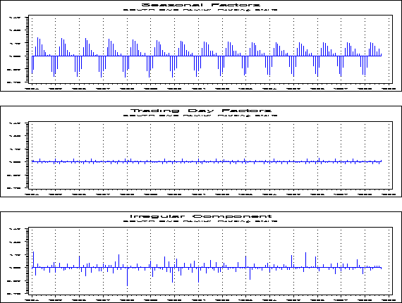
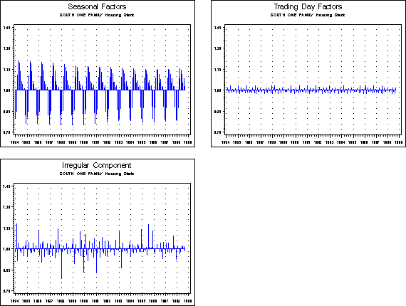
Component graphs allow you to select from one to four different
seasonal decomposition component elements to plot. The keyword for
component graphs is cmpnent.
If you choose more than one element, all components are graphed
in reduced size on one page. See component
graph formats for more information.
If you are saving the graphs, the individual graphs of the
elements can be saved by setting the variable graphall to 'yes,' as described
in Section 3.4.5. If you are displaying the
graphs on screen, you can scroll up to see the larger graphs of
each component individually.
If the selected graphs are of the same type- that is, outlier graphs, or factor graphs- then the graphs will have the same y-axis scale for easy comparisons.
| Element | Element Code |
|---|---|
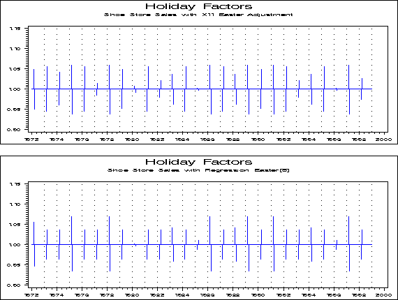
| Combined Holiday and TD Factors |
cal |
| Combined Holiday and TD Factors (from X11 regression) | ccal |
| Combined Seasonal and TD Factors |
caf |
| Final Adjustment Ratios | arat |
| Holiday Factors | hol |
| Indirect Adjustment Ratios | indarat |
| Indirect Combined Seasonal and TD Factors | indcaf |
| Indirect Irregular | indirr |
| Indirect Seasonal Factors | indsf |
| Irregular | irr |
| Irregular Component Modified for Extremes | mirr |
| Irregular Modifed for Extremes from Indirect | indmirr |
| Prior Adjustment Factors | prior |
| Seasonal Factors | sf |
| Seas Factors with User-Defined Regr | sfr |
| Trading Day Factors | td |
| Total Adjustment Factors | totadj |
| User-defined Regression Factors | usrdef |
| User-defined Seasonal Regression Factors | rgseas |
| X-11 Easter Factors | xeastr |
| Element | Element Code |
|---|---|
| Original (or Composite) Series | ori |
| Calendar-Adjusted Original Series | cad |
| Composite Series Adjusted by Prior Factors | cmppadj |
| Original Data with Preliminary Adjustments | priadj |
| Original Series Modified for Extremes | mori |
| Original Series with Replaced Missing Values | mvadj |
| Outlier Adjusted Original (or Composite) Series | oadori |
| Prior Adjusted Original Series | adjori |
| Seasonally Adjusted Series | sa |
| Seas Adjusted Series with Annual Totals | satot |
| Seasonally Adjusted Series Modified for Extremes | msa |
| Trend | trn |
| Indirect Seasonal Adjustment | indsa |
| Indirect Seasonal Adjustment with Annual Total | indsat |
| Indirect Trend | indtrn |
| Original Modified for Extremes from Indirect | indmor |
| Seas Adj Modified for Extremes from Indirect | indmsa |
| Element | Element Code |
|---|---|
| Log of Original (or Composite) Series | lori |
| Log of Original with Replaced Missing Values | lmvadj |
| Log of Outlier Adjusted Original (or Composite) | loadori |
| Log of Prior Adjusted Original Series | ladjori |
| Log of Seasonally Adjusted Series | lsa |
| Log of Trend | ltrn |
| Element | Element Code |
|---|---|
| Additive Outlier Factors | ao |
| Combined Outliers | otl |
| Level Shifts | ls |
| Temporary Change Outliers | tc |
| Indirect AO Adjustment Factors | indao |
| Indirect Level Shift Adjustment Factors | indls |
| Element | Element Code |
|---|---|
| Log of Additive Outlier Factors | lao |
| Log of Combined Outliers | lotl |
| Log of Level Shifts | lls |
| Log of Temporary Change Outliers | ltc |
| Element | Element Code |
|---|---|
| Irregular Weights | irrwt |
Return to contents.
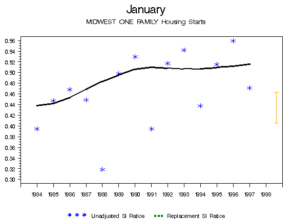
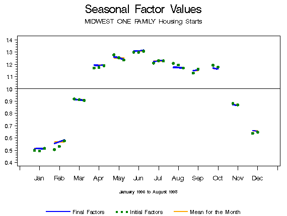
Two types of seasonal graphs are available: SI ratios (detrended series values) with seasonal factors by month or quarter, and seasonal factors by month or quarter. Boxplots of the irregular component by month or quarter are also available. The keyword for special seasonal factor graphs is seas.
Both types of seasonal graphs are due to Cleveland and Terpenning (1982).
SI Ratios with Seasonal Factors by Month or Quarter
The program produces as many as sixteen graphs when
this element is chosen. There is one graph for each month or
quarter, along with graphs with four months or quarters per page.
With monthly series, there is also a graph of all twelve months on
one page.
If you are saving the graphs, only the final graph
with all months or quarters shown will be saved unless you set the
option graphall to 'yes,'
as described in Section 3.4.5.

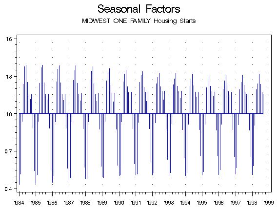
Seasonal Factors by Month or Quarter
The program graphs seasonal factors by calendar month or quarter. Each calendar period has a year axis drawn at the level of its factor mean.

Boxplots of the Irregular Component
The program produces side by side boxplots of the irregular for each month.

| Element | Element Code |
|---|---|
| SI Ratios (graphed with replacement values and seasonal factors) | si |
| Seasonal Factors | sf |
| Indirect Seasonal Factors | indsf |
| Boxplots of the Irregular Component | irr |
Return to contents.
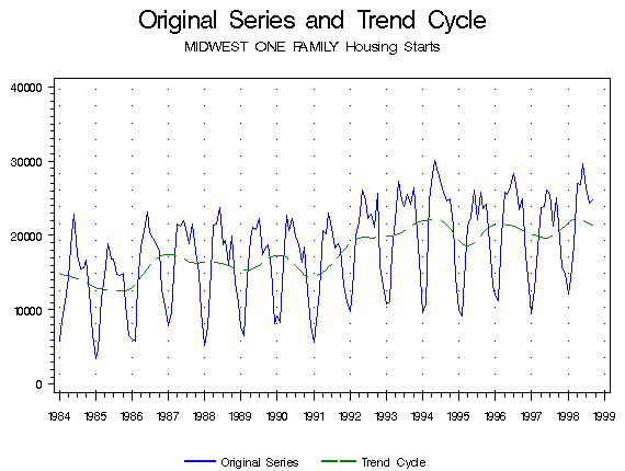
The program graphs the original series, the forecasts, and the confidence intervals for the forecasts. If you chose a transformation in the X-12-ARIMA run, you can choose to graph the series and forecasts on the original scale or the transformed scale. If the series does not have a transformation, you can only graph the series and the forecasts on the original scale. The keyword for the forecast graphs is forecast.

| Element | Element Code |
|---|---|
| Original Series and Forecasts on the original scale | fct |
| Original Series and Forecasts on the transformed scale | ftr |
Return to contents.
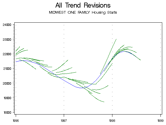
You can create graphs to study the revisions for the seasonal adjustment, seasonal factors, trend, and forecasts of a series. The keyword for history graphs is history1.
To create these graphs, you must have run X-12-ARIMA with the appropriate option in the estimates statement of the history spec. Including the line estimates=(sadj sadjchng trend trendchng seasonal aic fcst) in the history spec will allow all history graphs to be created. See the X-12-ARIMA documentation for a full description of these options.
You can create the following four types of history graphs:
Overlay Graphs
If you request a graph of the "Seasonal Adjustment
Values", "Indirect Seasonal Adjustment Values", or "Trend Values"
(elements ahst, indahst, and trhst, respectively), you will get two
graphs. The first is a graph of the initial and the final
estimates of that value overlaid with the original series and the
estimates from any other lags from which you requested history
information when running X-12-ARIMA. The second contains only the
final and initial estimates of the value.
Seasonal Factor Graphs
Graphs of the seasonal factor history plot the initial and the final seasonal factor estimates by calendar period. For each month or quarter, the final seasonal factors are plotted as a line and the initial seasonal factors as circles, and a year axis is drawn at the period's factor mean.
Percent Change Graphs
Three graphs are created when "Percent Changes in the Seasonal Adjustment Values" or "Percent Changes in the Trend Values" (elements csahst and ctrhst, respectively) are requested. Each graph plots two of the following for each observation: the percent change (from the previous observation) of the final estimate, the percent change of the initial estimate, and the percent change of the original series. Each is plotted as a circle or diamond, with a vertical line connecting them.

Special Trend Graphs
If you request graphs for "All Trend Revisions," "Trend Revisions for the Ending Date," or "Trend Revisions for the Ending Date," the program produces graphs that connect the estimates for trend from the lags requested when X-12-ARIMA was run. This shows the direction a trend was taking for a particular date. Each graph has a continuous line representing the final trend estimate. There is a shorter line connecting all the estimates for a particular date from the requested lags. That is, if lags 1, 2, 3, and 4 were requested, then for December 1999, the initial trend estimate is connected to the Lag 1 estimate from November, the Lag 2 estimate from October, the Lag 3 estimate from September, and the Lag 4 estimate from August to see where the trend was heading.
The graph "for the ending date" shows the trend lags only for the last date on the graph, while the graph "over the lag interval" shows trends from the end of the series back however many lags were requested, and the graph for "all trend revisions" shows the trend lags for all dates.
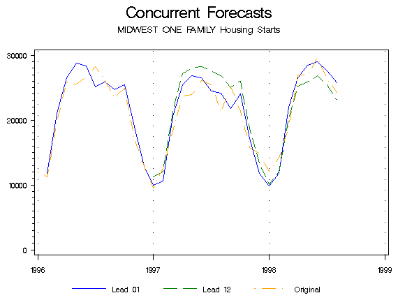
Concurrent Forecasts and Forecast Errors
Graphs for "Concurrent Forecasts" (element c) plot the original series and the within-sample forecasts for the lags specified in the history spec. Graphs for "Concurrent Forecast Errors" (element cfehst) plot the difference between the original series and the within-sample forecasts for the specified lags.
| Element | Element Code |
|---|---|
| Seasonal Adjustment Values | ahst |
| Indirect SA Values | indahst |
| Trend Values | trhst |
| Seasonal Factor Values | sfhst |
| Percent Changes in the SA Values | csahst |
| Percent Changes in the Trend Values | ctrhst |
| All Trend Revisions | trhall |
| Trend Revisions for the Ending Date | trhend |
| Trend Revisions over the Lag Interval | trhlag |
| Concurrent Forecasts | cfchst |
| Concurrent Forecast Errors | cfehst |
Return to contents.
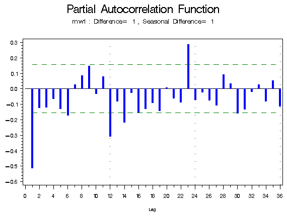
Graphs of the autocorrelation function and the partial autocorrelation function are available for both the residuals and for the original series, but only if the relevant spec was included when running X-12-ARIMA. Both types have the keyword acfpacf.
If you included the spec check when you ran X-12-ARIMA, you can create ACF and PACF plots of the residuals:
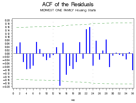
If you included the identify spec, you can create ACF and PACF plots from the original series. The program will create an ACF and a PACF graph for each combination of differencing and seasonal differencing that was given in the identify spec. That is, if you asked for nonseasonal differencing of 0 and 1 and seasonal differencing of 0 and 1 when you ran X-12-ARIMA, you will get eight graphs; the order of differencing is included in the subtitle:
| Element | Element Code |
|---|---|
| ACF Plot (from check spec) | acf |
| PACF Plot (from check spec) | pacf |
| ACF of the Squared Residuals | acf2 |
| ACF and PACF Plots (from identity spec) | idacf |
Return to contents.
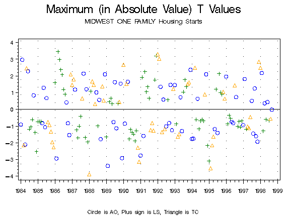
Outlier T Value Graphs allow you to compare the maximum absolute t values from the automatic outlier procedure. There are two types of graphs you can produce; each has its own keyword.
We've been using the graphs for research into ways for finding regARIMA outliers, with only limited success. For more information on our research, please see McDonald-Johnson and Hood (2001).
Information for the Outlier T Value graphs comes from the automatic outlier procedure from the final t value table. By default, X-12-ARIMA only looks for AO and LS outliers. If you ask for graphs of the temporary change outliers without requesting them specifically in X-12-ARIMA, you will get an error.
The t value graphs will plot the maximum absolute t values for each data point. That is, if for one particular month, say June 1989, X-12-ARIMA calculates an AO t value of 3.1, an LS t value of 2.2, and a TC t value of 2.7, at June 1989 the graph shows only the AO t value at 3.1. Another helpful feature of the maximum absolute t value plot is that X-12-ARIMA assigns a t value of 0 to any identified outlier. That is, if X-12-ARIMA identifies a particular month, say August 1998, as an LS, then the August 1998 LS t value would be 0, although X-12-ARIMA would calculate valid t values for the AO and TC effects. The greater (in absolute value) of the AO and TC t values would appear on the graph.
If you use the keyword tvalue, the actual value of the maximum absolute t value will be plotted, with the correct sign. If you use the keyword abtvalue, the absolute value of the maximum absolute t value will be plotted. The first graph below was created with the keyword tvalue, and the second with the keyword abtvalue. Both keywords use the same elements.

| Element | Element Code |
|---|---|
| T Values for additive outliers | ao |
| T Values for level shifts | ls |
| T Values for temporary change outliers | tc |
Return to contents.
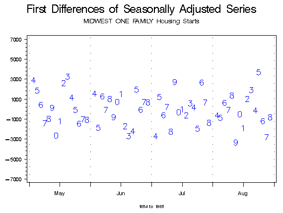
The program graphs the first differences of the selected element
by period. The keyword for first difference graphs is
fstdiff.
If the series is monthly, the differences of each month are plotted together with four months per graph, and then a graph of all twelve months together is produced. When saving the graphs, only this final graph will be saved unless the variable graphall is set to 'yes.' (See Section 3.4.5.) The number on the graph is the last digit of the difference's year.
The form of the first difference graphs was developed by Stuart Scott at the Bureau of Labor Statistics, where it has been used to detect outliers in the original time series. See Scott (1987) and Buszuwski and Scott (1988) for examples of using first difference graphs to identify different types of outliers.

| Element | Element Code |
|---|---|
| Original Series | ori |
| Calendar-Adjusted Original Series | cad |
| Original Series Adjusted by Prior Factors | priadj |
| Original Series Modified for Extremes | mori |
| Original Series with Missing Values Replaced | mvadj |
| Prior-Adjusted Original Series | adjori |
| Seasonally Adjusted Series | sa |
| Seasonally Adjusted Series Modified for Extremes | msa |
| Trend Cycle | trn |
| Composite Series Adjusted by Prior Factors | pacmp |
| Indirect Seasonally Adjusted Series | indsa |
| Seasonal Adjustment Modified for Extremes from Indirect | indmsa |
| Indirect Trend | indtrn |
| Original Series Modified for Extremes from Indirect | indmor |
Return to contents.
Year on Year Graphs plot the requested element by year in order to look for seasonal patterns in the data. The keyword for these graphs is yronyr.
The program will not create these graphs if the span is over eighteen years. Use the subspan option to limit the years to be graphed.
| Element | Element Code |
|---|---|
| Original Series | ori |
| Calendar-Adjusted Original Series | cad |
| Original Series Adjusted by Prior Factors | priadj |
| Original Series Modified for Extremes | mori |
| Original Series with Missing Values Replaced | mvadj |
| Prior-Adjusted Original Series | adjori |
| Seasonally Adjusted Series | sa |
| Seasonally Adjusted Series Modified for Extremes | msa |
| Trend Cycle | trn |
| Composite Series Adjusted by Prior Factors | pacmp |
| Indirect Seasonally Adjusted Series | indsa |
| Seasonal Adjustment Modified for Extremes from Indirect | indmsa |
| Indirect Trend | indtrn |
| Original Series Modified for Extremes from Indirect | indmor |
Return to contents.
Power graphs are plots of the original series with a Box-Cox power transformation applied. The keyword for these graphs is power. The elements for these graphs is the Box-Cox power λ . Setting λ =1 will produce a graph of the original series; λ =0 produces a graph of the logged series.

Return to contents.
Overlay graphs of two series can be produced to compare the adjustments. The keyword for these graphs is overlay2.
These overlay graphs need two different models to compare. Enter the names of the graphics metafiles for the two models on the same line in the graphics metafile list file (the .mls file). An example is given in the examples below.
Up to three elements can be chosen for each series. The elements do not have to be the same for each series. In the graphics list file (the .gls file), list the elements for the first series after the colon after overlay2. If the elements for the second series are the same as those for the first series, you do not need to enter anything else. If different elements are required for the second series, put another colon on the same line, and list the elements for the second series. So, to create a graph with the original series and the seasonally adjusted series of the first model and the seasonally adjusted series for the second series, put the line
overlay2: ori sa: sa
in the .gls file.
The elements available for these graphs match those for overlay graphs.
Return to contents.
You can compare the components of two different adjustments using the keyword cmpnent2.
When you request a component graph to compare two series, the program creates two graphs: the plots of the component for each series on one page, and either the difference or the ratio between the values of that component for each series. The ratio is graphed when the element is either a factor or the irregular and the adjustment is multiplicative, and the difference is graphed otherwise.
As two models are being compared, the two series must both be named on the same line in the graphics metafile list (the .mls file). An example of this is in the examples below.
The elements available for these graphs are the same as those for component graphs.
Return to contents.
History graphs allow you to compare two models by looking at the AIC Differences History and the Sum of Squared Forecast Error Differences History. For the Sum of Squared Forecast Error Differences graph, the program superimposes all available forecast lags on a single graph. The keyword for history graphs is history2.
These history graphs are discussed in Findley, Monsell, Bell, Otto and Chen (1998) and are related to diagnostics presented in Findley (1990, 1991).
History graphs require graphics output from two different models to compare. You must enter the names of the graphics metafiles for the two different models for the history graph on the same line in the graphics metafile list file. An example graphics metafile list file (.mls) is given in the examples below. These graphs also require that X-12-ARIMA was run with the option fcst or aic, respectively, in the estimates statement of the history spec.
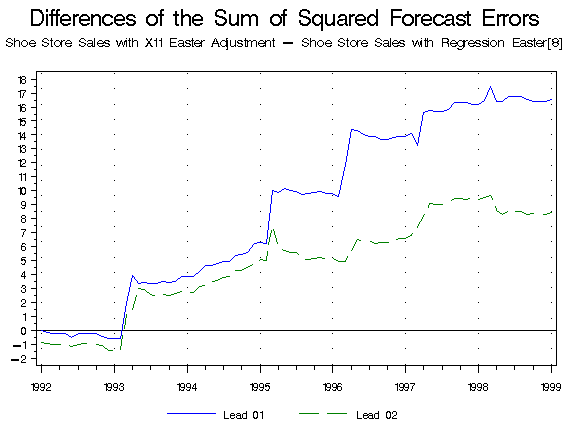
| Element | Element Code |
|---|---|
| AIC | aichst |
| Sum of Squared Forecast Errors | fcthst |
Return to contents.
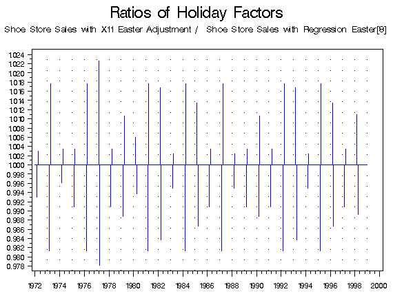
These graphs allow you to compare two models by graphing the SI ratios (the detrended series), the SI ratios with the extreme values replaced, or the SI ratios with the replaced value and the original value. The keyword for these graphs is rsi2.
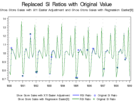
| Element | Element Code |
|---|---|
| SI Ratios | si |
| RSI Ratios | rsi |
| RSI Ratios with Original Value | sirsi |
Return to contents.
These examples will use data on one family housing starts in the four geographic areas (northeast, south, midwest, and west), as well as the total one family housing starts. The X-12-ARIMA spec files are called ne1.spc, mw1.spc, so1.spc, and we1.spc, with tot1F.spc containing the composite spec to create the U.S. total. To run this series, a metafile is needed. The contents of this file, called starts.mta, are:
ne1
mw1
so1
we1
tot1F
Before creating any graphs, X-12-ARIMA must run this metafile in graphics mode. To do this, enter x12a -m starts -g c:\x12a\graphics in DOS. The -m option informs the program that this is a metafile, the -g option instructs X-12-ARIMA to produce the graphics output files needed, and the directory after the -g is the destination for the output files.
After the graphics output files have been produced, you are ready to run the X-12-Graph Batch program.
Goal: To learn to set up the files needed to run the X-12-Graph Batch program.
Suppose you wish to compare the original series with the seasonally adjusted series for all four regions and for the total, and the original series with the outlier-adjusted series in the case of those series with outliers.
The first step is to create the .mls and .gls files. These must have the same name; use the name starts. As you want graphs for all five series, the starts.mls file is
ne1
mw1
so1
we1
tot1F
Note that this looks just like the metafile used to run X-12-ARIMA. The starts.gls file is
overlay: ori sa
overlay: ori indsa
overlay: ori oadori
The first command produces the graph of the original series and the seasonally adjusted series superimposed. The second overlay statement compares the original series with the seasonally adjusted series from the indirect adjustment. As this element exists only for the composite series, tot1F, X-12-Graph produces this graph only for that one series. The third command creates a graph of the original series and the outlier-adjusted series. The series for the South and for the composite have no outliers, so overlay graphs from the third statement are not created for these series.
Next, in x12gbat.sas, set the value of the variable
inptfile equal to starts and the
value of inptdir equal to the directory specified
after the -g option when X-12-ARIMA was run. Submit the program by
pressing the submit button (the running man), or by selecting
submit from the Run pull down menu.
Once the program has run, there will be nine graphs. Examples of
them follow:
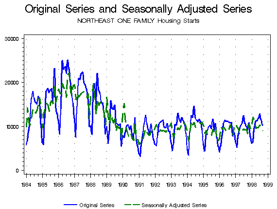
This is the graph of the original and the seasonally adjusted
series of the Northeast data. Similar graphs exist for the other
three regions and for the U.S. total.
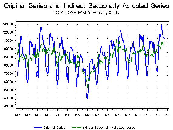
This graph is the original series for the U.S. totals, along with the seasonally adjusted series from the indirect adjustment. It is the only graph produced from the overlay: ori indsa statement in the .gls file.
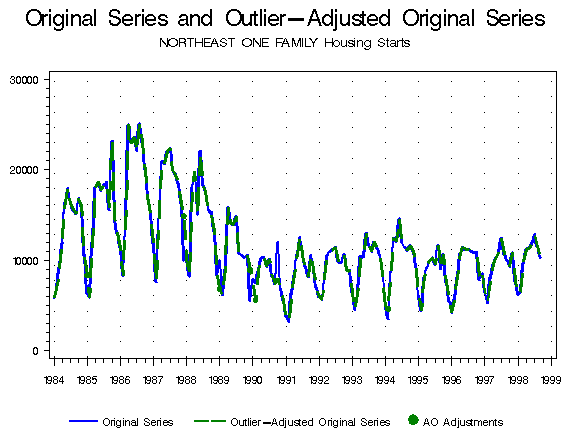
This is one of three graphs of original series and the outlier-adjusted original series; this one is from the Northeast. Most of the differences seem to be between 1985 and 1991. In the next example, this portion of the series will be expanded to better see these differences.
Goal: To use the color, line width, and subspan global options in creating graphs. Also, to learn to modify the .gls and .mls files without deleting content.
In this example, you will modify a graph plotted in the previous example in order to better see some of its details, and also create a component graph of this region's additive outliers.
First, modify the starts.gls file, keeping only one of the overlay graphs adding a component graph, so that the graph list file looks like:
overlay: ori oadori
cmpnent: ao
Next, modify the graphics metafile list, since the only series to be graphed is the Northeast region. One way to do this is to delete the series that aren't being graphed, but as you may want to create more graphs from them later, you can comment them out instead by putting a pound sign (#) in front of them. Starts.mls will look like:
ne1
#mw1
#so1
#we1
#tot1F
In order to graph only part of a series, use the subspan option. In the x12gbat.sas program, change substart to 1985.Jan, and subend to 1991.Dec. Graphs of the outlier-adjusted series place a dot where each additive outlier is (and a reference line where the level shifts and temporary changes are). To better see this dot, you can change the line widths of the first and second line to 1 by letting lw1 and lw2 equal 1. If you also want to change the default colors of the graph,you can change the appropriate color variables. Changing color1 to orange and color2 to purple creates the following two graphs after the program is run:

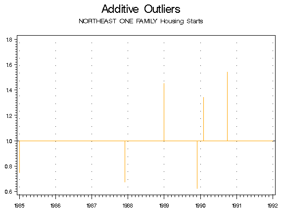
Note that in the overlay graph, the original series, which was listed first in the .gls file, takes the color assigned to color1, and the outlier adjusted series, which was listed second, takes the color2 value. The second graph has only one element, so it takes the color given in color1.
Goal: To create graphs to compare two series, and to modify them using the color, line type, line width, y-divisor, gridline, and subtitle global options.
If you want to compare the seasonally adjusted series for two different series, you can use the overlay graphs for two models or the component graphs for two series. The overlay graph will create a plot with the seasonally adjusted series of each model overlaid on one graph; the component graph will create a graph with each seasonally adjusted series on its own plot, and will also create a graph of the differences between the two series.
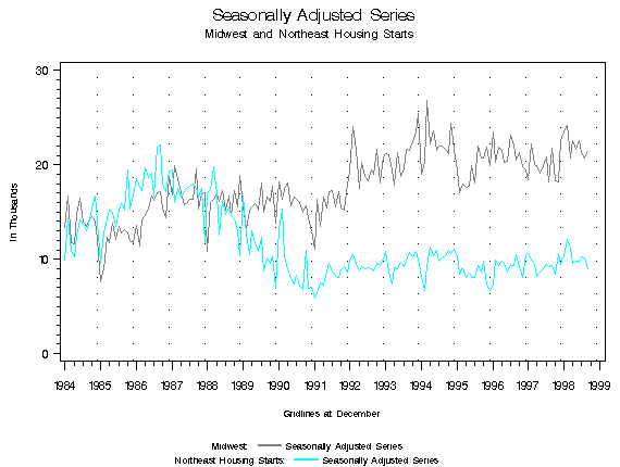
To create graphs for two comparing two series, the names of the series must be on the same line in the graphics metafile list (.mls) file. To compare the housing starts from the midwest to those from the northeast, the .mls file must read:
mw1 ne1
The graph list file (.gls) must read
overlay2: sa: sa
cmpnent2: sa
in order to create graphs for the seasonally adjusted series for each model. Actually, since the same elements are being plotted for the first and the second series in the overlay graph, the second colon and sa are not needed in the overlay2 command, but including them does no harm.
The following three graphs are produced when the program is run using the default options:


You can modify the appearance of the overlay graph with some of the global options. In the x12gbat.sas program, locate and change the following variables:
%let color1=gray;
%let color2=cyan;
%let ltype1=1;
%let ltype2=1;
%let lw1=1;
%let lw2=1;
%let subtitle=Midwest;
%let subtitle2=Northeast Housing Starts;
%let ydivisor=1000;
%let gridlinemo=12;
The variables color1 and color2 will change the first graph to gray and the second to cyan; ltype1 and ltype2 will make the plots of both series be an unbroken line, while lw1 and lw2 make both graph lines thinner. The subtitle of the overlay graphs for two series is the title of the first, the word and, and then the title of the second; the default subtitle is then 'MIDWEST ONE FAMILY Housing Starts and NORTHEAST ONE FAMILY Housing Starts.' Changing subtitle and subtitle2 will create the subtitle 'Midwest and Northeast One Family Housing Starts.' Note that the graph of the seasonally adjusted series has a y-axis ranging from 0 to 30000. Including a ydivisor of 1000 will change the axis range to 0 to 30, and will include the label 'In Thousands.' This option is very useful when the y-axis is in the range of millions or billions. Finally, changing gridlinemo to 12 will move the default gridlines from January to December to highlight the last month of the year instead of the first. The color and line type of these gridlines can be customized using the colorg and ltypeg variables, if desired.
Running the program with these options creates the following graph:
Note: If you wish to keep the default values for the variables handy while temporarily changing them, you can insert the new value after the equal sign, type a semicolon, and then insert a star (*) before the original value, as such:
%let ltype1 = 1;
%let ltype2 = 1;*21;
SAS views everything between a star and a semicolon as a comment, so the *21; will be ignored while the program is running.
Return to contents.
Return to contents.
Please report all problems or provide any feedback to Demetra Lytras by email ( demetra.p.lytras@census.gov) or to Kathy McDonald-Johnson either by email ( x12@census.gov) or by telephone at (301) 763-7602.
If the program graphs something incorrectly (including titles and legends), or doesn't produce a graph at all, please report the problem as soon as possible.
To help us diagnose the problem, it is helpful if we have
The SAS Log will be in the file X12GbatLog.sas, located in the directory in which the program is installed, typically c:\x12graph\appl.
Return to contents.
Brian Monsell wrote the basic SAS code for reading in the X-12-ARIMA files and for the SI ratio graphs. David Findley and Brian Monsell provided valuable suggestions for the design of the graphs and the documentation. Kellie C. Wills wrote the SAS code for many of the graphs. Kathy McDonald-Johnson updated and corrected some early SAS code. Many thanks to everyone who gave us suggestions.
Return to contents.
Buszuwski, J.S. and S. Scott (1988), "On the Use of Intervention Analysis in Seasonal Adjustment," Proceedings of the Business and Economic Statistics Section, American Statistical Association, Alexandria, VA, 337-342.
Cleveland, W.S. and I. Terpenning (1982), "Graphical Methods for Seasonal Adjustment," Journal of the American Statistical Association, 77, 52-72.
Findley, D.F. (1990), "Making Difficult Model Comparisons Graphically," Proceedings of the Section on Survey Research Methods, American Statistical Association, Alexandria, VA.
Findley, D.F. (1991), "Model Selection for Multi-Step-Ahead Forecasting," Proceedings of the Business and Economic Statistics Section, American Statistical Association, Alexandria, VA.
Findley, D.F., B.C. Monsell, W.R. Bell, M.C. Otto and B.-C. Chen (1998), "New Capabilities and Methods of the X-12-ARIMA Seasonal Adjustment Program," Journal of Business and Economic Statistics, 16, 127-177 (with discussion).
Hood, C.C. (2001), "User's Guide for X-12-Graph Interactive for PC/Windows, Version 1.2," U.S. Census Bureau, U.S. Department of Commerce.
McDonald-Johnson, K. and C.C. Hood (2001), "Outlier Selection for RegARIMA Models," Proceedings of the Business and Economic Statistics Section, American Statistical Association, Alexandria, VA.
SAS Institute, Inc. (1990), SAS/GRAPH® Software: Reference, Version 6, First Edition, Volumes 1 and 2, Cary, NC: SAS Institute, Inc.
Scott, S. (1987), "On the Impact of Outliers on Seasonal Adjustment," Proceedings of the Business and Economic Statistics Section, American Statistical Association, Alexandria, VA, 469-474.
U.S. Census Bureau (2002), X-12-ARIMA Reference Manual, Final Version 0.2.10, Washington, DC.
Return to contents.
Return to top.
Return to X-12-Graph Page.