|
Once you have gathered and analyzed all your data, making your
profile user-friendly will help ensure that prevention and care planning
groups can and will apply the information to their planning
activities.
This chapter provides suggestions for ensuring that your profile is
accessible and useful. It focuses first on ways to ensure that the body
of your epidemiologic profile―your data and accompanying narrative―is
clear and effective. It then provides guidance on preparing the
remaining sections. The chapter concludes with some suggestions for
preparing oral presentations of your data and analyses and for
disseminating your profile.
Section 1: Making Your Profile User-Friendly
- Organize the profile in a logical sequence, using these sections:
- front matter
- introduction
- body
- conclusion
- appendixes
- other back matter (in addition to appendixes)
- Present your data in clear, easy-to-understand tables and figures (graphs, charts, maps).
- Analyze and explain your data in a well-organized narrative, using straightforward and
easy-to-understand language.
Presenting Your Data
Summarizing your data and presenting them in tables or figures are critical to an effective
profile because raw data are difficult to
- understand
- visualize
- aggregate
- use in detecting trends
When used appropriately, tables and figures can be used to summarize and display
complex data clearly and effectively and can emphasize specific points. These tools let you
identify and present distributions, trends, and relationships among the data. They help
make sense of the data in the profile and communicate findings to planning groups.
However, poorly designed or executed tables and figures can mislead users or distract them
from your message.
Tables may be the only presentation format needed when the data are few and relationships
are straightforward (tables are the best choice when the display of exact values is important). Figures (e.g., line and bar graphs, pie charts) make more sense for trends and
for comparing populations, especially when you wish to show populations broken into
subsets, such as males and females or age groups. The key points of tables and figures
should always be explained in the accompanying narrative.
As you develop the profile and determine which kind of display to use, ask yourself these
questions:
- Can the planning group determine what I want to convey by looking at this type of
display, or would another type be better?
- Given the needs of the planning group, is this presentation of the data logical?
Important considerations for presenting data
The following guidelines apply to all graphic aids:
- The table or figure should be an integral part of the text but should also be able to stand
alone (i.e., the reader should understand the table or figure without reference to the
text). Ideally, a table or figure should convey one main point.
- The table or figure should explain the who, what, when, and where of your data. For
example, a figure (perhaps a line or bar graph) is useful for showing gender or
racial/ethnic differences, geographic differences, or trends
- Consider the number of tables and figures in the profile. You should have enough to
clearly summarize and display your data, but not so many that they are confusing and
difficult to understand in terms of the text, regardless of the user’s technical
background.
- For figures, write clear and consistent labels, and label all elements to avoid
misunderstanding. For tables, write clear and consistent column headings and row
entries (use consistent terms).
- Avoid clutter. Include only what you need to communicate the point. Eliminate
unnecessary words and avoid unnecessarily large words that can detract from the
message (e.g., footnotes to tables and notes to figures need not be expressed in
complete sentences).
- Maintain scale and balance by keeping the width and height of the table or figure in
proportion (i.e., for a figure, the length of the vertical (y) axis should be approximately
two-thirds the length of the horizontal (x) axis; in general, tables are longer than they
are wide).
- Write a clear, concise title.
- Name the source of your data.
- Discuss the key points of the table or figure in your text.
- Consider how copies of the profile will be produced. Often, epidemiologic profiles are
photocopied rather than professionally printed. If a color document is photocopied in
black and white, the data elements (e.g., bars in a chart of slices of a pie chart) will
probably be difficult to distinguish. Consider using patterns (e.g., dots, wavy lines, solid black). Shades of gray must differ at least 30%, or the gray elements will not be
clearly distinguished in the original or in the copies (even if the document is
professionally printed).
- Consider the preferences of your planning group. If you have an opportunity, find out
how they would like to see the data presented. That will help you determine the types
of presentation that are easiest for them to understand and use.
- Consider the best way to present your data:
- Ensure that your presentation of epidemiologic data does not inadvertently
stigmatize the demographic groups to which the data refer. Work with your CPG to
avoid this problem.
- In situations in which the presentation of data on larger groups would overwhelm
the presentation of data on smaller groups, you can present the data on the smaller
groups separately (see Figure 4-1). In the explanation below the figure, point out
the differences between the larger and smaller groups.
- When the numbers for a group are small, observe restrictions on cell size to protect
confidentiality.
Figure 4-1: Estimated number of deaths among adults with AIDS,a 1985–1999, United States
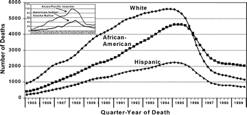
aAdjusted for reporting delays; data reported through June
2000.
Note: Edward Tufte’s book The Visual Display of Quantitative Information (Cheshire,
Conn.: Graphics Press; 2001) contains numerous excellent examples of how to (and
how not to) present data.
Tables
A table is a set of data arranged in rows and columns. Almost any quantitative (i.e.,
numeric) data can be organized into a table. Tables provide a reference for all the
descriptive data on a topic and are also a basis for preparing figures, which reflect
relationships, trends, or patterns, not details. See Tables
4-1 and
4-2, which are examples
of presentations with differing numbers of variables.
Pie charts
In the pie chart, the size of a “slice” is proportional to its percentage contribution to the
whole. That is, each slice shows how much of the pie each group represents. Pie charts are
useful for showing differences in proportions. For example, a pie chart can be used to show
AIDS incidence among female adults and adolescents, by exposure category (see
Figure
4-2).
Figure 4-2
Example of pie chart
Estimated AIDS incidencea among female adults and
adolescents, by exposure category, County X, diagnosis in 2001
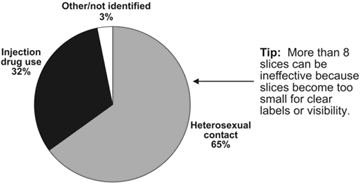
a Data adjusted for reporting delays and estimated proportion
distribution of cases initially reported without risk. Data reported
through June 2002.
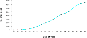
Line graphs
Line graphs display relationships between 2 variables on 2 dimensions, or axes. The
dependent variable (the variable you wish to predict or explain) is usually shown on the
vertical axis, and the independent variable (the variable you think will influence the
dependent variable) is shown on the horizontal axis. Values are recorded as points on a
graph and then connected (as a line) to show trends.
Line graphs are useful for showing patterns, trends, aberrations, similarities, and
differences in the data, especially trends in data from multiple periods of equal length (e.g.,
years).
In Figure 4-3, the dependent variable (the number of persons living with AIDS) is shown
on the vertical axis, and the independent variable (the range of years) is shown on the
horizontal axis. This line graph shows that the number of persons living with AIDS in
County X has been increasing.
Figure 4-3: Example of line graph
Number of persons living with AIDS, County X, 1981–1999
Epidemic curves
The epidemic curve (Figure 4-4) is a line graph of the number of new cases by date of
diagnosis.
Figure 4-4
Example of epidemic curve
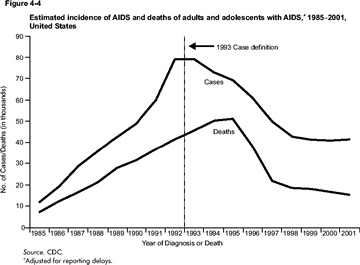
The epidemic curve is important because it tells what is happening with the disease in the
population. Figure 4-4 shows the incidence of AIDS cases and deaths from 1985 through
1999. Notice the sudden rise in AIDS cases in 1993. This is due to a change in the
definition of AIDS cases; after implementation of the case definition, the AIDS
surveillance system began to reflect cases that had not been reported. Figure 4-4 also
shows a downward trend in recent years in AIDS deaths and AIDS cases. This is due in
part to the effectiveness of new treatments, such as highly active antiretroviral therapy,
which inhibits the progression from HIV infection to AIDS and allows persons with AIDS
to live longer. Figure 4-4 shows what happened after the change in case definition and the
introduction of effective treatment.
Bar, or column, graphs
In a bar, or column, graph, data are organized so that each observation can fall into 1, but
only 1, category of the variable.
Bar graphs are useful for showing how data change during a time period or for comparing
categories. In a vertical bar graph, the measurable feature (e.g., percentage or rate) is shown on the vertical axis, sometimes called the measuring axis. Categories of a variable
(e.g., locations, groups) are represented by bars on the horizontal baseline. The length of
each bar corresponds to a value on the measuring axis.
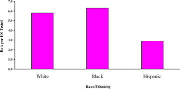
For example, Figure 4-5 shows the measurable feature—rates per 100 tested—along the
vertical (measuring) axis and the categories of the variable—race/ethnicity—along the
horizontal baseline. In this example, you can see that for the IDUs tested, the rate of HIV
positivity is higher for blacks than for whites or Hispanics.
Figure 4-5
Example of bar, or column, graph
HIV-positive injection drug users, by race/ethnicity, County X STD
Clinics, 1991–1998
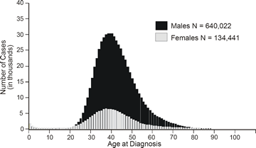
Histograms
The histogram, which resembles a bar graph because of the use of series of contiguous
rectangles, represents the frequency distribution of an ordinal variable with interval
properties (i.e., a variable, such as age, which has an infinite number of values). The
contiguous, or adjoining, rectangles represent the number of observations for each class of
interval in the distribution. The height of each rectangle is proportional to the number of
observations (values) in that range.
Figure 4-6: Example of histogram
AIDS cases, by age and sex, reported 1981–2000, United States
Maps
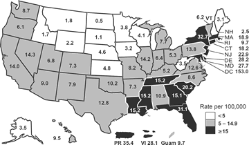
Maps are useful for showing the geographic location of events or attributes. Spot maps
show where a disease or an event occurred, area maps (see Figure 4-7) show either the
incidence of an event in an area or the distribution of some condition throughout a
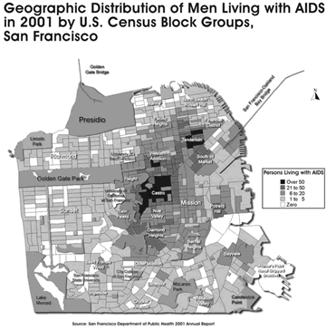
geographic area, and maps produced by the use of Geographic Information Systems (see
Figure 4-8) display data based on geographic mapping coordinates.
Figure 4-7:
Example of area map
AIDS rates per 100,000 population, reported July XXXX–June XXXX
Geographic Information Systems maps
Geographic Information Systems (GIS) technology is used to map geographic data such as
map coordinates and land features. By overlaying demographic data within known
geographic boundaries (e.g., state, county, or census boundaries) for health services,
socioeconomic indicators, risk behavior, or prevalence of a disease, users of this
technology can determine where to focus efforts for prevention or care services. GIS
technology can be used to display epidemiologic data by a geographic reference (e.g., city
to a neighborhood census block level).
In GIS, geographic information is described in terms of geographic coordinates (e.g.,
latitude and longitude or national grid coordinates) or by a street address, census
boundaries, postal code, or forest stand identifier. This system is capable of translating
implicit geographic data into an explicit map location. Maps can be obtained from public
sources or companies that specialize in collecting and organizing geographic information.
The process of converting implicit geographic data into explicit or map-form images is
called geocoding.
Geographic data can be stored in a database, and many GIS programs can map data to
produce images in various formats, including vector and raster formats. In a vector format,
2-dimensional data are stored as x and y coordinates. A road or a river can be described by
using a series of x,y coordinate points. Nonlinear features such as town boundaries can be
stored as a closed loop of coordinates. The vector model is good for describing well-delineated
features, including sites where counseling and testing are offered or facilities
where HIV care or other health services are provided. A raster format expresses data as a
continuously changing set of grid cells. Raster models can be used when comparing the
prevalence of HIV/AIDS cases in an area (Figure 4-8). Both types of formats are used by
most GIS.
Users of GIS should be aware of the limitations before drawing conclusions based on
mapping results. This is particularly important when explaining potential associations
between data. For example, when one examines the distribution of persons with HIV
infection by risk behavior and residence at diagnosis, the next logical step may seem to be
to describe the relationship between infection and residence. However, residence at the
time of HIV diagnosis may not be the location of the risk-taking behavior that resulted in
infection. Therefore, a city map showing areas with large numbers of persons with HIV
may not be equivalent to a map of the same city showing the locations of high-risk activity.
Confidentiality is also a concern when mapping data by use of GIS technology. As is true
of other methods of data presentation, disclosure of information is a potential risk.
However, GIS technology includes mapping techniques (e.g., spatial smoothing) that may
be used to decrease the risk of disclosure when presenting small numbers of cases. Spatial
smoothing is similar to moving averages, collapsing space rather than time. Users of GIS
should become familiar with this and other techniques to ensure the confidentiality of data.
Local restrictions on small cell size should be observed when creating maps by using GIS
technology.
Overall, remember the purpose of using GIS to display HIV surveillance data and other
public health information. For some health services programs, the purpose may be to show
the location of persons with HIV or AIDS in order to develop care-related services. Other
HIV prevention programs may use GIS to focus interventions by locating populations at
risk for infection.
Figure 4.8:
Example of a GIS Map
Tips for Presenting Data in Tables or Figures
- Tables and figures explain the who, what, when, and where of the data. Each should
stand alone (i.e., all relevant information needed to interpret the table or figure should
be part of the table or figure) so that the reader can understand without reference to the
text.
- Figures are used to illustrate trends, relationships, or patterns, often eliminating the
need for a complex passage in the text. Tables provide specific numeric values.
- Do not try to communicate too many ideas at once (the ideal is one main idea per table
or figure).
- Write clear, explanatory titles.
- Keep the table or figure uncluttered and free of unnecessary words.
- Word clearly and format consistently the labels on the axes of figures and the column
headings and row entries in tables. A consistent format cues readers so they know at a
glance that they are looking at HIV data, AIDS data, or HIV and AIDS data combined.
- Label all elements (e.g., lines on a line graph) of a figure. If the space doesn’t allow
you to label each element, include a legend.
- Do not create 3-dimensional graphs. They are harder to read and more likely to mislead
than are 2-dimensional graphs.
- Make the scale appropriate for the findings you want to convey.
- Use the same scale for the y axis when figures are meant to be compared.
- Use no more than 8 slices in a pie chart, and label all slices.
- When you present only percentages, include the total number (N). Do not chart
percentages and numbers in the same graph.
- Name the sources of the data.
- In the accompanying text, refer to the key points of the table or figure; do not simply
duplicate in words the content of the table or figure.
|
Writing Your Narrative
Presenting data without effective explanation and interpretation often limits the clarity and
user-friendliness of an epidemiologic profile. Your narrative is crucial in helping users
understand and interpret the data you present about the HIV/AIDS epidemic in your
service area and in helping them use the data appropriately to plan prevention and care
programs.
Effective writing has many elements. This section concentrates on 3 elements that can
significantly affect your profile:
- Know your audience―who they are, their level of familiarity with epidemiologic
issues and terminology, and their perspectives as end users of your profile.
- Focus your narrative on findings so that its purpose is clear and it addresses specific
questions and the needs of specific end users.
- Write clearly, using concrete, familiar words and strong, active language.
Know your audience
Good writing is reader-centered, not writer-centered. Start by assessing your audience—the
end users of the profile. Remember, your profile should be a document that planning group
members can use to make decisions about prevention and care programs and resources. To
help you bring your users into focus, ask yourself:
- Who will read the profile?
- How would I describe their professions, their viewpoints on the epidemic, and their
familiarity with epidemiology?
- How much do they already know about the epidemic?
- What are the most important things they will be looking for in the profile?
- How will they use the information in the profile?
Knowing the backgrounds of planning group members, their experience and expertise with
epidemiology, and the uses to which they will put the information can help you ensure that
the profile meets their needs and capabilities. Planning groups may be diverse (e.g.,
community advocates; paraprofessionals such as outreach workers; health care
professionals, such as nurses, social workers, counselors, physicians, or psychologists; and
program managers with differing educational backgrounds). Some members will have had
formal training in epidemiology or statistics. Others may have had no formal training but
may be able to easily assimilate epidemiologic concepts and the implications of those
concepts for prevention and care programs. Still others will know their communities well
but have little or no experience working with data.
Members will also have diverse experience and expertise with the epidemic, and that
diversity will influence what you include in your profile and how you frame the
information. For example, consider questions such as changing demographics or clinical
patterns that service providers and advocates in the planning group may have observed.
Think about how your data may or may not be able to address these kinds of changes.
In addition, members of CPGs will differ in their ability to read and comprehend English.
When you prepare slides for oral presentations, remember that persons who are color-blind
cannot distinguish red and green when they are close together and that persons with vision
defects may have difficulty with graduated colors (sometimes called color sweeps).
Work closely with members of the CPG in developing the profile. In doing so, keep the
following in mind:
- Understand the perspectives of the CPG; the members are the primary end users. This
will help you
- address populations that group members serve and will also help you address those
populations specifically, in terms of risk, reported cases, and testing or other service
patterns
- address policies that affect the data and also may affect service delivery (e.g.,
changes in case reporting resulting from named reporting)
- Recognize and respect different world views among end users. For example, service
providers and advocates tend to think in terms of individuals rather than in terms of
grouped data (such as means) and trends among the individuals they see.
Focus your narrative on the needs of users
Although the profile is not the only resource that CPGs use, it is a principal contributor to
the planning process. Therefore, your profile needs to be focused on the uses of the data
spelled out in CDC and HRSA guidelines. You also need to explain your conclusions
carefully and clearly to minimize the possibility that users will misinterpret them. Here are
some suggestions for how to respond to these uses. Craft your profile so that it allows
planning groups to
- Set priorities among populations by
- describing differences in HIV risk (geographic and by population)
- describing differences in the effect of HIV (geographic and by population)
- presenting trends in risk and effect
- detailing changes in policy, diagnostics, and treatment strategies that may affect
risk, effect, or care and prevention needs
- Prepare for needs assessments and for analysis of gaps in prevention and care by
- describing differences in HIV risk (geographic and by population)
- describing differences in the effect of HIV (geographic and by population)
- presenting trends in risk and effect
- detailing changes in policy, diagnostics, and treatment strategies that may affect
risk, effect, or care and prevention needs
- identifying questions that cannot be answered from the epidemiologic data
- Set priorities among interventions by
- defining populations who need prevention or care services
- identifying and describing areas that need prevention or care services
- describing whether services match the population and geographic distribution of the
epidemic and relevant risk behaviors
Write clearly
Good writing is straightforward and easy to follow. The ideas flow logically from one to
another. Readers should not have to stop and ask, “Now, what did that mean?” They
should come to the end of a document with a clear sense of the author’s main points and
the conclusions they should draw from the information presented.
These concepts are vital in an epidemiologic profile because CPG members have to
understand the narrative and the data presentations if they are to make sound decisions
about prevention and care services.
Here are suggestions for avoiding several common pitfalls in scientific or technical
documents. Skirting these pitfalls will make your profile clearer, more explicit, and more
accessible to your users, and therefore more useful.
Avoid jargon and overly technical terms
Jargon is the specialized vocabulary and idioms of a particular field or profession. Jargon
works against clarity because it is often composed of long or unfamiliar words or phrases.
Many people view jargon and overly technical terms as pretentious. The use of jargon and
technical terms is also seen as a way of talking above a group or avoiding direct discussion
of controversial issues.
Avoiding jargon and overly technical terms does not mean that you write down to the
audience or that you eliminate all technical terms related to epidemiology. In fact, many
terms are necessary to describe the epidemic (e.g., prevalence, incidence, rates). Avoiding
jargon does mean that you explain the technical term and how it relates to the data. The
following example demonstrates how to translate epidemiologic jargon into useful
information.
Example
Jargon: The data show an increase in the prevalence of persons living with HIV in 2001.
Data show an increase in adolescent drinking and unprotected sex; thus, there is an
increased risk of exposure for adolescents..
Useful information: In 2001, compared with earlier years, adolescents in County X were at
increased risk for exposure to HIV. Data show an increased prevalence (the total number of
persons with HIV who were alive in 2001) of HIV in 2001. At the same time, the
frequency of high-risk behavior among adolescents—drinking and unprotected sex—also
increased. When the prevalence of HIV infection in the community and the frequency with
which adolescents practice high-risk behavior increase, the risk for exposure may also
increase.
Spell out abbreviations
Abbreviations (used here to include acronyms and initialisms) can be especially confusing
to those who are not familiar with them. Be sure to write out the term or proper name at
first use. Include in your profile a list of abbreviations and the written-out forms for which
they stand.
Use active, not passive, voice
Voice is the relation of a subject to its verb, that is, whether the subject acts or is acted
upon. In the passive voice, the subject receives the action (is acted upon). It is formed by
adding the past participle of a verb to the proper form of the verb to be.
Many authors use the passive voice in scientific documents because they believe that it
contributes to an impersonal, more formal style. However, it requires more words and
forces the reader to work harder. Active voice, in which the subject acts, is usually better
than passive voice because it
- is often shorter
- gives more information
- is often more direct
- is closer to spoken language and therefore is more natural
- names the doer of the action
Examples
Here are two examples of the passive voice:
An additional seroprevalence study was conducted by the HIV Epidemiology Program.
The plan of the XYZ Community Action Group was submitted to the committee.
Here are the same two sentences in the active voice:
The HIV Epidemiology Program conducted an additional seroprevalence study.
The XYZ Community Action Group submitted its plan to the committee.
Uncover smothered verbs
Verbs are action words. Burying them in a group of other words robs them of their power.
Smothered verbs often end in ion—as in collection of―and may accompany the passive
voice. Getting rid of one sometimes helps you get rid of the other.
Example
Smothered: Collection of data occurs throughout the year.
Uncovered: The health department collects data throughout the year.
Avoid “there is” and “there are” constructions
Beginning a sentence with these phrases often leads to a wordy, weak sentence. You can
almost always rework your sentence to avoid this construction by beginning with the word
that is the subject of the sentence. Your writing will be shorter and more direct as a result.
Examples
Before: There is very limited information available on the risk behaviors among
transgender persons.
After: Information on the risk behaviors of transgender persons is very limited. Before: There are hundreds of Native American tribes in the United States.
After: Hundreds of Native American tribes live in the United States.
Be explicit
As the writer of the profile, you cannot assume that your readers know everything about
the subject or can intuit your meaning.
When you write explicitly, you anticipate readers’ questions. For example,
- Have you raised a question or issue but not answered it?
- Have you come to a conclusion in your paragraph but not stated it?
- Have you assumed important information in coming to a conclusion but not stated it?
- Are 2 points related in some way that is not evident to a reader who is not very familiar
with the subject matter?
If you can answer yes to any of these questions, you should revise your text.
Additional suggestions and reminders for clear writing and user-friendly
formats
- The word data is plural, not singular. For example, “Data show that injection drug use
increases a person’s risk for HIV.”
- Consider using the reading-level feature built into word-processing software to
determine readability.
- Ask another person to read your draft profile. If he or she has trouble understanding
what you’ve written or stumbles into the pitfalls already described, you should revise.
Having another person read your draft is particularly helpful for catching implicit
writing.
- Use consistent formats for headings in the overall profile and within sections and for
tables and figures.
- Use bullets to break up text and highlight key information.
Go
to Chapter 4, Section 2
|