
This is a guest blog post by Jeffrey Shen, a high-school Innovation Intern with LC Labs.
Over the course of my three month internship with the LC Labs team, I developed a website/interactive data visualization which allows users to explore the late 1800s through political cartoons contained in the Cartoon Drawings collection. The main feature of the website is an interactive timeline that displays the number of cartoons in this collection, graphed by year. Users can select specific topics like “Grover Cleveland” or “Caricatures”, then the timeline will update to show how these topics are represented over time.

A timeline representing cartoons in the Cartoon Drawings collection, graphed by year.
Underneath the timeline, there is also a slideshow of political cartoons from the Library’s collections. These images, which update alongside the timeline, help the user explore Library content in an interactive and engaging manner.

Below the timeline, a slideshow depicts each cartoon and allows you to jump to the item page.
Through this website, I hope users will develop a better understanding of this particular collection, and will also be motivated to further explore the other digital resources offered by the Library.
The Process
There were two main aspects of this project: processing the data, and displaying it on a website. I used JavaScript—Node.js, specifically—to process the data, as JavaScript interfaces well with the JSON format the LoC API uses.
To get the metadata for all the political cartoons, I first initiated a “get” request on the LoC API, specifically at the URL (//www.loc.gov/collections/cartoon-drawings/?fa=online-format:image%7Caccess-restricted:false&fo=json&c=1000) of the images within the Cartoon Drawings collection I want to use. The parameter “fo=json” will give me my data as a JSON object and the parameter “c=1000” will give me all the images at once (given that the total size of the collection is less than 1000) so I can bypass the API’s default pagination.
A major challenge I faced with the project regarded the issue of access rights. Not every resource contained in the Library’s collection is available for public or commercial use, so in order to identify which images in the Cartoon Drawings collection I could use, I contacted the curators of that collection using the Library’s Ask a Librarian service. This tool was as simple as filling out a web form, and I quickly received a response which informed me that the copyright in the Cartoon Drawings collection varied based on each image. Rather than manually figuring out which images were publicly available, I selected only the images I was sure were in the Public Domain (images printed before 1923, as of the time of this blog post). Though this may not be the ideal approach for most projects, it worked for mine, especially as my tool centers around the late 1800s.
I also removed duplicate cartoons, or images with the exact same title, author, and date, in the collection. I then stored this cleaned metadata in a file called “data.json”, which I would later call in the frontend.
Next, I downloaded all the images I would use, using another JavaScript program. Because I would be displaying these cartoons on the frontend, I downloaded local copies for my project, as I did not want to bog down the LoC’s API by requesting the images each time the page refreshed. If you would like to download all these images as a zip file for your own research, head over here; or learn more about downloading these images.
Lastly, I did some basic frequency analysis on the data. I was curious about which topics related to one another—essentially, which subjects were frequently tagged alongside other subjects—so I wrote another JavaScript program which uses a brute-force approach to traverse the data and output how frequently certain topics appear alongside other topics. This frequency data is then displayed on the website, as a helpful list of related topics.
Related topics are suggested and ranked by concurrence.
With the data fully processed, I began work on the frontend visualization. I programmed everything in standard HTML/CSS/JS, and the graph was created using D3 and the slideshow was created using Slick. Once I already had all the data in place, the main challenge was with presenting the data in a visually compelling and intuitive user interface. One feature of the website that I implemented to improve the user experience, for example, was the placement of “events” over the timeline (see the screenshot below) for certain subjects.
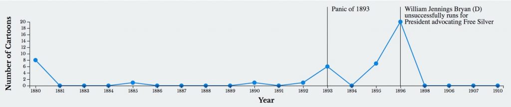
Shen added events to contextualize topic timelines.
The goal of these events was to contextualize the spikes in the graph, so the user can understand the collection better. I manually entered these events into a JSON file, which is then read and displayed on the website.
Closing Thoughts
Thanks to Jaime Mears, Elaine Kamlley, Jamie Bresner, Chris Thatcher, and everybody else in the Library who helped with this project! You can explore the website yourself via the Library of Congress Labs Experiments page, and can find full source code and documentation on Github. Feel free to add a comment to this blog post!