Climate Change Resources for Media
These selected multimedia and graphic resources are available for use by news media under NASA's media usage guidelines.
B-Roll
-
This media reel shows about 17 minutes of footage on the sea level-observing Sentinel-6 Michael Freilich satellite, scheduled to launch in November 2020. The Sentinel-6 Michael Freilich satellite is part of the Sentinel-6/Jason-CS (Continuity of Service) mission, a collaboration among NASA, ESA, EUMETSAT, and NOAA. Download the file here. › Preview on YouTube
-
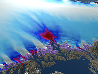
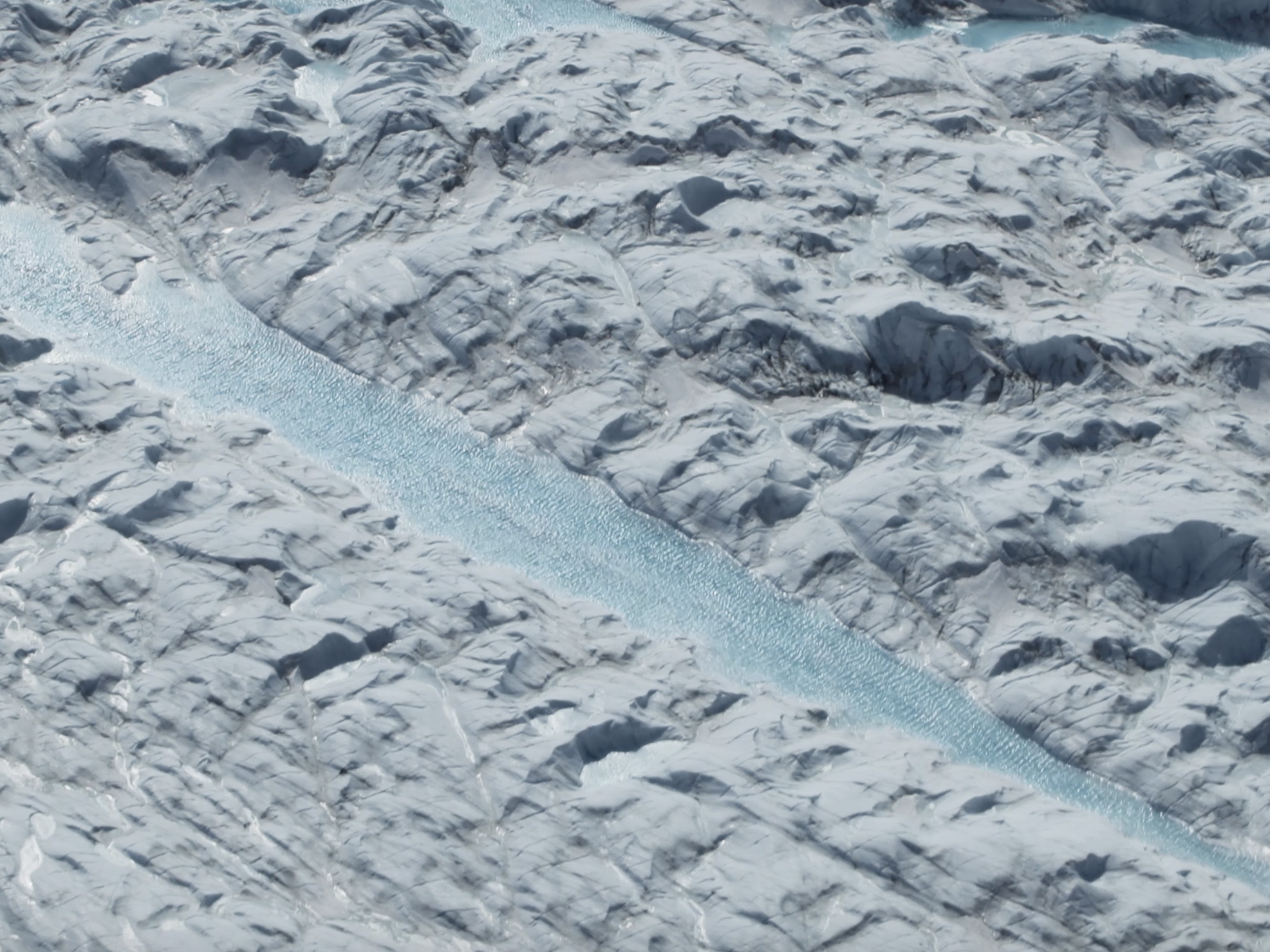 NASA's Operation IceBridge Over Western Greenland
This roughly two-minute reel contains B-roll of NASA Operation IceBridge flights over western Greenland in May. Using a fleet of research aircraft, Operation IceBridge images Earth's polar ice to better understand connections between polar regions and the global climate system and studies annual changes in thickness of sea ice, glaciers and ice sheets. › Preview on YouTube
-
 NASA Earth Mission Montage
Get a roughly two-minute montage of recent NASA Earth missions and instruments (such as OCO-3, GRACE Follow-On, Oceans Melting Greenland and CORAL), from their construction and launch to their data products and scientists in the field. These campaigns study carbon, Earth’s gravity field, the ocean-ice interface in Greenland and coral reef health. › Preview on YouTube
Vital Signs
-
This set of graphs and an animated time series track the vital signs of Earth's climate, including atmospheric carbon dioxide levels, global temperature, Arctic sea ice extent, land ice volume and sea level. › Explore
Frequently Asked Questions (FAQs) about Climate Change
-

These pages contain concise answers to some of the most commonly received questions from users of NASA's Global Climate Change website and NASA's Earth Observatory, with resources for further information.
› NASA Global Climate Change FAQs
› Earth Observatory FAQs
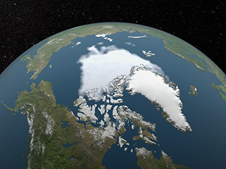
Sea Ice
-

This visualization shows the expanse of the annual minimum Arctic sea ice for each year from 1979 through 2019 as derived from passive microwave data. A graph overlay shows the area in million square kilometers for each year's minimum day.
Global Temperature
-

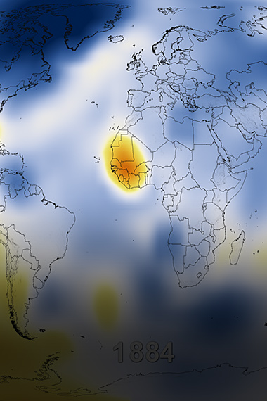
This color-coded map displays a progression of changing global surface temperature anomalies from 1880 through 2019. Higher than normal temperatures are shown in red and lower than normal termperatures are shown in blue. The final frame represents the global temperatures five-year averaged from 2014 through 2018.
-
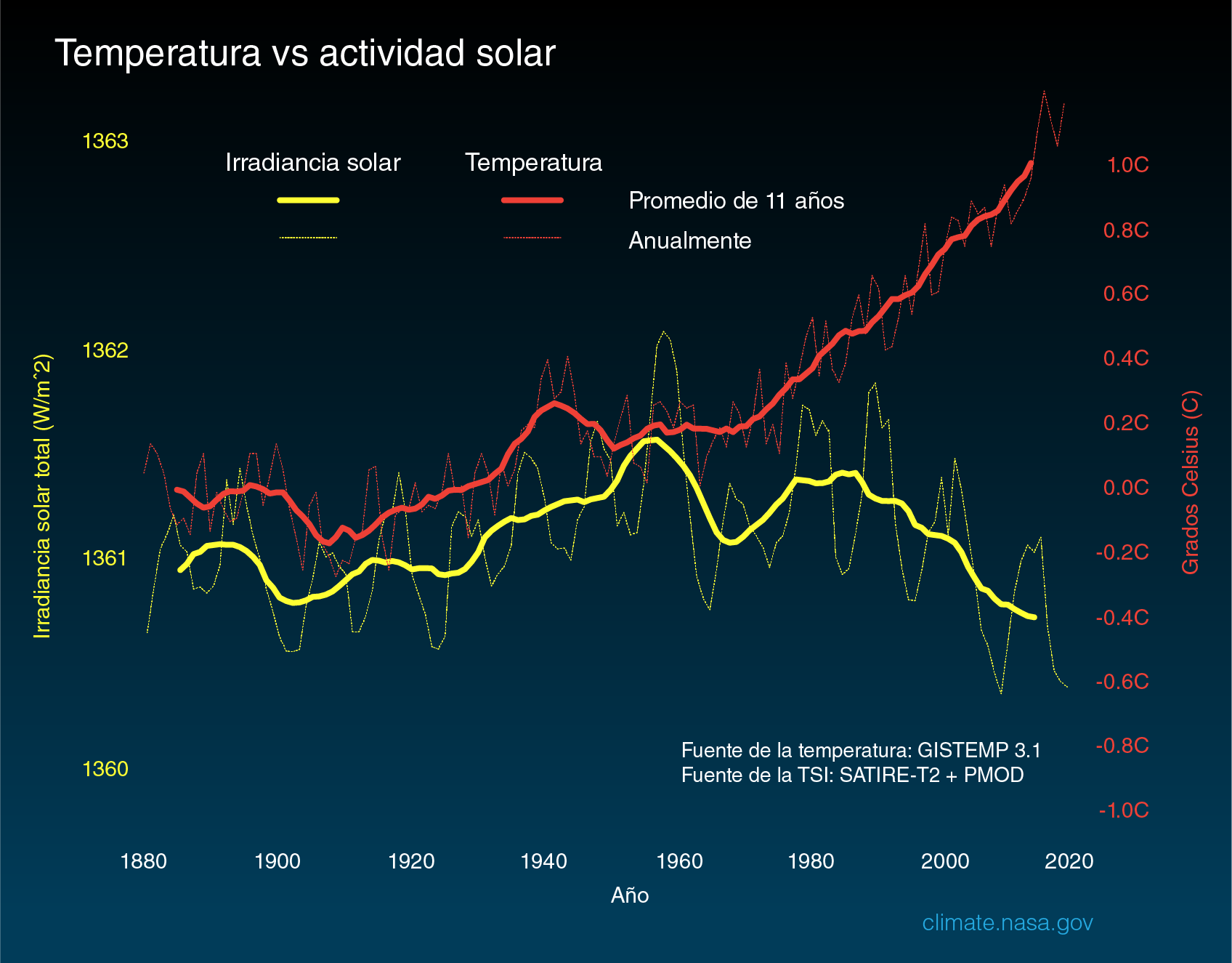
This graphic compares global surface temperature changes (red line) and the Sun's energy received by the Earth (yellow line) in watts (units of energy) per square meter since 1880.
Land Ice
-
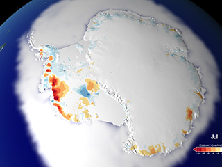
This animated data visualization depicts the last 25 years of land ice elevation change. Areas in red indicate land ice loss. Areas in blue are regions that saw land ice elevation gains.
-
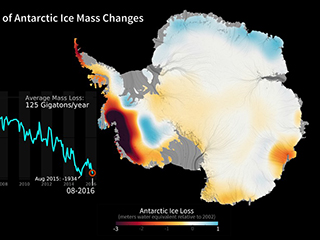
Created with data from NASA's GRACE mission, this image sequence and linear plot shows changes in Antarctic ice mass since 2002. Orange and red shades indicate areas that lost ice mass, while light blue shades indicate areas that gained ice mass.
-
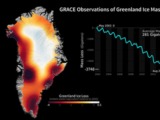
This image sequence and linear plot, created with data from NASA's GRACE mission, shows changes in Greenland's ice mass since 2002. Orange and red shades indicate areas that lost ice mass, while light blue shades indicate areas that gained ice mass.
-
This visualization shows the Jakobshavn region of the Greenland Ice Sheet from 2008 to 2300. This is the best case scenario for limiting greenhouse gases and assumes that emissions will peak by mid-century and decline thereafter.
Carbon
-

This visualization shows the global distribution and variation of mid-tropospheric carbon dioxide concentration observed by the Atmospheric Infrared Sounder (AIRS) on NASA's Aqua spacecraft. For comparison, it is overlain by a graph of the seasonal variation and interannual increase of carbon dioxide observed at the Mauna Loa, Hawaii, observatory.
-

This animation visualizes the behavior of carbon dioxide in the atmosphere from September 1, 2014, to August 31, 2015, based on observations from NASA's Orbiting Carbon Observatory (OCO-2) satellite. See also this version.
-

This animated gif displays a simplified animation of the greenhouse effect, with annotations.
Sea Level
-

Based on data collected from the TOPEX/Poseidon, Jason-1, and Jason-2 satellites, this visualization shows total sea level change between 1992 and 2014. Blue regions are where sea level has gone down, and orange/red regions are where sea level has gone up.
Additional Resources
Goddard Scientific Visualization Studio