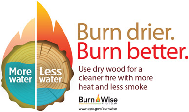
Draft Wood Moisture Graphic: What Are Your Thoughts?
We want people to burn only dry seasoned wood, but what is the best way to get the message across? Our brochures and website provide detailed information, but we want a quick and simple visual that demonstrates the difference between burning wet wood and dry wood.
The following is our latest version of a wood moisture graphic with accompanying text. In most cases we would expect the text to be included with the visual, but at times we may want the graphic to stand alone:
Since this is still in the draft stage, we would like to get your comments, thoughts, and suggestions. What works? What doesn’t work? If the graphic didn’t include explanatory text would it make sense?
We value you input in helping us make this something that will be useful to us – and to you – in trying to promote the use of dry, seasoned wood. Please leave us a reply and let us know what you think!
Editor's Note: The opinions expressed here are those of the author. They do not reflect EPA policy, endorsement, or action, and EPA does not verify the accuracy or science of the contents of the blog.
Please share this post. However, please don't change the title or the content. If you do make changes, don't attribute the edited title or content to EPA or the author.


I like it
[Reply]
I think this works well. The colors, design, and text work together nicely to convey the message. I think that the text is needed because not everyone is visual and may need the explanatory text.
Usually, I say “less is more” but in this case, as I learned at the conference in San Diego, that we cannot assume that the audience is always at the same level of understanding so the messages need to be tailored for all levels.
At the same time, depending upon where you are using this graphic (Facebook, iPhone apps, etc.), it might be ok to just have the graphic after the message has been communicated for a while.
It’s difficult to be unbiased when you’ve been doing this for years! 🙂 Do a pilot w/the graphic on BurnWise Facebook!
[Reply]
Hey Laura- Thanks so much for the idea to pilot of Facebook. We’ll try it out. Let us know if you have other ideas.
[Reply]
You’re welcome! I always have ideas!
[Reply]
I like the graphic, but I think the text was necessary for me to understand the message. It is similar to the instructions that come with things that need to be assembled – a few words can make things much more readily understood.
[Reply]
lherring Reply:
July 14th, 2011 at 2:17 pm
Thanks Tom!
[Reply]
Include something to indicate that less dry wood is needed to realize the same heat output as more wet wood. Maybe make the wet wood log bigger and include a grey smoke halo labelled “wasted heat.”
[Reply]