Thursday, January 3, 2013

No Debt Fix In Sight

The election is over, the fiscal cliff is over, and the problems remain.

For the past several years on this blog I have been showing simple charts to monitor progress—or lack of progress—on the persistent deficit and the growing debt, which in my view are impediments to returning to strong economic growth. Unfortunately neither the election nor the fiscal cliff deal has resulted in any meaningful change in these budget charts.

Here is the latest spending chart. It shows the Administration’s spending proposal prior to the debt deal of 2011, a CBO forecast with the fiscal cliff deal, and my pro-growth alternative which would balance the budget.

Clearly we still have a long way to go to bring spending growth down and thereby reduce spending as a share of GDP. The battle in Washington in the next few years will be where between the black and the green line we go.

Note that the CBO forecast is based on its alternative fiscal scenario, which is very close to what actually happened in the so-called fiscal cliff deal. As the CBO stated in their August 2012 report “That scenario incorporates the assumptions that all expiring tax provisions (other than the payroll tax reduction in effect in calendar years 2011 and 2012) are extended; the alternative minimum tax (AMT) is indexed for inflation after 2011; Medicare’s payment rates for physicians’ services are held constant at their current level; and the automatic spending reductions required by the Budget Control Act of 2011 (Public Law 112-25), which are set to take effect in January 2013, do not occur."

Moreover, the tax increase in the fiscal cliff deal has not affected the budget deficit in any substantial way. The assumption is that this tax increase will raise revenues by about $600 billion over ten years—probably an over statement as people adjust to the higher rates. But even that $600 billion is only .3 percent of GDP which is expected to be about $201,000 billion over that ten year period. This would hardly be noticeable in the spending chart.  So the scary the 2012 fix the debt chart and 2009 fix the debt video still apply in 2013.

Monday, December 24, 2012

Are these the shadows of the things that Will be...

. . . or are they the shadows of things that May be, only?
But if the courses be departed from, the ends will change.  So go back to First Principles, 102ff

Sunday, December 23, 2012

Five-Year Anniversary of the End of the Great Moderation

Five years ago this month the Great Moderation ended. To be precise December 2007 is the month that the NBER business cycle dating committee designated as the peak of the third and final expansion of the Great Moderation and the beginning of the Great Recession.

Hundreds of research papers have been written on the nature and causes of the Great Moderation, which got started around 1983. While that research began long after the Great Moderation got underway (I published one of the earliest papers on it in 1998), we should not wait so long to start seriously researching the causes of the post-Great Moderation period, regardless of how this period is eventually named by economists.

In my view, the framework that Ben Bernanke used in a February 2004 paper to study the causes of the Great Moderation is a good one. It goes back to research that started before the Great Moderation. Bernanke characterized the Great Moderation as a reduction in (1) the variance of inflation and (2) the variance of real GDP. He used the following diagram (it is a replica of Figure 1 in his paper) in which these two measures are on the horizontal and vertical axes respectively. Using the diagram he represented the Great Moderation as a move from point A to point B. He showed that a primary cause was better monetary policy, and he represented this by showing that better policy brought the economy closer to the true policy tradeoff curve (TC2) rather than the occurrence of a shift in the curve (from TC1 to TC2) . I completely agree with that interpretation.
But what caused the end? I have updated Bernanke’s diagram by adding a point C and a line from point B to point C (in red), based on the empirical volatility measures in the table below for the three periods. Observe that the post-Great Moderation deterioration does not simply retrace the previous improvement. It is nearly vertical, reflecting that virtually all the deterioration is in the output variability dimension.

In my view monetary policy was a major factor in the end of the Great Moderation just as it was the major factor in the Great Moderation itself. I review the reasons for this view in this paper on central bank independence versus policy rules which I am presenting at the annual meeting of the American Economic Association next month.

Saturday, December 22, 2012

EconTalk with Charts: A New Idea Well Executed

This week Russ Roberts released the third episode in his innovative new interview series called “The Numbers Game.” The innovation is to add graphs and other visuals—and thereby helpful numerical information—to his popular podcast interview series EconTalk.

The first three episodes go together to form a three part series on the economy and in particular on the nature and cause of the weak recovery from the 2007-2009 recession. The episodes also go together in that I was Russ's guest on all three—yes, a volunteer subject for Russ’s new experiment.

All the episodes are on YouTube.The first episode establishes that the recovery actually has been weak—even compared to other recoveries following deep recessions and financial crises. The second episode examines the possible causes of the weakness, and the third episode concentrates on what, in my view, is the main cause—economic policy.

It’s challenging to integrate charts effectively into a podcast of an interview, but it’s very worthwhile, especially in economics.  Charts give the interviewee a chance to show the facts behind the arguments and then the interviewer can ask about and debate those facts. And it is even possible for the interviewer to add some challenging new charts as Russ did with a bar chart on a survey of economists in the third episode. Charts are also an invaluable way to convey ideas, and, speaking as a teacher, that’s why I love charts.

I think that Russ and his collaborator in this new endeavor, Shana Farley, have done a fantastic job. They have thought about everything, including putting up little caricatures of Russ and his guests like the one of me here. I hope they keep it up with many more episodes of The Numbers Game.

Thursday, December 13, 2012

More Monetary Policy Uncertainty

The Fed’s announcements yesterday increase monetary policy uncertainty in two fundamental ways.

Quantitative Easing on Steroids?

First, the new quantitative easing announcement implies a gigantic increase in the size of the Fed’s balance sheet and thus effectively an amplification of the policy risks and uncertainty which I have discussed, for example, in this oped with George Shultz and other colleagues in September. The Fed now plans to purchase $85 billion a month of longer-term Treasury and mortgage backed securities until there is substantial improvement in the labor market, which requires a completely unprecedented increase in reserve balances as illustrated in this chart.

The chart shows reserve balances held by banks at the Fed. These are used to finance the large scale asset purchases.  The chart assumes that substantial labor market improvement is defined by the 6.5% unemployment rate the Fed is using to assess when to raise interest rates. Thus, assuming the central tendency forecast of the FOMC, the announced buying spree will bring reserve balances to about $4 trillion in mid-2015. The risk is two-sided. If the Fed does not draw down reserves fast enough during a future exit, then it will cause inflation. If it draws them down too fast, then it will cause another recession.

Another Great Deviation On the Way?

Second, the new state-based zero interest rate policy will lead to interest rates far below levels that created good performance in the past and close to levels that eventually created high unemployment. In an effort to explain the new policy during the press conference yesterday, Ben Bernanke referred to the Taylor rule, saying:

"So it's really more like a reaction function or a Taylor rule if you will. I don't want--I'm--I'll get it--I'm ready to get the phone call from John Taylor. It is not a Taylor rule but it has the same feature that it relates policy to observables in the economy such as unemployment and inflation."

In fact, the Fed’s new state-based policy calls for the federal funds rate to stay way below the Taylor rule, as did the calendar-based policy. You can see this deviation in two ways: a chart or some algebra. 

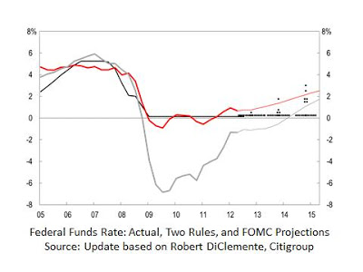
Consider the following chart (an updated version of a chart due to Bob DiClemente) which I used in my talk last month at the Cato Institute. The red line shows the interest rate according to the Taylor rule with the future values based on FOMC forecasts for inflation and growth. The zero interest rate forecasts by most FOMC members (shown by the dots) for mid-2015—a time when, they forecast, the unemployment rate will be about 6.5 percent—are more than 2 percentage points below the Taylor rule. (The gray line is a version of the Taylor rule used by Janet Yellen and others at the Fed.)


You can also plug in values into the Taylor rule:

R = 2 + π + 0.5(π - 2) + 0.5Y

where R is the federal funds rate, π is the inflation rate, and Y is the GDP gap.

Assume that Y = -2(U-5.5) where U is the unemployment rate and 5.5 is the long-term unemployment rate implied by FOMC projections. Then when the unemployment rate is 6.5% and the inflation rate is 2%, the interest rate is 2+2 -1 = 3%. So there is a 3 percent deviation.

The last time the deviation between the Taylor rule and the actual rate was this large was in the “too low for too long” period of 2003-2005 which helped create the boom which led to the bust, the financial crisis, and the recession. High unemployment was the result. The deviation was also this large during the economic mess of the 1970s. High unemployment, along with high inflation, was the result then too.

Comparison with Larry Ball’s Calculations

Larry Ball did a very similar algebraic calculation with similar conclusions about the difference between the Fed’s future policy rate and the Taylor rule, which Greg Mankiw posted on his blog earlier today.

However, Larry finds that the actual interest rate was not below the Taylor rule in the 2003 period. This result is contrary to empirical research by George Kahnme and others. The difference may be due to Larry's using an implied coefficient on the output gap which is larger than .5. Nevertheless, the deviation Larry uncovers is much larger than in the 1970s, which in itself raises risks.

Thursday, December 6, 2012

Recent Books to Read on Rules-Based Money

For a respite from the saga of the fiscal cliff why not read some of the latest books on monetary economics and policy? Below is a list of books on money published in 2012 which I found to be interesting and provocative. You can find a common theme in these books: that poor economic performance provides convincing evidence of the need for a sound rules-based monetary policy. But you can also find disagreement about how to achieve such a policy with proposals for interest rate rules, money growth rules, fixed exchange rate systems, nominal GDP targeting, and gold and commodity standards. Though my favorite is a simple interest rate rule (also discussed in this book on the Taylor rule), one can learn a lot by studying the case for other rules.


Boom and Bust Banking: The Cause and Cures of the Great Recession, David Beckworth (Ed,) The Independent Institute, Oakland, California, 2012.

I enjoyed reading this book, perhaps because I agree so much with the general themes and conclusion that U.S. monetary policy—by creating a boom and a bust—led to the financial crisis and the great recession. But, as I said in my back cover review of the book, David Beckworth and the other authors—including Lawrence H. White, Diego Espinoza, Christopher Crowe, Scott Sumner, Jeffrey Rogers Hummel, William Woolsey, Nick Rowe, Josh Hendrickson, Bill White, Larry Kotlikoff, and George Seglin—go much further. For example, the chapter by David Beckworth and Christopher Crowe puts forth their original theory of the Fed’s “monetary superpower” status and the resulting unfortunate international repercussions of these boom-bust monetary policies. Scott Sumner writes on why nominal GDP targeting would work better than recent and current policy, and Larry Kotlikoff explains how his narrow banking proposals would help to prevent future crises. More generally the authors of this book show why economic policy got off track, why alternative explanations of the boom—such as a global-saving glut—are flawed, and why monetary policymakers must return to rules-based policies in the future.


The Unloved Dollar Standard: From Bretton Woods to the Rise of China, Ronald McKinnon, Oxford University Press, 2013, available on Amazon, Dec. 27, 2012

The clever irony of this title, of course, is that the world is still largely on the dollar standard, despite its being unloved. Ron McKinnon, my Stanford colleague, begins by asking why the dollar standard is “unloved” and explains that it is because U.S. monetary policy has often been mismanaged. He particularly laments the periods when U.S. monetary policy caused global instability, including the “Nixon shock” with the ensuing inflation in the 1970s and what he calls the “Bernanke shock” in recent years, and on the latter he is on the same page as David Beckworth and Christopher Crowe. McKinnon is much more positive about policy in the 1980s and 1990s. He clearly explains why the Fed’s current zero interest rate policy causes destabilizing carry trade opportunities and commodity bubbles, and is interfering with the allocation of capital. He also shows why, despite all these problems, the world has continued to use the dollar, warning that it will not last if American monetary policy does not mend its ways. McKinnon has always been an advocate of rules-based policy, but has focused on an international system of fixed rather than flexible exchange rates, and that view is evident throughout the book.


Roads to Sound Money, Alex Chafuen and Judy Shelton, Atlas Economic Research Foundation, Washington D.C. 2012

As the title suggests, this collection of essays, which Judy Shelton and Alex Chafuen have put together, makes the case for many different “roads” to the goal of a sound rules-based monetary system with contributions by Gerry O’Driscoll, Steve Hanke, Allan Meltzer, Jerry Jordan, Sean Fieler, Lew Lehrman, George Selgin, and Lawrence H. White, the latter two contributors also included in the Beckworth collection. Shelton gives a nice short summary of all the chapters in the Forward. For example, O’Driscoll hammers home the inherent problems with discretionary monetary policies and shows why he believes the gold standard would be an improvement despite its imperfections, a proposal that Lew Lerhman makes the case for in his chapter and in more detail in the second edition of his book The True Gold Standard. In contrast, in Meltzer’s nice review of his monumental history of the Fed, he concludes that a more rules based policy like we had in the 1980s and 1990s would be sufficient. Hanke reminds us that good monetary policy means more than keeping inflation low, and raises questions about the view that policy is just fine if an inflation target is hit. Seglin’s essay in an informative excursion into the operations of the New York Fed in the money markets with a concrete proposal for the Fed to dramatically broaden and increase the number of dealers it engages with. Jerry Jordan’s essay focusses on fiscal discipline rightly arguing that bad fiscal policy usually leads to bad monetary policy.


The Great Recession: Market Failure or Policy Failure? Robert Hetzel, Cambridge University Press, 2012.

Hetzel makes a compelling case that policy failure was the main cause of the recent financial crisis, and more generally that “monetary disorder” rather than a “market disorder” is the cause of poor macroeconomic performance over many years. At the same time, he acknowledges and discusses disagreements among those who argue for rules rather than discretion. For more details see my review of this book from Economics One earlier this year.


Volcker: The Triumph of Persistence, William Silber, Bloomsbury Press, New York, 2012.

This book is all about monetary policy making in practice. It shows in fascinating detail how Paul Volcker, starting in 1979, was able to implement a major change for the better in monetary policy that lasted for more than two decades. It also shows how Volcker learned how to implement such a change while working as Under Secretary of the Treasury under George Shultz in the early 1970s. For more details see my review of this book from the Wall Street Review earlier this year.

Tuesday, November 27, 2012

Taylor Rule (the book) Now Near Zero Bound with Forward Guidance

Like the Fed, the Hoover Press is experimenting with an extraordinary and unprecedented policy. It’s setting a key price very close to the zero lower bound and holding it there for a while.

To be specific, the Press is having a special anniversary sale of the book The Taylor Rule and the Transformation of Monetary Policy edited by Evan Koenig (Dallas Fed), Robert Leeson (University of Notre Dame, Australia), and George Kahn (Kansas City Fed). The sale marks the 20th anniversary of the first presentation of the paper proposing that rule back in November 1992.

88% OFF!

The ebook version—available on Amazon—is on sale for $2.88, or 88% off the usual ebook list price of $24.95. Like the federal funds rate, it’s tough to go much lower!

Also, for orders that are made directly through the Hoover Press and use the promotion code taylor20, the hardcover edition is on sale for $7.50, which is a huge 79% off the list price of $34.95.

Forward Guidance

Taking due account of market expectations, the Hoover Press has made it very clear that the sale will last for 5 weeks through the end of December 2012. This is calendar-based, not outcome-based, forward guidance, and it’s a firm commitment without contingencies.

Monday, November 26, 2012

A Way to Avoid the Fiscal Cliff without Creating Another One

So far the fiscal cliff debate has mainly been about whether tax revenues should be on or off the table with little mention of spending. But the economics of the debate—as distinct from the raw politics—make no sense without considering spending. And whenever spending is mentioned, it’s in terms of gargantuan ten-year totals like 2 or 3 trillion dollars, which are meaningless to most people and sweep under the rug key questions about the size of government and the speed of adjustment.

So consider an alternative way to present and discuss spending proposals. It involves the following chart, and while not everyone likes to use charts, this one is far more digestible than those multitrillion dollar sums thrown around. And it suggests away to avoid the fiscal cliff.

Starting on the lower left of the chart a history line shows the sharp rise in federal spending as a share of GDP from the year 2000 to the present. It then splits into four lines corresponding to different year-by year spending paths which were proposed in the months leading up to the budget deal of last year:
  • The top line is the Administration’s spending proposal made in February 2011.
  • The next line shows the result of the budget deal of the summer of 2011, but it does not include the additional sequestration reductions that were part of the deal.
  • The third line is the Simpson-Bowles spending proposal which was put forth in their December 2010 report.
  • The fourth line is a “pro-growth” proposal made by Gary Becker, George Shultz and me in the Wall Street Journal on April 4, 2011.
  • Two other proposals worth noting on the chart:
    • spending with sequester cuts from the 2011 deal; it’s close to Simpson-Bowles
    • the House Budget resolution of March 2012; it’s close to the pro-growth line.
Note that although federal spending as a share of GDP declines for the pro-growth and Simpson-Bowles paths, actual spending rises at 3.3 % per year and 4.8% per year respectively.

When looked at in this way, the logic of the pro-growth proposal jumps out at you:
  • First, the proposal simply reverses the recent spending surge by bringing spending to 2007 shares of GDP, still well above levels at the end of the Clinton Administration.
  • Second, the reversal is very gradual; substantially more gradual than the rapid run up in spending. This gives people a chance to adjust. In fact, macro model simulations show that this gradual spending reduction will increase economic growth even in the short run.
  • Third, the spending reduction will lead to a balanced budget without tax increases, because the budget was nearly in balance in 2007. This is why it’s called the pro-growth path, and it also allows for static revenue neutral tax reform which will raise growth further.
For those who want a bigger government than implied by the pro-growth path, the chart points to a good way to avoid the fiscal cliff without creating another:
(1) Agree now, during the lame duck session, to spending as in the Simpson-Bowles proposal. That is sequester spending levels without the damaging cliff-like sequester. Most members of Congress are familiar with the proposal making it easier to pass during the lame duck session.
(2) Postpone all scheduled income tax increases until a negotiation over tax reform is completed in the next Congress. There the key issue will be whether to increase taxes to pay for the higher spending levels in Simpson Bowles, or to keep spending at 2007 levels as a share of GDP without tax increases, or somewhere in between. Agreeing to the Simpson Bowles spending levels now in order to avoid the cliff shouldn't give either side additional bargaining power after the cliff.

Wednesday, November 21, 2012

A Simple Rule for Monetary Policy After 20 Years

It was 20 years ago today at a conference in Pittsburgh that I first presented what is now called the Taylor rule. Here’s the November 1992 Stanford working paper. It’s nearly impossible to predict which ideas will be picked up by policy makers and which won’t, and I certainly didn’t predict in 1992 that the Fed and other central bankers would still be referring to the idea in 2012.

Last week, for example, the Taylor rule served as a reference point for two very different talks by two members of the FOMC. In a speech in Berkeley, Vice Chair Janet Yellen talked about forward guidance. She argued that the federal funds rate should stay below the Taylor rule for a while longer and even below a “Modified Taylor rule” with a higher response to the output gap. She said that “times are by no means normal now, and the simple rules that perform well under ordinary circumstances just won’t perform well with persistently strong headwinds restraining recovery and with the federal funds rate constrained by the zero bound.” So that means more discretion, and, in my view, more drag on the economy.

Philadelphia Fed President Charles Plosser also spoke about forward guidance last week, but he saw no reason not to use a policy rule under current circumstances, and he recommended setting interest rates according to one of those policy rules. That would bring a more rules-based policy, which experience over the past 30 years shows would be better for the economy, as I argued in a talk at the same conference where Charlie spoke.

New research by Kansas City Fed economist George Kahn provides highly relevant econometric evidence on the issue. In an article forthcoming in the Kansas City Fed’s Economic Review, he estimates simple policy rules over relatively well-performing periods. He finds that the estimated parameters over these periods are very close to those of the rule I proposed 20 years ago, though with a different constant term implying a higher equilibrium federal funds rate.

Sunday, November 11, 2012

Milton Friedman and the Power of Monetary Ideas

Last Friday the University of Chicago hosted a wonderful Centennial Celebration of Milton Friedman and the Power of Ideas. All of the speakers, especially Jim Heckman, Kevin Murphy, Bob Lucas, and Gary Becker chose to focus on how amazingly well Milton integrated data, theory, and policy in inseparable ways in his research and writings, and that this was the key to the power of his ideas.

That well-documented facts and sound economic theory informed his policy views in practice is very evident in the case of monetary policy, which was the focus of the session where Bob Lucas, Allan Meltzer and I spoke and Lars Hansen moderated.

Lars asked me to address these two questions in my remarks for the session
-- How do you see Fed behavior at this juncture?
-- To what extent has monetary policy alone run out of gas in nurturing a more healthy macroeconomic recovery?

Because I had given the opening talk at Milton Friedman’s 90th birthday conference in Chicago exactly ten years ago in November 2002, I found that the best way for me to answer these questions was to begin my presentation at the Centennial by returning to that 2002 talk and bringing back some of the charts

From the vantage point of 2002 I was very positive about Fed behavior because of its greater reliance on steady rule like behavior in the 1980s and 1990s, and I gave credit to Milton for that change at the 90th birthday. The result was solid economic performance especially in comparison with the economic mess of the 1970s when discretion dominated.

But the steadier monetary policy and good economic performance did not last. Little did I know in November 2002 that the Fed would soon do it again. It went back to the types of discretionary actions it had used in the past. The results have not been good.

The obvious implication is that a change in policy would lead to improved economic performance.In this sense, I do not think it is correct to say that monetary policy has run out of gas: A return—a steady gradual return—to the type of steady-as-you-go policies we had in the 1980s and 1990s and until recently would be as big a positive for the economy as it was in those decades.

Tuesday, November 6, 2012

Strengthening of America

Many have been asking me to write more about the fiscal cliff.  As we watch the election returns today, I would keep two straightforward things in mind.

First, the fiscal cliff was not created by aliens from outerspace.  It is another poor government economic policy created in Washington. But the good news is that, like other bad economic policies in recent years, it can be fixed by a change in government policy.

Second, it will take a bipartisan policy effort, but the policy ingredients are ready.  One of the best examples is the work of former Senator Sam Nunn and Pete Domenici who have created a bipartisan group of former members of Congress who have had a series of hearings with economists and other experts. The initiative is called the Strengthening of America--Our Children's Future and is supported by these organizations and think tanks:

The Concord Coalition
The Bipartisan Policy Center
The Center for Strategic and Interantional Studies
The American Business Conference
The James A. Baker III Institute for Public Policy at Rice University.
The Hoover Institution at Stanford
Harvard’s Belfer Center for Science and International Affairs
Woodrow Wilson International Center for Scholars

I had the opportunity to be on a policy panel with Alice Rivlin. There were also panels with Martin Feldstein and Lawrence Summers and with Robert Rubin and James Baker.

Sunday, November 4, 2012

Stagnation or Real Progress?

As the presidential election campaign reaches its final crucial hours, the main issue remains the economy—unemployment, jobs, growth—and what the economic policy can do about it. Campaigning in Ohio and other swing states, President Obama says his policies have meant “real progress” and wants to stick with them, while Governor Romney says they have meant “stagnation” and wants to change them. If you have been monitoring this blog since it started three plus years ago—long before the political season began—you probably know that my view is that it’s “stagnation,” not “real progress,” and that policy is the problem.

The High Unemployment is a Tragedy

This “stagnation versus real progress” debate came up in several TV shows I did on Friday, and in each case the networks chose headlines that reflect my view well:

Our Unemployment Number is a Tragedy, Bloomberg TV
(30 second video pull quote) Unemployment a Tragedy, We Can Do Better
We Could Be Doing Better, CNN
Slow Growth Is Biggest Economic Challenge Facing Incoming President, (paired up with Austan Goolsbee), PBS NewsHour

Jeffrey Brown was the interviewer on Newshour and asked at the opening: “What is the problem that most needs to be addressed by whoever is the next president?” I answered: “That unemployment rate. It's too high. It shouldn't be this high. And it has increased a bit. But it's increased even more in states like -- I think Pennsylvania went up from 7.4 to 8.2 over the last few months. And the reason is the weak economy. We shouldn't be growing this slowly. We have an economy which can do much better. It's done better in similar periods in the past. And with the right policies, it can do much better, get the unemployment down much further. And there's also people dropping out of the labor force. You know, in Ohio, since the recovery began, 194,000 people just dropped out of the labor force, stopped looking for work. That's another bad sign that I think people should be very concerned about. It's really depressing what's happening with respect to the labor market right now in this country.”

In my view, it’s also a concern that some people have begun talking as if the unemployment problem does not exist. I know this is hard to believe, but if you search, for example, the 20 page glossy brochure on the economy recently distributed by the Administration, you will not find the word “unemployment.” If one does not discuss a problem—its magnitude, its causes—how is one ever going to fix it?

Now consider what is happening in the Swing States

Ohio

Yesterday, The New York Times argued that “Mr. Obama was right when he talked about ‘real progress’ in the economy during a campaign swing in Ohio, where the state unemployment rate has declined from 8.6 percent a year ago to 7 percent recently.”

But the Times skips over the reason why unemployment fell in Ohio, and it’s “stagnation,” not real progress: Virtually all of the decrease in unemployment in Ohio has been caused by unemployed people dropping out of the labor force—discouraged not to find a job after many months of search. There has been virtually no increase in the number of jobs during the recovery. Worse, 33,000 jobs have been lost in the past four months.

By the official definition of the Bureau of Labor Statistics, unemployment in Ohio fell by 218,000 persons since the national recession ended and so-called recovery began in June 2009. But the vast amount of the decrease in unemployed was due to 194,000 persons leaving the labor force. There were only 24,000 additional jobs. In other words, 9 of 10 workers who had been counted as unemployed are no longer counted as unemployed simply because they are no longer looking for work. Were it not for this decline in the labor force, the unemployment rate would be around 10% rather than the 7% mentioned by the Times.

The two charts below tell the tragic story: With few jobs, people are dropping out of the labor force and are no longer even looking for work. Here is a picture of how employment has actually declined in Ohio.


Iowa

In an oped in the Cedar Rapids Gazette today, Tad Lipsky and I wrote about why there was employment stagnation in Iowa, and even worse than in Ohio. The chart below shows that employment is actually lower than at the start of the recovery or the day the Obama Administration began.


Colorado, New Hampshire, and Wisconsin

The recent employment drop off in Ohio and Iowa is also occurring in Colorado, New Hampshire, and Wisconsin. In Colorado, the number of people employed has fallen by over 17,000 since March. In New Hampshire, the number of people employed has fallen by nearly 8,000 since April. And in Wisconsin, the number of people employed has fallen by over 30,000 since May.

Pennsylvania

This post is already too long. I conclude with chart of the unemployment rate in Pennsylvania which speaks for itself.


Thursday, November 1, 2012

A Slow and Declining Growth Rate Delays Prosperity

In his article “A Slow but Steady Climb to Prosperity” in today’s Wall Street Journal, Alan Blinder argues that “The U.S. economy is improving.” I wish he were right, but the data—even much of the data he mentions—do not support that view.

First, he admits that real GDP growth—the most comprehensive measure we have of the state of the economy—is declining; that’s not an improvement.

Second, he admits that, according to the payroll survey, job growth isn’t faster in 2012 than 2011; that’s not an improvement either.

Third, he mentions that the household survey shows employment growth is faster, but that growth must be measured relative to a growing population. If you look at the employment to population ratio, it is the same (58.5%) in the 12 month period starting in October 2009 (the month he chooses as the low point) as in the past 12 months. That’s not an improvement.

Fourth, he shows that the unemployment rate is coming down. But much of that improvement is due to the decline in the labor force participation rate as people drop out of the labor force. According to the CBO, unemployment would be 9 percent if that unusual and distressing decline--certainly not an improvement--had not occurred.

He then goes on to consider forecasts, saying that there are promising signs, such as the housing market. The problem here, however, is that growth is weakening even as housing is less of a drag, because other components of GDP are flagging.

If you want to look at forecasts, consider this chart of the Fed’s (Federal Open Market Committee’s) forecast for real GDP growth in 2012. It is a depressing picture of a worsening outlook, meeting after meeting, not an improving outlook.


Tuesday, October 30, 2012

Updated White Paper on the Romney Program

It has been three months since the August 2 white paper was released on the growth and employment impacts of Governor Romney’s economic program in comparison with President Obama's program.  

Much has happened since then, so an update of the white paper was released today, mentioning the 650 other economists who have signed on to support the Romney plan, the deterioration of the economy and the outlook, the greater robustness of the 12 million jobs estimate, and the release of the booklet on the Obama program. 

Monday, October 29, 2012

A Monetary Historian's Delight

A fascinating and useful new e-book, The Bretton Woods Transcripts, has just been published by the Center for Financial Stability (CFS). It is the first publication of the transcripts of the famous international meeting that took place nearly 70 years ago in Bretton Woods, New Hampshire and founded the International Monetary Fund and the World Bank. The transcripts include important commentary by John Maynard Keynes, Harry Dexter White and other representatives from 44 countries, many of whom went on to be key economic leaders in the early post war period.

While an 822 page “transcript” might turn off all but the most serious monetary scholars, Kurt Schuler, who discovered the transcripts in the Treasury, and his coeditor Andrew Rosenberg have done a remarkable job of making the book user friendly by editing, creating summaries, and providing a road map to guide the reader. Their own commentary, with lines such as “Keynes proceeded with lightning speed, hop-scotching across the provisions of the draft World Bank agreement, because he was able to hold all of its provisions in his mind in a way that probably no other delegate could,” are fascinating on their own right. Moreover, standard search engines allow one to easily scan through the document looking for topics or participants.

In reading through various passages, I was most impressed by the foresight of the participants at the conference and their spirit of international cooperation, as they hammered out the agreements. Coincidently, at this past summer’s Jackson Hole Conference, Jaime Caruana—the head of the Bank for International Settlements—argued in a speech that there is now a need for more international cooperation in monetary policy. There was pushback from several central bankers at the meeting, but if they change their minds (I hope they do) and move in Caruana’s direction, then a careful examination of these transcripts is the place to begin.

Sunday, October 28, 2012

Disappointing Labor Markets in the Nation and in Key States

Earlier this year the CBO Budget and Economic Outlook (p 36-37) pointed out that much of recent decline in the national unemployment rate has been due to an unusually large decline in the labor force participation rate. Of course, people who drop out of the labor force—even if they give up looking for a job because they could not find one—are not counted as unemployed. Were it not for the unusual labor force decline (that is, the decline beyond what is due to the aging of the baby boomers and the downturn in the business cycle), the unemployment rate would be “about 1¼ percentage points higher than the actual rate” according to the CBO. This means that the current 7.8 percent is actually 9.1 percent.

Of course, the same phenomenon is occurring at the state level, and affects voters’ views in the battleground states about the effectiveness or ineffectiveness of economic policy. It is difficult to estimate aging and business cycle effects on the labor force at the state level, but an examination of employment can give a pretty clear picture of what is going on.

Consider Iowa for example. Many have noted that the unemployment rate is lower in Iowa than the national average, but that has been the case for decades. What is less well known is that employment has recently been declining in Iowa. In fact, employment is now lower in Iowa than at the start of the recent recovery, meaning that in Iowa the recovery is even weaker than the United States as a whole.

The following chart tells the story. It shows that employment is lower than at the start of the recession, or than at the start of the Obama administration, or than at end of the recession. It also shows a worrisome sharp decline in the past few months. Since May of this year, 26,000 jobs have been lost in Iowa according to the household survey reported by the Bureau of Labor Statistics. The pace of decline is sharper than in the recession.


The reason that unemployment has declined in Iowa even though employment fell is, of course, due to the decline in the labor force. In fact, the sharp decline in employment since May was matched by a 25,000 person decline in the labor force. This sharp decline could not be due to the more gradual aging of the population nor to the business cycle, unless there is double dip in Iowa.

Friday, October 26, 2012

Exploding Debt Still Threatens America

Back in May 2009 I wrote “Exploding Debt Threatens America” in the Financial Times. Unfortunately the federal debt is still exploding, but fortunately we are learning more about the threat thanks to research reported and carefully explained in a new piece by my colleague Michael Boskin.

The following chart is a quick summary of his amazing findings. It shows the enormous decline in American income (measured by GNP) if fiscal policy follows the path we are now on as estimated by the Congressional Budget Office. The stars represent several different estimates for the year 2040 reported in Michael’s paper. The ranges show CBO estimates under current policy or under the House Budget resolution of last spring.


Thursday, October 25, 2012

An Unusually Weak Recovery as Usually Defined

The view that the current U.S. recovery is unusually weak compared to past U.S. recoveries from recessions with financial crises is gaining more and more support.

Economists David Papell and Ruxandra Prodan in an article posted on Jim Hamilton and Menzie Chen’s blog Econbrowser examine an alternative measure of growth during recoveries following recession troughs, and they too come to the conclusion “that the current recovery for the U.S. has been slower than the typical recovery from severe recessions associated with financial crises.” Michael Bordo’s rejoinder to Carmen Reinhart and Ken Rogoff shows that his finding with Joe Haubrich that this recovery is relatively weak is robust to the Reinhart-Rogoff criticism about how one defines financial crises. Clive Crook rightly points out along with Bordo that when you define recovery  as starting from the trough (the standard way), this U.S. recovery is relatively weak compared to recoveries from past deep recessions with financial crises.

For the record, recovery is defined in this standard way in my Principles of Economics text as “the early part of an economic expansion, immediately after the trough of a recession” with the following schematic illustration, which has appeared in every edition from the first in 1995 to the current seventh.

Martin Wolf in the Financial Times weighed in on the other side of this debate yesterday. First, he takes issue with my comparison chart (included in his article) saying that I should not have included the recoveries in the “mid-1970s, early 1980s and early 1990s” because “the precursors and results of the recent crisis were quite different.” But if you exclude those three periods from the average my finding is even stronger as the top line in the chart below makes clear.


Second, he questions my definition of recovery, but as Bordo points out that definition has been used productively by monetary historians for decades. Third, Wolf argues that other countries experiences are important too, but Bordo, who has written over 250 papers on economic history, and other historians question lumping countries together in this way. In any case, all I have said is that this recovery is weak compared to previous US recoveries following financial crises, so as a logical matter brining in other countries does not show I am wrong about what I wrote, as Wolf claims. Finally, Wolf argues toward the end of his article that the fact that the recent recession was not as severe as the Great Depression and earlier recessions following financial crises means recent policy was successful. But the argument that the recession “could have been worse” has been made before and disputed here and here for example. In fact, I have argued that government policy prior to 2009 was largely responsible for the crisis and the deep recession.

In his column Clive Crook also makes a good point that we should be spending more time debating which economic plan is best for economic growth and job growth going forward. I completely agree, and here it should be noted that more than 650 economists have chosen to support the Romney economic plan rather than the Obama economic plan because of its positive effects on growth and job creation.

Wednesday, October 17, 2012

Weak Recovery Denial

Paul Krugman disagrees with my recent post that the recovery is weak compared to recoveries from past serious U.S. recessions including those associated with financial crises. I’ve been writing about the reasons for weak recovery for two years, but the issue has heated up because of its relevance to the elections this fall.

In making his critique, Krugman appeals to a recent oped in Bloomberg View by Carmen Reinhart and Ken Rogoff who criticize the research of economic historian Michael Bordo and his coauthor Joseph Haubrich of the Cleveland Fed, which I have referred to. Bordo and Haubrich demonstrate that the recovery from the recent recession and financial crisis has been unusually weak compared to recoveries from past recessions with financial crises in the United States. In separate research, Jerry Dwyer and Jim Lothian report the same finding. Neither Reinhart-Rogoff nor Krugman disprove this finding.

To see this, consider the points made by Reinhart and Rogoff, and also by Krugman.

First, they argue for a narrower definition of a financial crisis. Reinhart and Rogoff say that one should “distinguish systemic financial crises from more minor ones and from regular business cycles.” Thus they exclude some cases studied by Bordo and Haubrich. But narrowing the focus to systemic crises in this way does not change the Bordo-Haubrich findings because the recovery from the recent recession is weaker than the average of past recessions cum financial crises even with these exclusions.

Second, Reinhart and Rogoff argue that one should look at recessions together with recoveries when looking at severity. In fact, in their work they explicitly “don’t delineate between the ‘recession’ period and the ‘recovery’ period.” But there is no disagreement that recessions associated with financial crises have tended to be deeper than those without financial crises. I certainly don’t deny that there was a serious financial crisis. In fact I wrote one of the first books on the crisis and found that government policy prior to 2009 was to blame, just as government policy was to blame for the even more serious Great Depression.

The issue that I and others have focused on is whether the recovery is unusually weak. By mixing recessions with recoveries Reinhart and Rogoff blur the classic distinction, which has long been at the heart of macroeconomic analysis. Because they do not examine recoveries per se, their empirical analysis does not disprove the fact that the current recovery is very weak as Bordo and Haubrich and others have shown.

Third, there is the complaint that in a simple chart I used to show how weak the recovery has been, I only looked at the first four quarters of recovery. But I also mentioned that Bordo and Haubrich use a different measure, which goes well beyond 4 quarters, and come to the same conclusion, and also that the current recovery has weakened further since the first four quarters. In any case, the focus on four quarters has nothing to do with it. Here is a chart that looks at growth during the first eight quarters. The story is the same.

Since most of the Reinhart, Rogoff and Krugman criticism is implicitly aimed at the historical work of Bordo and Haubrich, it is appropriate to conclude with what Bordo wrote in response to a press inquiry which he shared with me. Bordo puts it this way:

Aside from the unnecessary political rhetoric and ad hominems, the basic difference between my research with Joseph Haubrich on U.S. recoveries and that of Carmen Reinhart and Ken Rogoff is over the methodology of defining a recovery. Reinhart and Rogoff focus on the behavior of the level of real per capita GDP from the peak preceding the financial crisis to the point in the succeeding recovery at which the earlier peak level of real per capita GDP is reached. We look at what is called the bounce back, the pace of recovery from the trough of the business cycle.

We find that deep recessions accompanied by financial crises bounce back faster than recessions which do not have financial crises. These results are even stronger when we focus on what Reinhart and Rogoff call systemic crises, like 1893 and 1907. The recent recession and financial crisis is a major exception to this pattern. The recovery remains tepid after three years.

Reinhart and Rogoff s methodology combines the downturn with the recovery. Using our data but following their approach one would get the same results as they do, that recessions with financial crises have slow recoveries as I show in my Wall Street Journal op ed. Their use of real per capita GDP rather than just real GDP would not make any difference to our results. Thus comparing their methodology with ours is like comparing apples with oranges. Our approach focuses directly on the question-- are recoveries after recessions with financial crises associated with slower or faster than average recoveries. Their approach answers a different question than we ask.

In sum, the weak recovery deniers have not made their case.


Monday, October 15, 2012

More on the Unusually Weak Recovery

The weak recovery continues to be a major topic. Over the weekend, Russ Roberts issued the second episode of his three part “chartcast” series on the topic, which is based on interviews with me and builds on his highly-regarded podcast series, but with helpful charts and illustrations. (Here is the first episode). Among other things we discuss the work of Mike Bordo and Joe Haubrich on the unusual nature of this recovery, and their views of the work by Carmen Reinhart and Ken Rogoff.

Also, as Jon Hilsenrath and Ezra Klein report, over the weekend Carmen Reinhart and Ken Rogoff released a short rebuttal to Bordo and Haubrich as well as to several opeds. Reinhart and Rogoff argue in favor of a narrower definition of a financial crisis, and they thus focus on a subset of the eight Bordo-Haubrich recessions with financial crises (for example, they exclude 1913 and 1982). This alone does not change the Bordo-Haubrich results as the figure in my post of last week makes clear. But Reinhart and Rogoff argue that one should look at the downturn as well as the recovery when looking at severity. There is no disagreement that recessions associated with financial crises have tended to be deeper than those without financial crises. The disagreement is over the recoveries. By mixing downturns with recoveries Reinhart and Rogoff get different results from Bordo and Haubrich.

But the question for policy now is whether the recovery has been unusually slow compared to earlier recoveries from recessions with financial crises, and the evidence is still clear that it has been. Papers in the book Government Policies and the Delayed Economic Recovery edited by Lee Ohanian, Ian Wright, and me show that policy is the reason.

Saturday, October 13, 2012

Getting Tax Reform History Right

"For the past 75 years or so, tax reform has been defined by a tradeoff: broaden the tax base and lower rates,” as tax historian Joseph Thorndike explained in a recent article. That’s the framework behind the Romney tax reform proposal, as well as the last major federal tax reform in 1986. History tells us that such a strategy will work if the tradeoff and its pro-growth purpose are explained to the American people, and the mechanics of base expansion are then worked out in bipartisan negotiations with Congress. That’s the lesson from the 1986 tax reform in which Ronald Reagan put forth the general framework and the details were then negotiated with Democrats and Republicans in Congress. That history lesson is very important now, but it will be lost if Americans don’t get the history right.

That is why my colleague and tax expert Charlie McLure was so concerned when he heard Vice-President Biden describe President Reagan’s approach to the 1986 tax reform in the vice-presidential debate this week. Charlie served in the U.S. Treasury in the 1980s and was responsible for preparing the tax proposals for President Reagan. As Charlie explained in an email yesterday, the history told in the debate wasn’t right:

"During the Vice-Presidential debate, Vice-President Joe Biden asserted that President Ronald Reagan made his tax reform proposals public. The implication – and the only context in which the assertion would be relevant – is that he did so during the 1984 Presidential campaign. This is not true. As Deputy Assistant Secretary of the Treasury, I was responsible for preparation of the Treasury Department’s proposals to President Reagan. In his 1984 State of the Union address, President Reagan gave Treasury Secretary Don Regan the mandate to send him the proposals by a date in November that fell after the election. That is what we did. The President did not endorse the Department’s proposals and did not send his proposals to the Congress until May 1985, six months after the election. Had he done that before the election, the resulting demagoguery would have forced him to take so many options off the table that the Tax Reform Act of 1986 would not have happened – or at least would not have been the landmark legislation that it was."

Thursday, October 11, 2012

Simple Proof That Strong Growth Has Typically Followed Financial Crises

People are looking for answers to why the economy is growing so slowly. Is the answer that economic growth is normally weak following deep recessions and financial crises, as, for example, Kenneth Arrow argued in the presidential election event with me this week at Stanford? Or is poor economic policy the answer, as I argued?

In my view the facts contradict the “deep recession cum financial crisis” answer, so I have focused my research on economic policy and have found that the answer lies there. The chart below illustrates these facts. It is derived from historical data reported in a paper by economic historians Michael Bordo of Rutgers and Joe Haubrich at the Cleveland Fed.

The bars show the growth rate in the first four quarters following all previous American recessions that are associated with financial crises, as identified by Bordo and Haubrich. The upper line shows the average growth rate in all those recoveries. The lower line shows the growth rate in the four quarters following the 2007-2009 recession. It is very clear that recessions with financial crises are normally followed by much more rapid recoveries than this current recovery. The current recovery not only started out weak, averaging 2.5% in the first year, it got weaker over time, declining to only 1.3% in the second quarter of this year.

Growth was nearly 4 times stronger on average in the past recoveries. The only recovery in this list in which growth was as weak as this one followed the 1990-91 recession, but that was from a very shallow recession with output declining only 1.1%, so growth did not need to get very high to catch up. (The chart would look very similar if instead of 4 quarters you use the length of the recession from peak to trough as Bordo and Haubrich also do).

With such obvious evidence, how can people come to different views? Usually they mix in experiences in other countries with different economies at different points in time, as for example Carmen Reinhart and Kenneth Rogoff have done in an often cited book. But this approach can lead to mistaken conclusions, as Bordo explained recently in the Wall Street Journal. As he put it, “The mistaken view comes largely from the 2009 book "This Time Is Different," by economists Carmen Reinhart and Kenneth Rogoff, and other studies based on the experience of several countries in recent decades. The problem with these studies is that they lump together countries with diverse institutions, financial structures and economic policies.”

Monday, October 8, 2012

Recent Part-time Job Increase Is Not a Good Sign

Many have noted the large September increase in “part-time employment for economic reasons” reported in the BLS household survey. The 582,000 increase in these part time jobs caused total employment to rise by 873,000—a major reason for the decrease of the overall unemployment rate, and the broader U-6 measure of labor underutilization—which adds in this part-time employment—did not decline at all.

This increase in part time jobs is not a good sign for the economy.

Joe LaVorgna, chief US economist at Deutsche Bank, argues that the part-time increase is likely due to the election. He offers two pieces of evidence. First, there was an unusually large gain in non-private employment, defined as total employment less “private industries” employment, which thus includes campaign workers who organize grass roots efforts, make phone calls, knock on doors, or help at political conventions. Second, there was an unusually large increase in employment in the 20 to 24 year age group—a typical age for campaign workers. The explanation is appealing because both Democrats and Republicans are increasing such grass roots campaigns. State data—especially from the swing states—is needed to confirm LaVorgna’s hypothesis. But if true the increase in part time employment is not a sign of an improving economy: it implies that the jobs gain in September is largely temporary.

Another view is that the increase in part-time employment is directly due to the weak recovery, and a sign that it is getting weaker. Surges in part time employment frequently occur in times of economic stress. Consider, for example, all the months in which part time employment rose by 500,000 or more. There are 13 such monthly increases in the BLS data base—Jan 1958, Mar 1958, Jan 1975, May 1980, Oct 1981, Feb 1982, Feb 1991, Sep 2001, Nov 2008, Dec 2008, Feb 2009, Sep 2010, Sep 2012. With two exceptions, every one of these occurred during recessions when the economy was sharply contracting. The two exceptions are in the current recovery, which ia another measure of its weakness.

Even more troublesome is that in the past 6 months of the recovery, the entire employment increase was more than accounted for by part time jobs: Total employment rose by 940,000 from March to September and part time employment rose by 941,000. This deterioration in the labor market is consistent with the dip in economic growth to 1.3 percent in the 2nd quarter. It too is not a sign that the economy is improving.

Sunday, October 7, 2012

From Economic Scare Stories to the Other Side of Reality

Twenty years ago this month my colleague Bob Hall and I wrote an op-ed for the New York Times about how “in recent months press reporting about the economy has become so pessimistic that it has completely lost touch with reality.” (October 16, 1992). The Times editors headlined our article “Economic Scare Stories,” which captured our point perfectly and fit the Halloween season. In October 1992, economic growth was improving following the 1990-91 recession, but most reporting looked beyond good economic news and said that the economy was doing poorly. Amazingly, the frequently-reported view that the economy in October 1992 was like the Great Depression went unchallenged. So we challenged it, hoping that our article would in some small way result in improved reporting.

Today press reporting seems to have switched to the other side of reality. Compared to October 1992, economic growth is now slower, unemployment is higher, and tragically the long-term unemployment rate is twice has high. And reported economic growth has been declining rather than improving as it was in 1992. Yet, in recent months much reporting about the economy has turned so upbeat that it has again lost touch with reality. Many look beyond the tragic growth or employment news and say that the economy is improving, or that things could have been worse, emphasizing that it is fortunately nothing like the Great Depression.

When asked what caused the switch, I answer, facetiously, that people must have read our article, remembered it, tried to make a correction, but unintentionally overcorrected. That answer, of course, is out of touch with the reality that both October 1992 and October 2012 constitute the final days of a presidential election where the main issue is the economy, and, as Bob Hall and I wrote, “people’s perceptions about the economy affect elections.”

Friday, September 21, 2012

Regulatory Expansion Versus Economic Expansion in Two Recoveries

Much can be learned by comparing the very weak recovery from the 2007-2009 recession with the very strong recovery from the 1981-82 recession. Both recessions were severe, and U.S. history shows that severe recessions tend to be followed by fast recoveries, even when the severe recession is due to a financial crisis. But growth has averaged only 2.2 percent in this recovery while it averaged 5.7 percent in the 1980s recovery as shown in this chart.

As I testified in a House Judiciary Committee hearing on regulation yesterday, I’ve come to the conclusion that the difference between the two recoveries is due a difference in government policies, including regulatory policy.

One measure of the difference between the regulatory policies in the two recoveries is shown in the next chart. It compares the number of federal workers engaged in regulatory activities in the years before and during both recoveries. Note that in the early 1980s the number of federal workers in these regulatory areas was declining, in sharp contrast to the situation now, even when TSA workers are excluded as in this chart.

While correlation does not prove causation, regulations, whatever their benefits, tend to raise the cost of doing business and thus discourage business expansion and economic growth. This does not imply that increased regulation was the cause of the recession, which was surely due to other factors including financial and monetary shocks. But had legislation been passed into law to contain the recent regulatory expansion, it is likely that we would have had a stronger economic recovery.

The data on federal workers comes from this paper by Susan Dudley and Melissa Warren.  This chart shows the full series going back to the 1960s, again adjusted for TSA workers in recent years.


Wednesday, September 19, 2012

The Eroding Effect of QE3 on Mortgage Spreads

It has been a week now since the Fed’s QE3 announcement that it would be again buying mortgage backed securities (MBS). There was an initial decline in the mortgage spread on the announcement but, as often happens, that initial impact seems to have been eroding away day by day.

Take a look at this Bloomberg chart of the option adjusted spread (OAS) for mortgage securities. Wednesday September 12 is marked so you can see the effect on Thursday September 13 when the Fed made the announcement. The spread moved down again on Friday, but this week it went back up. By Wednesday September 19 it had completely returned to the pre-announcement value. The effect on the spread has eroded away.

Of course, the effect of the announcement could already have been discounted before September 13, in which case some of the earlier downward movements could be attributed to QE3. Nonetheless, this real time experience is a good illustration of why announcement day measures—which the Fed has relied on to assess its LSAP programs—can be misleading. This is why Johannes Stroebel and I used other techniques in our analysis of the earlier MBS program, in which we did not find significant effects.

One should also note that the effect on mortgage rates depends on what happens to other rates, such as Treasury yields, as well as the spread. But the yield on 10-year Treasuries has risen since QE3. So in effct, the overall effect on mortgage rates could even end up being counter to the Fed's intentions in the end.

Friday, September 7, 2012

A New Chart Cast on the Bad News Recovery

As many have observed the employment report for August released today was disappointing news, but it really is a continuation of a steady stream of bad employment news that has been the story of this recovery since its beginning. The economy is growing too slowly to increase jobs at a pace that matches the growing population—unlike previous recoveries from deep recessions.

Here is an update of the chart that compares the change in the employment to population ratio in this recovery with the recovery from the deep slump of the early 1980s. This percentage dropped a litttle in August, but the big story is that there has never been a lift off.

Russ Roberts has produced a fascinating a new "chartcast" which illustrates how unusually poor this recovery has been.  Through a series of questions and answers he traces through several key charts with me. It is a visual version of his very successful podcast series Econ Talk.

Russ is planning a follow-up chartcast which gets into the causes of the slow recovery.

Tuesday, September 4, 2012

Strong Push Back at Jackson Hole

In his Jackson Hole speech, Ben Bernanke argued that quantitative easing (in particular Large Scale Asset Purchases, or LSAPs) has had large macroeconomic effects, saying that “a study using the Board’s FRB/US model of the economy found that, as of 2012, the first two rounds of LSAPs may have raised the level of output by almost 3 percent and increased private payroll employment by more than 2 million jobs, relative to what otherwise would have occurred.” He footnoted a Fed paper by Hess Chung et al, in which the authors plugged in other people’s estimates of the impact of LSAPs on long term rates into the FRB/US model which does not have its own estimates.

However, a number of conference participants pushed back on this view, including John Ryding of RDQ, Mickey Levy of Bank of American and me, but most of all Michael Woodford whose paper showed in detail how empirical evidence and basic economic theory did not support these beneficial effects.

Woodford’s empirical evidence included a simple graph (Fig 15) showing that there was no economic growth effect around the times of the expansions in the size of the Fed’s balance and thus that the quantitative easing had “little evident effect on aggregate nominal expenditure…”

He challenged the view that the LSAPs lowered long term rates or at least had the kind of impact assumed by Chung et al. He explained that “‘portfolio-balance effects’ do not exist in a modern, general-equilibrium theory of asset prices…” which is what many of us have been teaching students for thirty years. 

He questioned the various event studies cited by the Fed, such as Gagnon et al, saying "it is not clear that their announcement-days-only measure should be regarded as correct."

He showed that the often-cited evidence reported by Arvind Krishnamurthy and Annette Vissing-Jorgensen that “purchases of long-term Treasuries could raise the price of (and so lower the yield on) Treasuries…would not necessarily imply any reduction in other long-term interest rates, since the increase in the price of Treasuries would reflect an increase in the safety premium, and not necessarily any increase in their price apart from the safety premium…This means that while the US Treasury would then be able to finance itself more cheaply at the margin, there would not necessarily be any such benefit for private borrowers, and hence any stimulus to aggregate expenditure….There seems little reason to believe that purchases of long-term Treasuries should be an effective way of lowering the kind of longer-term interest rates that matter most for stimulating economic activity.”

Woodford also questioned the beneficial impacts of forward guidance as practiced by the Fed so far, saying that “simply presenting a forecast that the policy rate will remain lower for longer than had previously been expected, in the absence of any reason to believe that future policy decisions will be made in a different way, runs the risk of being interpreted as simply an announcement that the future is likely to involve lower real income growth and/or lower inflation than had previously been anticipated — information that, if believed, should have a contractionary rather than an expansionary effect.”

In Woodford’s view, forward guidance could have achieved positive effects if it had “made it clear that short-term interest rates will not immediately be increased as soon as a Taylor rule descriptive of past FOMC behavior would justify a funds rate above 25 basis points,” because “this would provide a reason for market participants to expect easier future monetary and financial conditions than they may currently be anticipating, and that should both ease current financial conditions and provide an incentive for increased spending.”

Many Fed watchers interpreted the benefit-cost analysis in Ben Bernanke’s speech as signaling more quantitative easing. But viewed in the context of the whole Jackson Hole meeting, which many FOMC members attended, the benefits are considerably smaller than stated in that speech, and perhaps even negative.

Wednesday, August 29, 2012

Government Policies and the Delayed Economic Recovery

A year ago, when the economic recovery had already been delayed two years, Lee Ohanain and I got the idea for a book on the role policy in the delay.  To make the idea operational we invited people who were working on the topic to a conference and to write chapters. The book Government Policies and the Delayed Economic Recovery  is now available as an ebook with printed copies on their way to Amazon and other booksellers.With yet another year of delayed recovery and growing debates about the cause, the topic is more relevant than ever.

Here is how Lee Ohanian, Ian Wright and I summarized the papers and their implications in the Introduction:

The contributors to this book consider a wide range of topics and policy issues related to the delayed economic recovery. While their opinions are not always the same, together they reveal a common theme: the delayed recovery has been due to the enactment of poor economic policies and the failure to implement good economic policies. The discussion at the conference where some of the papers were presented—summarized by Ian Wright—reveals a similar theme.

The clear implication is that a change in the direction of economic policy is sorely needed. Simply waiting for economic problems to work themselves out, hoping that growth will improve as the Great Recession of fades into the distant past, will not be enough to restore strong economic growth in America.

And here is the Table of Contents:

Economic Strength and American Leadership
George P. Shultz
Uncertainty Unbundled: The Metrics of Activism
Alan Greenspan
Has Economic Policy Uncertainty Hampered the Recovery?
Scott R. Baker, Nicholas Bloom, and Steven J. Davis
How the Financial Crisis Caused Persistent Unemployment
Robert E. Hall
What the Government Purchases Multiplier Actually Multiplied in the 2009 Stimulus Package
John F. Cogan and John B. Taylor
The Great Recession and Delayed Economic Recovery: A Labor Productivity Puzzle?
Ellen R. McGrattan and Edward C. Prescott
Why the U.S. Economy Has Failed to Recover and What Policies Will Promote Growth
Kyle F. Herkenhoff and Lee E. Ohanian
Restoring Sound Economic Policy: Three Views
Alan Greenspan, George P. Shultz, and John H. Cochrane
Summary of the Commentary
Ian J. Wright

Monday, August 27, 2012

Which Simple Rule for Monetary Policy?

The discussion of "Simple Rules for Monetary Policy" at last week’s FOMC meeting is a promising sign of a desire by some to return to a more rules-based policy. As described in the FOMC minutes, the discussion was about many of the questions raised in recent public speeches by FOMC members Janet Yellen and Bill Dudley. A big question is which simple rule?

Yellen and Dudley discussed two rules. Using Yellen’s notation these are

R = 2 + π + 0.5(π - 2) + 0.5Y
R = 2 + π + 0.5(π - 2) + 1.0Y

where R is the federal funds rate, π is the inflation rate, and Y is the GDP gap. Yellen and Dudley refer to the first equation as the Taylor 1993 Rule and the second equation as the Taylor 1999 Rule, though the second equation was only examined along with other rules, not proposed or endorsed, in a paper I published in 1999.

The two rules are similar in many ways. Both have the interest rate as the instrument of policy, rather than the money supply. Both are simple, having two and only two variables affecting policy decisions. Both have a positive weight on output. Both have a weight on inflation greater than one. Both have a target rate of inflation of 2 percent. Both have an equilibrium real interest rate of 2 percent.

The two rules differ substantially, however, in their interest rate recommendations as this amazing chart constructed last April by Bob DiClementi of Citigroup illustrates. The chart shows two rules along with historical and projected values of the federal funds rate. The rule labeled “Taylor” by DiClementi is the rule I proposed. The other rule is labeled “Yellen” by DiClementi because it corresponds to the rule apparently favored by Yellen. The projected values are the views of FOMC members.

Observe that the first rule never gets much below zero, while the second rule drops way below zero during the recent recession and delayed recovery. The difference continues though it gets smaller into the future. Note that the projected interest rates by FOMC members span the two rules.

This big difference between the two rules in the graph can be traced to two factors: (1) The second rule has a much larger GDP gap, at least as used by Yellen. (2) The second rule has a much bigger coefficient on the GDP gap.

In my view, a smaller value of the GDP gap and a smaller coefficient are more appropriate. This view is based on a survey of estimated gaps by the San Francisco Fed and simulations of models over the years. But given the striking differences in DiClememti's chart, more research on the issue by people in and out of the Fed would certainly be very useful.