
Census.gov › Data › Data Visualization Gallery › Cartograms of State Populations in 1890, 1950, and 2010
Data
Cartograms of State Populations in 1890, 1950, and 2010
August 23, 2012

The size and overall distribution of the U.S. population has changed over time, as some states--especially those in the South and West--have grown faster than others. This series of cartograms shows the distribution of the population in 1890, 1950, and 2010. A cartogram is a map that represents the size of geographic units by a statistic such as population count instead of by actual land area. In each cartogram below, one square represents 50,000 people.
SOURCE: Census 2010 tables showing historical populations for states based on current boundaries.
NOTE: Population counts for 1890 do not include "Indians not taxed." The number of squares per state was calculated by dividing the state population by 50,000 and then rounding to the nearest whole number.
This data visualization requires a browser that supports the HTML5 canvas element. You will need at least Internet Explorer 9, Firefox 3.5, Safari 4, or Chrome 2.
Recent Data Visualizations
 The Great Migration, 1910 to 1970
 Following the Frontier Line, 1790 to 1890
 Changing Ranks of States by Congressional Representation
 Cartograms of State Populations in 1890, 1950, and 2010
 Before and After 1940: Change in Population Density
 From Physical to Political Geography
 Differential City Growth Patterns
 I-95 Population Density Profile
 Increasing Urbanization
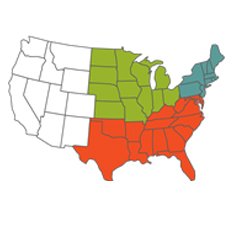 Gaining and Losing Shares
 Top 20 Cities
 Facebook
 Twitter
 Flickr
 YouTube