

When my daughter was three and out for a walk on an autumn day, she pointed at a spider’s web and explained what it was. “Daddy, it’s a website,” she said.
It was a visual way to describe a word she had heard but didn’t yet understand. And information graphics and visualisations give us a method to do the reverse: use images to describe a story in a way that we can understand. If children want to comprehend the world around them, infographics can do that.
There is a data revolution taking place across the globe right now. From journalism to government, the world’s stories are being told through numbers and facts. But while we treat this as something that only applies to adults, it belongs to everyone. And the younger it starts, the better.

This week sees the publication of a book that I have worked on with the father of infographic design Peter Grundy — Infographics: Human body. And in April the Animal Kingdom, produced with graphic designer Nichola Blechman comes out.
So, why produce a book of infographics for children? Data is a way of tackling vagueness, something children dislike intensely. Facts are black and white, right and wrong to the average six year old. They want certainty.
“A good picture is equivalent to a good deed” said Van Gogh and as long as we have been able to draw a line chart, designers have known that a picture can bring data to life. In 1801 William Playfair — who invented line charts and pie charts as a way to help people understand complex issues — published his Statistical Review and wrote of how important it is to make data interesting:
“Making an appeal to the eye when proportion and magnitude are concerned, is the best and readiest method of conveying a distinct idea.”
But he wanted to start them young too, by imprinting data “on the mind at a time when the memory is capable of being impressed in a lasting and durable manner, thereby laying the foundation for accurate and valuable knowledge.”

Peter Grundy has been explaining the world in infographics since the 1970s as one half of Grundy & Northedge. Human Body is his first work for children. “I’ve been trying different things for 30 years and the younger the easier,” he says. “We teach ourselves to see, my belief is that we are engaged by pictures long before we learn to read and by the time we get to school our visual language is very advanced. So I feel I can be most experimental with a younger audience.”
The data is a crucial part of the work he does — this is not decoration but storytelling. “With a lot of editorial design illustration is regarded as a decorative component. As an info designer/illustrator I regard the words and pictures as one, both delivering a stronger message together.”
Psychologists have known for a while that showing rather than just telling a child works. This study compared children who had been told something verbally to others who had only been shown an image. The children shown the pictures were more likely to retain that information and recall it later. “Without image, thinking is impossible,” said Aristotle. Pictures work.

Alberto Cairo writes about data visualization and teaches Information Graphics and Visualization at the School of Communication at the University of Miami. He points out that understanding infographics is not innate in us - it needs to be learnt.
“You need to be taught how to read a graph before you can understand it. The only reason we take bar charts and line graphs for granted is because they are so common and we have been taught how to read them,” he says. “An eye-opening experience for me was seeing that my kid was being introduced to bar and line charts at school and after that happened he started using those kinds of charts in his work.”
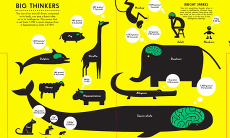
Animal Kingdom designer Nicholas Blechman says the reality of data is enticing and in contrast to the diet of fantasy that children face in their entertainment every day. “So many children’s books fictionalize the world through wildly creative and inventive story telling. There is something refreshing about a book that deals with hard facts,” he says. “So much of the information is bizarre, you almost couldn’t make it up (for example, Koala bears feeding poop to their young). Knowledge is power, and kids love the certainty that comes with knowing the fastest animal, or the animal with the largest brain.”
It’s not about dumbing down or aiming charts just at children. Designer Nigel Holmes is author of the Lonely Planet book of everything, a visual guide to traveling the world. He says that a major factor is perhaps the most-retro aspect of a book: the paper it’s printed on.
Books speak to children by “presenting them in a book (or on paper) rather than via digital media. There are too many distractions on i-devices. This doesn’t mean the books should be like homework.”
He pinpoints Otto Neurath and Gerd Arntz’s Isotype system (rows of beautifully drawn little icons representing quantities of anything: money, motorbikes, corn, guns, women, men, children). “It is a terrific, friendly way to show both what the numbers are, and what the numbers are about. They can see what the subject is before they ‘read’ the chart”
Holmes’ tips for designing visuals for kids are to do it:
By not talking down to children, just writing clearly, and by making the writing conversational (hence “talk”). By using humor. I find children understand, and love, jokes and wordplay. Many children’s book editors don’t believe this. My experience shows they are wrong.
• Simon Rogers is a currently data editor at Twitter. He launched the Guardian Datablog in 2009 and is author of the data journalism book ‘Facts are Sacred’.
More open data
Data journalism and data visualisations from the Guardian
Development and aid data
• Search the world’s global development data with our gateway
Can you do more with this data?
• Contact us at data@theguardian.com
• Follow us on Twitter
• Like us on Facebook


