02 September 2014
Blog Break
25 August 2014
Science Advice Summit

This week I'll be focusing on issues of science advice to governments, as I attend the "Science Advice to Governments" conference in Auckland, New Zealand. It is being characterized as a science advice "summit." I'll be participating on a panel focused on "Science advice in the context of opposing political / ideological positions" along with the chief scientific advisor to the Australian government, Ian Chubb, and the chief scientific advisor to Defra, Ian Boyd, among others.
The conference is being convened by ICSU and hosted by Sir Peter Gluckman, chief science advisor to the New Zealand government. Not long ago James Wilsdon previewed the conference:
The summit will take place in a year when we've seen important debates in scientific advisory systems worldwide. In the UK, Sir Mark Walport is about to mark his first year as Government Chief Scientific Adviser, during which he has had to tread a careful path through controversies over bees, badgers, fracking and flooding. In Brussels, Anne Glover, Chief Scientific Adviser to the President of the European Commission, has been working tirelessly to persuade more EU member states to appoint national scientific advisers, with a view to establishing an EU-wide network. In Japan, three years on from the Great East Japan earthquake and nuclear meltdown at Fukushima, arguments continue about how to reform structures for scientific advice and risk management. And at the United Nations, a new Scientific Advisory Board, hosted by UNESCO, held its inaugural meeting at the end of January 2014.The conference will likely have a large online presence. I'll blog and tweet (@rogerpielkejr) as I can and the conference itself has a Twitter handle -- @globalsciadvice.
All of this suggests that the Auckland meeting couldn't be happening at a better time. Sir Mark Walport, Anne Glover, and their equivalents from India, Malaysia, Japan, Germany, Australia and the Philippines, will be among those attending. Scientific advisers, policymakers, academics – and anyone with an interest in these debates – is invited to register, or to follow developments online.
24 August 2014
Normalized US Earthquake Damage

With news of a 6.0 magnitude earthquake today in San Francisco, I thought I'd provide a perspective on historical damage, The data in the table below are estimates of normalized damage for the top
There are a lot of uncertainties in earthquake normalization methods, and those interested in digging deeper should have a look at our paper for the gory details. The top event is the 1906 San Francisco earthquake, which reminds us that while big earthquakes are rare, they can do lots of damage. For perspective, a repeat of the 1906 San Francisco earthquake could cause more than twice the damage caused by all US tornadoes since 1950.
| Rank | Date | Normalized 2014 Damage | Deaths | Magnitude | Location |
| 1 | 18-Apr-06 | $345,207,435,386 | 2000 | 8.3 | San Francisco |
| 2 | 28-Mar-64 | $38,910,888,527 | 131 | 8.4 | Anchorage, Alaska |
| 3 | 18-Oct-89 | $37,521,623,532 | 62 | 7.1 | California, Loma Prieta |
| 4 | 17-Jan-94 | $37,046,374,369 | 60 | 6.6 | Los Angeles |
| 5 | 11-Mar-33 | $19,340,807,766 | 100 | 6.3 | California, Long Beach |
| 6 | 13-Apr-49 | $11,078,046,116 | 8 | 7.0 | Olympia, Washington |
| 7 | 18-May-80 | $9,495,474,795 | 31 | 5.2 | Washington, Mt St. Helens |
| 8 | 9-Feb-71 | $9,197,179,695 | 65 | 6.5 | California, San Fernando |
| 9 | 28-Feb-01 | $6,024,383,136 | 0 | 6.8 | Washingotn, Olympia |
| 10 | 11-Oct-18 | $5,670,099,871 | 116 | 7.5 | Puerto Rico |
| 11 | 19-May-40 | $5,036,397,660 | 9 | 6.5 | Imperial Valley (California) |
| 12 | 21-Jul-52 | $4,116,494,364 | 13 | 7.7 | Central Calfornia |
| 13 | 19-Oct-35 | $3,989,310,216 | 2 | 6.2 | Montana |
| 14 | 29-Jun-25 | $3,729,835,249 | 13 | 6.3 | Santa Barbara (California) |
20 August 2014
New UK Flood Normalization

There are lots of interesting new studies emerging on trends in disasters and extreme events, and their possible relation to changes in climate, human-caused or otherwise. A new paper in the Hydrological Sciences Journal (Stevens et al. here in PDF) finds no evidence for an increase in UK flooding, once the data is normalized for exposure.
The authors conclude:
Consequences are the combined results of high river flows, pluvial flooding and coastal flooding, the numbers of people and property exposed to flooding and the effects of flood defence construction and floodplain management policies. The increase in the total number of reported flood events in the 20th century in the UK appears to be a function of the gradual increase in exposure due to urban expansion and population growth. However there is also greater capacity to report flood events. The number of reported ‘Class 3’ flooding events has remained static or decreased slightly over the 20th Century. This is despite the UK population almost doubling and the number of dwelling houses tripling over the same time period.As frequent readers here will appreciate, the best way to evaluate the fidelity of any normalization approach is to compare trends in the normalization with trends in the geophysical events. That checks out in this study.
There is no clear underlying trend in flood reports present in the UK flood data when it is normalised for exposure. Pielke Jr. and Landsea (1998) studied damage caused by hurricanes in the USA. They also found that normalising damage reports to take account of exposure removed the upward trend of losses over time and only left a large decade to decade variation in losses. The lack of a systematic trend in the normalised UK total flood count mirrors these findings. It is also in agreement with studies of trends in river flows (Robson 2002).
Add Stevens et al. 2014 to the large and growing academic literature indicating that increasing disaster losses cannot at present be attributed to human-caused climate change.
16 August 2014
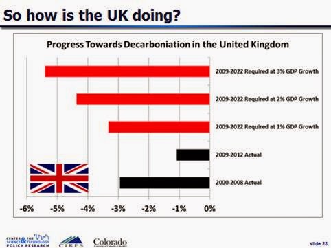
The Failure of the UK Climate Change Act
As a refresher, decarbonization refers to the rate of decline in carbon dioxide emissions to GDP. In order for the UK to hit the targets prescribed in the UK Climate Change Act for 2022, it will need to achieve consistently an annual rate of decarbonization of more than 3%, for any GDP growth rate greater than 1% per year. For more detail, and a full exploration of the quantitative implications of the UK Climate Change Act for decarbonization of the British economy, see my 2009 paper in ERL (open access).
With the UK GDP in 2014 at the same level as it was in 2008, it allows us to calculate a simple rate of decarbonization, as it will be exactly equal to the annual rate of emissions decline.
The 12 month (ending 2nd quarter 2008) carbon dioxide emissions for the UK for 2008 was 536.1 million metric tonnes (data here in XLS). The trailing 12 month (ending first quarter 2014) carbon dioxide emissions for the UK for 2014 was 507.9 million metric tonnes (data here in XLS).
These data imply a rate of decarbonization of -0.9% per year. This is far less than would be needed to hit the targets of the UK Climate Change Act. Last year I calculated an update of the UK decarbonization rate through 2012, which arrived at a similar result. That calculation is shown below.
It is also possible to express the magnitude of the challenge of meeting the targets of the UK Climate Change Act in more intuitive terms. The graph below shows how much carbon-free energy (not electricity) would need to be deployed by 2020 assuming constant demand to 2022.

In my 2009 paper, which was written upon passage of the UK Climate Change Act in 2008, I concluded:
The approach to emissions reduction embodied by the Climate Change Act is exactly backwards. It begins with setting a target and then only later do policy makers ask how that target might be achieved, with no consideration for whether the target implies realistic or feasible rates of decarbonization. The uncomfortable reality is that no one knows how fast a major economy can decarbonize. Both the 2022 interim and 2050 targets require rates of decarbonization far in excess of what has been observed in large economies at anytime in the past. Simply making progress to the targets requires steps of a magnitude that seem practically impossible, e.g., such as the need for the UK to achieve a carbon efficiency of its economy equal to that of France in 2006 in a time period considerably less than a decade.
Further, the focus on emissions rather than on decarbonization means that it would be very easy for policy makers to confuse emissions reductions resulting from an economic downturn with some sort of policy success (cf, McGee 2009). However, as implicit in the Kaya identity, a lower GDP does very little to change the role of energy technology in the economy. So during a downturn emissions may level off or even decrease as policy makers of course seek to preserve (and even accelerate) economic growth. Consequently, a more directly useful metric for policy success for efforts to stabilize carbon dioxide concentrations in the atmosphere is the decarbonization of the economy, represented in terms of carbon dioxide emissions per unit GDP.
A focus on decarbonization as the central goal of carbon policy rather than emissions reductions means that to achieve specific stabilization targets the rate of decarbonization of the UK economy must not only exceed the rate of economic growth, but it must exceed rates of decarbonization observed historically in the UK and in other developed countriesNote5. Because no one knows how fast a large economy can decarbonize, any policy (or policies) focused on decarbonization will have to proceed incrementally, with constant adjustment based on the proven ability to accelerate decarbonization (cf Anderson et al 2008). Setting targets and timetables for emissions reductions absent knowledge of the ability to decarbonize is thus just political fiction. . .
The failure of the UK Climate Change Act is yet to be broadly recognized, but when it is, it will provide an opportunity to recast carbon policies in a more effective manner.
Looking back from 2014, that analysis looks pretty good.
13 August 2014
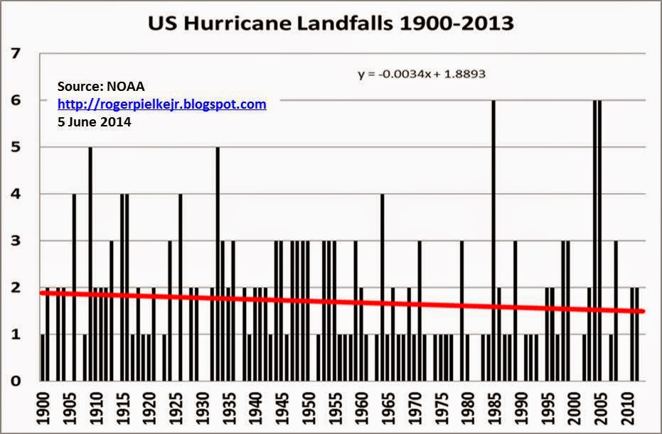
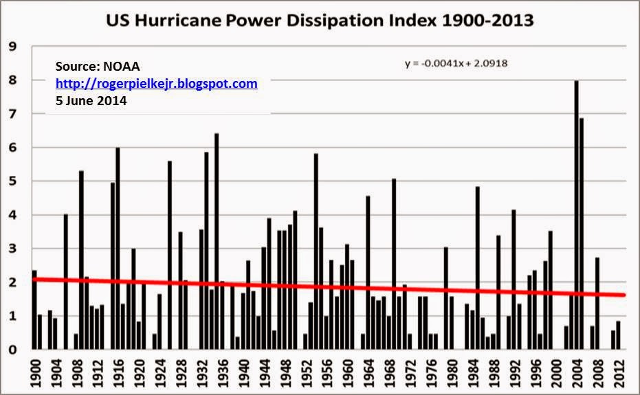
Normalized US Hurricane Losses 1900-2013

Pielke, Jr., R.A., J. Gratz, C.W. Landsea, D. Collins, M. Saunders, and R. Musulin (2008), Normalized Hurricane Damages in the United States: 1900-2005. Natural Hazards Review 9:29-42. And is updated to 2014 values by ICAT.How do we know if the normalization is any good? We compare it to trends in hurricane frequency and intensity, and when we do so we find no evidence for a residual bias in our methods. Specifically, US hurricanes have not become more frequent or intense, so there is simply no basis to expect an increase in normalized losses. Of course, this analysis has been replicated several times as well, using different methods and loss data.
Here is that data on trends in US hurricane landfall frequency and intensity:
29 July 2014
Costing Climate: It is all Relative

Based on a leading aggregate damage estimate in the climate economics literature, a delay that results in warming of 3° Celsius above preindustrial levels, instead of 2°, could increase economic damages by approximately 0.9 percent of global output.The report seeks to place 0.9% of output into context by presenting it in terms of the US economy in 2014:
To put this percentage in perspective, 0.9 percent of estimated 2014 U.S. Gross Domestic Product (GDP) is approximately $150 billion.The New York Times, mistakenly, assumes from this that the future impacts of climate change will be $150 billion:
Failing to adequately reduce the carbon pollution that contributes to climate change could cost the United States economy $150 billion a year, according to an analysis by the White House Council of Economic Advisers released on Tuesday.
To be fair, the $150 billion as cost of climate change was repeated by many media outlets. Does anyone read the report?
The actual impacts would be much larger, since the US (and global) economy will be larger in the future. But the White House, nor the media, mention this. Here is why.
Let's assume that the US economy grows at 2% per year to 2100 (both 2% and 2100 are round numbers, feel free to pick others if you like them better). That means that the US GDP will be $82.4 trillion in 2100. From that perspective, the cost of climate change will be an astounding $741 billion!
But that is not right either, as the cost reported by the White House was the marginal cost of going from a global temperature increase of 2 degrees Celsius to 3 degrees. According to Nordhaus (Figure 22 in the Climate Casino), the total damage cost of a 3 degree C increase is more like 3.2% of GDP. That equates to a cost of climate change of $2,635 billion! Now we are talking.
So why isn't that huge number presented?
Well, informing people that US GDP in 2100 will increase from $15 trillion today to only $79.7 trillion in 2100, rather than $82.4 trillion, due to the effects of a 3 degree C climate change doesn't sound so scary. This is why William Nordhaus wrote of these estimates in The Climate Casino:
The first surprise is that, for the range of changes that have been calculated, the estimated impacts of climate change are relatively small.Postscript: For any trouble makers looking to misrepresent my views, I presented a more in depth analysis along these lines before the House Science Committee in 2007 (here in PDF). In that testimony I concluded:
Mitigation provides benefits under all scenarios discussed here, and almost all scenarios presented by the IPCC. According to the IPCC these benefits increase as the time horizon extends further into the future... nothing in this testimony should be interpreted as being opposed to or contrary to the mitigation of greenhouse gases. To the contrary, under all scenarios discussed here the benefits of mitigation exceed its costs. Mitigation is good policy, and many decision makers are now coming to understand that it is good politics, as well.
28 July 2014
My Interview on Departing FiveThirtyEight

25 July 2014
Sack the Science Advisor

That is the advice that Greenpeace and other NGOs are giving to European Commission president-elect Jean-Claude Junker. If it sounds a bit like something out of the Richard Nixon playbook, well, it is.
I defend the EU science advisor and the broader structure over at the Guardian. Read it here.
For a deeper dive into science advice in government, see this volume by James Wilsdon and Rob Doubleday. My chapter in that volume on the role of the science advisor can also be found here in PDF.
22 July 2014
A New Paper on Disaster Losses and Climate Change
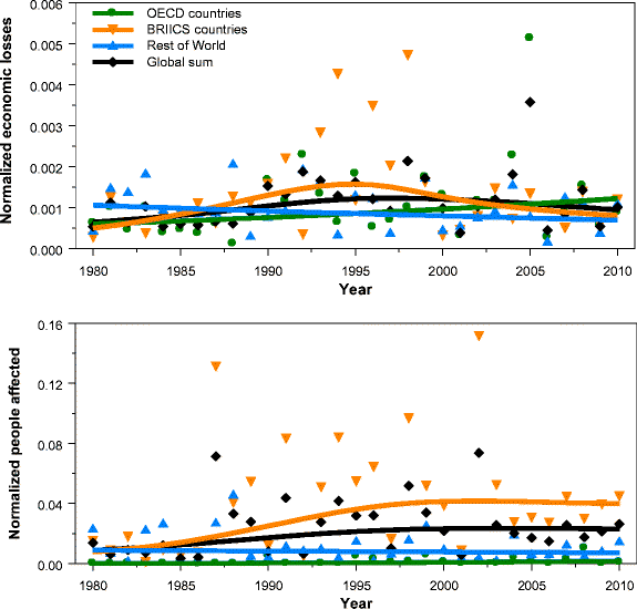
They conclude:
The absence of trends in normalized disaster burden indicators appears to be largely consistent with the absence of trends in extreme weather events. This conclusion is more qualitative for the number of people killed. As a consequence, vulnerability is also largely stable over the period of analysis.The top line conclusion here is not surprising, though it is interesting because it uses independent methods on largely independent data. It is consistent with previous data and analyses (e.g., Bouwer 2011, Neumayer and Bartel 2011, Mohleji and Pielke 2014) as well as with the conclusions of the recent IPCC assessments (SREX and AR5).
What is perhaps most interesting about this new paper is their discussion of vulnerability. Some have argued that our methodological inability to fully account for possible changes in vulnerability to losses over time may mask a climate change signal in the data. (It's gotta be there somewhere!) This line of argument has always been suspect, because there are not relevant trends in phenomena such as floods and hurricanes which would lead to an expectation of increasing normalized losses.
Visser et al. take this issue on and offer several explanations as to why vulnerability does not mask any hidden signals:
Firstly, global disaster management initiatives have only recently been put in place. The Hyogo Framework for Action (HFA) was adopted by 168 Member States of the United Nations in 2005 to take action to reduce vulnerabilities and risks to disasters (UNISDR, 2011). Although these highly important efforts will certainly pay off in the near future, it is unclear whether they are reflected in the sample period chosen for this study. Similar conclusions are drawn in IPCC (2014). . .In short, those who claim that a signal of human caused-climate change is somehow hidden in the disaster loss record are engaging in a bit of unjustified wishful thinking. The data and evidence says otherwise.
Secondly, it is unclear to what extent adaptation measures work in practice. Heffernan (2012) argues that many countries, and even the richest, are ill-prepared for weather extremes. As an example, he names Hurricane Sandy, which wreaked a loss of 50 billion USD along the northeast coast of the US in 2012. As for early warning systems, Heffernan states that not all systems are functioning well. For example, in 2000, Mozambique was hit by a flood worse than any in its history, and the event was not at all anticipated. Warnings of above-average rainfall came too late and failed to convey the magnitude of the coming flood.
Thirdly, a positive trend in vulnerability may be offset by the increasing number of people moving from rural to urban environments, often situated in at-risk areas (UN 2012). Since many large cities lie along coastlines, these movements will make people more vulnerable to land-falling hurricanes (Pielke et al. 2008), coastal flooding and heatwaves (due the urban heat island effect). With regard to economic losses, Hallegatte (2011) argues that these migration movements may have caused disaster losses to grow faster than wealth.
Fourthly, it is unclear how political tensions and violent conflicts have evolved over large regional scales since 1980. On the one hand, Theisen et al. (2013) show that the number of armed conflicts and the number of battle deaths have decreased slightly at the global scale since 1980. On the other hand, these methods are rather crude as far as covering all aspects of political tensions are concerned (Leaning and Guha-Sapir et al. 2013).
We conclude that quantitative information on time-varying vulnerability patterns is lacking. More qualitatively, we judge that a stable vulnerability V t, as derived in this study, is not in contrast with estimates in the literature.
The bottom line? Once again, we see further reinforcement for the conclusion that there is no detectable evidence of a role for human-caused climate change in increasing disaster losses. In plain English: Disaster losses have been increasing, but it is not due to climate change.
Subscribe to:
Posts (Atom)