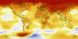
Five-Year Average Global Temperature Anomalies from 1880 to 2008 for Science on a Sphere
|
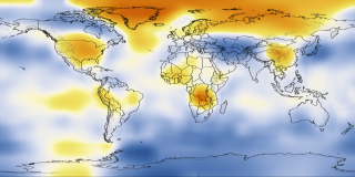
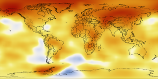
Each year, scientists at NASA Goddard Institute for Space Studies analyze global temperature data. A rapid warming trend has occurred over the past 30 years. Calendar year 2008 was the coolest year since 2000, according to the Goddard Institute for Space Studies analysis of surface air temperature measurements. In this analysis, 2008 is the ninth warmest year in the period of instrumental measurements, which extends back to 1880. 2005 is the hottest year on record, and 2007 is tied with 1998 for second place. The Earth is experiencing the warmest level of the current interglacial period, or interval between ice ages, which has lasted nearly 12,000 years. This color-coded map displays a long term progression of changing global surface temperatures, from 1880 to 2008. Dark red indicates the greatest warming and dark blue indicates the greatest cooling.
|
|

|
|
This data visualization of five-year global temperature differences from 1880 to 2008 was designed to be shown on the Science On A Sphere. Dark blue areas show regions where the temperature was cooler then the average temperature. Red areas show regions where the temperature was warmer then the average. This particular image show the global average from 2004 to 2008.
Duration: 52.0 seconds
Available formats:
2048x1024
TIFF
2 MB
320x160
PNG
241 KB
160x80
PNG
64 KB
80x40
PNG
17 KB
2048x1024 (15 fps)
Frames
640x320 (15 fps)
MPEG-4
6 MB
512x288 (30 fps)
MPEG-1
4 MB
1280x720 (30 fps)
Frames
640x360 (30 fps)
MPEG-4
4 MB
1280x720 (30 fps)
MPEG-4
37 MB
1280x720 (30 fps)
Frames
How to play our movies
|
|

|
|
Colorbar - blue represents cooler then average regions and red represents warmer then average regions.
Available formats:
320 x 90
PNG
7 KB
|
|
|
|
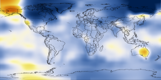
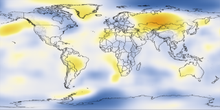
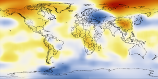
This image is a five year average from 1881 to 1885.
Available formats:
2048 x 1024
TIFF
1 MB
320 x 160
PNG
247 KB
|
|
|
|
This image is a five year average from 1891 to 1895.
Available formats:
2048 x 1024
TIFF
1 MB
320 x 160
PNG
250 KB
|
|

|
|
This image is a five year average from 1901 to 1905.
Available formats:
2048 x 1024
TIFF
2 MB
320 x 160
PNG
253 KB
|
|
|
|
This image is a five year global temperature average from 1911 to 1915.
Available formats:
2048 x 1024
TIFF
2 MB
320 x 160
PNG
248 KB
|
|

|
|
This image is a five year global temperature average from 1921 to 1925.
Available formats:
2048 x 1024
TIFF
2 MB
320 x 160
PNG
250 KB
|
|
|
|
This image is a five year global temperature average from 1931 to 1935.
Available formats:
2048 x 1024
TIFF
2 MB
320 x 160
PNG
250 KB
|
|

|
|
This image is a five year global temperature average from 1941 to 1945.
Available formats:
2048 x 1024
TIFF
2 MB
320 x 160
PNG
249 KB
|
|

|
|
This image is a five year global temperature average from 1941 to 1945.
Available formats:
2048 x 1024
TIFF
2 MB
320 x 160
PNG
246 KB
|
|
|
|
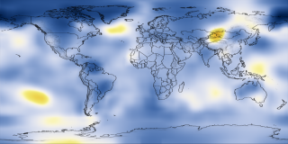
This image is a five year global temperature average from 1961 to 1965.
Available formats:
2048 x 1024
TIFF
2 MB
320 x 160
PNG
247 KB
|
|
|
|
This image is a five year global temperature average from 1971 to 1975.
Available formats:
2048 x 1024
TIFF
2 MB
320 x 160
PNG
250 KB
|
|

|
|
This image is a five year global temperature average from 1981 to 1985.
Available formats:
2048 x 1024
TIFF
2 MB
320 x 160
PNG
250 KB
|
|

|
|
This image is a five year global temperature average from 1991 to 1995.
Available formats:
2048 x 1024
TIFF
2 MB
320 x 160
PNG
252 KB
|
|
|
|
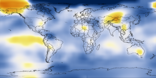
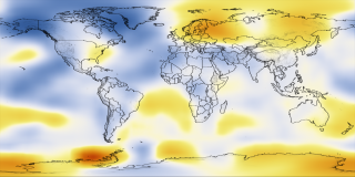
This image is a five year global temperature average from 2001 to 2005.
Available formats:
2048 x 1024
TIFF
2 MB
320 x 160
PNG
245 KB
|
|

|
|
This image is a five year global temperature average from 2002 to 2006.
Available formats:
2048 x 1024
TIFF
2 MB
320 x 160
PNG
243 KB
|
|

|
|
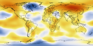
This image is a five year global temperature average from 2003 to 2007.
Available formats:
2048 x 1024
TIFF
2 MB
320 x 160
PNG
243 KB
|
|
|
Back to Top
|

