Speech users and low vision users click here for help on using this Web siteSkip to main content
 Historical Trends Description
National Cancer Institute State Cancer Profiles Centers for Disease Control and Prevention
Send to Printer  |  Close Window
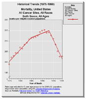
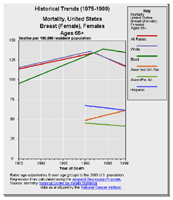
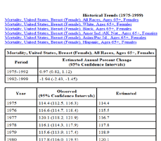
    Historical Trends Graph
Purpose: Use this graph to explore the relationship over time of levels and trends in cancer rates for geographic areas and for demographic subgroups. Potential health disparities can be explored to identify opportunities or to evaluate the success of prior interventions.

While useful for planning and evaluating cancer control, these trends represent an ecological analysis. An cancer epidemiologist knowledgeable about the area and its demographics and health resource utilization should assist in interpreting unexpected trends.

Cancer statistics require careful interpretation. See the information page about interpret rankings for insight into interpreting cancer statistics particularly if you are a new user of cancer statistics.

The Quick Reference Guide provides an introduction to the interactive features of this graph.

Data Sources:

  • Mortality data are provided by the National Vital Statistics System at the National Center for Health Statistics of the Centers for Disease Control and Prevention.
  • Incidence data are provided by the National Program of Cancer Registries Cancer Surveillance System (NPCR-CSS), Centers for Disease Control and Prevention and by the National Cancer Institute's Surveillance, Epidemiology, and End Results (SEER) Program.
  • Population counts for denominators in the calculation of rates and trends are provided to the National Cancer Institute by the U.S. Census Bureau and use the National Center for Health Statistics file needed to bridge from the Census 2000 multiple race coding to historical groupings of race and ethnicity.
  • Trends are determined by using Joinpoint analysis.
  • Rates are calculated using SEER*Stat.
  • Trends are determined by using Joinpoint analysis of available historical data and reporting the last segment as the most recent trend.
Picture of an Historical Trend graph showing one line of data with yearly points turned on Picture of an Historical Trend graph showing multiple lines of data with yearly points turned off Pictrure of the table version of an Historical Trends graph