Archive for December, 2006

Altostratus clouds

Tuesday, December 19th, 2006

About two years ago, a group of graduate students on the Cloud Protocol PI team and I took the on-line GLOBE cloud quiz. None of us did very well, in spite of years of experience looking at clouds, and in some cases, even doing research on them. We found we could do better when we started recognizing the pictures (for example, the picture with the red house in the foreground is altocumulus).

So three of us worked together to “clean up” the cloud quiz and post the revised version on the GLOBE Web site. We looked carefully through the cloud pictures used in the cloud quiz, and decided that many were impossible to identify. The pictures were blurry, or there was no foreground; so you had no idea of the scale. So, we took out the pictures we found hard to identify, and left only the best pictures in the cloud quiz. For further information on what we did, see the Chief Scientist’s Message: New Cloud Quiz.

The most-photographed clouds in the GLOBE collection were cumulus clouds and cumulonimbus clouds. Stratus clouds were relatively rare, as were altostratus clouds. Looking at other cloud collections on the Web (or on calendars), I saw a lot of cumulonimbus clouds as well. People simply don’t seem to be that interested in altostratus or stratus.

Why are there so few pictures of altostratus? The picture below is an example of altostratus I took in Calgary, Alberta, Canada, looking south. The first thing you notice is … almost nothing. Is it surprising few people would take a picture of this cloud? (unless of course they wanted to have an example of altostratus)

Altostratus cloud picture
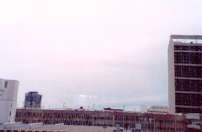
Altostratus, around noon, 5 June, 2006, looking south in Calgary, Alberta, Canada. Photograph by Peggy LeMone.

Look more closely. Near the horizon, you can see some cloud edges. And, if you look carefully, you can gradually see other features in the cloud. For example, in the lower middle part of the picture is a group of thin spots with more sunlight coming through.

Stratiform clouds — stratus, altostratus, and cirrostratus, are all fairly plain clouds, so you have to look for clues to see how high the clouds are.

Sometimes, tall buildings or mountains are hidden by stratus clouds. Sometimes the detailed features in the clouds — they aren’t perfectly flat — will make the clouds look nearby, and thus you identify them as stratus. Also, seen through stratus clouds that are thin enough, the sun or moon will look like a bright disc with sharp edges.

Cirrostratus clouds are in a flat layer that often looks fibrous, like a collection of fine, straight, hairs. Often, cirrostratus clouds form a halo or circle around the sun or moon. If you hold your arm out straight, your out-stretched hand should fit between the sun and its halo. (or the angle between an imaginary line from the sun to your eye, and the imaginary line from the halo to your eye, is 22 degrees).

Altostratus clouds don’t have a halo. If the altostratus layer is thin enough, the sun looks like a bright spot with fuzzy edges.

For more about clouds, visit the GLOBE on-line cloud module or take the cloud quiz at the Educator’s Corner (enter from the menu on the left side of the GLOBE home page). And don’t get discouraged if it’s still hard to identify some clouds! Clouds in pictures are harder to name than clouds in the sky. And sometimes clouds inthe sky are hard to identify, even for scientists. More about that next time.

GPS: Conclusion

Tuesday, December 12th, 2006

Based on these measurements, following the GLOBE GPS protocol and similar averaging procedures improves the precision of position and elevation estimates by about a factor of two. Biases (being too high or too low) are harder to identify, but the average elevation during my test appears to be high by about five meters, and the average elevation on a given day was off by up to 10 meters. Being off by elevation by ten meters will lead to about a one millibar bias when station pressure is converted to sea level pressure. Being off by 10 meters horizontally could put you in the wrong Landsat pixel Hence the extra work in the GLOBE protocol seems justified for these purposes.

Exact location becomes less important for many things, so one GPS reading would be enough. A few months ago, GLOBE and the National Optical Astronomy Observatory had a Web-based field campaign called GLOBE@Night to measure light pollution. This was done by looking for stars visible in the constellation Orion. The more stars you could see, the less light pollution there was. In this case, the observers didn’t need as precise GPS readings, because light pollution wouldn’t change much in 10 meters. Similarly, clouds will look similar to two observers 100 meters apart. I always take GPS measurements as carefully as I can, however — because sometimes I need better accuracy than I originally thought. In fact GLOBE@Night asks you to record all the decimal places for latitude and longitude on your GPS unit.

Let’s go back to my earlier question, “Why were we able to use GPS elevation to determine how a rock formation sloped horizontally?” Look again at the elevation plot (below). On a given day, it looks like individual elevations could be off (relative to the line) by five meters, either due to GPS error, or due to our not being exactly at the top of the reddish-black rock layer. However, the elevation of the rock layer changed by over 30 meters in the kilometer over which we took measurements on 23 September. Also, we took about 20 measurements along that kilometer, which is in some sense like using four averages of five points. Similarly, the elevation change was about 20 meters over a kilometer along the line we walked on 24 September, and we took 15 measurements (3 sets of five). Finally, all of our measurements on both days were taken in about two hours. Over a longer period, we would expect the average to change, much as it does from day to day in the elevation graphs and table.

 GPS elevations along the sides of the canyon

Some hints in taking GPS measurements:

  1. Nearby terrain can block satellites and make GPS readings less accurate. That could be why there is more scatter for the Western Point elevation graph, which was closer to the mountains than the Eastern point graph.
  2. Your body also blocks the satellites. It’s best to hold it over your head or away from your body. If you are holding the GPS in front of you, it’s best to face the Equator, since the GPS satellite orbits keep them in the lower latitudes longer. During my tests, I think this might have also led to greater scatter at the Western Point, because I was holding the GPS unit waist-high and was facing north. At the Eastern Point, I faced east. (Of course the GPS was on the ground when we took the rock layer elevation measurements.)
  3. Averaging seems to improve precision and accuracy. However, the average on a given day can still be too high or too low.
  4. You should take measurements to five decimal places if they appear on your GPS unit. 37.35000 degrees North is five meters south of 37.35005 degrees North. If you follow a careful procedure to get 37.35005 degrees North, you don’t want to add error by missing the last decimal place!

Just for fun, why not take some GPS measurements at exactly the same location and see how they change from day to day?

More about GPS: Test for Elevation

Friday, December 8th, 2006

If you’ve used a GPS unit, you know that the elevation readings vary faster than latitude or longitude readings. Sometimes the elevation readings change rapidly. Thus, when I took my GPS readings, I wrote down the elevation, than I wrote down the latitude and longitude, and then checked the readings again. If anything changed, I used the average. Usually latitude and longitude did not change, but elevation always did. When I was walking around the oval circuit, I would watch how the elevation changed, and it seemed to go from high to low values and back again about once every three minutes or so.

Figure 5 shows the GPS elevation for the five periods, for the Western Point on the circuit, and for the Eastern Point on the circuit. Let’s look at the Eastern Point graph first. This graph is called a bar graph or histogram. The measurements for the different days are in different colors. The numbers along the bottom are the elevations in meters. Not all the elevation numbers are on the graph, but you can guess what the missing numbers should be. For example, halfway between 1643 and 1647 is 1645. The bars represent observations between the numbers at their edges — a range of two meters.

GPS positions for Eastern Point
Figure 5. Bar graph showing variation of observed elevations for (left) Western Point and (right) Eastern Point.For 1 November, there are five observations at the Eastern Point (blue). Each square stands for one observation:

  • One just above where “1645″ meters should be on the graph (meaning there is one measurement between 1644 and 1646 meters).
  • One at 1647 meters (one measurement between 1646 and 1648 meters).
  • Two at 1649 meters (that is, two measurements between 1648 and 1650 meters). Here the squares “run together”)
  • One at 1653 meters (one measurement between 1652 and 1654 meters).

So the elevations varied from as low as 1644 meters to as high as 1654 meters — up to 10 meters — on 1 November. We would need the actual numbers of course to know the range exactly.

It looks like the average Eastern Point elevation for 1 November is the lowest of the 5 days on the graph, since the blue squares are mostly above the lower numbers. Similarly, the brown squares are mostly above the highest numbers, so it looks like the average measured elevation is highest on 3 November in the afternoon. This is just what we see on the table below.

Date Western Point
Elev. (meters)
Eastern Point
Elev. (meters)
1 November 2006 a.m. 1651 1649
2 November 2006 a.m. 1652.5 1652.3
3 November 2006 a.m. 1651.3 1649.7
3 November 2006 p.m. 1656.5 1653.3
5 November 2006 GLOBE 1659.2 1650.7
AVERAGE 1654.1 1651.0

Now the Western Point. Again, it looks like the blue squares are mostly near the low numbers, which suggests that the average elevation is the lowest on 1 November. The table shows that the average elevation measurement on this day is the lowest of the five days — but not by much! 3 November a.m. (1649.7 or pink in the figure) is almost as low. The range of values at the Western Point on 1 November is between as low as 1644 meters and as high as 1648 meters — up to 14 meters! When is the highest elevation measured at the Western Point? In the table the highest elevation is measured on 5 November. Does this look right from the Figure?

The actual elevation of the Western Point, from a topographic map, is between 1646 and 1652 meters, so the average value in the table — 1654 meters — is a little too high. If we take 1649 meters as the true elevation, the highest single value, between 1662 and 1664 meters, from the figure, is up to 15 meters too high. The highest daily average in the Table, 1659 meters on 5 November, is 10 meters too high. The five-day average, 1654 meters, is only five meters too high. Thus averaging the observations on a given day give a better answer than the single points. And averaging measurements over more than one day makes the estimated elevation even better, but most people don’t have the time to do this!!

More about GPS: Test for Position

Tuesday, December 5th, 2006

Those of you who have taken GPS measurements to characterize your GLOBE observation site know that the “elevation” on the GPS unit often varies a great deal. That’s one of the reasons the GPS protocol requires that you take five measurements instead of just one.

In tracking the rock layer (see last blog), we didn’t stay in one place very long, and we averaged two hurried measurements at each location. So why were we so successful in tracking the rock layer? To find out more about the accuracy of the GPS elevation, I did an experiment, which I will now describe.

We live on the top of a mesa, inside an oval formed by the street and sidewalks. One trip (circuit) around the oval on the sidewalk is about 500 meters. I picked a point at the west end of the oval (the Western Point), where there was an oil stain just large enough for me to put both feet on). I picked a second point at the east end of the oval (the Eastern Point, where there was a distinctive set of cracks in the surface). Thus I could repeat measurements at exactly the same two points.

To do the rock layer observations, we walked and stopped only long enough to get the two GPS readings. So I decided I would do the same thing in the oval. The next three mornings, I got up early and walked around the oval six times. I stopped at the Eastern Point and the Western Point, just long enough to take two GPS readings of latitude, longitude, and elevation. On the third day, I took the same measurements in the afternoon. Two days after that, I stayed at the Eastern Point and took position measurements using the GLOBE protocol (except with six measurements instead of five, to have the same number as the other days). Then I went to the Western point to obtain six positions and elevations the same way.

How did I do with GPS position?

GPS positions for Eastern Point
Figure 4. GPS positions for Eastern Point. On the left, each point is plotted relative to the average on that day. On the right side is plotted the daily average positions relative to the overall average position (+ sign).The green figures show how the positions varied at the Eastern Point. The figure on the left shows how the positions scattered relative to the mean latitude and longitude. We converted the numbers to meters. (One degree latitude equals about 111 kilometers; for longitude you have to reduce this number to allow for the longitude lines getting closer together toward the Poles. For those of you who know trigonometry, this is done by multiplying 111 by the cosine of the latitude. Thus at 40 degrees North, one degree longitude is about 85 kilometers).

Notice that the positions on the last two days (white and yellow) changed by over 10 meters if you use only one point to define your position.

The second figure shows the average for each day at the Eastern Point. the “+” marks the average position for all the days. Three points — for two of the “morning” circuits (black triangles) and for the GLOBE averages (white triangle, upside down so that you can see the black triangle underneath), were close to the average position. The farthest point from the average is only about 3 meters away. This is about as good as I think I can do with my GPS unit.