Archive for the ‘Atmosphere’ Category

What Causes Hurricane Damage?

Wednesday, October 8th, 2008

Since we’ve had another bad hurricane season for the United States and the islands in the Caribbean, this topic seemed timely.

ike_vis1.jpg

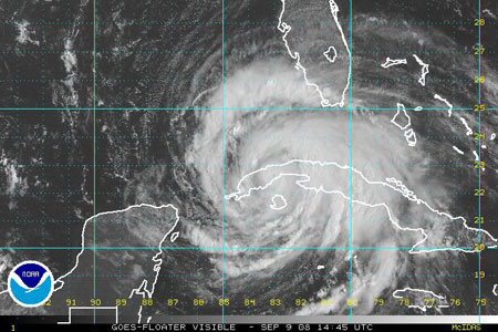
Figure 1. Hurricane Ike over Western Cuba 9 September 14:45 UTC as seen from space. Source http://www.ssd.noaa.gov/goes/flt/t4/vis-l.jpg. Ike later hit Galveston, Texas, and points northeast, causing widespread damage.

Tropical Cyclones in the United States are classified according to their wind speeds. For instance, a “Category 1″ (or Cat 1, for short) is a storm with sustained winds of 119-164 kilometers per hour (74-95 miles per hour). Yet a lot of the damage due to tropical cyclones is due to the heavy rain and storm surge as well.

What is a storm surge?

Put simply, the storm surge is the water that is blown onto the land by the wind. If you’ve watched the water level on the beach – even of a lake – you will see that the water reaches higher up the shore with onshore winds. I’ve seen this on Lake Michigan. You can make your own storm surge. Simply fill a shallow bowl or small cake pan with water, and blow across the surface of the water. The water on the opposite side of the dish becomes higher when you blow on it. (If you want to get fancy, you can even put a beach on the opposite side of the dish and see how hard you have to blow to cover it up with water. Maybe you can even get a friend to help.)

Storm surges are worse when the tides are high, because there is more water to work with. It’s like filling up your shallow bowl a little bit more.

Wind Damage.

The force due to wind increase as the square of the wind speed (wind speed times wind speed). So a 4 meter-per-second wind (8 miles per hour) will exert 16 times as much force on a tree, house, or you compared to a 1-meter-per-second wind. I’m told that the damage from a hurricane is a function of the “work” done by the wind – and that goes as the cube of the wind speed. In this case, a 4 meter-per-second wind will cause 64 times as much damage as a 1 meter-per-second wind. Again – this is just a rough estimate. The way the wind behaves – its steadiness or gustiness and its direction relative to a structure – will also affect damage patterns.

You can get a pretty good idea of the wind speed – at least for lighter winds – by watching the effects of wind on trees, smoke, and other things. Those of you interested in trying this should go to http://www.ncdc.noaa.gov/oa/climate/conversion//beaufortland.html to get a complete chart.

The force also increases with the density of the air. One thing I was curious about was whether the rainfall also helped to push you (or a building) over in stronger winds. It turns out that the extra force due to the rain is not very big. The largest rainfall rate I could find was 304.8 mm in 42 minutes (Locatelli and Hobbs, Weather and Forecasting, 2005), and that is equivalent to about 15.1 grams of water in a cubic meter of air. Since air has a mass of about 1.2 kilograms per cubic meter, the raindrops increase the density by around 1.2 per cent. Not much at all!

Of course rainfall may have other effects, like weakening some structures or changing the way they interact with the wind.

Water Damage

Rain also leads to flooding. Slow-moving tropical cyclones like Hurricane Fay, which recently hit Florida, can dump lots of water onto land, creating widespread flooding. Rainfall totals from Fay reached around 700 millimeters in a few days.

Tornado Damage

If you want to make a tornado, you need to have (1) “unstable” air – (This simply means that the temperature and humidity of the air make it easy for strong updrafts to develop.) and (2) wind change with height. Hurricanes have both. So, many hurricanes lead to tornado outbreaks. Fortunately, the tornadoes tend to be weaker than those associated with severe thunderstorms in the U.S.

For storms like hurricanes and tornadoes, it is important to know the rules for being safe. Also, keep close track of updates when severe weather threatens.

Climate-Change Misconceptions, Part II: Partial Misconceptions

Wednesday, September 24th, 2008

Understanding something as complicated as climate change is really tough. So it’s easy to understand why people don’t always get things right. But it’s much easier to explain why the term “global warming” is misleading than it is to explain why some climate-change messages are only partially understood. So I put the “partial misconceptions” in a separate blog.


Partial Misconception: The greenhouse warming is due to carbon dioxide
. Figure 4 shows that slightly over half of the warming near Earth’s surface is caused by carbon dioxide (CO2), with other gases – methane (CH4), Nitric oxide (N2O), halocarbons, and ozone in the lower atmosphere, accounting for the rest of the “forcing.” What is forcing? Forcing can be thought of as a “push” that warms (or cools) the Earth system.

The warming that results is actually larger then you might expect from an increase in these gases alone. This is because the warming surface and air leads to more water vapor, which is also a greenhouse gas. This leads us to the next partial misconception.

figure_4_ipcc_gaz_graph2.jpg

Figure 4. Effect of greenhouse gases and aerosols on surface air temperature warming, in terms of “forcings.” From 2007 report, Intergovernmental Panel on Climate Change.

Misconception: Carbon dioxide is the most important greenhouse gas. Certainly this is what you might expect from a first glance of Figure 4. But where is water vapor? I was taught as an Atmospheric Science graduate student that water vapor was the primary greenhouse gas, but carbon dioxide was also important. Modeling studies with various degrees of simplification confirm this first impression. A nice summary can be found on the RealClimate blog.

Why, then, do so many people say that carbon dioxide is the “most important greenhouse gas.” It’s probably because of figures like Figure 4. Note a very important adjective at the bottom which is often ignored, “anthropogenic,” meaning “made by humans.” Humans of course affect water vapor as well, but it cycles through very fast, and the amount of water vapor in the air is basically controlled by the temperature of the air and surface. In a climate model, water vapor continuously adjusts to the conditions within the model, while anthropogenic greenhouse gases in Figure 4 are adjusted by those who run the model.

Put another way, water vapor doesn’t appear in the “forcing” terms for climate models, because it is “internal” to the system. It changes as the result of a “feedback” within the model. Thus external inputs like solar radiation, changes in ground cover, and gases introduced into the atmosphere by human activity are counted as “forcing” but water vapor as not.

In short, we can say that carbon dioxide is the most important greenhouse gas whose amount people are directly altering. Not just in models, but in real life.

Partial Misconception: The warming climate means more exposure to dangerous diseases. I say “partial misconception” because there are multiple factors that change our exposure to disease. Many articles in scientific journals and newspapers discuss increased exposure to malaria, for example, in a warming climate. But that is not the whole story. For example, in the United States, malaria was a real threat over much of the country in the 1700s and the 1800s, and even into the early 20th century. However, public health efforts such as mosquito control and changes in peoples’ habits (for example, using window screens to keep out mosquitoes or staying indoors from dusk to dawn) have largely removed the malaria threat. Similarly, world travel spreads germs, such as the West Nile virus, around the world. This is not a new phenomenon. Europeans coming to the Americas brought small pox with them, leading to the tragic death of countless Native Americans. And populations moving into new areas can expose themselves to new germs.

However, we cannot ignore the fact that vectors for existing diseases will migrate with their preferred climate. Thus at some time in the future, some diseases will show up in areas where they haven’t been before; and in other areas where they have been suppressed.

Partial misconception: The warming climate means more birds will die. Again, there are many factors involved. There are stories of bird populations suffering because food supplies (for example caterpillars) are no longer available when the birds need them, because the two species are responding differently to climate change. However, songbird populations have also suffered because the scarcity of predators like wolves has led to an increase in the number of animals (like raccoons) who eat birds’ eggs. Similarly, pesticides have done serious harm to bird populations. This contributed to a ban on the use of the insecticide DDT in many countries. Finally, the West Nile virus has led to the deaths of many birds (although the magpies and crows, which fell victim to West Nile, seem to be recovering here in Boulder).

Once again, we cannot ignore the impact of climate change. If climate changes continue at the predicted rates, then the entire ecosystem will have to adjust to a new seasonal cycle. This will not be a smooth process: different plants and animals will respond in different ways. And, as in the case of the birds and caterpillars, the food supply will be interrupted at critical times.

Partial Misconception: If we cut back on our production of greenhouse gases, global warming will “go away.” This is true only over a very long period of time. It will take hundreds of years to decrease the carbon dioxide content back to pre-industrial levels through natural processes (the lifetime of carbon dioxide in the atmosphere is around 120 years). This does not mean we shouldn’t consider reducing carbon-dioxide emissions, because continuing the increase in carbon dioxide leads to even more warming than if we slow down the increase in carbon dioxide. One hopeful note is that not all greenhouse gases last as long as carbon dioxide, so reducing their release in the atmosphere might help on shorter time scales. Another hopeful note is that people are studying ways to take carbon dioxide out of the atmosphere, but this is the subject of another blog.

So, when you read or hear about the effects of people on the environment, or try to figure out what you can do to help the environment, please remember that we affect our environments in many ways. Similarly, actions we take to help our environment can improve our environment in many ways. But responding to climate change will remain a challenge for years to come.

Climate-Change Misconceptions

Tuesday, September 16th, 2008

As noted in previous blogs, many of us don’t understand the terms people use in describing climate change; nor do we always understand how ideas related to global climate change relate to everyday life. So I decided it would be useful to write about some of these common misconceptions or partial misconceptions. I’ll start with the misconceptions.

Misconception: The term “global warming” means the temperature is getting warmer everywhere. “Global warming” sounds to many (including me) like the temperature should be warming everywhere. If there is “global warming” shouldn’t it be getting warmer where I live? Or, if it’s not getting warmer where I live, how can “global warming” be happening!

If you look at the recent temperature records from several GLOBE schools, the temperature does seem to be warming gradually in some places. But other schools show a cooling trend. It is the same way with the stations used to monitor climate change. As noted in my July 2008 blog, the global average temperature change is often much less than the trends at local sites.

The term “global warming” really means that the yearly average of the temperature averaged over all the Earth’s surface is rising over time scales of several years.

Misconception: We just had a month that was the coldest on record. That means that the climate has started to cool again. When I stop thinking like a scientist, I also briefly think – or hope – that a cold month means that “global warming” will go away. But a record cold day or month doesn’t mean that the climate is getting cooler on the long term.

In a warming climate, there are still changes in both directions from day to day, month to month, and year to year. But there will be fewer record cold months. And there will be more periods of record high temperatures. For example, the city of Chicago in the Midwestern United States is having more heat waves, as illustrated by Figure 1 (taken from the blog, “Regional Climate Change, Part I: Iowa Dew Points and Chicago Heat Waves,” 22 March 2007).

figure_1chagnonetalheatwaves.JPG

Figure 1. Temperatures during Chicago, Illinois, USA heat waves. While the graph was made to show how the dew point has risen during the heat waves, the increase of the number of points (heat waves) with time shows that there are more heat waves than there used to be. Figure based on data from Changnon et al. (Climate Research, 2003).

Misconception: Earth’s temperature will steadily warm (as in “This year is warmer than last year, and next year will be warmer than this year.”). The globally-averaged yearly temperature record in Figure 2 has many dips and peaks. It is well-known that strong El Nino events, through spreading warm water across the tropical Pacific, will cause peaks in the record (There were strong El Ninos for example in 1982-3 and 1997-8). Similarly, volcanic eruptions can cool the surface temperatures globally for a year or two.

figure_2hadcrut3.JPG

Figure 2. Annual average temperatures, averaged over the Earth. Data from the UK Hadley Centre.

There will be even more extreme year-to-year changes locally. Some regions will have colder-than-normal periods due to persistent airflow from the Polar Regions. At the same time, there will have to be compensating airflow toward the poles in other regions, which will have warmer-than-normal periods. If you look at any local temperature record, such is the one in Figure 3; there are year-to-year changes that are faster than the overall warming trend. Even though there is a general upward trend in temperature as indicated by the straight line, the warmest year on record was 2000. On the other hand, 1998 was the warmest year in Figure 2.

figure_3_ttrend_jicin.JPG

Figure 3. Average annual temperature at the GLOBE School 4. Zakladi Skola in Jicin, Czech Republic. From 15 July 2008 blog.

Misconception: The “warming” scientists write about is not real. Many thermometers are showing warmer temperatures because their surroundings have changed over time, and this affects the global average You can find web sites showing weather stations next to buildings, air-conditioning heat exhausts, and so on. So this is certainly true for some sites. However, climate scientists try very hard to eliminate such sites from the climate record. There are literally thousands of weather stations in the United States today, and a similar density of sites exist in other parts of the developed world. These are used for many things, such as weather forecasting, keeping track of weather at airports or along roads or railroad tracks, or for education and outreach purposes by television stations or schools. But only a small fraction of these are used to document the global change in temperature. It is important to know that the temperature at any station is not taken at face value. Each measurement is checked carefully. For example, each station is compared to nearby stations to see if their temperatures are biased or just plain wrong.

At the GLOBE Learning Expedition, we saw a climate-monitoring station, on a rocky hill at the southern tip of Africa, away from any urban influence (11 August 2008 blog). And, only 30 per cent of the Earth’s surface is covered by land – the other 70% of the area is over the ocean. There, ships, buoys, and now satellites supply the needed measurements.

This does not mean that the warming recorded by sites that were once rural but are now surrounded by cities is not telling us something. Cities are warmer than the surrounding rural areas. They have more concrete and asphalt, which means that more of the incoming solar radiation is converted to heat rather than used in photosynthesis or evaporation. Also, factories, buildings, cars, and even people release energy that warms the environment. If you move from a rural area to a city, you will experience a warmer climate. However, this “urban heat island” has only a small effect on the global average because cities cover only a small fraction of Earth’s surface (See “Land Use: How Important for Climate, 11 June 2008).

Also, we need to remember that the famous surface-temperature curve shown in Figure 2 is not the only evidence that the climate is getting warmer. Satellite data also indicate warming at and near Earth’s surface, as does the shrinking of most glaciers and the smaller extent and thickness of Arctic sea ice (see, e.g., http://svs.gsfc.nasa.gov/goto?3464) . Furthermore, sea level is rising slowly, a result of more water in the ocean basins (from the melting of ice on land) and expansion (as the water gets warmer). And there is more water vapor in the atmosphere than there used to be, consistent with more evaporation (to be expected from water land and sea surface temperatures as well as warmer air).

Carbon Dioxide, Part 3: A Global Look

Thursday, August 28th, 2008

The amount of CO2 given off by industry in a year

Figure 1 is a diagram of the carbon cycle from the GLOBE Carbon Cycle Project, based at the University of New Hampshire. This diagram shows where the carbon is, and where it is going. So, for example, industry produces about 6 petagrams of carbon a year. What is a petagram? A petagram is written 1,000,000,000,000,000 grams, which can be written 1 times 10^15.

In order to compare the value of CO2 production for human respiration to the “flux” or exchange terms in the diagram (in red), we have to (a) convert it to a flux for carbon rather than CO2 and (b) compute a total for the entire world population for a year.

So, we take

0.9 kg per person per day, times
6,700,000,000 people in the world, times
365 days in a year (neglecting leap years), to get
220,000,000,000 or 2.2 x 10^11 kg or 2.2 x 10^14 grams, or

0.22 petagrams

To convert this to carbon, we multiply by 12/44, the fraction of CO2 that is carbon, to obtain 0.06 petagrams a year.

From Figure 1, that’s about 1% of most of the exchange terms, and about one-hundredth the carbon released by burning fossil fuels globally. And less than one-thousandth the amount of carbon uptake by plants.

What does this really mean? It was pointed out to me by Richard Wolfson, a professor of physics at Middlebury College [who wrote the book Energy, Environment, and Climate (W.W. Norton, 2008), cited a few blogs ago.], that we get our energy from plants, or animals that eat plants, or animals that eat animals that eat plants, so one could argue that we are “carbon-neutral” in the sense that we are part of the natural system, with the plants taking back the carbon we emit. Only in a sense, however – as Wolfson notes, our food production is not carbon-neutral: we produce carbon dioxide in growing the food and transporting the food, not to mention keeping it warm or cold, and, usually, cooking it.

figure1ccdiagramweb.jpg

Figure 1. The carbon cycle. The numbers in blue in represent the amount of carbon stored (e.g., 38,000 petagrams of Carbon in the ocean). The numbers in red represent “fluxes” – carbon flowing from one part of the earth system to another. Figure © GLOBE Carbon Cycle.

CO2 from Space

Figure 2 is a snapshot of the global distribution of CO2 at 8 kilometers (5 miles) above the surface. This is high enough so that there is a lot of mixing by the winds, but you can see a pattern anyway. And the pattern is associated with the sources and sinks of carbon in Figure 1.

figure2airs_co2_july2003_550×396.jpg

Figure 2. July 2003 average CO2 from the Atmospheric Infrared Sounder (AIRS) on the Aqua Satellite. From http://www-airs.jpl.nasa.gov/Products/CarbonDioxide/. Preliminary data.

For example, the higher values are associated with the industrial parts of the world. The high values in the north Atlantic are downstream from the United States and Canada. The lowest values are over the high-latitude oceans in the Southern Hemisphere and over Antarctica.

figure3co2_graph_steady_rise_300×230.jpg

Figure 3. CO2 from AIRS. From http://www-airs.jpl.nasa.gov/Products/CarbonDioxide. Preliminary data. The curve shows carbon dioxide decreasing in the Northern Hemisphere spring and summer, when vegetation is growing and leafing out, and increasing in fall and winter, when respiration dominates.

The “snapshot” in Figure 2 is from the Atmosphere Infrared Sounder (AIRS) on the NASA/Aqua satellite. These data can also be used to look at trends in the global average CO2. Like the well-known surface-based curve from Mauna Loa, there is an upward trend, and you can clearly see the effect of the seasons. If you compare this figure to the curves in the blog Land Use and CO2, posted 7 September 2007, you will find the curves quite similar, with CO2 decreasing during the Northern Hemisphere spring and summer. As noted there, this decrease in carbon dioxide is associated with photosynthesis. During photosynthesis the plants take carbon dioxide out of the atmosphere and use it to grow and leaf out. It is not surprising that photosynthesis is the largest term in Figure 1.

Carbon Dioxide, Part 2: Walk, Drive a Car, or Ride a Bike?

Thursday, August 21st, 2008

The blog about carbon dioxide (CO2) produced by our bodies during respiration created so much discussion that I decided to work harder to put the numbers into context.

Last time, we calculated an average adult human breathes out between 0.7 and 0.9 kg of carbon dioxide each day. This is based on lots of assumptions, with people of all ages and nationalities counted as processing 0.5 liters of air, 16 times an hour, for 24 hours.

Let’s compare this rough estimate to some other numbers.

The amount of carbon dioxide given off by an automobile in a mile (1.6 kilometers)

I’ve heard a number quoted for this one, but thought it would be good to estimate to find out how close I was, and then I will convert the number to metric units. We start from some facts.

  • Density of gasoline is 0.71-0.77 grams per cubic centimeter (that’s 0.71-0.77 kg per liter)
  • Gasoline is 85% carbon by mass

So there is approximately 0.74 times 0.85 = 0.63 kg carbon per liter.

This converts to 0.63 kg C x 3.79 liter/gallon or 2.39 kg C per gallon (C=Carbon).

If our car drives 20 miles on one gallon of gas (this is clearly not a very efficient car!), the car burns 2.39 kg per gallon x 1 gallon per 20 miles, or 0.12 kg of carbon per mile.

This is equivalent to 0.12 x 44 divided by 12 = 0.44 kg per mile, or 0.96 pounds (~1) pound of carbon dioxide per mile. Or, in metric units, 0.28 kg per kilometer.

And, driving this car for two miles (3.2 km) produces 0.88 kg carbon dioxide – as much as we produce by breathing all day! (What if the car could travel twice as far per gallon?)

Carbon dioxide released by going from Point A to Point B.

I’m going to suppose someone wants to travel two miles or 3.2 kilometers. That’s a distance many of us would be willing to walk (and about the distance between where I live and where I work).

That means:

If we walk three miles per hour, it would take us 40 minutes to reach Point B walking 3 miles an hour.

If we ride a bicycle at 8 miles (12.8 kilometers) per hour on average, it would take 15 minutes to get to Point B.
The Web is full of charts listing the number of Calories (kCal, abbreviated kCal) used in different types of exercise. I’ll select the following values. For a 155-pound (70 kg) person:

  • Walking at 3 miles per hour (4.8 km/hr) burns 250 kCal
  • Riding a bicycle at 8 miles per hour (12.8 kilometers per hour) burns 280 kCal

Which means the number kCal burned going from Point A to Point B is:

  • 167 kCal walking for 40 minutes compared to 56 kCal for 40 minutes at rest
  • 70 kCal riding a bicycle for 15 minutes compared to 21 kCal for 15 minutes at rest

The “at rest” numbers are based on the previous blog, where we used energy production to estimate carbon dioxide output. We assumed a human produced 2000 kCal of energy (equal to the amount eaten) and found that roughly equivalent to 0.7 kilograms of carbon dioxide a day. (0.9 kg a day could be used as well. We used 0.7 simply because that was the number associated with the 2000 kCal.

The carbon dioxide we produce by going two miles on foot or on a bicycle is then, if we count the total:

  • 0.7 kg CO2 per 2000 kCal times 167 kCal: 0.058 kg CO2 walking
  • 0.7 kg CO2 per 2000 kCal times 70 kCal: 0.025 kg CO2 biking

But the “extra cost” of traveling the distance should be the difference between the “exercising” number and the “at rest” number, namely:

  • 0.7 kg per 2000 kCal times (167-56) kCal = 0.039 kg of extra CO2 walking
  • 0.7 kg per 2000 kCal times (70-21) kCal = 0.017 kg of extra CO2 riding a bike

Thus: traveling the 2 miles (3.2 kilometers) produces this amount of CO2 above what was produced by respiration at rest:

Traveling 2 miles (3.2 kilometers)


By car: 0.88 kg CO2
Walking: 0.039 kg CO2
Riding a bike: 0.017 kg CO2

While the numbers aren’t exact, the large factor – 20 or more, is probably close. Walking or riding a bicycle does reduce the production of CO2 relative to driving. And – these modes of transportation provide healthful exercise as well! If we have to drive, putting more people in the car reduces the impact of driving. And, driving a car that uses half as much gasoline per unit distance would also help.