Archive for the ‘GLOBE Protocols’ Category

Relating Air Temperature to Surface Temperature

Tuesday, January 6th, 2009

As Dr. C wrote during his Surface Temperature Field Campaign, the weather in mid-December was cold in many parts of the United States. At our house here in Boulder, Colorado (Figure 1), this morning’s minimum temperature was -21 degrees Celsius. Just 20 kilometers east of here, the minimum temperatures was 27 degrees Celsius below zero, and about 50 km to the southeast of here, the minimum temperature reached -28 degrees Celsius. The weather reports were saying that those of us who live closer to the mountains weren’t having temperatures as cold as those to the east of us.

colorado.jpg

Figure 1. Map showing location of Boulder and CASES-99. The colors represent contours. The Rocky Mountains are yellow, orange, and red on this map. The colors denote elevation, with yellows, oranges and reds indicating higher terrain.

How does the air temperature relate to the surface temperatures that the students measured during Dr. C.’s field campaign? To answer this question, I looked at how the surface temperature related to the air temperature at our house.

The air temperature at our house was measured at 1-1.5 meters in our carport, and also on a thermometer I carried with me on our early-morning walk around the top of our mesa. That temperature, as noted above, was -21 degrees Celsius. To get the surface temperature, I put the thermometer I was carrying on the surface after I finished my walk. I am assuming that this temperature is close to the temperature that would be measured by a radiometer like the one used in GLOBE. I took the reading ten minutes later.

Just for fun, I also measured the temperature at the bottom of our snow (now 10 cm deep) and at the top of the last snow (about in the middle of the snow layer). At these two places, I put the snow back on top of the thermometer, waited ten minutes, and then uncovered the thermometer and read the temperature. The new snow was soft and fluffy, while the old snow was crusty; so it was easy to find the top of the old snow.

All of the measurements were taken close to sunrise, when the minimum temperature is normally reached, and the area where I took the measurements was in the shade.

Figure 2 shows the temperatures that I measured.

fig-2_snow_temp_boulder.jpg

Figure 2. Temperature measurements at the snow surface, between the old and new snow, at the base of the snow layer, and at 1-1.5 meters above the surface at 7:30 in the morning, local time.

That is, the temperature was coolest right at the top of the snow. The temperature was warmer at the top of the old snow, and warmest at the base of the snow. As noted in earlier blogs, the snow keeps the ground warm.

The temperature at the top of the snow was also cooler than the air temperature. The surface temperature is often cooler than the air temperature in the morning, especially on cold, clear, snowy mornings like this one. However, on hot, clear, days in the summertime, the ground is warmer than the air.

Here are two sets of measurements taken in the Midwestern United States in October of 1999. Could you guess which measurements were taken at night, and which measurements were taken during the day even if the times weren’t on the labels? The first plot is from data taken after sunset, while the second plot was from data taken at noon.

t9oct_2000lst.jpg

t11oct_1200lst.jpg

Figure 3. Data from the 1999 Cooperative Atmosphere Exchange Study (CASES-99) program in the central United States, courtesy of J. Sun, NCAR.

Chinook!

Tuesday, December 30th, 2008


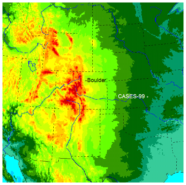
On 7 December, when I wrote the blog below, we were experiencing a warm wind called a “Chinook” here in Boulder, Colorado. I wanted to wait until after the surface temperature field campaign to post this. It seems appropriate to do so this morning (30 December), since we are again experiencing a Chinook, and this blog was designed to follow the second birding blog. Winds have gusted to over 100 kilometers per hour, and the temperature outside is 12 degrees Celsius – quite warm for an early morning in December! During a Chinook, the temperature warms rapidly. Chinooks are also called “snow eaters” because they can make winter snows disappear quickly. They can also make the temperature rise suddenly by tens of degrees.

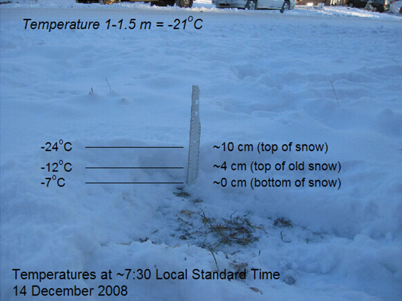
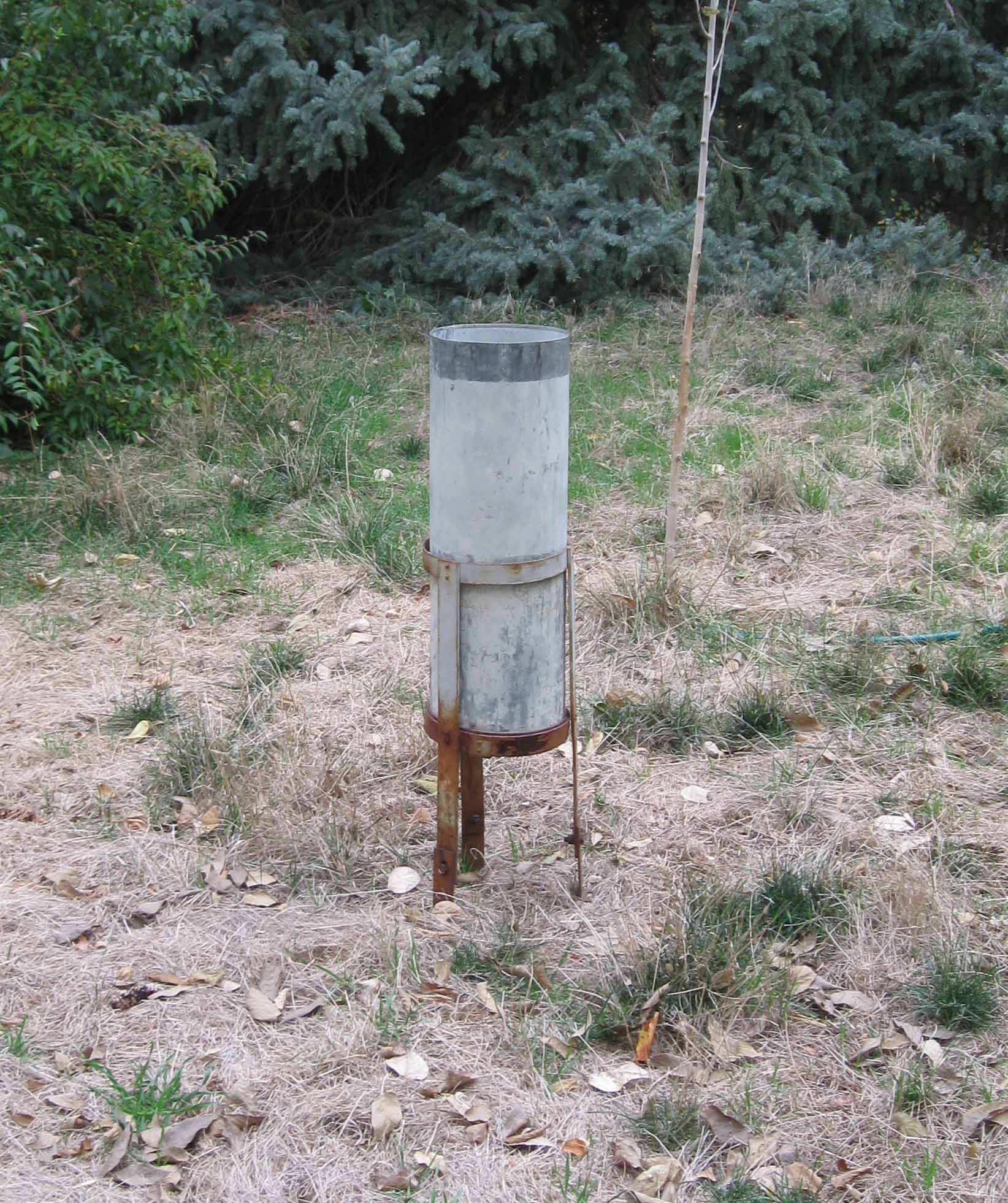
In my last blog on birding, I took a picture of a blind on Saturday, 6 December (Figure 1). Early that morning, the temperature was cold (about -5 degrees Celsius) and the ground had about 12 centimeters of snow on the ground. The lakes near the blind were frozen when we arrived there around 9:30 a.m. local time. The temperature was probably still below freezing when I took the picture. The next morning, we woke up to 10 degree Celsius temperatures, and the 12 centimeters of snow we had in our yard had entirely disappeared. When we returned to the blind to record the how different things looked, it was 11:30 a.m. local time – about 26 hours later.

figure-_1_icy_blind.JPG

Figure 1. Picture of blind taken for last blog. Sawhill Ponds, Boulder, Colorado, 10:00 a.m. Local time. The snow was about 10 centimeters deep here; the lakes were frozen.

figure_2_warm_blind.JPG

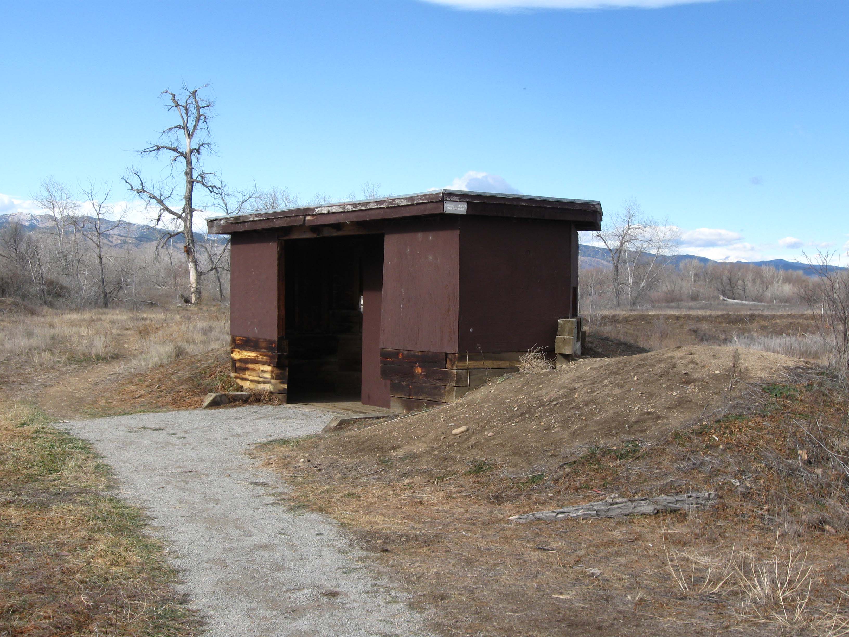
Figure 2. Picture of blind, roughly 26 hours later (11:30 Local Time, 7 December 2008). Note that not only has the snow disappeared, but the soil is dry in some places.

Basically the temperature didn’t fall much the night of 6 December – in fact it might have even warmed. This is because air is coming down from higher up in a Chinook. As air sinks in the atmosphere, it gets compressed (squashed) by having more air above it pressing down. This squashing warms the temperature – much as the temperature of the air in your bicycle tire warms when you pump (squeeze) more air into it. In sinking dry air, the temperature rises 10 degrees Celsius for each kilometer – quite a bit.

Figure 3 shows the temperature record for another Chinook (the instruments at NCAR Foothills Lab, which lies between where we live and Sawhill Ponds) weren’t working on 6-7 December, so I couldn’t get the data). The air is very dry during the Chinook. (The air is dry if the temperature is much higher than the dew point. Recall that fog or dew forms when the temperature and dew point are equal, so it makes sense that drier air has lower dew points). The dryness of the air is not surprising – the air is drier higher up. So the dryness is a sign that the air is coming from higher up.

figure_3_ttd10feb08.png

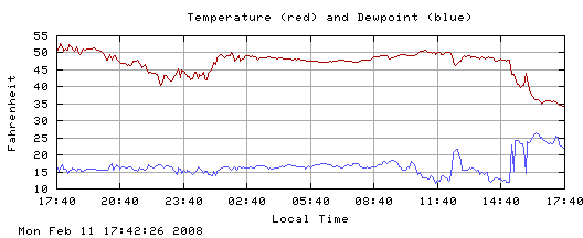
Figure 3. Temperature and dew point from a Chinook on 11 February 2008, at roof level. From NCAR Foothills Laboratory in Boulder, Colorado. You can tell from the cooler temperatures starting around 15:00 local time that the Chinook ended about that time. From http://www.rap.ucar.edu/weather/.

You notice how the temperature went up half way between 23:40 (11:40 p.m.) and 02:40 (2:40 a.m.) local time and then didn’t change much for the rest of the night like it normally does? Also the temperature wasn’t going up much the next morning. (Note: 50 degrees Fahrenheit is about 10 degrees Celsius). During this time the wind was out of the west – from the mountains, meaning sinking air (Figure 4). Also notice that the temperature cools off when the wind changes from west to north at around 15:00 local time (3:00 p.m.).

figure_4_dd10feb08.png

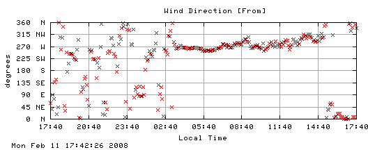
Figure 4. As in Figure 3, but for wind direction

The lack of a temperature change makes me think that the air in Boulder didn’t just simply slide down the mountain, but we were getting air from above the surface. Air high above the ground doesn’t cool or warm as much as air right next to the ground does.

So we have four clues that the air came from higher up during the Chinook. First, the temperature rose to abnormally high levels at the onset of the Chinook and rapidly cooled afterward. Second, the wind came from the mountains to the west. Third, the air was very dry. And finally, the temperature didn’t change during the day like it normally does. The last clue also suggests the air came from above the surface.

What do the clouds look like? In a Chinook, the wind blowing across the mountains flows in ripples much like the water flows over rocks in a stream. It’s harder to see air flow than to see the water flow. However, clouds occur when the air is at the top of ripples, if the air is moist enough. From the surface here in Boulder, we saw a long line of low clouds stretching along the mountains (one ripple), and higher cloud doing the same thing, but farther east (Figure 5).

figure_5_chinook_clouds.JPG

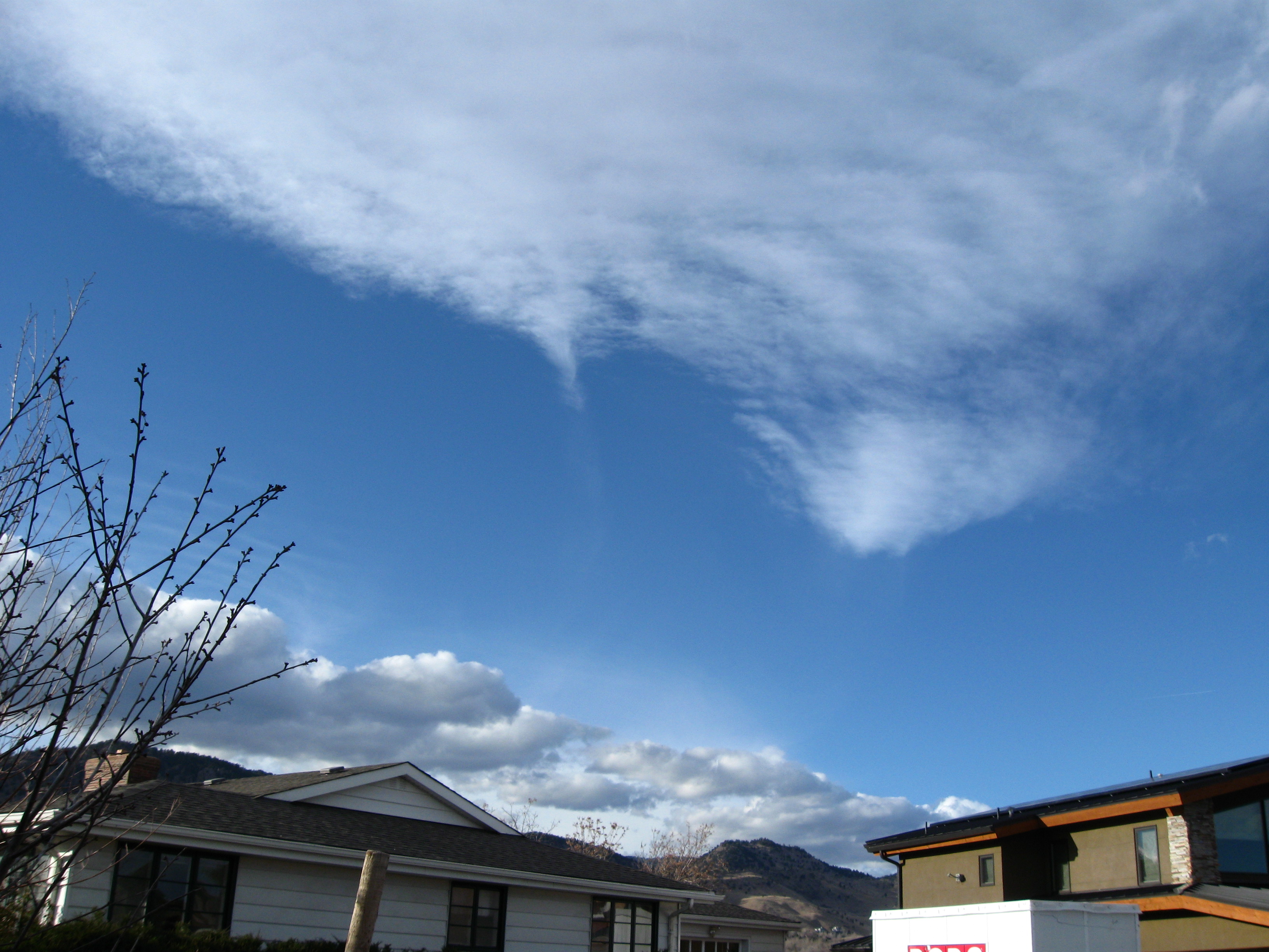
Figure 5. Clouds associated with the Chinook at 14:50 local time, looking northwest. The mountains are to the west. The cumulus clouds near the horizon are just to the east of the mountains, which are not visible on this picture. The higher clouds (altocumulus) are part of a broad north-south band starting east of the mountains. The little tail in the middle is the leftovers from a contrail. Looking eastward, I could see that the altocumulus clouds stretched to the horizon.

You can probably see this more clearly from space. First, I show you the visible image (Figure 6). You can see some ripples over the mountains, a dark area stretching from Boulder (plus sign) to the south, and the altocumulus (or higher) clouds extending east-south east from the dark area.

figure_6_vis.JPG

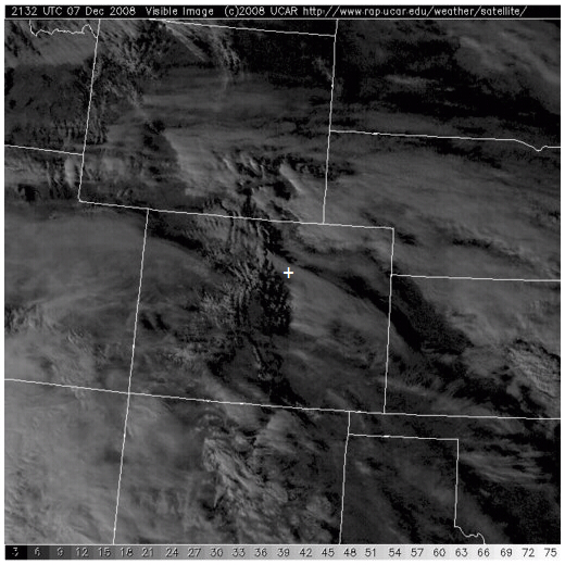
Figure 6. GOES satellite visible image of clouds at 2132 UTC (1432 Local Standard Time). The plus sign snows where Boulder is. Note the north-south clouds along the Rockies in the middle of Colorado (like ripples in the water). Then there is a broad band of clouds stretching eastward to the east side of Colorado. This is the larger-scale view of the altocumulus in Figure 5. From http://www.rap.ucar.edu/weather/satellite/.

We can see the difference in the heights of the “ripples” and the broad area of altocumulus clouds by looking at the image showing the infrared signal (Figure 7), which is related to the temperature the satellite “sees” – either at the surface or at the top of the clouds. Since the temperature in the atmosphere drops with height at these heights, this temperature can be used to estimate cloud top height. The brighter areas indicate higher cloud tops, so the broad band of clouds to the east of Boulder appear to be higher than the ripples, which are hard to see.

figure_7_ir.jpg

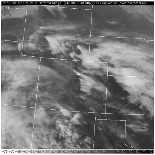
Figure 7. GOES satellite infrared image in and around Colorado at 2132 UTC (1432 local time). The plus sign shows where Boulder is. The broad bands of clouds are showing up much more than the ripples. Since lighter colors indicate higher clouds, this tells us that the broad area of clouds to the east is higher than the ripples – just as in the picture I took in Boulder. (But I’m not sure we can see the ripple in my picture on the satellite). From http://www.rap.ucar.edu/weather/satellite/.

What was the result of the Chinook? We already pointed out the much warmer temperatures, the complete melting of our snow (12 cm in our yard originally), and the melting of ice on many of the lakes.

This also affected the ducks in the lakes near the blind.

On 6 December, when we went out to photograph the blind, we could find no ducks on the frozen ponds – only Canada geese waddling on the ice. Also, there were almost no birds at the feeders in our back yard. We were surprised, because we thought they would be hungry in the cold weather.

On 7 December, when we got up, the feeders were full of birds. So were the trees: chickadees, pine siskins, sparrows, finches, juncos, and collared doves, were eating continuously, even when squirrels and cats (and in one case a deer with antlers) came by. Today, when we went back to Walden Ponds (north of the blind), we saw many ducks on the one pond that had thawed out most completely. And the ducks and geese were eating. My guess is that they were making up for yesterday. But – there is a mystery. Where were the ducks during the cold weather? What do you think?

Do you have names for winds where you live? Winds – particularly those that bring different weather – have names around the world. In Africa, the hot dry winds that come south from the Sahara are called Harmattans. In southern Europe, cold winds that come out of the mountains are called Boras and warm winds that come out of the mountains are called Foehns in Germany. However, we also use the word “foehn” to describe warm dry winds from the mountains in the United States. In South Africa, the warm winds coming from the mountains are called “berg winds,” since “berg” means mountain in Afrikaans. There is no snow to melt, but the berg winds do raise the temperature in winter.

Czajkowski’s Field Campaign — 9 Dec 2008

Tuesday, December 9th, 2008

This is the third installment from Dr. Czajkowski Last night, we had snow here in Colorado. In my front yard in Boulder, we had about 23 centimeters of snow. Three kilometers to the east, at Foothills Lab (close to the GLOBE offices), the “official” reading ws 17 centimeters — a six-centimeter difference of 3 kilometers. This difference is real — snowfall amounts are often greater closer to the mountains.

Hi All,

Things are continuing to go well with the surface temperature field campaign. As of December 8, 2008, there were 317 surface temperature observations from 31 schools were added to the GLOBE website.

Major Winter Storm in the United States

There is a major winter storm in the center of the United States this Tuesday, 9 December, 2008. This map is for 1:00 p.m. Eastern Standard Time which is 1800 UTC. This low pressure system with its associated warm front and cold front is producing a lot of rain, “wintry mix” (rain and snow, pink shades in figure 1), and some snow in the Midwest. You can also see that there is a cold high pressure system in Nevada and Idaho.

figure_1_crop.jpg

Figure1: Surface weather map 9 December 2008, The radar shows snow in the blue shades and the heaviest rain is shown in black. Figure from http://www.rap.ucar.edu/

There have been some pretty extensive snowfall in the United States this fall and early winter. But, you can see from the figures below that there was actually more extensive snowfall cover in 2007. By the weekend the weather pattern in the United States is going to change to have a storm in the western United States and warm weather in the eastern United States. This storm should give significant snow out west and to the Rocky Mountains. This will make the weather in the Great Lakes warmer.

figure_2_2008snowfall.jpg

Figure 2: Snow cover and depth from NOAA for 9 December, 2008 .

figure_3_.jpg

Figure 3: Snow Cover in the United States for 8 December 2007 from NOAA.

Here are schools that have entered data so far in the field campaign:

More and more schools are participating and getting their data on the GLOBE website. Keep up the good work.

Roswell Kent Middle School, Akron, OH, US [9 rows]
Dalton High School, Dalton, OH, US [8 rows]
Chartiers-Houston Jr./Sr. High School, Houston, PA, US [2 rows]
Lakewood Middle School, Hebron, OH, US
The Morton Arboretum Youth Education Dept., Lisle, IL, US
Peebles High School, Peebles, OH, US [25 rows]
Gimnazjum No 7 Jana III Sobieskiego, Rzeszow, PL [6 rows]
Penta Career Center, Perrysburg, OH, US [3 rows]
Canaan Middle School, Plain City, OH, US [2 rows]
Mill Creek Middle School, Comstock Park, MI, US [8 rows]
Brazil High, Brazil Village, TT [9 rows]
Kilingi-Nomme Gymnasium, Parnumaa, EE [10 rows]
Swift Creek Middle School, Tallahassee, FL, US [3 rows]
National Presbyterian School, Washington, DC, US
Maumee High School, Maumee, OH, US [5 rows]
Whittier Elementary School, Toledo, OH, US [2 rows]
Huntington High School, Huntington, WV, US [8 rows]
Warrensville Heights High School, Warrensville Heights, OH, US
Bellefontaine High School, Bellefontaine, OH, US [6 rows]
Oak Glen High School, New Cumberland, WV, US [12 rows]
Nordonia Middle School, Northfield, OH, US [4 rows]
Orrville High School, Orrville, OH, US
Bowling Green Christian Academy, Bowling Green, OH, US [6 rows]
McTigue Middle School, Toledo, OH, US [3 rows]
Highlands Elementary School, Naperville, IL, US [2 rows]
South Suburban Montessori School, Brecksville, OH, US [3 rows]
John Marshall High School, Glendale, WV, US [30 rows]
Birchwood School, Cleveland, OH, US [9 rows]
Hudsonville High School, Hudsonville, MI, US [7 rows]
The University of Toledo, Toledo, OH, US [4 rows]
Main Street School, Norwalk, OH, US [16 rows]

Stay Dry.
Dr. C

Measuring Rain

Tuesday, November 4th, 2008

For years, I have been measuring the rain in our back yard using a standard rain gauge similar to the ones used by the U.S. National Weather Service (Figure 1). Like the gauge used by GLOBE students, rain goes through a funnel into a tube whose horizontal cross-sectional area is one-tenth that of the outer gauge, so that the measured rain is ten times the actual amount of rainfall. This year, I took a GLOBE-approved plastic gauge home. We put this one on a fence along the east side of our yard (Figure 2).

figure_1metal_gauge.JPG

Figure 1. Rain gauge used for observations in my backyard. Normally, there is a funnel and small tube inside, but it doesn’t fit very well, so we pour the rain into the small tube after each rain event. This gauge is similar to those used by the U.S. National Weather Service. This gauge is about 25 cm in diameter.

figure_2plastic_gage.jpg

Figure 2. Plastic raingauge matching GLOBE specs. This gauge is about 12 cm in diameter. Note the tall tree in the background.

Neither gauge is in an ideal location. In both cases, there are nearby trees (Fig. 2, map) which might impact the measuring of the rain. This is a problem a lot of schools have: there is just no ideal place to put a rain gauge. We were particularly worried about the plastic gauge, which was closer to trees than the metal gauge.

Why do we have two gauges? The metal gauge was hard to use: its funnel didn’t fit easily into the gauge, so we had to pour the rain from the large gauge into the small tube after every rainfall event. We got the plastic gauge to replace the metal one. We put the gauge on the fence because it was well-secured. But the first six months we used the new gauge, the rainfall seemed too low compared to totals in other parts of Boulder. So, I put the metal gauge back outside and started comparing rainfall data.

figure_3backyard_map.jpg

Figure 3. Map of our backyard. Left to right (west to east), the yard is about 22 meters across. The brown rectangular shape is our house; the circles represent trees and bushes. The numbers denote the height of the trees and bushes. The 10-m tree is an evergreen; the remaining trees and bushes are deciduous. The southeast corner of the house is about 3 m high.

How did the gauges compare?

Starting this summer, I started taking data from both gauges. Unfortunately, it didn’t rain much. And sometimes, we were away from home: so this is not a complete record. But I don’t need a complete record to compare the rain gauges.

Table: Rain measurements from the two rain gauges

table.jpg

The results (in the table, also plotted in Figure 4) look pretty good. With the exception of the one “wild” point on 6 October 2008, the measurements are close to one another. We think that the plastic gauge was filled when the garden or lawn next door was watered. This would not be surprising: we have found rain in the plastic gauge when there was no rain at all.

I learned after writing this blog that Nolan Doeskin of CoCoRaHS (www.cocorahs.org) has compared these two types of gauges for 12 years, finding that the plastic gauge measures slightly more rain (1 cm out of 38 cm per year, or about 2.6%).

figure_4rain.jpg

Figure 4. Comparison of rainfall from the two rain gauges in our back yard. Points fall on the diagonal line for perfect agreement.

I learned two things from this exercise.

First, I probably should have used the two gauges before I stopped using the metal one. That way, my rainfall record wouldn’t be interrupted if the new gauge was totally wrong. (I was worried that the trees were keeping some rain from falling into the gauge. This would have led to the plastic gauge having less rainfall than the metal gauge. And, since the blockage by the trees would depend on wind direction and time of year, I wouldn’t have been able to simply add a correction to the readings.) Fortunately, the new and old gauges agreed.

In the same way, if you want to replace an old thermometer with a new one, it’s good to take measurements with both for awhile, preferably in the same shelter. Suppose the new thermometer gives higher temperatures than the old one. If you want to know the temperature trend, you can correct the temperatures for one of the two so that the readings are consistent.

The second thing I learned is that it is o.k. to reject data if there is a good reason (such as people watering their lawns). It’s also important to note things going wrong – like my spilling a little bit of water on 15 August. If you keep track of things going slightly wrong (or neighbors watering the lawn), you can often figure out why numbers don’t fit the pattern.

I will continue to compare records for awhile, to see whether the readings are close to one another on windy days. If they continue to be similar, I will be able to try a method to keep birds away from the rain gauge that was developed by a GLOBE teacher – Sister Shirley Boucher in Alabama. Keep posted!

Comparing Fahrenheit and Celsius Temperatures

Wednesday, October 22nd, 2008

I try to write this blog to inform, rather than to express opinion, but I have to admit that I love the metric system. Perhaps it’s because I still remember how hard it was to learn how to convert things from one set of units to another in the British system we still follow here in the United States. Ounces to pounds, feet to yards to rods, square feet to square yards to acres. And so on. While in the metric system, it’s often simply a question of multiplying or dividing by 10, 100, and so on.

So, when my children were little, I taught them to think in metric, at least for some units. I succeeded with centimeters and inches, but kilometers and miles were harder, and temperature was the hardest of all. So today I’m writing about temperature.

In using the two sets of units, it’s useful to have some mileposts (kilometer-posts?). For example:

  • 0 degrees Celsius (or 32 degrees Fahrenheit), the temperature at which water freezes

and

  • 100 degrees Celsius (or 212 degrees Fahrenheit), the temperature at which water boils at sea-level pressure (about 1013 millibars).

But there are some other “kilometer-posts:”

  • – 40 degrees Celsius, where Fahrenheit and Celsius degrees are the same

And human body temperature:

  • 37 degrees Celsius or around 98.6 degrees Fahrenheit.

And “comfortable” room temperature:

  • 20 degrees Celsius or 68 degrees Fahrenheit

And, my favorite one:

  • 10 degrees Celsius (or 50 degrees Fahrenheit), above which insects become active.

Since this my favorite milepost and this might not be familiar to you, I’ll fill you in on some details.

When I did my cricket blog, I couldn’t get any data points below about 10 degrees Celsius, because the crickets weren’t chirping. You can see this from the graph in Figure 1. Well, that’s not quite true. The thermometer temperature showed below 10 degrees Celsius when I heard crickets once, but the cricket was “reporting” a temperature above 10 degrees Celsius with his chirps. Not really surprising — the temperature varies a lot from place to place at night, when you hear crickets chirp. In fact, before dawn on 6 October 2008 I heard a cricket when the thermometer temperature measured 46 degrees Fahrenheit (~8 degrees Celsius), but I didn’t count the chirps.

figure_1_fvsc.JPG

Figure 1. Using Crickets to estimate temperature. Notice the lack of data for temperature below 10 degrees Celsius. From cricket blog at http://www.globe.gov.

I knew about this temperature cut-off before observing crickets, from radar meteorologists. They see strong “clear-air” echoes when insects are flying. Figure 2 shows an example of insect echoes from a downward-looking radar used for research. The radar was mounted on a King-Air aircraft operated by the University of Wyoming. The data were collected while flying along a north-south track. So this is a north-south “picture” of insect plumes. It was 29 May 2002, and the air was quite warm — with temperatures well above 10 degrees Celsius.

figure_2may29_bright_band_smooth_v2.gif

Figure 2. Wyoming Cloud Radar image of “insect plumes” rising from the ground. 29 May 2002, on a north-south track over the Oklahoma panhandle (about 106 degrees West longitude). AGL means “above ground level.” Figure from Dr. Bart Geerts at the University of Wyoming.

Dr. Bart Geerts and his then graduate student Dr. Qun Miao found that the air was moving upward in the red and orange insect plumes, and that the air was moving down between them. They could see this because there were instruments on the King Air measuring the up-and-down air movement. I could feel the motion while I was on the plane: the airplane would get carried up when we crossed the “red” areas, and down in between. It was very “bumpy” where there were a lot of insect plumes.

You might think that the insects should be everywhere — after all, wouldn’t the insects be carried up by the upward-moving air and then back downward by the air between? Geerts and Miao found that the insects fly down in the updrafts, working hard to stay near the ground. This keeps the insects mainly in the rising air. Geerts and Miao even found that they could “measure” the updrafts and downdrafts by the radar alone by subtracting out the insect speed.

Here is another example of insect echoes, taken from weather radar in the southeast United States. The west-northwest to east-southeast-oriented light and darker blue patches are probably the “clear-air” (insect) echoes or small clouds; the yellows and reds are probably small rain showers.

fig_3_fvc_20081007_173406_black.png

Figure 3. Fair-weather echoes over southeast Georgia and Northern Florida in the SW United States.

Let’s summarize all these data in a table and a plot. First, the data. Plot this yourself, and see if you can think of any more “mileposts.” Or do some research to find some interesting temperatures, like the record high or record low temperature where you live. Or look at the FLEXE web site to see how hot it is near hydrothermal vents at the bottom of the ocean. You can use the graph to convert to the other units, or use the formula to convert back and forth (at the end of this blog).

Temperatures in Celsius and Fahrenheit

Degrees
Fahrenheit
Degrees
Celsius
Comments
-40.0 -40.0 Temperatures the same
32.0 0.0 Freezing point of water
50.0 10.0 Insects become active
68.0 20.0 Room temperature
98.6 37.0 Healthy human temperature measured by mouth
212.0 100.0 Boiling temperature for water at sea level pressure

figure-4_fvc.JPG

Figure 4. “Milestone” temperatures, in Fahrenheit and Celsius.

Methods of converting

You can use the table to make sure you are doing it right.

To convert Fahrenheit to Celsius:

Subtract 32 (notice you are subtracting Fahrenheit from Fahrenheit)
Then multiply by 5/9.

Or, if you prefer a formula, C = (F-32) x 5/9, where F is the Fahrenheit temperature and C is the Celsius temperature.

To convert Celsius to Fahrenheit:

Multiply by 1.8
Add 32
Or, in a formula: F = 1.8C + 32