SURFS UP! Ocean scientists are stoked! It's Jason-1, dude!
For the past 10 years, oceanographers from all over the world have been riding
wave after wave of amazing sea surface height (SSH) data. Orbiting from 1336 kilometers
(830 miles) in space, the NASA/CNES TOPEX/Poseidon spacecraft keeps cranking out never
before seen views of our Ocean Planet. At the same time, the National Oceanic and
Atmospheric Administration's (NOAA) Polar Orbiting Satellites have been measuring
the sea surface temperature (SST) of all our oceans. These images and animations complement
each other in many, many ways ... for scientists, their sum is much more than each
individually.
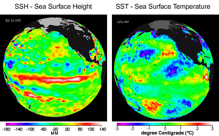
The temperature data show us the warmer and cooler than normal sea-surface temperatures
that influence our atmosphere every day, while sea-surface heights are a measure of how
much heat is stored in the ocean below. The differences between what we see and what is
normal are called anomalies. When you put these two critical pieces of the climate puzzle
together, the SST's tell us about what is influencing today's weather, and the SSH's tell
us how much heat is being stored in the ocean to influence future planetary climate events.
| MONTHLY TIME SERIES - IMAGES |
 |
We invite you to surf through the world's oceans from the early 90's into the 21st century.
There are waves of information here that others have missed and much more to learn from these
revolutionary data. From professional, both ocean and atmospheric scientists, to interested
students and the public, grab your computer surfboards and enjoy your TOPEX/Poseidon surfing
safari!
Check out the Monthly Time Series Images
|
WHAT ARE WE LOOKING AT?
On these pages you are going to be viewing anomalies! What is an anomaly? Simply, an anomaly
is something that is outside of a range of what we consider to be normal. In this
case, the anomalies are data points of sea-surface height and sea-surface temperature that
stray away from a range of normal variations in height and temperature for the specified time
of year. The normal slow, regular patterns of sea-surface height and temperature are moved up
and down (warm and cool) with the normal progression of the seasons ... winter to spring to
summer to fall. To better view the largest year-to-year variations of the '90's, a "normal"
annual signal has been removed from these data. The years 1993 through 1996 have been chosen
as "normal" because of a lack of any large El Niño or La Niña signal. This same time period
was used to calculate a "normal year" for both SST and SSH maps and to calculate the monthly
anomalies. Repeating what our charts are ... these SSH and SST "anomaly" maps are defined
as the difference between the satellite-measured SSH and SST and the 'normal' SSH and SST
for that time of year and location. This allows the best visualization of climate events
such as the El Niño, La Niña and Pacific Decadal Oscillation.
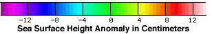
Sea-surface height is shown relative to normal with normal shown as green. Blue and purple
areas represent heights measuring between 8 and 24 centimeters (3 and 9 inches) lower than
normal. Red and white areas represent higher than normal sea-surface heights and indicate
warmer water. These areas are between 8 and 24 centimeters, (3 and 9 inches) higher than normal.