  |
||
|
|
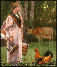
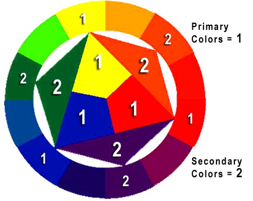
Horse of a Different Color: An Introduction to Color in the Visual Arts—Curriculum Unit Overview—IntroductionThe names of the primary and secondary colors are often among the first words we learn to speak and write. Even very young children can identify the red object in a painting, or the blue object in a photograph, but there is a lot more to color than initially meets the eye.In this curriculum unit students will be introduced to the importance and effect of color in the visual arts. Why do artists use particular colors in their compositions? The activities in this lesson will guide students towards a greater understanding of the ways in which color can focus the viewer's attention, give the illusion of depth in a two-dimensional medium, and affect the tone and mood of an artwork. Guiding QuestionHow do artists use color to create effects of perception and to set the tone of an artwork?Learning ObjectivesUpon completing this lesson, students will be able to:
Preparing to Teach this LessonThis unit is one of a series of EDSITEment lessons designed to help students gain the skills to better understand the visual arts. You may wish to teach this unit alone or as part of the series of EDSITEment lessons that includes the curriculum unit Everything in its Right Place: An Introduction to Composition in the Visual Arts and Portraits, Pears, and Perfect Landscapes: Investigating Genre in the Visual Arts.There are a number of definitions that will be helpful for teaching this lesson:
Unit LessonsLesson One: In Depth with the Full SpectrumLesson Two: Color Me Happy: Color, Mood, and ToneSelected EDSITEment Websites
Standards Alignment View your state’s standards |
||||||||||||||||||||||||||||||||||||||||||||||||||||||||||||||||||||||
  |
||
| EDSITEment contains a variety of links to other websites and references to resources available through government, nonprofit, and commercial entities. These links and references are provided solely for informational purposes and the convenience of the user. Their inclusion does not constitute an endorsement. For more information, please click the Disclaimer icon. | ||
| Disclaimer | Conditions of Use | Privacy Policy Search
| Site
Map | Contact
Us | ||