|
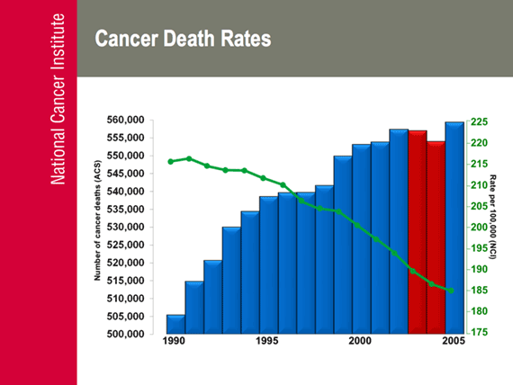
Slide displays an overlay graph, with the cancer death rate per 100,000 displayed as a line,
over the number of cancer deaths displayed as bars. The chart covers the period from 1990
to 2005. The death rate per 100,000 shows a peak in 1991 of 215, declining steadily to 184 in
2005. The number of deaths climbed from 505 thousand in 1990 to a peak of 557 thousand in 2003,
declined slightly in 2003 and 2004, and climbed to a new peak of 559,000 in 2005.
Numbers of cancer deaths figures are from the American Cancer Society (ACS). The numbers of
Deaths figures in the graph are:
1990: 505,366
1991: 514,705
1992: 520,616
1993: 529,951
1994: 534,353
1995: 538,505
1996: 539,593
1997: 539,615
1998: 541,582
1999: 549,838
2000: 553,091
2001: 553,768
2002: 557,271
2003: 556,902
2004: 553,888
2005: 559,312
Death rate per 100,000 figures are from the NCI. The death rate figures in the graph are:
1990: 214.9
1991: 215.1
1992: 213.5
1993: 213.4
1994: 211.7
1995: 209.9
1996: 207.0
1997: 203.6
1998: 200.8
1999: 200.7
2000: 198.7
2001: 195.9
2002: 193.7
2003: 190.0
2004: 185.8
2005: 184.0
< Previous | Index | Next Slide > |