Data Visualization - eHealth Marketing
Introduction
To enhance CDC science and research activities, CDC has started developing improved techniques for visualizing health data. Some of these techniques include creating interactive or dynamic images, diagrams and displays. Currently, CDC is developing improved ways to display public health data, such as the interactive map below, to give users the ability to interact with and better understand CDC’s public health science.
Selected Project
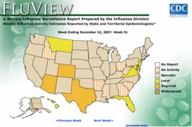 To assist users with better ways to visualize data, CDC created the interactive flu activity map, recently released for the 2007-2008 seasonal influenza season, which provides users with an animated map of flu activity over time. This map allows users to look at the change in national or state specific data and is updated weekly with new CDC data.
Public Health Impact
Dissemination of CDC’s science and research are core functions of achieving the agency’s mission. By providing dynamic, interactive and visually appealing ways for users to interact with this data, CDC aims to increase the impact of this research. A series of data visualization tools are currently under development and feedback is always welcome on these tools and other ideas for making CDC’s data more accessible and engaging.
CDC Partner
CDC’s National Center for Immunization and Respiratory Diseases (NCIRD)
Page last modified on April 14, 2008