Injury Data and Resources
Slide 1
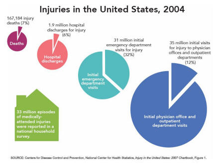
Figure 1
Four pie charts for data year 2004 show injury as a proportion of deaths, hospital discharges, initial emergency department visits, and initial physician office and outpatient department visits. It also depicts the number, 33 million, of episodes of medically attended injuries reported in a national household survey.
Slide 2
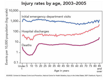
Figure 2
This line chart graphs injury rates by single year of age for initial emergency department visits and hospital discharges for years 2003 through 2005 and death rates for the combined years 2003 and 2004.
Slide 3
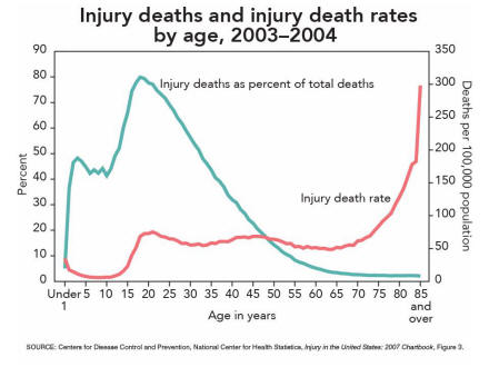
Figure 3
This line chart has two lines; one line has “percent� as its axis and shows injury deaths as a percentage of total deaths by single year of age, and the other has death rates as its axis and shows injury death rates by single year of age for the combined years 2003 and 2004.
Slide 4
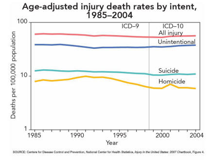
Figure 4
This line chart has four lines showing age-adjusted death rates for all injury, unintentional injury, suicide, and homicide for the years 1985 through 2004.
Slide 5
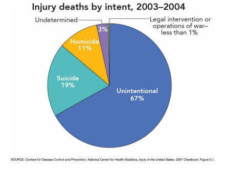
Figure 5-1
This pie chart shows the percent distribution of injury deaths by intent of injury for the combined years 2003 and 2004.
Slide 6
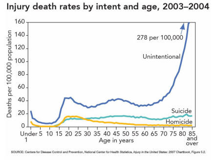
Figure 5-2
This line chart has three lines showing unintentional injury death rates, suicide rates, and homicide rates by single year of age for the combined years 2003 and 2004.
Slide 7
Figure 6
This line chart has five lines showing age-adjusted death rates for the leading mechanisms of injury deaths, which are motor vehicle traffic accidents, firearms, poisoning, falls, and suffocation for the years 1985 through 2004.

Slide 8
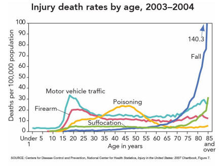
Figure 7
This line chart shows death rates by single year of age for the leading mechanisms of injury death that include motor vehicle traffic accidents, poisoning, firearms, suffocation, and falls for the combined years 2003 and 2004.
Slide 9
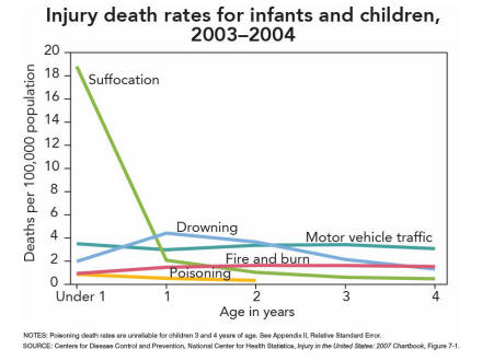
Figure 7-1
This line chart shows injury death rates by single year of age for infants and children under 5 years of age for the leading mechanisms of injury including suffocation, drowning, motor vehicle traffic accidents, fires and burns, and poisoning for the combined years 2003 and 2004.
Slide 10
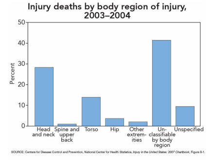
Figure 8-1
This bar chart has seven bars showing the percent distribution of injury deaths by body region of injury categorized as head and neck, spine and upper back, torso, hip, other extremities, unclassified, and unspecified for the combined years 2003 and 2004.
Slide 11
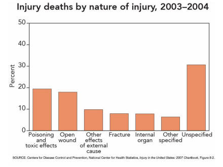
Figure 8-2
This bar chart has seven bars showing the percent distribution of injury deaths by nature of injury, categorized as poisoning and toxic effects, open wound, other effects of external causes, fracture, internal organ, other specified, and unspecified for the combined years 2003 and 2004.
Slide 12
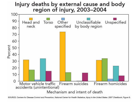
Figure 9
This bar chart has three sets of bars: motor vehicle traffic deaths, firearm suicides, and firearm homicides, with each set having five bars showing the percent distribution of injury deaths by body region of injury for the combined years 2003 and 2004.
Slide 13
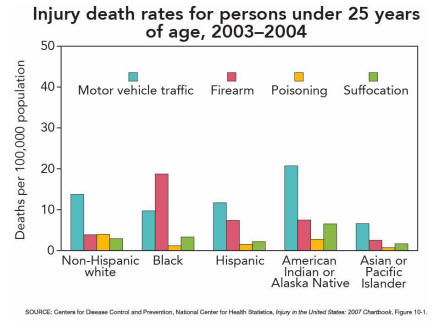
Figure 10-1
This bar chart has five sets of bars: non-Hispanic white, black, Hispanic, American Indian or Alaska Native, and Asian or Pacific Islander, with each set showing injury death rates for people under 25 years of age for the leading mechanisms of injury, which are motor vehicle traffic accidents, firearm, poisoning, and suffocation for the combined years 2003 and 2004.
Slide 14
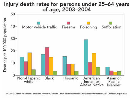
Figure 10-2
This bar chart has five sets of bars: non-Hispanic white, black, Hispanic, American Indian or Alaska Native, and Asian or Pacific Islander, with each set showing injury death rates for people 25 through 64 years of age for the leading mechanisms of injury, which are motor vehicle traffic accidents, firearm, poisoning, and suffocation for the combined years 2003 and 2004.
Slide 15
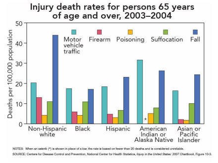
Figure 10-3
This bar chart has five sets of bars: non-Hispanic white, black, Hispanic, American Indian or Alaska Native, and Asian or Pacific Islander, with each set showing injury death rates for people 65 years of age and over for the leading mechanisms of injury, which are motor vehicle traffic accidents, firearm, poisoning, suffocation, and fall for the combined years 2003 and 2004.
Slide 16
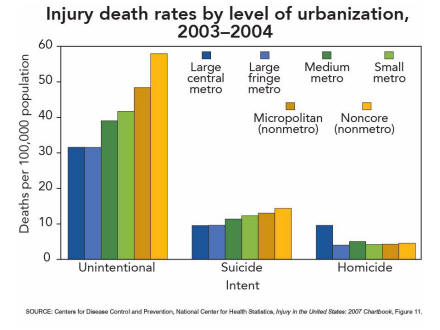
Figure 11
This bar chart has three sets of bars representing unintentional injury, suicide, and homicide, with each set showing injury death rates by level of urbanization categorized as large central metro, large fringe metro, medium metro, small metro, micropolitan, and noncore for the combined years 2003 and 2004.
Slide 17
Figure 11-1
This bar chart has three sets of bars representing motor vehicle traffic accidents, firearm suicides, and firearm homicides, with each set showing injury death rates by level of urbanization categorized as large central metro, large fringe metro, medium metro, small metro, micropolitan, and noncore for the combined years 2003 and 2004.

Slide 18
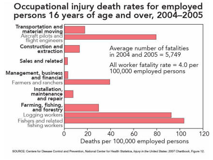
Figure 12
This bar chart shows occupational injury death rates for employed persons 16 years of age and over for the following occupations: transportation and material moving; aircraft pilots and flight engineers; construction and extraction; sales and related; management, business and financial; farmers and ranchers; installation, maintenance and repair; farming, fishing, and forestry; logging workers; and fishers and related fishing workers for the combined years 2004 and 2005.
Slide 19
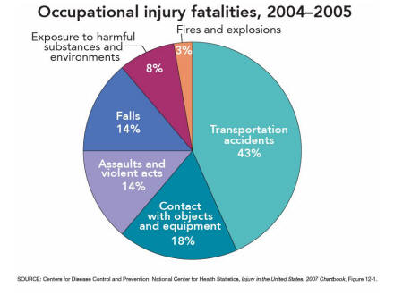
Figure 12-1
This pie chart shows the percent distribution of occupational injury fatalities by type of event or exposure, categorized as transportation accidents, contact with objects and equipment, assaults and violent acts, falls, exposure to harmful substances and environments, and fires and explosions for the combined years 2004 and 2005.
Slide 20
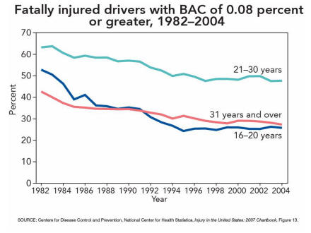
Figure 13
This line chart has three lines by driver age, which are 16 through 20 years, 21 through 30 years, and 31 years and over, and shows the percentage of fatally injured drivers of passenger vehicles with blood alcohol concentration of 0.08 percent or greater for the years 1982 through 2004.
Slide 21
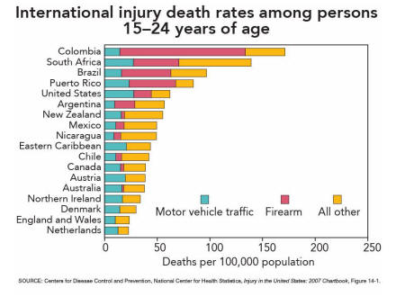
Figure 14-1
This bar chart shows injury death rates for teens and young adults 15 through 24 years of age for selected countries, by leading mechanisms of injury categorized as motor vehicle traffic, firearm, and all other for the most recent data years available. Countries are listed in the data table.
Slide 22
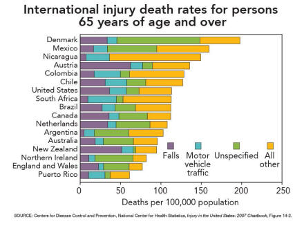
Figure 14-2
This bar chart shows injury death rates for persons 65 years of age and over for selected countries by leading mechanisms of injury categorized as falls, motor vehicle traffic, unspecified, and all other for most recent data years available. Countries are listed in the data table.
Slide 23
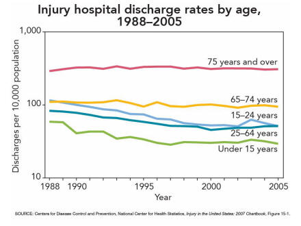
Figure 15-1
This line chart has five lines for age groups under 15 years, 15 through 24 years, 25 through 64 years, 65 through 74 years, and 75 years and over and shows injury hospital discharge rates for the years 1988 through 2005.
Slide 24
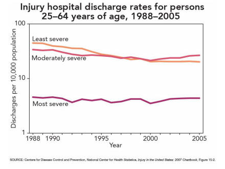
Figure 15-2
This line chart has three lines of degree of severity, which are least severe, moderately severe, and most severe, and show injury hospital discharge rates for persons 25 through 64 years of age for the years 1988 through 2005.
Slide 25
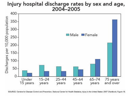
Figure 16
This bar chart shows injury hospital discharge rates for males and females by these age groups: under 15 years, 15 through 24 years, 25 through 64 years, 65 through 74 years and 75 years and over for the combined years 2004 and 2005.
Slide 26
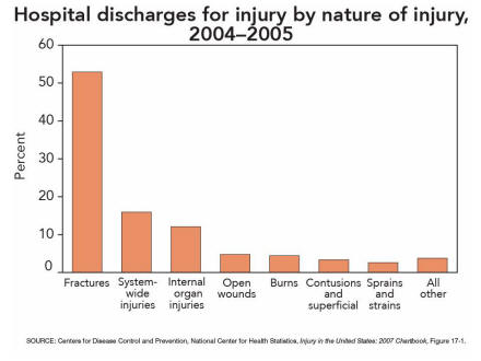
Figure 17-1
This bar chart has eight bars showing the percent distribution of injury hospital discharges rates by nature of injury categorized as fracture, system-wide injuries, internal organ injuries, open wounds, burns, contusions and superficial, sprains and strains, and all other for the combined years 2004 and 2005.
Slide 27
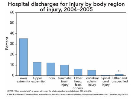
Figure 17-2
This bar chart has eight bars showing the percent distribution of injury hospital discharges by body region of injury categorized as lower extremity; upper extremity; torso; traumatic brain injury; other head, face, or neck; vertebral column injury; spinal cord injury; and other and unspecified for the combined years 2004 and 2005.
Slide 28
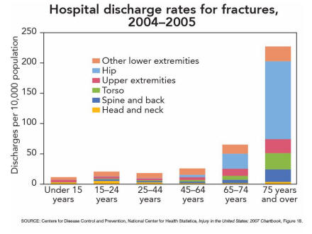
Figure 18
This stacked bar chart has six bars by the following age groups: under 15 years, 15 through 24 years, 25 through 44 years, 45 through 64 years, 65 through 74 years, and 75 years and over, each showing the percent distribution of injury hospital discharge rates for fractures by body region categorized as head and neck, spine and back, torso, upper extremities, hip, and other lower extremities.
Slide 29
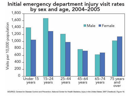
Figure 19
This bar chart has six bars for age groups under 15 years, 15 through 24 years, 25 through 44 years, 45 through 64 years, 65 through 74 years, and 75 years and over and shows the initial emergency department injury visit rates by sex and age group for the combined years 2004 and 2005.
Slide 30
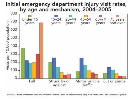
Figure 20
This bar chart has four sets of bars for initial emergency department injury visit rates for the four leading mechanisms of injury, which are fall, struck by or against, motor vehicle traffic, and cut or pierce. Each set of bars shows the age-specific rates for under 15 years, 15 through 24 years, 25 through 44 years, 45 through 64 years, 65 through 74 years, and 75 years and over for the combined years 2004 and 2005.
Slide 31
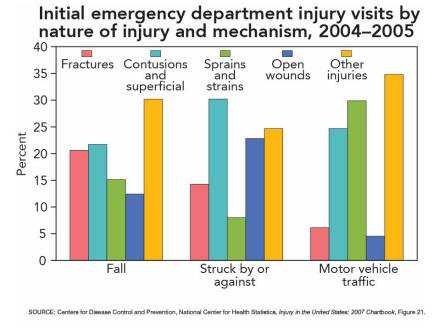
Figure 21
This bar chart has three sets of bars for three leading mechanisms of injury, which are falls, struck by or against, and motor vehicle traffic. Each set shows the percent distribution of initial emergency department injury visits by nature of injury grouped into the following five categories: fractures, contusions and superficial injuries, sprains and strains, open wounds, and other injuries for the combined years 2004 and 2005.
Slide 32
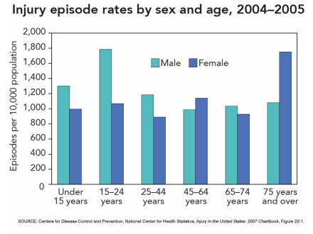
Figure 22-1
This bar chart has six sets of bars for the following age groups: under 15 years, 15 through 24 years, 25 through 44 years, 45 through 64 years, 65 through 74 years, and 75 years and over, with each bar showing age and sex specific injury episode rates.
Slide 33
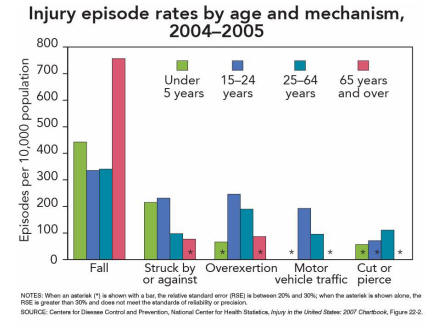
Figure 22-2
This bar chart has five sets of bars for the leading mechanisms of injury: fall, struck by or against, overexertion, motor vehicle traffic, and cut or pierce. Each set of bars shows the age specific injury episode rates for four age groups, which are under 15 years, 15 through 24 years, 25 through 64 years, and 65 years and over.
Slide 34
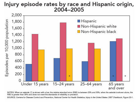
Figure 23-1
This bar chart has four sets of bars showing injury episode rates for the Hispanic, non-Hispanic white, and non-Hispanic black populations. Each set of bars shows age specific rates for persons under 15 years, 15 through 24 years, 25 through 64 years, and 65 years and over.
Slide 35
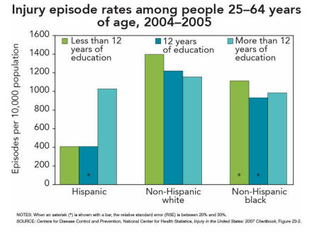
Figure 23-2
This bar chart has three sets of bars showing injury episode rates for the Hispanic, non-Hispanic white, and non-Hispanic black populations. Each set of bars shows education level-specific rates for persons with less than 12 years of education, 12 years of education, and more than 12 years of education.
Slide 36
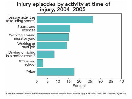
Figure 24-1
This bar chart has seven bars showing the percent distribution of injury episodes by activity at the time of injury. Activities include leisure, sports and exercise, working around house or yard, working at paid job, driving or riding in a motor vehicle, attending school, and other.
Slide 37
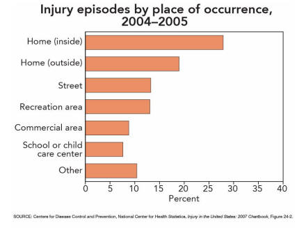
Figure 24-2
This bar chart has seven bars showing the percent distribution of injury episodes by place of occurrence. Places include inside the home, outside the home, street, recreation area, commercial area, school or child care center, and other.
Slide 38
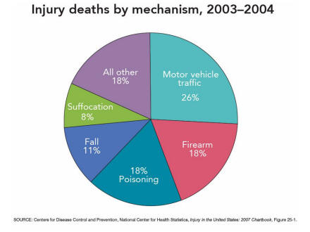
Figure 25-1
This pie chart shows the percent distribution of injuries for 2003 through 2004 by the leading mechanisms of injury deaths, including motor vehicle traffic accidents, firearms, poisoning, falls, suffocation, and all other mechanisms.
Slide 39
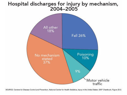
Figure 25-2
This pie chart shows the percent distribution of injuries for 2004 through 2005 by the leading mechanisms of injury hospital discharges including falls, poisoning, motor vehicle traffic accidents, all other mechanisms, and injury discharges for which no mechanism was stated.
Slide 40
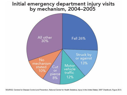
Figure 25-3
This pie chart shows the percent distribution of injuries by the leading mechanisms of initial injury emergency department visits including falls, struck by or against, motor vehicle traffic accidents, cut or pierce, all other mechanisms, and those initial injury visits for which no mechanism was stated.
Slide 41
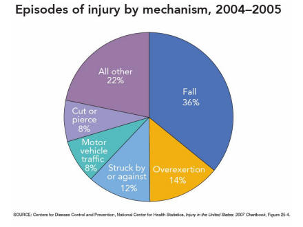
Figure 25-4
This pie chart shows the percent distribution of injuries by the leading mechanisms of episodes of injury including falls, overexertion, struck by or against, motor vehicle traffic accidents, cut or pierce, and all other mechanisms.
Slide 42
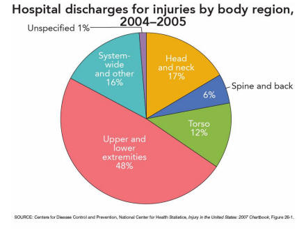
Figure 26-1
This pie chart shows the percent distribution of injuries by body region of injury for hospital discharges. Body regions include head and neck, spine and back, torso, upper and lower extremities, system wide and other, and unspecified.
Slide 43
Figure 26-2
This pie chart shows the percent distribution of injuries by body region of injury for initial emergency department visits. Body regions include head and neck, spine and back, torso, upper and lower extremities, system wide and other, and unspecified.
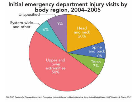
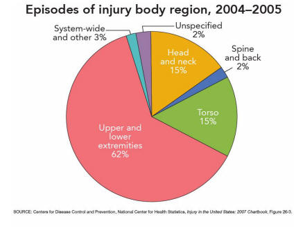
Slide 44
Figure 26-3
This pie chart shows the percent distribution of injuries by body region of injury for episodes of injury. Body regions include head and neck, spine and back, torso, upper and lower extremities, system wide and other, and unspecified.
Page Last Modified: July 31, 2008
- NCHS Home
- Deaths: Injuries, 2002

- Document on Injury Severity Measurement
- National Trends in Injury Hospitalization Chartbook
- FASTSTATS A-Z
Special Projects Branch
Office of Analysis and Epidemiology
NCHS, Centers for Disease Control and Prevention
Mailstop P08
nchsinjury@cdc.gov
National Center for Health
Statistics
3311 Toledo Road
Hyattsville, MD 20782
Phone:
1-800-232-4636
cdcinfo@cdc.gov
Centers for Disease Control and Prevention, 1600 Clifton Rd, Atlanta, GA 30333, U.S.A
Tel: (404) 639-3311 / Public Inquiries: (404) 639-3534 / (800) 311-3435