|
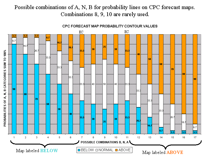
The contours on the map show the total probability (%) of three
categories, above, indicated by the letter "A", below, indicated by
the letter "B", and the middle category, indicated by the letter "N".
At any point on the map, the sum of the probabilities of these three
categories is 100%.
For any particular location, and season, these three categories are
defined from the 30 observations from 1971-2000. The coldest or driest
1/3 (10 years) define the B category, the warmest or wettest 1/3 (10
years) define the A category, and the remaining 10 years in between
define the middle (N) category.
When the forecasters decide that one of the extreme categories, say
above (A), is the most likely one, they assign probabilities which
exceed 33.33% to that category, and label the map with an "A" in the
center of the region of enhanced probabilities. To make it possible to
display three categories on one map, we assume that, when either A, or B
is the most likely category, the probability of the middle category
remains at 33.33% for most situations. This means, for example, that
when the probability of A (B) is 40%, the probability of N is 33.33%,
and the probability of B (A) is 100% minus 40%+33.33%=26.67%.
When probability values of the favored category reaches 70%, or higher,
the probability of the opposite category is fixed at 3.3%, and the
probability of the middle category is adjusted to values (less than
33.33%) which cause the sum of the three probabilities to equal 100%.
When the middle category (N) is higher than 33.33%, the probabilities of
the A and B categories decline by (equal) amounts required for the sum
of the A, N, B probabilities to equal 100%.
In regions where the forecasters have no forecast tools which favor the
chance of either A, or B, the chance of these two categories is defined
to be 33.33% each, and the region is labeled "EC", which stands for
equal chances.
Shading is used to indicate different levels of probability above 33.33%.
|


