By Victoria A. Harden
As we drive down the highway, we see a huge yellow neon "M" and
immediately recognize the "golden arches," the internationally-known
logo for McDonald's restaurants. Such types of visual identification
have become pervasive, even in the Federal Government. The NIH
has used three logos since 1969, but what do they mean? Why were
these logos adopted?
Before 1969, NIH did not have a logo. Rather, NIH was viewed as
the "laboratory arm" of the U.S. Public Health Service
(PHS) and NIH publications used the PHS seal or the logos of the
Department of Health, Education, and Welfare (the predecessor to
the Department of Health and Human Services). In 1965, however,
the President's NIH Study Committee strongly urged increased NIH
communications with the public. The development of an NIH logo
was one of the first steps taken to implement that study. In 1969,
George Mannina of the Office of Information worked with artist
Charlie Shinn of the NIH Medical Arts and Photography Branch to
develop the first NIH logo. The result was a triangle with rounded
sides and the initials "NIH" in the center (above). The
meanings of the three sides varied, with some seeing "research,
treatment and education," and others the trilogy of "searching,
serving, and teaching."
In 1976, work began on a new logo to update the triangle and develop
a symbol that could be recognized all over the world. The first
proposal was a concentric triangle with rounded vertices and straight
sides, but NIH Director Dr. Donald Fredrickson wanted it altered
to indicate NIH's relationship with grantees and other health institutions.
By leaving the ends of the triangle open, the completed logo demonstrated
NIH's "openness to the outside" as well as invoking "the
glassware that is used in NIH laboratories."
The new logo could be used with or without the words "National
Institutes of Health." Its component parts could be rendered
in different colors, for example in silver, blue, and red to commemorate
the American bicentennial in 1976.
Click here to
view a larger version
of the logo
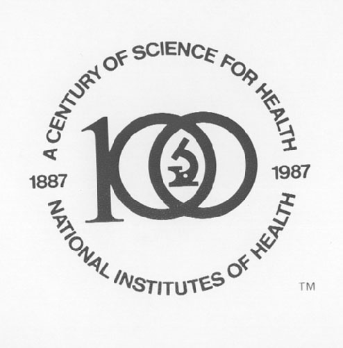
NIH has had one additional logo, which was used during its 1986-1987
centennial observance. This logo was chosen in a contest in which "384
individuals submitted 1,354 highly creative entries," according
to an
NIH Record account. Sherry Meyers, a Clinical Center
psychiatric nurse, won the $500 prize with a design that featured
the number 100 with a microscope set in interlocked zeros and the
words "National Institutes of Health, 1887-1987" surrounding
the image).
As Ron Winterrowd of NIH's Medical Arts and Photography knows, "Logos
are powerful. A good logo is an image on a sign that registers
in your mind while you're driving down the highway at 70 miles
per hour."
Special thanks to Marc Stern, Ron Winterrowd, and Clifford F.
Johnson for their help in reconstructing this history.
For more information about the history of NIH, see the Office
of NIH History website at http://history.nih.gov/.
This page was last reviewed on
August 7, 2007
.


