Performance Indicators Visualization and Outreach Tool Introduction
Some of the following links are to locations outside the EPA website. EPA does not maintain these pages and is
not responsible for their content. These links are provided as a service to the user.
 |
Introduction to PIVOT
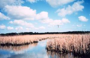
 This PIVOT module for the National Estuary Program (NEP) highlights common habitat degradation and loss problems faced by NEP communities around
the country. PIVOT's interactive graphics and maps are designed to help users better understand the issues and visually track the National Estuary
Program's progress toward achieving its habitat restoration goals.
This PIVOT module for the National Estuary Program (NEP) highlights common habitat degradation and loss problems faced by NEP communities around
the country. PIVOT's interactive graphics and maps are designed to help users better understand the issues and visually track the National Estuary
Program's progress toward achieving its habitat restoration goals.
What you'll find in these pages:
Habitat Loss
 "What's the Problem?" summarizes the issue.
-
"What Are We Doing?
" describes how the NEP is addressing this issue at a national level.
-
"How Can We Map Our Progress?
" provides links to
- Maps
 and Reports
  that illustrate current conditions and present performance data reported to the National Estuary Program from NEP communities across the
nation
that illustrate current conditions and present performance data reported to the National Estuary Program from NEP communities across the
nation
- Photos
 and descriptions of habitat categories used to summarize NEP actions
- Definitions
 of habitat activity terms used in NEP action reports.
Contributing Factors
-
An interactive graphic shows how everyday human activities along the coast increase pressures on natural habitat and can impact the health
of our estuaries in other ways as well.
Resources
-
Links are provided here to further information about watersheds, maps, and performance measures useful for reporting progress toward improving
the health of coastal watersheds.
The PIVOT framework
for reporting performance was developed by the National Oceanic and Atmospheric Administration (NOAA)
Coastal Services Center. While PIVOT is applied here by the EPA National Estuary Program at a national level, the
framework is also an effective local tool, helping individual communities assess and communicate the success of local management actions. See
PIVOT for Tillamook Bay NEP
as an example. Or continue reading below to learn more about the PIVOT concept of using maps and graphics to communicate performance.
 Return to Top
Why PIVOT?
Reporting Performance Matters
The National Estuary Program works with local communities to improve
the health of our nation's estuaries. Community support and involvement
is fundamental to the success of these efforts. Through an extensive stakeholder
planning process, NEP communities develop comprehensive conservation and
management plans, or CCMPs. These plans serve as documentation of the
communities' environmental goals for their estuaries and watersheds as
well as blueprints for achieving those goals. As this is a long-term process,
keeping the community well informed and connected with plan activities
and progress is critical to keeping the plan a vital, living process for
the community.
Performance reporting is not only essential for garnering and maintaining
community support, it is often mandated. Enabling legislation or other
laws—federal or local—may require responsible agencies to report
on what progress they are making toward established goals. For the National
Estuary Program, several pieces of federal legislation weigh in on performance
reporting.
Estuaries and Clean Water Act of 2000
(PDF)
This new legislation makes restoring the nation's estuaries a national
priority and funds community-based estuary restoration projects. Reauthorization
of EPA's National Estuary Program is included, with funds for estuary
management in addition to planning. The core of the bill establishes
a five-year program through which the federal government will promote
and track estuary restoration.
Government Performance Reporting Act of 1993 (GPRA)
(PDF)
This act requires that federal agencies should link inputs, outputs,
and outcomes of their programs to improve government planning, budgeting,
performance, and results overall.
Clean Water Act Amendments of 1987
The enabling legislation for the NEP program stipulates that NEPs
must "monitor the effectiveness of actions taken pursuant to the plan."
Maps Make Sense
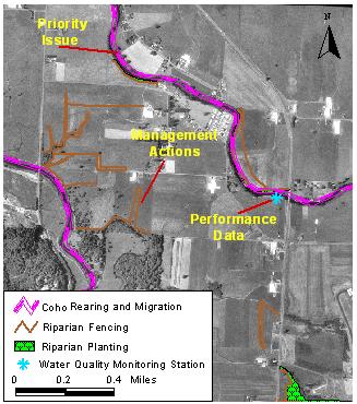 PIVOT takes a geography-centered approach because where things
happen matters, in a watershed or in a program area. The ability to see
on a map the spatial relationships of factors contributing to priority
issues and the management actions designed to address those issues can
be powerful. Once those spatial relationships are established, questions
about the effectiveness of management actions naturally start to emerge.
PIVOT takes a geography-centered approach because where things
happen matters, in a watershed or in a program area. The ability to see
on a map the spatial relationships of factors contributing to priority
issues and the management actions designed to address those issues can
be powerful. Once those spatial relationships are established, questions
about the effectiveness of management actions naturally start to emerge.
What are the monitoring and tracking data that will help measure plan
performance through time? Indicators are pieces of information, pre-established
during planning, that can lead to conclusions about the effectiveness
of actions. How will the community stay informed about plan progress?
Maps can help tie management actions to performance data, or indicators.
When effectively evaluated and communicated to stakeholders, indicators
can help illustrate and even guide progress.
PIVOT focuses on getting results to stakeholders, which may include key
decision makers or local citizens. Maps of management issues, actions,
and performance, presented in combination with educational text and graphics,
provide a visual, intuitive format for informing communities about how
well their plans are working.
See how the National Estuary Program is demonstrating its progress by
viewing "How
Can We Map Our Progress?" under the Habitat Loss section.
| You will need Adobe Acrobat Reader to view the Adobe PDF files
on this page. See
EPA's PDF page for more information about getting and using
the free Acrobat Reader. |
|