Climate-Change Misconceptions

September 16th, 2008

As noted in previous blogs, many of us don’t understand the terms people use in describing climate change; nor do we always understand how ideas related to global climate change relate to everyday life. So I decided it would be useful to write about some of these common misconceptions or partial misconceptions. I’ll start with the misconceptions.

Misconception: The term “global warming” means the temperature is getting warmer everywhere. “Global warming” sounds to many (including me) like the temperature should be warming everywhere. If there is “global warming” shouldn’t it be getting warmer where I live? Or, if it’s not getting warmer where I live, how can “global warming” be happening!

If you look at the recent temperature records from several GLOBE schools, the temperature does seem to be warming gradually in some places. But other schools show a cooling trend. It is the same way with the stations used to monitor climate change. As noted in my July 2008 blog, the global average temperature change is often much less than the trends at local sites.

The term “global warming” really means that the yearly average of the temperature averaged over all the Earth’s surface is rising over time scales of several years.

Misconception: We just had a month that was the coldest on record. That means that the climate has started to cool again. When I stop thinking like a scientist, I also briefly think – or hope – that a cold month means that “global warming” will go away. But a record cold day or month doesn’t mean that the climate is getting cooler on the long term.

In a warming climate, there are still changes in both directions from day to day, month to month, and year to year. But there will be fewer record cold months. And there will be more periods of record high temperatures. For example, the city of Chicago in the Midwestern United States is having more heat waves, as illustrated by Figure 1 (taken from the blog, “Regional Climate Change, Part I: Iowa Dew Points and Chicago Heat Waves,” 22 March 2007).

figure_1chagnonetalheatwaves.JPG

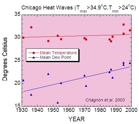
Figure 1. Temperatures during Chicago, Illinois, USA heat waves. While the graph was made to show how the dew point has risen during the heat waves, the increase of the number of points (heat waves) with time shows that there are more heat waves than there used to be. Figure based on data from Changnon et al. (Climate Research, 2003).

Misconception: Earth’s temperature will steadily warm (as in “This year is warmer than last year, and next year will be warmer than this year.”). The globally-averaged yearly temperature record in Figure 2 has many dips and peaks. It is well-known that strong El Nino events, through spreading warm water across the tropical Pacific, will cause peaks in the record (There were strong El Ninos for example in 1982-3 and 1997-8). Similarly, volcanic eruptions can cool the surface temperatures globally for a year or two.

figure_2hadcrut3.JPG

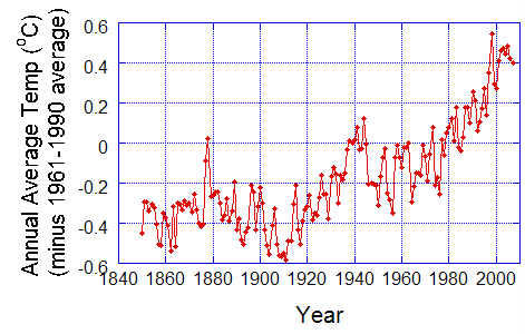
Figure 2. Annual average temperatures, averaged over the Earth. Data from the UK Hadley Centre.

There will be even more extreme year-to-year changes locally. Some regions will have colder-than-normal periods due to persistent airflow from the Polar Regions. At the same time, there will have to be compensating airflow toward the poles in other regions, which will have warmer-than-normal periods. If you look at any local temperature record, such is the one in Figure 3; there are year-to-year changes that are faster than the overall warming trend. Even though there is a general upward trend in temperature as indicated by the straight line, the warmest year on record was 2000. On the other hand, 1998 was the warmest year in Figure 2.

figure_3_ttrend_jicin.JPG

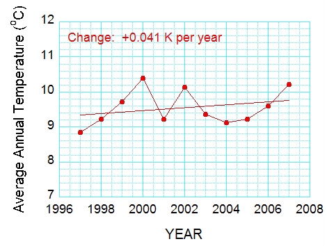
Figure 3. Average annual temperature at the GLOBE School 4. Zakladi Skola in Jicin, Czech Republic. From 15 July 2008 blog.

Misconception: The “warming” scientists write about is not real. Many thermometers are showing warmer temperatures because their surroundings have changed over time, and this affects the global average You can find web sites showing weather stations next to buildings, air-conditioning heat exhausts, and so on. So this is certainly true for some sites. However, climate scientists try very hard to eliminate such sites from the climate record. There are literally thousands of weather stations in the United States today, and a similar density of sites exist in other parts of the developed world. These are used for many things, such as weather forecasting, keeping track of weather at airports or along roads or railroad tracks, or for education and outreach purposes by television stations or schools. But only a small fraction of these are used to document the global change in temperature. It is important to know that the temperature at any station is not taken at face value. Each measurement is checked carefully. For example, each station is compared to nearby stations to see if their temperatures are biased or just plain wrong.

At the GLOBE Learning Expedition, we saw a climate-monitoring station, on a rocky hill at the southern tip of Africa, away from any urban influence (11 August 2008 blog). And, only 30 per cent of the Earth’s surface is covered by land – the other 70% of the area is over the ocean. There, ships, buoys, and now satellites supply the needed measurements.

This does not mean that the warming recorded by sites that were once rural but are now surrounded by cities is not telling us something. Cities are warmer than the surrounding rural areas. They have more concrete and asphalt, which means that more of the incoming solar radiation is converted to heat rather than used in photosynthesis or evaporation. Also, factories, buildings, cars, and even people release energy that warms the environment. If you move from a rural area to a city, you will experience a warmer climate. However, this “urban heat island” has only a small effect on the global average because cities cover only a small fraction of Earth’s surface (See “Land Use: How Important for Climate, 11 June 2008).

Also, we need to remember that the famous surface-temperature curve shown in Figure 2 is not the only evidence that the climate is getting warmer. Satellite data also indicate warming at and near Earth’s surface, as does the shrinking of most glaciers and the smaller extent and thickness of Arctic sea ice (see, e.g., http://svs.gsfc.nasa.gov/goto?3464) . Furthermore, sea level is rising slowly, a result of more water in the ocean basins (from the melting of ice on land) and expansion (as the water gets warmer). And there is more water vapor in the atmosphere than there used to be, consistent with more evaporation (to be expected from water land and sea surface temperatures as well as warmer air).

Carbon Dioxide, Part 3: A Global Look

August 28th, 2008

The amount of CO2 given off by industry in a year

Figure 1 is a diagram of the carbon cycle from the GLOBE Carbon Cycle Project, based at the University of New Hampshire. This diagram shows where the carbon is, and where it is going. So, for example, industry produces about 6 petagrams of carbon a year. What is a petagram? A petagram is written 1,000,000,000,000,000 grams, which can be written 1 times 10^15.

In order to compare the value of CO2 production for human respiration to the “flux” or exchange terms in the diagram (in red), we have to (a) convert it to a flux for carbon rather than CO2 and (b) compute a total for the entire world population for a year.

So, we take

0.9 kg per person per day, times
6,700,000,000 people in the world, times
365 days in a year (neglecting leap years), to get
220,000,000,000 or 2.2 x 10^11 kg or 2.2 x 10^14 grams, or

0.22 petagrams

To convert this to carbon, we multiply by 12/44, the fraction of CO2 that is carbon, to obtain 0.06 petagrams a year.

From Figure 1, that’s about 1% of most of the exchange terms, and about one-hundredth the carbon released by burning fossil fuels globally. And less than one-thousandth the amount of carbon uptake by plants.

What does this really mean? It was pointed out to me by Richard Wolfson, a professor of physics at Middlebury College [who wrote the book Energy, Environment, and Climate (W.W. Norton, 2008), cited a few blogs ago.], that we get our energy from plants, or animals that eat plants, or animals that eat animals that eat plants, so one could argue that we are “carbon-neutral” in the sense that we are part of the natural system, with the plants taking back the carbon we emit. Only in a sense, however – as Wolfson notes, our food production is not carbon-neutral: we produce carbon dioxide in growing the food and transporting the food, not to mention keeping it warm or cold, and, usually, cooking it.

figure1ccdiagramweb.jpg

Figure 1. The carbon cycle. The numbers in blue in represent the amount of carbon stored (e.g., 38,000 petagrams of Carbon in the ocean). The numbers in red represent “fluxes” – carbon flowing from one part of the earth system to another. Figure © GLOBE Carbon Cycle.

CO2 from Space

Figure 2 is a snapshot of the global distribution of CO2 at 8 kilometers (5 miles) above the surface. This is high enough so that there is a lot of mixing by the winds, but you can see a pattern anyway. And the pattern is associated with the sources and sinks of carbon in Figure 1.

figure2airs_co2_july2003_550×396.jpg

Figure 2. July 2003 average CO2 from the Atmospheric Infrared Sounder (AIRS) on the Aqua Satellite. From http://www-airs.jpl.nasa.gov/Products/CarbonDioxide/. Preliminary data.

For example, the higher values are associated with the industrial parts of the world. The high values in the north Atlantic are downstream from the United States and Canada. The lowest values are over the high-latitude oceans in the Southern Hemisphere and over Antarctica.

figure3co2_graph_steady_rise_300×230.jpg

Figure 3. CO2 from AIRS. From http://www-airs.jpl.nasa.gov/Products/CarbonDioxide. Preliminary data. The curve shows carbon dioxide decreasing in the Northern Hemisphere spring and summer, when vegetation is growing and leafing out, and increasing in fall and winter, when respiration dominates.

The “snapshot” in Figure 2 is from the Atmosphere Infrared Sounder (AIRS) on the NASA/Aqua satellite. These data can also be used to look at trends in the global average CO2. Like the well-known surface-based curve from Mauna Loa, there is an upward trend, and you can clearly see the effect of the seasons. If you compare this figure to the curves in the blog Land Use and CO2, posted 7 September 2007, you will find the curves quite similar, with CO2 decreasing during the Northern Hemisphere spring and summer. As noted there, this decrease in carbon dioxide is associated with photosynthesis. During photosynthesis the plants take carbon dioxide out of the atmosphere and use it to grow and leaf out. It is not surprising that photosynthesis is the largest term in Figure 1.

Carbon Dioxide, Part 2: Walk, Drive a Car, or Ride a Bike?

August 21st, 2008

The blog about carbon dioxide (CO2) produced by our bodies during respiration created so much discussion that I decided to work harder to put the numbers into context.

Last time, we calculated an average adult human breathes out between 0.7 and 0.9 kg of carbon dioxide each day. This is based on lots of assumptions, with people of all ages and nationalities counted as processing 0.5 liters of air, 16 times an hour, for 24 hours.

Let’s compare this rough estimate to some other numbers.

The amount of carbon dioxide given off by an automobile in a mile (1.6 kilometers)

I’ve heard a number quoted for this one, but thought it would be good to estimate to find out how close I was, and then I will convert the number to metric units. We start from some facts.

  • Density of gasoline is 0.71-0.77 grams per cubic centimeter (that’s 0.71-0.77 kg per liter)
  • Gasoline is 85% carbon by mass

So there is approximately 0.74 times 0.85 = 0.63 kg carbon per liter.

This converts to 0.63 kg C x 3.79 liter/gallon or 2.39 kg C per gallon (C=Carbon).

If our car drives 20 miles on one gallon of gas (this is clearly not a very efficient car!), the car burns 2.39 kg per gallon x 1 gallon per 20 miles, or 0.12 kg of carbon per mile.

This is equivalent to 0.12 x 44 divided by 12 = 0.44 kg per mile, or 0.96 pounds (~1) pound of carbon dioxide per mile. Or, in metric units, 0.28 kg per kilometer.

And, driving this car for two miles (3.2 km) produces 0.88 kg carbon dioxide – as much as we produce by breathing all day! (What if the car could travel twice as far per gallon?)

Carbon dioxide released by going from Point A to Point B.

I’m going to suppose someone wants to travel two miles or 3.2 kilometers. That’s a distance many of us would be willing to walk (and about the distance between where I live and where I work).

That means:

If we walk three miles per hour, it would take us 40 minutes to reach Point B walking 3 miles an hour.

If we ride a bicycle at 8 miles (12.8 kilometers) per hour on average, it would take 15 minutes to get to Point B.
The Web is full of charts listing the number of Calories (kCal, abbreviated kCal) used in different types of exercise. I’ll select the following values. For a 155-pound (70 kg) person:

  • Walking at 3 miles per hour (4.8 km/hr) burns 250 kCal
  • Riding a bicycle at 8 miles per hour (12.8 kilometers per hour) burns 280 kCal

Which means the number kCal burned going from Point A to Point B is:

  • 167 kCal walking for 40 minutes compared to 56 kCal for 40 minutes at rest
  • 70 kCal riding a bicycle for 15 minutes compared to 21 kCal for 15 minutes at rest

The “at rest” numbers are based on the previous blog, where we used energy production to estimate carbon dioxide output. We assumed a human produced 2000 kCal of energy (equal to the amount eaten) and found that roughly equivalent to 0.7 kilograms of carbon dioxide a day. (0.9 kg a day could be used as well. We used 0.7 simply because that was the number associated with the 2000 kCal.

The carbon dioxide we produce by going two miles on foot or on a bicycle is then, if we count the total:

  • 0.7 kg CO2 per 2000 kCal times 167 kCal: 0.058 kg CO2 walking
  • 0.7 kg CO2 per 2000 kCal times 70 kCal: 0.025 kg CO2 biking

But the “extra cost” of traveling the distance should be the difference between the “exercising” number and the “at rest” number, namely:

  • 0.7 kg per 2000 kCal times (167-56) kCal = 0.039 kg of extra CO2 walking
  • 0.7 kg per 2000 kCal times (70-21) kCal = 0.017 kg of extra CO2 riding a bike

Thus: traveling the 2 miles (3.2 kilometers) produces this amount of CO2 above what was produced by respiration at rest:

Traveling 2 miles (3.2 kilometers)


By car: 0.88 kg CO2
Walking: 0.039 kg CO2
Riding a bike: 0.017 kg CO2

While the numbers aren’t exact, the large factor – 20 or more, is probably close. Walking or riding a bicycle does reduce the production of CO2 relative to driving. And – these modes of transportation provide healthful exercise as well! If we have to drive, putting more people in the car reduces the impact of driving. And, driving a car that uses half as much gasoline per unit distance would also help.

Release of carbon dioxide by individual humans

August 11th, 2008

This blog was inspired by activities at the 2008 GLOBE Learning Expedition (GLE) in South Africa. As part of their field activities, the students visited the Global Atmosphere Watch station (GAWS) at Cape Point, where carbon dioxide and several other trace gases are measured from the top of a 30-m tower. The carbon dioxide record goes back to 1978, showing a rise comparable to that seen in the Northern Hemisphere.

Standing for much of two days with groups of students at the base of the weather tower at the GAWS site at Cape Point, I found myself wondering how much we were contributing to the carbon dioxide in the atmosphere. I returned home, resolving to estimate how much carbon dioxide an average human gives off in a given day simply by breathing.

figure1a_gaws2crop.jpg

Figure 1a. 30-meter tall Global Atmosphere Watch Station (GAWS) tower from a distance. It is located almost at the southern tip of Africa.

figure1bgawstower.JPG

Figure 1b Close-up of GAWS tower. The air is pumped in from the top of the tower into the laboratory building, when it is analyzed for the fraction of carbon dioxide and other trace gases.

I will estimate this in two ways. First, based on how many Calories a “typical” human consumes. And secondly, based on how much carbon dioxide is released with each breath.

Based on how much we eat

I start with some rather gross assumptions:

  1. The average human eats 2000 Calories (kiloCalories) of food a day
  2. 100% of this food is processed, with all the carbon returning to the atmosphere
  3. All of the food eaten is in the form of sugars with carbon:hydrogen:oxygen ratios of 1:2:1.

And some information:
Atomic weight of carbon: 12
Atomic weight of hydrogen: 1
Atomic weight of oxygen: 16
Molecular weight of carbon dioxide (2 x 16 + 12 = 44)

This means that:
By mass, the sugars are 40% carbon
By mass, carbon dioxide is 27% carbon

Sugar provides 4 kiloCalories of energy per gram, meaning that our human eats 500 grams of sugar each day. 40% of this or 200 grams is carbon. Assuming all this carbon is released as part of carbon dioxide, our human releases 733 grams of carbon dioxide (200 grams x 44/12).

So, let’s just call our estimate 700 grams of carbon dioxide a day, recognizing that the number is an approximate one.

There are a number of reasons this is probably an overestimate. Our human wouldn’t eat all sugar. He/she would eat some fat as well, which has 9 kiloCalories per gram. We are assuming our human to be in steady state – so that net uptake by the body would be zero. But our human would release carbon in other forms (feces, dried skin, shed hair, etc.) So there would be some solid waste as well as gas – but over long term, there would be some carbon dioxide released from that.

Based on carbon dioxide released through breathing (respiration)

Let’s try another way to estimate the amount of carbon dioxide our human releases. But this time we focus on breathing. Again, some facts:

A human adult breathes 15 times a minute, on average (Reference 1). While I am writing this, my respiration rate is 16 breaths per minute, so this number seems reasonable. And, just for fun, I’ll use my respiration rate.

Each breath exchanges 500 cubic centimeters of air (Reference 2)

Assuming an air density of 1 kilogram per cubic meter, we can find out how many kilograms of air are exchanged for each breath:

500 cm x cm x cm x 0.01 m/cm x 0.01 m/cm x 0.01 m/cm
= 0.0005 cubic meters

0.0005 cubic meters x 1 kilogram per cubic meter
= 0.0005 kilograms of air per breath.

We now use this to estimate the kilograms of air processed each day, which is

0.0005 kilograms per breath x 16 breaths per minute x 1440 minutes per day
= 11.52 kilograms per day “processed” by breathing

To find out how much carbon dioxide is put into the atmosphere, we compare the amount of carbon dioxide (0.038% by volume) inhaled to the amount (4.6-5.9% by volume exhaled, Reference 3.), from the same web site. But first we need to allow that “by volume” means (using carbon dioxide as an example)

0.038 carbon dioxide molecules per 100 air molecules, or
3.8 carbon dioxide molecules per 10000 air molecules.

From above, we know that the molecular weight for carbon dioxide is about 44. The molecular weight for moist air is about 28, which means that the air we inhale contains about

3.8 x 44 divided by 28 x 10000 = or 0.0006 grams carbon dioxide per gram of air

The number “.0006″ is really a fraction – which I am labeling in grams per gram. It could just as easily be pound per pound.

Similarly, the fractional amount of carbon dioxide exhaled, by mass is, assuming 5% by volume:

0.05 x 44 divided by 28 x 100 or 0.0786

So the net fractional change in carbon dioxide for each breath is

0.0786 – 0.0006 or 0.0.078

Now we convert this to a mass by multiplying the fraction times the mass per breath, namely:

11.52 kilograms of air exchanged each day x 0.078 fractional increase in carbon dioxide,

= 0.9 kilograms of carbon dioxide for each day per human.

Again, we made assumptions to make things simple. Our human wasn’t exercising. Our human was an adult. And our human was exchanging a typical amount of air. Recognizing that the number is a crude estimate, I will again round the number to one significant figure, so that we have 0.9 kilograms of carbon dioxide released each day per human.

Isn’t it exciting that we came up with roughly the same answer! For comparison, Wickipedia (http://en.wikipedia.org/wiki/Breathing) quotes an estimate of 900 grams of carbon dioxide a day by the United States Department of Agriculture (USDA).

Here are some questions to think about:

The respiration rate I used was for an average adult. When I measured my respiration, I was sitting, so I’m thinking this is for an average adult at rest. How would these numbers be changed for someone who was exercising? Children breathe faster (Reference 3) but have smaller lungs. How would each of these factors affect the result? Finally, if you wanted a more accurate number, how would you change the calculations?

Comparison to carbon dioxide uptake by plants

How does that compare to some other things?

Prairie near Mandan, ND during the growing season (24 Apr – 26 October) 1996-1999, (reference 4)
1.85 grams CO2 per square meter taken from the atmosphere on average
(Meaning that 380 square meters of land would cancel out the effect of our human) – but remember – this in only during the growing season!

A generic tree (reference 5)

This tree (I’m assuming this is a big one) is said to take up 21.8 kilograms of carbon dioxide a year. For a year, our human produces about 365 x 0.7 kilograms a year, or 255 kilograms. So we’d need 10 of these threes to cancel the carbon dioxide we exhale. This site unfortunately does not quote a source.

Pine forest in Finland (Reference 6)

During the period of measurement, this forest took up
2.4 grams carbon dioxide per square meter per day during July/August, and
1.7 grams carbon dioxide per square meter per day during September

In “human units”, taking 0.7 kg/day, this means we’d need
290 square meters to offset our exhaled carbon dioxide in July and August, and 410 square meters to offset our exhaled carbon dioxide in September.

So – we are part of the carbon cycle, too! At Cape Point, we were breathing out carbon dioxide, but the atmosphere sampled was 30 meters above us – so we probably did not affect the measurements there. But I hear stories from scientists who are measuring carbon dioxide uptake about how they avoid contaminating their measurements. Some of the things they do – push their cars when they get close to the instruments instead of driving them, and leaving their dogs inside the car instead of letting them wander around the site. For more about the carbon cycle, visit the carbon cycle pages on the GLOBE web site.

References

1. p. 151, Berkow, , R., et al., 1997: The Merck Manuel for Medical Information: Home Edition. Merck & Co, publishers, 1509 pp.

2. p. 44, Kapit, W., et al., 1987: The Physiology Coloring Book. HarperCollins. 154 pp.

3. The five percent was decided on based on several references. The Argonne National Laboratory “Ask a Scientist” (http://www.newton.dep.anl.gov/askasci/zoo00/zoo00065.htm) lists 5.3 per cent by volume for “alveolar air” in response to a question about how much CO2 is exhaled. This is slightly lower than the range of values for arterial blood gases derived from p. 907, Taylor, C., C. Lillis, and P. LeMone, 1989: Fundamentals of Nursing. J. B. Lippincott Company, Philadelphia. 1356 pp. On the other hand, http://en.wikipedia.org/wiki/Breath writes exhaled air has 4-5% carbon dioxide by volume, with the BBC (http://www.bbc.co.uk/schools/gcsebitesize/biology/humansasorganisms/2breathingrev3.shtml ) listing 4%.

4. Frank, A.B., and A. Dugas, 2001: Carbon dioxide fluxes over a northern, semiarid. mixed-grass prairie. Agricultural and Forest Meteorology. 108, 317-326,

5. http://www.coloradotrees.org/benefits.htm#10

6. U. Rannik et al, 2002 fluxes of carbon dioxide and water vapour over Scots pine forest and clearing. Agricultural and Forest Meteorology, 111, 187-202

Acknowledgments. I talked about this blog a great deal with colleagues. I am indebted to Jimy Dudhia and Greg Holland for contributing useful ideas and information. Also, our sincere thanks to the staff at the Cape Point GAWS station for sharing their facility with the students at the GLE.

500 People DO Make a Difference!

July 28th, 2008

This is the second blog related to events at the GLOBE Learning Expedition that took place in Cape Town, South Africa, from 22-27 June 2008. (You can find daily reports, a photo gallery, and student delegation blogs at the above link.)

Have you ever arrived at a school event, movie, or concert, shivering in a cold auditorium at first, but then feeling too warm by the time the auditorium was full? (For an earlier discussion, see the blog, Human Metabolism: What is That?, posted 23 February 2007).

The opening day of the GLOBE Learning Expedition offered a perfect opportunity to show the effect of people on the temperature of a large room, Jameson Hall at the University of Cape Town (Figure 1).

fig1p6222757jameson.JPG

Figure 1. Jameson Hall; photo by Jan Heiderer. The GLE banners in front are slightly less than 9 meters high.

In order to measure the temperature, Jamie Larsen of GLOBE installed the temperature sensor on the speaker’s podium on the stage. This kept the sensor away from the doors to the outside, and put the sensor in full view of the audience. The sensor was supplied to us by Robyn Johnson of Vernier Software and Technology, one of the GLE sponsors. The sensor was installed while the auditorium was still empty, so that we would know the temperature of the room before many people came in. It was attached to a data logger, which was attached to a computer, so that the audience could see what happened to the temperature of the hall from the time it was empty, to when the approximately 500 people attending came in and sat down, and through several welcoming talks.

Thanks to Jamie and Robyn, my welcome talk could include a science question, “How much had the room warmed up during the time people came in?” Most of the people in the audience thought that the room was warmer. And the graph did in fact show that the temperature had warmed – about 3 degrees Celsius. Unfortunately, the data logger was turned off without storing the data (there were more talks and a performance before Jamie could get back to the logger), but the warming curve looked very much like the one in Figure 2, which is basically a sketch of the curve rather than actual data.

Based on our memories, the photograph in Figure 1, and some pictures of Jameson Hall on the Web, we estimated the size of the Jameson Hall Auditorium to be about 30 meters high on average, and about 40 m by 40 meters inside. So that there were about 48,000 cubic meters of air in the auditorium. The room started out empty, but by the time it was full, there were 500 people.

Each person was giving off about 100 Watts* (one Joule of energy each second). A Joule is a measure of energy. To get a feel for the rate of energy release, think of a 100-Watt light bulb.

fig2temperature.JPG

Figure 2. Sketch of the observed warming of Jameson Hall before and during the GLOBE Learning Expedition Opening Ceremony at Jameson Hall, University of Cape Town.

The curve showed steady and rather cool temperatures before people came in, a rapid warming phase as the hall filled, and then the temperature was steady again as the air adjusted to the number of people in the hall. It was surprising that the temperature didn’t continue to warm – the people were still releasing heat, but they kept the doors open to keep the hall from getting too warm. This suggests a new “equilibrium” with the heat escaping to the outside the same as the heat given off by those of us in the hall. (There did not seem to be any heating or air conditioning operating at the time.) The actual curve was so “perfect” many found it hard to believe it was real data!

So does the temperature increase make sense?

From the earlier blog, the heating per unit time by the 500 people is given by:

500 people times 100 Watts per person = 50,000 Watts.

50,000 Watts is equal to the change in heat content in the air per unit time (here seconds), written

Heat content change per second =
specific heat
times volume
times density of air
times temperature change per second

The specific heat is around 1000 Joules per kilogram per degree Celsius. (Specific heat is a nearly-constant number that relates heating of a given mass to its change in temperature.)

Let’s use this relationship to figure out what the temperature change should be over the roughly one hour or 3600 seconds the temperature climbed.

Temperature change = total heat input, divided by (volume x air density x specific heat)

Total heat input is 50,000 Watt times about 3600 seconds, or 180,000,000 Joules

Specific heat times volume times air density = 1000 K per Joule per degree C times 48,000 cubic meters x 1 kg air per cubic meter = 48,000,000 Joules per degree C

Temperate change in degree C = 180,000,000 Joules divided by 48,000,000 Joules per degree C, or about 3.8 degrees Celsius!

This is amazingly close to the measured temperature change.

You could try this experiment in your school. All you need is a thermometer (or perhaps more than one) to take temperatures before and during an event. The results might not always look like Figure 2, since heating and air conditioning systems are designed to keep the temperature the same. What does it mean if the temperature stays the same? If you had thermometers in different parts of the auditorium, would they show the same temperature changes? (Note: since the temperature change is important rather than the actual temperature, it is o.k. if the thermometers aren’t starting out at the same temperature).

*A nice discussion of the amount of heat release by an individual can be found in Energy, Environment, and Climate, by Richard Wolfson. (published 2008, by W.W. Norton and Company)