98.7% outward migration for inpatient care
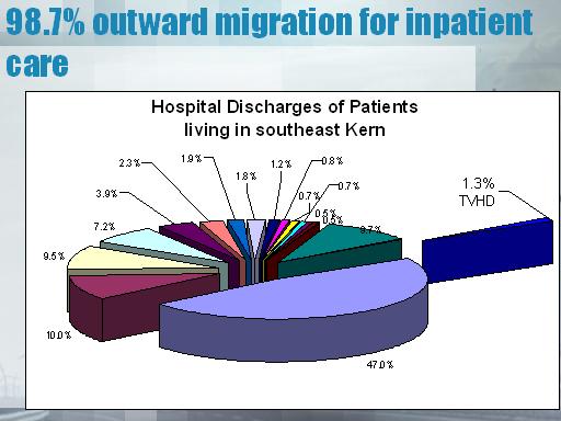
Pie chart describing "Hospital Discharges of Patients living in southeast Kern" There is no legend to the colors in the pie chart, although the "slices" show percentages.
Notes:
Hard to address chronic disease and quality of care when everyone is leaving the region to get their care! Have to get the care back in the region.
 Previous Slide Contents Next Slide


 540 Gaither Road Rockville, MD 20850