|
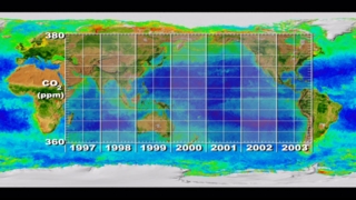
This animation shows the global biosphere in the background and corresponding carbon dioxide graph in the foreground. The biosphere is represented as phytoplankton concentrations over the ocean and vegetation index over land. The carbon dioxide concentrations are from Mauna Loa, Hawaii measurements. As each year progresses, notice how the greening of the land moves south to north, then north to south. Also, notice how this corresponds to the carbon dioxide graph. As the northern hemisphere greens up, the carbon dioxide decreases due to the fact that the plants are absorbing more carbon dioxide. As the northern hemisphere gets less green, the carbon dioxide increases. These are annual oscillations in the carbon dioxide graph; however, the overall carbon dioxide trend from 1980 to 2005 is upward.
|


