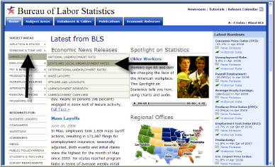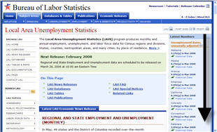
Create Customized MapsThis tutorial will show you how to create customized maps showing unemployment rates, or changes in rates, by state, county, or metropolitan area. On the left menu near the top, select "Unemployment" then click on the link for "State and Local Unemployment rates".
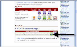
On the Local Area Unemployment Statistics page, Click on the icon for "Mapping Unemployment Rates (States, Metropolitan Areas, Counties)."
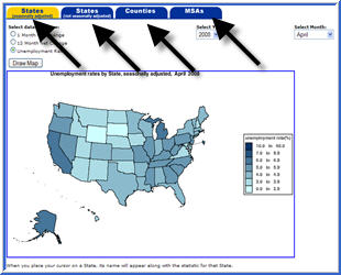
Data are available for states - both seasonally adjusted and not seasonally adjusted, counties within states, or MSAs.
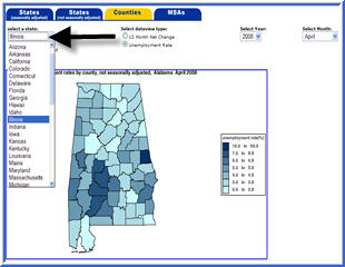
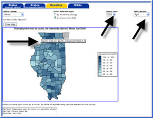
Let's say we are in interested in data for Cook County in Illinois. Click the "Counties" tab. The first state in alphabetical order, Alabama, displays. To see county-level data for Illinois, select "Illinois" from the state drop-down list.The state will display after we click the "Draw Map" button.
The county name and data level appears. The name of the county and the unemployment rate displays when we place the mouse pointer over the map. To see data for a different time period, choose from the choices under the "Select Year" and "Select month" drop-down lists.
This concludes the tutorial. Thank you for visiting the BLS website. |
Tools |
Calculators |
Help |
Info |