Atmospheric Carbon Dioxide from 1980 to 2005
|
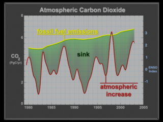
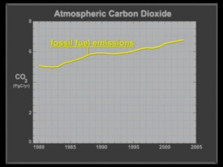
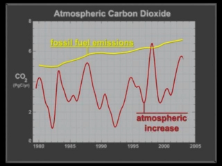
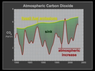
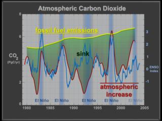
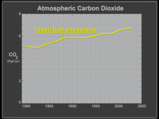
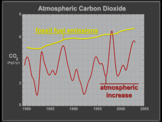
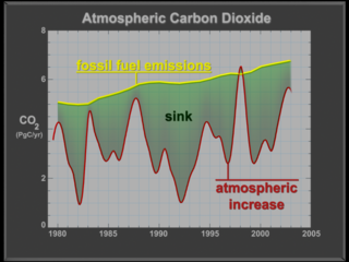
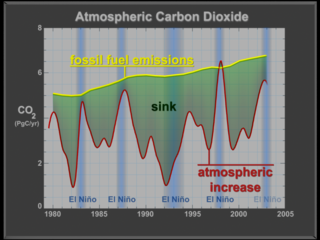
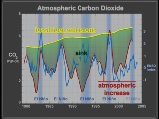
This visualization shows atmospheric carbon dioxide from 1980 to 2005. The first curve (in yellow) is fossil fuel emissions which is the known amount of carbon dioxide put out into the atmosphere. The second curve (in red) is the atmospheric increase which is the measured carbon in the atmosphere. Next, a green region between the two curves highlights the sink which is the amount of carbon dioxide that taken out of the atmosphere by natural processes. Scientists understand when some of the carbon sink occurs, but not all of it. This 'missing carbon' is a scientific mystery. Finally, in the visualization, the El Nino Southern Oscillation (ENSO) Index is added along with blue bars that indicate when each El Nino happens. Notice the strong correlation between the ENSO Index curve and the spikes in the atmospheric increase curve. During an El Nino, there is apparently less of a carbon sink.
|
|
|
|
Atmospheric CO2 from 1980 to 2005 (full animation)
Duration: 26.0 seconds
Available formats:
1280x720 (29.97 fps)
MPEG-2
48 MB
512x288 (29.97 fps)
MPEG-1
4 MB
320x240 (30 fps)
MPEG-1
4 MB
640x480 (30 fps)
MPEG-1
11 MB
720x480 (29.97 fps)
MPEG-2
22 MB
1280x720 (29.97 fps)
Frames
640x480 (29.97 fps)
Frames
320x240
PNG
71 KB
1280x720 (29.97 fps)
MPEG-4
6 MB
How to play our movies
|
|

|
|
Push into the graph
Duration: 5.0 seconds
Available formats:
640x480 (30 fps)
MPEG-1
925 KB
320x240
JPEG
9 KB
How to play our movies
|
|
|
|
Add fossil fuel emissions curve to the graph
Duration: 5.0 seconds
Available formats:
640x480 (30 fps)
MPEG-1
976 KB
320x240
JPEG
29 KB
How to play our movies
|
|
|
|
Add atmospheric increase curve to the graph
Duration: 6.0 seconds
Available formats:
640x480 (30 fps)
MPEG-1
1 MB
320x240
JPEG
36 KB
How to play our movies
|
|
|
|
Add the sink area to the graph
Duration: 5.0 seconds
Available formats:
640x480 (30 fps)
MPEG-1
1 MB
320x240
JPEG
36 KB
How to play our movies
|
|
|
|
Add the El Ninso Southern Oscillation (ENSO) curve to the graph
Duration: 12.0 seconds
Available formats:
640x480 (30 fps)
MPEG-1
2 MB
320x240
JPEG
13 KB
How to play our movies
|
|

|
|
A version without the ENSO curve
Duration: 3.0 seconds
Available formats:
640x480 (30 fps)
MPEG-1
563 KB
320x240
JPEG
12 KB
How to play our movies
|
|
|
|
Empty graph
Available formats:
1280 x 960
TIFF
811 KB
320 x 240
PNG
37 KB
|
|
|
|
Graph with fossil fuel emissions
Available formats:
1280 x 960
TIFF
854 KB
320 x 240
PNG
43 KB
|
|
|
|
Graph with fossil fuel emissions and atmospheric increase
Available formats:
1280 x 960
TIFF
962 KB
320 x 240
PNG
57 KB
|
|
|
|
Graph with fossil fuel emissions, atmospheric increase, and sink
Available formats:
1280 x 960
TIFF
956 KB
320 x 240
PNG
61 KB
|
|

|
|
Graph with fossil fuel emissions, atmospheric increase, sink, ENSO curve and ENSO bars
Available formats:
1280 x 960
TIFF
1 MB
320 x 240
PNG
74 KB
|
|
|
|
Graph with fossil fuel emissions, atmospheric increase, sink, and ENSO bars
Available formats:
1280 x 960
TIFF
1 MB
320 x 240
PNG
66 KB
160 x 80
PNG
13 KB
80 x 40
PNG
4 KB
|
|
|
Back to Top
|

