
The Use of Ensemble Forecasts to Produce Improved Medium Range (3-15 days) Weather Forecasts
By Klaus Weickmann, Jeff Whitaker, Andres Roubicek and Catherine Smith
The traditional method of making a weather forecast is to take the best model available and run it until it loses it's skill due to the growth of small errors in the initial conditions. Skill is typically lost after 6 days or so, depending on the season. An alternate method that produces forecasts with skill up to 15 days after the initial forecast uses what is called "ensemble forecasting". Instead of using just one model run, many runs with slightly different initial conditions are made. An average, or "ensemble mean", of the different forecasts is created. This ensemble mean will likely have more skill because it averages over the many possible initial states and essentially smoothes the chaotic nature of climate. In addition, it is now possible to forecast probabilities of different conditions because of the large ensemble of forecasts available. A more detailed description of ensemble forecasting and PSD's forecast products follow.
Background and Introduction
All of the products on this page are based on forecasts produced by the National Centers for Environmental Prediction (NCEP) global atmospheric circulation models. Every day at 00z and 12z global weather observations are collected, transmitted to major weather centers and, with the aid of a global model to fill in gaps, used to produce a snapshot of the global atmosphere. This snapshot includes winds, pressure, moisture, temperature, etc. at multiple vertical levels in the atmosphere and at grid intersections of about 100km. These "observed" global fields provide the initial conditions for numerical models that integrate the equations of motion of the atmosphere forward in time to produce a forecast. Because of the uncertainty in these initial conditions, an individual model run merely "samples" one of many possible future states of the atmospheric circulation. In order to sample more states, NCEP (and other weather centers) makes many forecast runs of a model out to 15 days in which the initial conditions of the individual runs are slightly perturbed. It has been shown that the average of all these model integrations is the most skillful forecast that can be made given the chaotic nature of the atmospheric circulation.
The Physical Sciences Division (PSD) "downloads" these forecasts from NCEP computers on a daily basis and produces the plots shown on the page. Currently, there are 11 predictions that are run at 12z and another 12 that are run at 00z. PSD transfers these results to Boulder, CO overnight, after the 00z runs have been completed. Results are usually displayed by the next morning. Thus what you see today was derived from initial atmospheric conditions from last night (the 00z runs) and from yesterday morning (the 12z runs). These 23 members represent the current best estimate of the distribution of states expected in the atmosphere out to lead or forecast times of 15 days. An average of all members is referred to as the ensemble mean. One can also use the members to estimate probabilities of certain events, such as much below or much above normal temperatures. Such probabilities are dependent on the spread in the forecasts of individual members. For those familiar with the term, the ensemble prediction approach attempts to define the probability density function or PDF of atmosphere variables. For example, the temperature predicted at a specific location would have a most likely value (the ensemble mean) but would also have values that are scattered around the mean. This scatter increases with forecast lead time and should eventually approach the climatological distribution of temperature (or whatever the variable of interest).
Now let's get on with describing and interpreting the products. Only a subset of fields output by the model are transferred and shown because the data quantities involved are large. The numbers on each paragraph refer to the column of links on the web page.
Product Description, Northern Hemisphere Results
- Column 1 (click on to open a
new window and follow along with today's forecasts) of the NCEP ensemble forecast web page
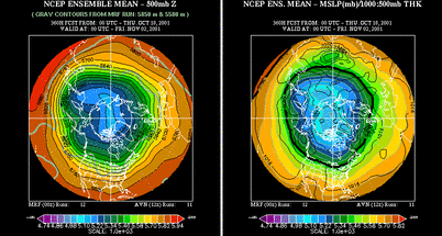
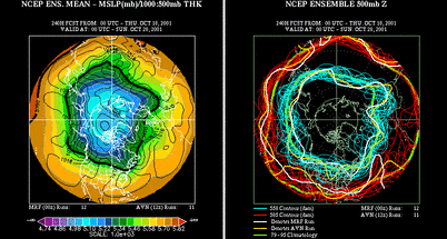
shows predictions of 500 mb height and sea
level pressure over the entire northern hemisphere . 500 mb
is a pressure level in the atmosphere located at about
18,000 ft. and has about half the air pressure experienced
at sea level. The lines of equal height are similar to the
lines of equal elevation on a topographic map. However, in
addition to providing information about the elevations
changes of this pressure surface, they also tell us about
the atmospheric winds. The closer the lines are together
the stronger the winds blow. Also, winds blow
counterclockwise around low heights and clockwise around
high heights (opposite in the southern hemisphere). The
generally low heights near polar regions and high heights
in the tropics/subtropics are consistent with a general
westerly flow (flow toward the east) in the atmosphere at
this level. The first column shows the ensemble mean or
average of the 23 members that make up this prediction
system. Links are provided to individual forecast lead
times and, at the bottom of the column, to all forecast
times together or to an animation of all forecast times.
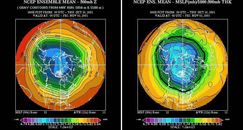
Clicking on an individual lead time brings up a picture
showing the 500 mb heights on the left and the surface
pressure (contours) and 1000-500 mb "thickness" (color
shading) on the right.
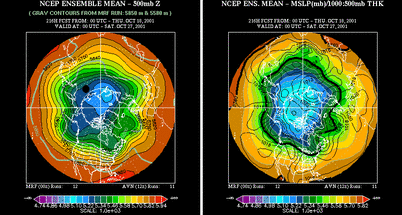
The thickness is proportional to the mean temperature in the vertical layer from near the surface to 18,000 feet. Clicking on either the left or right panel brings up a slightly larger picture of the individual field. Note that as forecast lead time increases the ensemble mean maps get smoother.
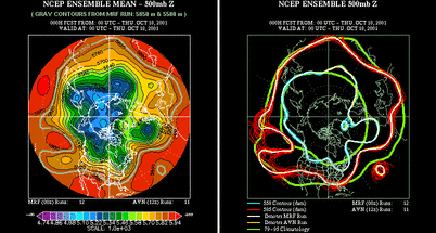
This reflects the fact that there is more uncertainty in the predictions at long lead times or further into the future. The "tight or peaked" distribution of states at the initial time is becoming more spread out as individual members "sample" different but plausible future solutions of the atmospheric circulation. This is nicely demonstrated by the spaghetti plots which are shown in the second column.
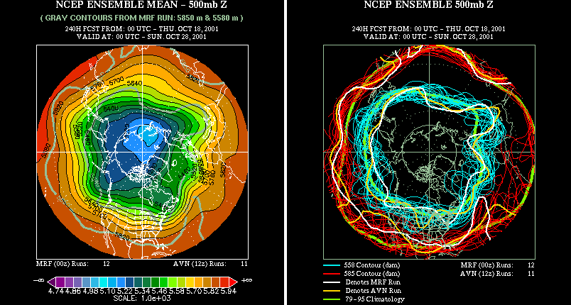
- In this column the 500mb ensemble mean has been repeated
and is shown side-by-side with a "spaghetti diagram".
The latter is constructed by taking two different 500 mb height
lines from each of the 23 members and plotting all of these
curves on one map. The two different lines are chosen to
represent a high latitude (blue line) and mid-latitude (red
line) 500 mb height. When all members are available, there
should be 23 blue lines and 23 red lines, one for each
ensemble member. At the initial time (000 hr fcst), the
two lines are very close together, reflecting a high level
of confidence in the initial atmospheric state.
However, even here there are slight differences and it's these differences that will result in very different forecasts of the future atmospheric state. As one goes further into the future the lines start showing more and more spread or scatter so that by, say, the 240 hr fcst and beyond they look like spaghetti.
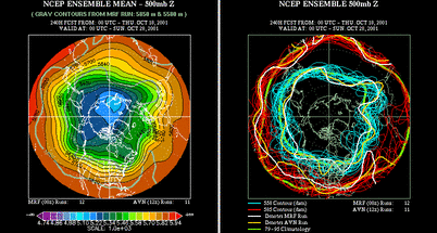
This again demonstrates why the ensemble mean gets smoother. Information on individual storms is essentially lost so that one member may be predicting high pressure in a region while another is predicting low pressure. Averaging smoothes out these differences. However, there may still be useful information at these "long-lead" forecast times, especially for the larger scales of motion. This will be demonstrated later.
One additional feature has been added to the spaghetti plots, namely, two heavy green lines. They represent the two climatological lines of 500 mb height (heavy green lines) that correspond to the red and blue forecast lines. These change slightly every day and are based on about 30 years of global data. By comparing the high latitude green line with the blue lines and the lower latitude green line with the red lines, one can determine how far removed from climatology a particular region is observed (000 hr Fcst) or predicted (024 hr Fcst through 360 hr Fcst) to be. Note that as the scatter of the red and blue lines becomes more pronounced it tends to occur around these climatological lines. This suggests that the ensemble mean (or average of the forecast lines) is approaching climatology. Sometimes, however, even for predictions beyond 10 days (240 hours) most of the predicted lines may remain above or below their respective climatological lines. This might occur for a variety of reasons, e.g., ocean sea surface temperature departures due to an El Nino can produce persistent, long- lived departures from climatology.
- The third column is a repetition of the sea level
pressure/thickness ensemble mean on the left and the
spaghetti plot on the right. This couplet allows for easy
comparison of upper and lower level atmospheric features.
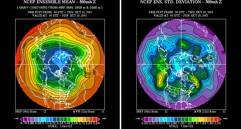
- The fourth column again shows the 500 mb ensemble mean
height along with the standard deviation or spread of
height among the ensemble members.
The mean and standard
deviation define the probability distribution of the
forecast at each lead time.
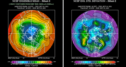
One can see that at the initial time the spread is small so that the distribution must be strongly peaked, i.e., there is relatively high confidence about the current state of the atmosphere. Any spread is due to the small perturbations introduced in the initial conditions of individual ensemble members. These perturbations are generally within the range of observational errors.
Early on in the forecast integration or cycle, many locations over the hemisphere are far removed from their climatological value (e.g., compare green lines with red and blue lines in column 3). This results from initial condition information related to individual weather systems and other processes (e.g., El Nino) that produce departures from climatology. As the forecast lead time increases, the departures from climatology get smaller and the spread gets larger. This means that the probability distribution is becoming less peaked and at very long lead times it should approach the climatological distribution. Once this is reached any predictive skill present in the initial conditions of the atmosphere (or in the ocean sea surface temperatures) has been lost and the "forecast" would be no better than using climatology. In practice, model errors and the manner whereby the initial conditions are perturbed produces a probability distribution that may deviate from the climatological distribution. Accounting for these errors and still extracting useful information is an area of current research at PSD.
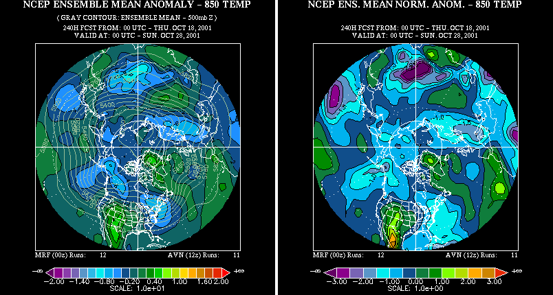
- The sixth column shows the prediction of temperature at
850 mb, which is an atmospheric pressure level located at
about 5000 feet.
The temperature forecasts are shown at
this level rather than the surface because there tend to be
larger forecast errors at the surface in most atmospheric
prediction models. Broadly speaking, the temperature
departures from normal at the 850 mb level give an
indication of departures from normal at the surface. In the future, we may
produce a surface
temperature forecast using statistical regression. At any
rate, this field is probably most directly relevant and
useful in terms of a weather variable that people are
generally interested in. How cold or warm do the model
predictions say the temperature will be in the future? The
left panel shows the ensemble mean departures of 850 mb
temperature from a climatology in degrees Celsius (shaded
field) with the actual ensemble mean 500 mb heights
superimposed (contours).
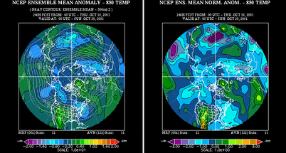
Again, clicking on the figure will bring up a larger version in which features are seen more easily. The departures from normal are computed from a global dataset covering about 30 years of daily data. A question one might ask is: "How unusual are these temperature departures from normal?" The right panel answers this question by showing a normalized departure from climatology. It is computed by using the climatological standard deviation or spread (not shown) along with the departure from normal (left panel). Roughly speaking the numbers can be interpreted as follows. Regions where the numbers are +1.0 represent a positive departure from normal. If we remember our statistics we know that a normalized departure of +1.0 or greater occurs in a normal or gaussian distribution about 16% of the time. The same would be true for numbers of -1.0 or less; they also have a probability of occurrence of 16%. The climatological distribution of daily 850 mb temperatures can be assumed to be gaussian. Thus the percent probability of having a normalized 850 mb temperature departure of either +1.0 or -1.0 would be about 32%. Actually, this would be the probability at a particular location. Over the entire Northern Hemisphere a certain percentage of the area should be covered by such values as weather systems pull cold air southward and push warm air northward. A more extreme departure from normal is represented by values of +2.0 and -2.0. The percent probability of such values at a specific location would be about 2.5% for a value of +2.0 or greater and 2.5% for a value of -2.0 and less. These are truly rare events; for example, in a 90-day winter season there would be on average 4-5 days that would have departures from normal of -2.0 or +2.0.
Now, what happens to the ensemble mean predictions of the temperature departure at longer forecast times? As with the 500 mb heights, the size of the departures decreases because different ensemble members are predicting different temperatures at the same location. One member may move a storm relatively fast so that a region is in the cold air behind the storm while another member may move it more slowly so that the same region is in the warm air ahead of the storm. Averaging the two would result in a smaller temperature departure. However, we can also use the ensemble approach to determine a probability that the predicted temperature departure will be positive or negative. For example, let's assume 15 out of 23 members are predicting a storm will move fast and thus predicting a particular region will be in the cold air behind the storm while the other 8 members are predicting it will move slow and thus are predicting warm conditions in the region. Then one can say that the probability of cold conditions in the region is 15/23 = 65%. Rather than just asking whether it will be cold or warm in a region, one can also ask whether the departure will be larger enough to be one standard deviation from normal (i.e., the +1.0 or -1.0 numbers in the right hand plot of column 5) or even two standard deviations from normal. Such probabilities are shown in the plots of the next column.
- The description of column 6 products should be read
before this column. Clicking on an individual forecast
time brings up two plots. The plot on the left shows the
probability that the 850 mb temperature will be one
standard deviation above normal (green to red shading) or
one standard deviation below normal (blue to purple
shading). The plot on the right shows the same except for
a two standard deviation temperature departure.
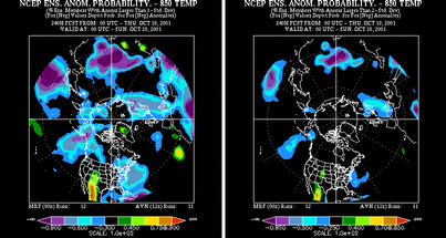
The different colors represent the probability of the departure as predicted by the ensemble members. For forecasts further into the future these probabilities can be expected to decrease as the spread of the individual members increases or alternatively weather systems are predicted to do different things by the ensemble members (e.g., to grow or move differently). The minimum probability shown on both the left hand plot is 30% and on the right is 25%. This number means that 30% (or 25%) of the ensemble members are predicting the given standard deviation of 850 mb temperature. This is OK for the short forecast lead times (~ less than 5 days or 120 hours) but underestimates the information content of the predictions for the long forecast lead times. Remember from previous discussion that the probability distribution of the ensemble members tends to approach the climatological PDF at long lead times. Let's assume for the sake of argument that on average the climatological distribution is reached at 360 hours. This would mean that the probability of a one standard deviation positive temperature departure would be 16% - the climatological value. However, in some cases the atmosphere could be particularly predictable so that maybe 40% of the ensemble members are predicting a +1.0 departure. This would represent more than twice the climatological risk of such a departure; information that could be conceivably useful. However, this would not show up in the current plots.
- The last column allows the user to access all the products available in the previous six columns for a specific forecast time.


North American and Southern Hemisphere plots
All of the above plots are available from the same page for North America in the 2nd table. A subset of the plots available for the Northern Hemisphere are also shown for the Southern Hemisphere and can be accessed in the 3rd table on the page.