Use of Health Care Services
Most older Americans have health insurance through Medicare. Medicare covers a variety of services, including inpatient hospital care, physician services, hospital outpatient care, home health care, skilled nursing facility care, hospice services, and (beginning in January 2006) prescription drugs. Utilization rates for many services change over time because of changes in physician practice patterns, medical technology, Medicare payment policies, and patient demographics.
- Between 1992 and 1999, the hospitalization rate increased from 306 hospital stays per 1,000 Medicare enrollees to 365 per 1,000. The rate then decreased to 350 per 1,000 enrollees in 2005. The average length of a hospital stay decreased from 8.4 days in 1992 to 5.7 days in 2005.
- Skilled nursing facility stays increased significantly from 28 per 1,000 Medicare enrollees in 1992 to 79 per 1,000 in 2005. Much of the increase occurred from 1992 to 1997.
- Between 1992 and 2005, the number of physician visits and consultations increased. There were 11,359 visits and consultations per 1,000 Medicare enrollees in 1992, compared with 13,914 in 2005.
- The number of home health care visits per 1,000 Medicare enrollees increased rapidly from 3,822 in 1992 to 8,227 in 1997. Home health care use increased during this period in part because of an expansion in the coverage criteria for the Medicare home health care benefit.40 Home health care visits declined after 1997 to 2,295 per 1,000 enrollees in 2001. The decline coincided with changes in Medicare payment policies for home health care resulting from implementation of the Balanced Budget Act of 1997. The visit rate increased thereafter to 2,770 per 1,000 enrollees in 2005.
- Use of skilled nursing facility and home health care increased markedly with age. In 2005, there were 30 skilled nursing facility stays per 1,000 Medicare enrollees age 65–74, compared with 228 per 1,000 enrollees age 85 or over. Home health agencies made 1,333 visits per 1,000 enrollees age 65–74, compared with 6,549 per 1,000 for those age 85 and over.
Data for this indicator’s charts and bullets can be found in Tables 29a and 29b.
Health Care Expenditures
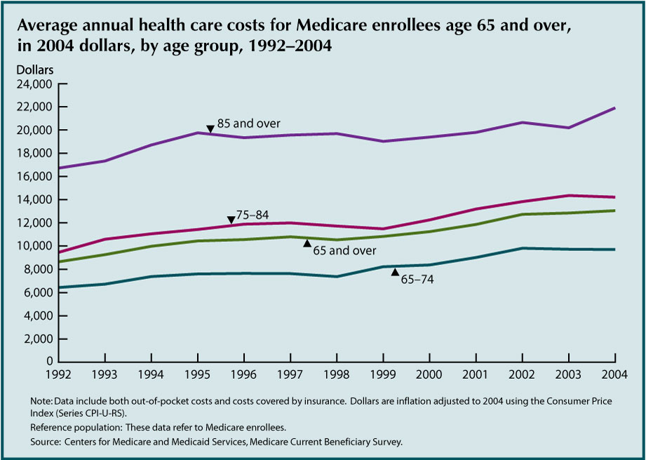
Older Americans use more health care than any other age group. Health care costs are increasing rapidly at the same time the Baby Boom generation is approaching retirement age.
- After adjusting for inflation, health care costs increased significantly among older Americans from 1992 to 2004. Average costs were substantially higher at older ages.
- Average health care costs varied by demographic characteristics. Average costs among non-Hispanic blacks were $14,989 in 2004, compared with $13,101 among non-Hispanic whites and $11,962 among Hispanics. Low income individuals incurred higher health care costs; those with less than $10,000 in income averaged $16,766 in health care costs, whereas those with more than $30,000 in income averaged only $10,676.
- Costs also varied by health status. Individuals with no chronic conditions incurred $4,718 in health care costs on average. Those with five or more conditions incurred $20,334. Average costs among residents of long-term care facilities were $52,958, compared with only $10,448 among community residents.
- Access to health care is determined by a variety of factors related to the cost, quality, and availability of health care services. The percentage of older Americans who reported they delayed getting care because of cost declined from 9.8 percent in 1992 to about 5 percent in 1997 and remained relatively constant thereafter. The percentage who reported difficulty obtaining care varied between 2 percent and 3 percent.
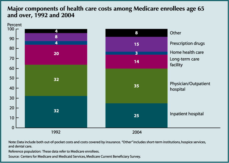
Health care costs can be broken down into different types of goods and services. The amount of money older Americans spend on health care and the type of health care that they receive provide an indication of the health status and needs of older Americans in different age and income groups.
- Hospital and physician services are the largest components of health care costs. Long-term care facilities accounted for 14 percent of total costs in 2004. Prescription drugs accounted for 15 percent of health care costs.
- The mix of health care services changed between 1992 and 2004. Inpatient hospital care accounted for a lower share of costs in 2004 (25 percent compared to 32 percent in 1992). Prescription drugs increased in importance from 8 percent of costs in 1992 to 15 percent in 2004. “Other” costs (short term institutions, hospice and dental care) also increased as a percentage of all costs (4 percent to 8 percent).
- The mix of services varied with age. The biggest difference occurred for long-term care facility services; average costs were $7,057 among people age 85 and over, compared with just $431 among those age 65–74. Costs of home health care and “other” services also were higher at older ages. Costs of physician/outpatient services and prescription drugs did not show a strong pattern by age.
Data for this indicator’s charts and bullets can be found in Tables 30a, 30b, 30c, 30d, and 30e.
Prescription Drugs
Prescription drug costs have increased rapidly in recent years, as more new drugs become available. Lack of prescription drug coverage has created a financial hardship for many older Americans. Medicare coverage of prescription drugs began in January 2006, including a low income subsidy for beneficiaries with low incomes and assets.
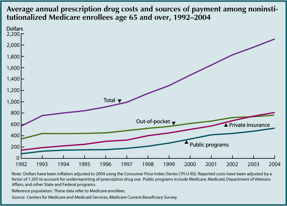
- Average prescription drug costs for older Americans have increased rapidly in recent years. Average costs per person were $2,107 in 2004.
- Average out-of-pocket costs also increased, though not as rapidly as total costs because private and public insurance covered more of the cost over time. Older Americans paid 60 percent of prescription drug costs out of pocket in 1992, compared with 36 percent in 2004. Private insurance covered 38 percent of prescription drug costs in 2004; public programs covered 25 percent.
- Costs varied significantly among individuals. Approximately 8 percent of older Americans incurred no prescription drug costs in 2004. About 24 percent incurred $2,500 or more in prescription drug costs that year.
The purpose of this indicator is to provide a count of Medicare enrollees age 65 and over receiving drug coverage through Part D or in plans of former employers subsidized by Part D. Under Medicare Part D, beneficiaries may join a stand alone prescription drug plan or a Medicare Advantage plan that provides prescription drug coverage in addition to other Medicare-covered services. In situations where beneficiaries receive drug coverage from a former employer, the former employer may be eligible to receive a retiree drug subsidy from Medicare to help cover the cost of the drug benefit.
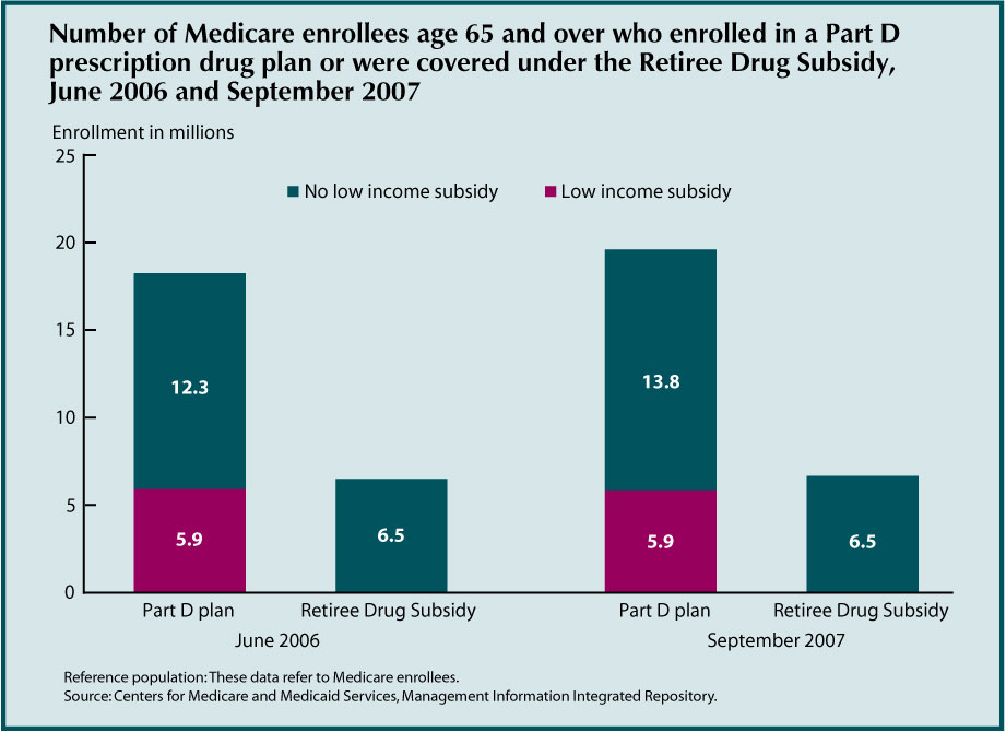
- The number of Medicare beneficiaries enrolled in Part D prescription drug plans increased from 18.2 million in June 2006 to 19.7 million in September 2007. In September 2007, two-thirds of enrollees were in stand-alone plans and one-third were in Medicare Advantage plans. In addition, approximately 6.5 million beneficiaries were covered by the Retiree Drug Subsidy in both years. Beneficiaries who were not in Part D plans and not covered by the Retiree Drug Subsidy either had drug coverage through another source (e.g., Tricare, Federal Employees Health Benefits plan, Department of Veterans Affairs, or current employer) or did not have drug coverage.
- In September 2007, 5.9 million Part D enrollees were receiving low income sub-sidies. Many of these beneficiaries had drug coverage through the Medicaid program prior to enrollment in Part D.
- Chronic conditions are associated with high prescription drug costs. In 2004, older Americans with no chronic conditions incurred average prescription drug costs of $800. Those with five or more chronic conditions incurred $3,862 in prescription drug costs on average.
Data for this indicator’s charts and bullets can be found in Tables 31a, 31b, 31c, and 31d.
Sources of Health Insurance
Nearly all older Americans have Medicare as their primary source of health insurance coverage. Medicare covers mostly acute care services and requires beneficiaries to pay part of the cost, leaving about one-half of health spending to be covered by other sources. Many beneficiaries have supplemental insurance to fill these gaps and pay for services not covered by Medicare. Since January 2006, beneficiaries have had the option of receiving prescription drug coverage through stand-alone prescription drug plans or through some Medicare Advantage health plans.

- Most Medicare enrollees have a private insur-ance supplement, approximately equally split between employer sponsored and Medigap policies. The percentage with Medicaid cover-age has increased slightly over the last several years to about 12 percent in 2005. Enrollment in Medicare HMOs and similar health plans, which are usually equivalent to Medicare supplements because they offer extra benefits, varied between 6 percent and 21 percent. About 12 percent of Medicare enrollees report having no health insurance supplement.
- Enrollment in HMOs and similar health plans increased rapidly throughout the 1990s, then decreased beginning in 2000 as many HMOs withdrew from the Medicare program. The percent with Medigap policies decreased in the late 1990s as HMO enrollment increased. There was a slight increase in the percentage of Medicare enrollees without a supplement in 2002.
Data for this indicator’s chart and bullets can be found in Tables 32a and 32b.
Out-of-Pocket Health Care Expenditures
Large out-of-pocket expenditures for health care service use have been shown to encumber access to care, affect health status and quality of life, and leave insufficient resources for other necessities.41,42 The percentage of household income that is allocated to health care expenditures is a measure of health care expense burden placed on older people.
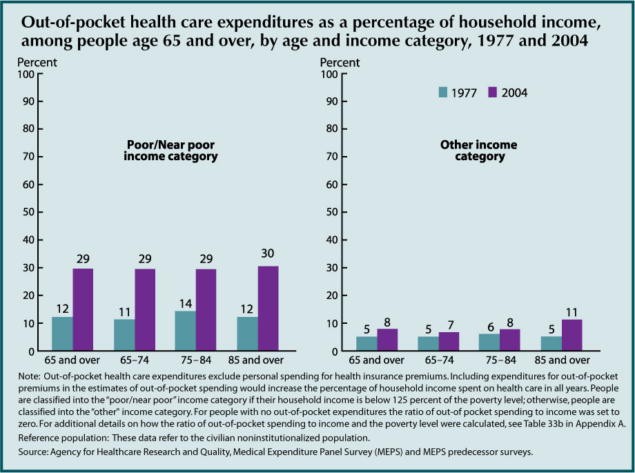
- The percentage of people age 65 and over with out-of-pocket spending for health care services increased between 1977 and 2004 (83 percent to 96 percent, respectively).
- From 1977 to 2004, the percentage of household income that people age 65 and over allocated to out-of-pocket spending for health care services increased among those in the poor/near poor income category (from 12 percent to 29 percent). Increases were also observed for those in poor or fair health, most notably among those age 85 and over (from 9 percent to 18 percent).
- In 2004, as in the 4 previous years, over one-half of out-of-pocket health care spending by people age 65 and over was used to purchase prescription drugs (from 54 percent in 2000 to 61 percent in 2004).
- In 2004, people age 85 and over were less likely than people age 65–74 to spend out-of-pocket dollars on dental services or office-based medical provider visits but more likely to spend out-of-pocket dollars on other health care (e.g., home health care and eyeglasses).
Data for this indicator’s chart and bullets can be found in Tables 33a, 33b, and 33c.
Sources of Payment for Health Care Services
Medicare covers about one-half of the health care costs of Medicare enrollees age 65 and over. Medicare’s payments are focused on acute care services such as hospitals and physicians. Nursing home care, prescription drugs, and dental care have been primarily financed out-of-pocket or by other payers. Medicare coverage of prescription drugs began in January 2006, including a low income subsidy.
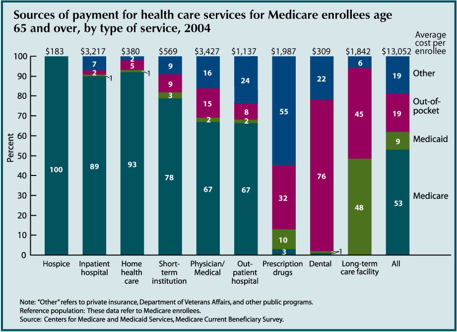
- Medicare paid for slightly more than one-half (53 percent) of the health care costs of Medicare enrollees age 65 and over in 2004. Medicare finances most of their hospital and physician costs, as well as a majority of short term institutional, home health, and hospice costs.
- Medicaid covered 9 percent of health care costs of Medicare enrollees age 65 and over, and other payers (primarily private insurers) covered another 19 percent. Medicare enrollees age 65 and over paid 19 percent of their health care costs out-of-pocket, not including insurance premiums.
- In 2004, 48 percent of long-term care facility costs for Medicare enrollees age 65 and over were covered by Medicaid; another 45 percent of these costs were paid out-of-pocket. Fifty-five percent of prescription drug costs were covered by third party payers other than Medicare and Medicaid, consisting mostly of private insurers. Thirty-two percent of prescription drug costs were paid out-of-pocket. Seventy-six percent of dental care received by older Americans was paid out-of- pocket.
- Sources of payment for health care vary by income. Lower income individuals rely heavily on Medicaid; those with higher incomes rely more on private insurance. Lower income individuals pay a lower percent of health care costs out-of-pocket, but have a higher average cost for services than individuals with higher incomes.
Data for this indicator’s chart and bullets can be found in Tables 34a and 34b
Veterans Health Care
The number of veterans age 65 and over who receive health care from the Veterans Health Administration (VHA) within the Department of Veterans Affairs has been steadily increasing. This increase may be because VHA fills important gaps in older veterans’ health care needs not currently covered or fully covered by Medicare, such as mental health services, long-term care (nursing home care and community-based care), and specialized services for the disabled.
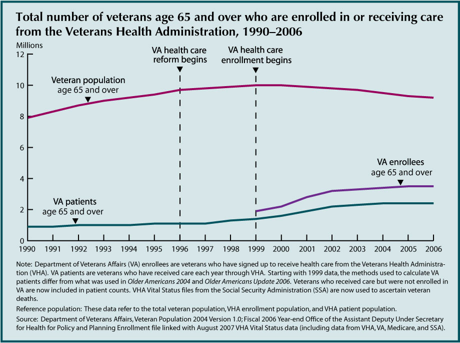
- In 2006, approximately 2.4 million veterans age 65 and over received health care from VHA. An additional 1.1 million older veterans were enrolled to receive health care from VHA but did not use its services in 2006.
- Reforms and initiatives implemented by VA since 1996 have led to an increased demand for VHA services among veterans despite the short-term decline in the numbers of older veterans (see “Indicator 6: Older Veterans”). Some of the changes include opening the system to all veterans (1996), implementing enrollment for VHA health care (1999), and enhancing availability of outpatient and community based care.
- An increasing number of older veterans are turning to VHA for their health care needs despite their potential eligibility for other sources of health care, most notably prescription drug coverage through Medicare. VHA estimates that 94 percent of its enrollees age 65 and over are covered by Medicare Part A, 74 percent by Medicare Part B, 51 percent by Medigap, 13 percent by Medicaid, 20 percent by private insurance (excluding Medigap), and 10 percent by TRICARE for Life. About 4 percent have no other public or private coverage.43
Data for this indicator’s chart and bullets can be found in Table 35.
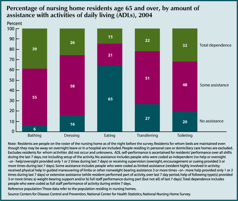
Nursing Home Utilization
Residence in a nursing home is an alternative to long-term care provided in one’s home or in other community settings. Recent declines in rates of nursing home residence may reflect broader changes in the health care system affecting older Americans. Other forms of residential care and services, such as assisted living and home health care, have become more prevalent as rates of nursing home admissions have declined.
- In 2004, 9 people per 1,000 age 65–74 resided in nursing homes, compared with 36 people per 1,000 age 75–84 and 139 people per 1,000 age 85 and over.
- The total rate of nursing home residence among the older population declined between 1985 and 2004. In 1985, the age adjusted nursing home residence rate was 54 people per 1,000 age 65 and over. By 2004 this rate had declined to 35 people per 1,000. Among people age 65–74, rates declined by 24 percent, compared with a 37 percent decline among people age 75–84 and age 85 and over.
- Despite the decline in rates of nursing home residence, the number of nursing home residents age 65 and over had been increasing until recently because of the rapid growth of the older population. Between 1985 and 1999, the number of current nursing home residents age 65 and over increased from 1.3 million to 1.5 million but then declined to 1.3 million in 2004. In 2004, almost three-fourths (980,000) of older nursing home residents were women.
- In 2004, the majority of nursing home residents age 65 and over received assistance with at least one activity of daily living (ADL). Levels of assistance provided for individual ADLs were high, from 94 percent for bathing to 73 percent for transferring. The only ADL for which the majority of residents received no assistance (65 percent) was eating.
- Among the nursing home population, women were more likely than men to require full assistance with daily activities. The percentage of women who were totally dependent in any one of the five activities was higher than that for men. Conversely, men were more likely to receive no assistance with daily activities.
- Older white nursing home residents were less likely than black residents or residents of other races to be dependent in daily activities. For example, nearly one-half of all black and other race residents were dependent in bathing, 46 percent for both, while 37 percent of white residents required total assistance. White residents were more likely to receive some intermediate level of assistance.
Data for this indicator’s charts and bullets can be found in Tables 36a, 36b, and 36c
Residential Services
Some older Americans living in the community have access to various services through their place of residence. Such services may include meal preparation, laundry and cleaning services, and help with medications. Availability of such services through the place of residence may help older Americans maintain their independence and avoid institutionalization.
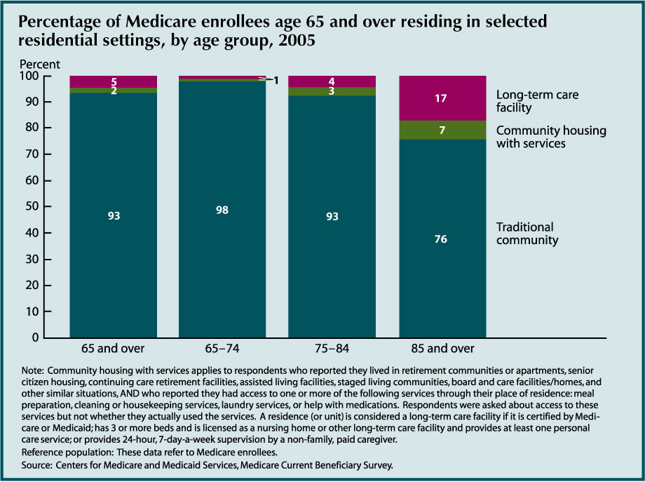
- In 2005, 2 percent of the Medicare population aged 65 and over resided in community housing with at least one service available. Approximately 5 percent resided in long-term care facilities. The percentage of people residing in community housing with services and in long-term care facilities was higher for the older age groups; among individuals age 85 and over, 7 percent resided in community housing with services, and 17 percent resided in long-term care facilities. Among individuals age 65–74, 98 percent resided in traditional community settings.
- Among residents of community housing with services, 86 percent reported access to meal preparation services, 82 percent reported access to housekeeping/cleaning services, 70 percent reported access to laundry services, and 45 percent reported access to help with medications. These numbers reflect percentages reporting availability of specific services, but not necessarily the number that actually used these services.
- More than one-half (54 percent) of residents in community housing with services reported that there were separate charges for at least some services.
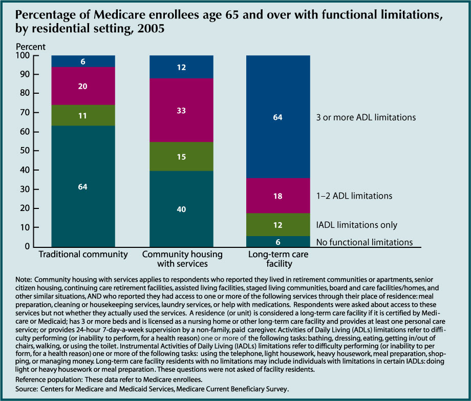
- People living in community housing with services had more functional limitations than traditional community residents, but not as many as those living in long term care facilities. Forty-six percent of individuals living in community housing with services had at least one activity of daily living (ADL) limitation compared with 26 percent of traditional community residents. Among long-term care facility residents, 82 percent had at least one ADL limitation. Forty percent of individuals living in community housing with services had no ADL or instrumental activities of daily living (IADL) limitations.
- The availability of personal services in residential settings may explain some of the observed decline in nursing home use (see “Indicator 36: Nursing Home Utilization”).
- Residents of community housing with services tended to have slightly lower incomes than traditional community residents, but higher incomes than long-term care facility residents. Twenty-two percent of residents of community housing with services had incomes of $10,000 or less in 2005, compared with 15 percent of traditional community residents and 40 percent of long-term care facility residents.
- Over one-half (52 percent) of people living in community housing with services reported they could continue living there if they needed substantial care.
Data for this indicator’s charts and bullets can be found in Tables 37a, 37b, 37c, 37d, and 37e.
Caregiving and Assistive Device Use
Possible reasons for the decline in nursing home rates (see “Indicator 36: Nursing Home Utilization”) include improvements in the health and functioning of the older population, changes in household living arrangements (e.g., the move toward assisted living and other residential care alternatives), and greater use of personal assistance and/or special equipment that help older people living in the community maintain their independence.

- Between 1992 and 2005, the age adjusted proportion of people age 65 and over who had difficulty with one or more ADLs and who did not receive personal assistance or use special equipment with these activities decreased from 42 percent to 35 percent. More people are using equipment only—the percentage increased from 28 percent to 36 percent. The percentage of people who used personal assistance only decreased from 9 percent to 7 percent.
- In 2005, nearly two-thirds (65 percent) of people who had difficulty with one or more ADLs received personal assistance or used special equipment: 7 percent received personal assistance only, 36 percent used equipment only, and 22 percent used both personal assistance and equipment.

- In 2005, more than three-fifths of people age 65 and over who had difficulty with one or more IADLs received personal assistance. The percentage of people receiving personal assistance was higher for people age 85 and over (74 percent) than it was for people age 75–84 (67 percent) or people age 65–74 (63 percent).
- There was no significant change between 1992 and 2005 in the percentage of people (in any age group) who had difficulty with one or more IADLs and who received personal assistance. Men and women were equally likely to receive assistance.
Data for this indicator’s charts and bullets can be found in Tables 38a and 38b.