


Environmental Visualization Program
|
|||||||||||||||||||||||||||||||||||||||||||||||||||||||||||||||||||||||||||||||||||||
| Title | File Size (MB) |
Duration (MM:SS) |
Description |
|---|---|---|---|
| New! Corals from Outer to Inner Space | 118 | 8:30 | 2008 is the International Year of the Reef. This production, created for the Science on a Sphere (link: www.sos.noaa.gov) , highlights NOAA's activities in coral reef science. Audio is included. RTF file of transcript. |
| New! 22 Years of Sea Surface Temperature | 47 | 1:48 | The NOAA polar orbiting satellites (POES) have been collecting sea surface temperature data since 1985. This animation is a compilation of all of the data collected from POES from 1985-2006. |
| La Niña | 3 | 0:04 |
Description
The La Niña is the climatic
antithesis of El Niño. Whereas El Niño created equatorial Pacific
warming due to weak surface winds, La Niña arises from very strong
easterly winds that promote the upwelling of deep, cold waters to the
surface of the ocean. These colder than average waters are visible in
the animation as blue and purple colors. Like El Niño, the La Niña
also alters global precipitations, ocean and atmospheric circulation.
These climatic changes differ depending on the region examined. |
| El Niño | 6.7 | 0:11 |
Description
The El Niño Southern
Oscillation is a climatic cycle that is characterized by reduced
easterly winds around the Pacific equator. Without these winds, warm
water accumulates off the coast of South America and slowly spreads
across the Pacific. Higher than normal temperatures, shown as orange
and red in the animation, alter global precipitation, ocean and
atmospheric circulation. |
| Global Temperature Change | 20 | 0:12 |
Description
This animation shows the
global annual temperature anomalies from 1880 to the present. As also
shown in the animated graph, the average temperate of the Earth has
increased since 1880, when compared to the average temperatures of
1960-1991. Notice the rapid appearance of orange and red over the
U.S. in the last 25 years. |
| Polar Ice Changes | 16 | 0:14 |
Description
This animation shows three
years of sea ice concentration data, as observed by the NASA QuikSCAT
satellite. Notice how the North Pole ice minimum is at the opposite
time of the year as the South Pole's. This difference is cause by the
axis of Earth's rotation creating different seasons in the northern
and southern hemispheres. |
| 2006 Ozone Hole | 16 | 0:15 |
Description
The change in the ozone hole over
Antarctica is shown from the NOAA-16 polar orbiting satellite from Jan
1, 2006 to Nov 6, 2006. Notice how the size of the hole is enlarging
during the colder months. See
NASA and NOAA
Announce Antarctic Ozone Hole is a Record Breaker for more
information. |
| Atmospheric Aerosols and Dust | 27 | 0:19 | Description
Movement of aerosol plumes over
the oceans are shown in the NOAA-16 Aerosol Optical Thickness from
July 2005 to August 2006. Notice the large amout of aerosol coming
off the coast of Africa. See
NESDIS'
Office of Satellite Data Production and Distribution |
| Environmental Satellites | 22 | 1:12 |
Description
NOAA operates two different
satellite constellations, defined by how they orbit the Earth. Shown
are examples of geostationary vs. polar-orbiting satellites. |
| Global Earth Observation Satellite System | 50 | 0:16 |
Description
An integrated Global Earth
Observation System of Sytems (GOESS) is a major priority for NOAA.
Shown here are the environmental satellites involved in GOESS in the
actual orbits. |
| Global Chlorophyll Concentration in the Ocean | 20 | 0:12 |
Description
NOAA uses the commercial OrbView
satellite to monitor chlorophyll in the ocean. This monitoring is
improtant for fisheries management and harmful algal bloom warnings.
Shown is the change in phytoplankton chlorophyll during 2005. Notice
how the black areas shift up and down during the "polar night"...the
time when the poles receive no sunlight. |
| Energy in Ocean Available for Hurricanes | 27 | 0:15 |
Description
This animation depicts
Tropical Cyclone Heat Potential (TCHP) during the 2005. The TCHP
differs from sea surface temperature in that it takes into account
water temperature below the surface. TCHP is defined as a measure of
the integrated vertical temperature from the sea surface to the depth
where the ocean temperature is 26ºC (the minimum temperature needed to
produce hurricanes). The more red areas in the animation have more
heat energy available for hurricane intensification. |
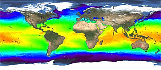
| Sea Surface Temperatures | 26 | 0:11 | Description
This animation shows the heating
and cooling of the world's oceans over the course of three years. Warm
colors (orange, red) indicate warm temperatures; cool colors (blue,
purple) indicate cold temperatures. Visible is the extremely intense
El Nina of 2003-2006. It can be identified by an undulating band of
green color around the equatorial region off of South America. Another
characteristic of the La Nina is the extremely warm ocean temperatures
of the West Pacific and Atlantic oceans. Also visible is the
fluctuations in the distribution of sea ice (dark grey) around the
poles. The images were produced from temperature sensors aboard the
National Oceanic and Atmospheric Administration's fleet of
geostationary and polar orbiting satellites. This data is crucial for
such activities as monitoring the health of marine ecosystems,
detecting the start of El Nino or La Nina, monitoring the threat of
ice bergs, and providing data on the potential for severe
hurricanes. |
| Tsunami Waves | 28 | 0:50 | Description
This animation shows the wave
propagation from the June 10, 1996 tsunami that formed off of
Andreanov Island in the Aleutian Archipelago off Alaska. Also depicted
are the Deep ocean Assessment and Reporting of Tsunami (DART) buoys
that are used by National Oceanic and Atmospheric Administration
(NOAA) to detect and alert the public to the presence of tsunami
threats. An interesting enhancement of this animation, originally
provided by the NOAA Pacific Marine Environment Laboratory, is the
underlying ocean topography. You can see how the waves interact with
ocean bottom features. |
| Global Topography | 83 | 1:40 | Description
This rotating globe animation
displays satellite altimetry data showing the topographic features of
the continents and oceans. The data was compiled from the U.S. Navy
GEOSAT (Geodetic/Geophysical Satellite) and European Space Agency's
ERS-1 satellites, as well as information from high resolution ship-
based soundings of the ocean floor. Try to identify 1. Tectonic plate
margins, 2. Marianas Trench, 3. Hawaiian Islands undersea mountain
chain, 4. Mid-Atlantic ridge, 5. Areas of divergence, convergence, and
transform-faults. |
| Severe storms forming tornadoes | 24 | 0:13 | Description
Between 8:20 and 8:30 PM on March
12, 2006, the city of Springfield, IL, was affected by a pair of F2-
strength tornadoes. These tornadoes killed 2 people, injured 50, and
caused $2.5 million in damage. The NOAA GOES-12 satellite captured
infrared imagery of the system as it moved across the plains. Using
color enhancements, the rapid intensification is evident. In this
color scheme "cold"/blue colors indicate stronger storm intensity.
Though the actual tornadoes are not visible, the intense storm system
can be seen. |
| Hurricane Season 2005 Animation | 133 | 4:28 | Description
This animations shows all of the
cyclonic activity associated with the 2005 hurricane season from June
to November. The 2005 hurricane season was a record breaker: the most
named storms, three of the six most intense storms on record, the
latest forming storm, and the most costly season in property damages.
The infrared imagery was captured by the NOAA GOES-12 satellite with
4km resolution. Names of all of the tropical storms and hurricanes are
included in the animation. |
| Colorized infrared imagery of Hurricane Katrina | 40 | 0:36 | Description
Colorized satellite infrared (IR)
imagery was used to show the relative intensity of Hurricane Katrina
as it moves towards the U.S. coast during August of 2005. White colors
indicate the cold, high elevated clouds that are associated with the
most intense storm activity. Green colors are the low-level, warmer
cloud tops that are less intense. Again, notice how rapidly the storm
reorganizes and intensifies once it reaches the warm waters of the
Gulf of Mexico. |
| Hurricane hunter airplane | 34 | 1:24 | Description
During tropical storm and
hurricane activity, NOAA flies aircraft into the storms to acquire
highly accurate data on wind speeds, pressure, etc. This animation
overlays the flight paths of two hurricane hunter missions during
Hurricane Michelle (November 2001). |
| Hurricane Katrina | 13 | 0:37 |
Description
The animation shows the
progression of Katrina as it intensifies from a tropical storm on Aug
22, 2005 to a hurricane, crosses the Florida peninsula, 5. in the Gulf
of Mexico, and makes landfall near New Orleans on Aug 29, 2005. Notice
how rapidly the storm reorganizes once it reaches the warm waters of
the Gulf of Mexico. |
All imagery produced by the NOAA Environmental Visualization Program are free and may not be copyrighted. You may use these products for educational or informational purposes, including photo collections, textbooks, public exhibits and Internet Web pages. However, please credit "NOAA" for the use of these materials.
 Many of the products
available on this site are large files (greater
than 10mb in size). It is recommended that users "right click" and "save
as" to a location your computer. Clicking the links directly may result
in extremely long download times, and incomplete viewing of the
animations. Animations are in MOV format, and can be viewed in
Quicktime player or Real player, available for download at the
sites listed below:
Many of the products
available on this site are large files (greater
than 10mb in size). It is recommended that users "right click" and "save
as" to a location your computer. Clicking the links directly may result
in extremely long download times, and incomplete viewing of the
animations. Animations are in MOV format, and can be viewed in
Quicktime player or Real player, available for download at the
sites listed below: