CleanTechnica is the #1 cleantech-focused
website
 in the world. Subscribe today!


Clean Power Click here to embiggen.

Published on May 6th, 2013 | by Zachary Shahan

14

Solar — A Disruptive Technology (Graph)

Share on Google+Share on RedditShare on StumbleUponTweet about this on TwitterShare on LinkedInShare on FacebookPin on PinterestDigg thisShare on TumblrBuffer this pageEmail this to someone

May 6th, 2013 by Zachary Shahan 

This article was originally published on Solar Love.

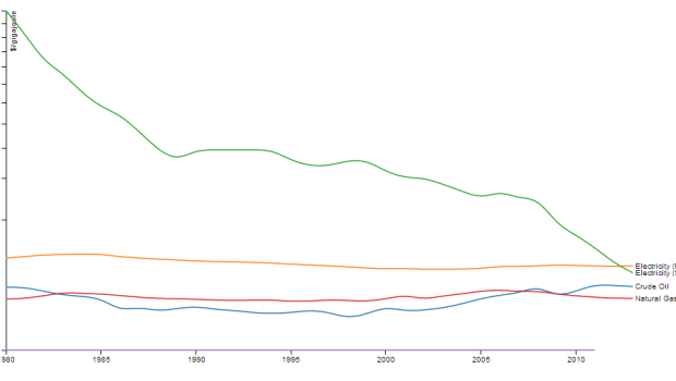
I recently ran across this interesting graph on reddit:

The title of the article in which the graph was housed (similar to mine above) was: “Solar Energy: This Is What A Disruptive Technology Looks Like.”

I think the graph is pretty clear — while the price of retail electricity, residential natural gas, and crude oil have all remained fairly constant in the past few decades (in inflation-adjusted terms), the price of solar has rolled down a long, big hill. And, the good news is, it’s still rolling.


For a bit more detail on the methodology, Brian McConnell, a software engineer and the creator of The Joule Standard, explains:

Using data from the Energy Information Agency, I pulled together a history of retail prices for natural gas, crude oil, gasoline and residential electricity, all adjusted for inflation. For each energy source, I converted the prices to $/gigajoule, using conversion factors from engineering tables. (For example, a million cubic feet of natural gas contains 1.083 gigajoules of energy content).

Next, using data from the National Renewable Energy Laboratory and other sources, I looked up the price history for solar power, in terms of dollar per Watt of system capacity (a standard unit of measure for solar). With this data, I built a cost model to translate the cost of a solar cell into $/gigajoule. The basic idea is to amortize the system cost over its useful life, and divide this by the average amount of power it generates per month. This allows the cost of solar to be compared directly to other sources.

The comparison shows quite clearly that the cost effectiveness of solar power is increasing exponentially. In 1977, solar cells cost upwards of $70 per Watt of capacity. In 2013, that cost has dropped to $0.74 per Watt, a 100:1 improvement (source: The Economist). On average, solar power improves 14% per year in terms of energy production per dollar invested.

Good stuff.

There’s still a lot of room for improvement in the efficiency of solar cells and in bringing down their costs, through technological advancement and scaling up of production. If that trend graphed above continues much further, solar will be about as “disruptive” as it gets… for the better, of course.

Nice piggy-back onto the post about an hour ago, eh?

Keep up to date with all the hottest cleantech news by subscribing to our (free) cleantech newsletter, or keep an eye on sector-specific news by getting our (also free) solar energy newsletter, electric vehicle newsletter, or wind energy newsletter.


Share on Google+Share on RedditShare on StumbleUponTweet about this on TwitterShare on LinkedInShare on FacebookPin on PinterestDigg thisShare on TumblrBuffer this pageEmail this to someone

Tags: , , ,


About the Author

spends most of his time here on CleanTechnica as the director/chief editor. Otherwise, he's probably enthusiastically fulfilling his duties as the director/editor of Solar Love, EV Obsession, Planetsave, or Bikocity. Zach is recognized globally as a solar energy, electric car, and wind energy expert. If you would like him to speak at a related conference or event, connect with him via social media. You can connect with Zach on any popular social networking site you like. Links to all of his main social media profiles are on ZacharyShahan.com.


  • Pingback: Solar Power's Massive Price Drop (Graph) | CleanTechnica

  • Ferd Roseboom

    Solar’s future’s about to get a whole lot brighter thanks to the Moore’s Law of PVs. Heard of Swanson’s Law? See: Pricing sunshine – The Economist: http://www.economist.com/blogs/graphicdetail/2012/12/daily-chart-19“]

    And here’s the tech that’ll do it (in 5 ways):
    http://news.nationalgeographic.com/news/energy/2013/04/130429-nanotechnology-solar-energy-efficiency/
    Sun Plus Nanotechnology: Can Solar Energy Get Bigger by Thinking Small?
    “Advances in nanotechnology will lead to higher efficiencies and lower costs. Today’s commercial solar cells, usually fashioned from silicon are still relatively expensive to produce even though prices have come down, and they generally manage to capture only 10 to 20% …”

    • Bob_Wallace

      Whoever wrote that Economist article back in December 2012 should have done a bit more research. They predicted PV was going to fall to $0.75/watt in 2013. Solar was already cheaper than that in 2012.

      The current average price for silicon panels is 68c/W. Thin film is 62c/W. Lowest selling prices are 56c/W and 52c/W.

      http://pvinsights.com/

  • Bob_Wallace

    Here’s an interesting graph I found. Unfortunately it has historical data to only 2005 and everything past then is projected.

    They really missed it with PV. Even the bottom of their range is way high for 2012. The wind projection looks fairly good.

  • Steeple

    I give credit to the people who have done so much good work in making solar a real alternative. I have to say that using a log scale graph is a bit disingenuous and doesn’t tell the true story about the remarkable development of shale based natural gas.

    • Bob_Wallace

      Here’s what shale gas has done for NG prices. About a 3x cost decrease which isn’t likely to hold. There was a drilling “gold rush” which knocked prices very low and we’re still burning off the surplus.

      Prices are not yet up to the point of making additional drilling profitable. Shale gas may have cut cost about 2x overall.

      • Steeple

        Thanks. It’s going to be really tough for Nat Gas prices to push through $5 given the apparent reserves and the ability for coal to come back into the mix at those prices.

        • Bob_Wallace

          Coal doesn’t have the same grid value as NG because it isn’t dispatchable. Late night coal is worth almost nothing but it still costs to keep the boiler hot.

          If by “reserves” you mean the gas still in the ground, that is not going to be as cheap as one might think. New wells, generally, drop off production very rapidly. In some fields wells drop 50% in one year and some drop 95% in three years. Once a well drops appreciably then it’s time to either drill a new well or re-frack the old one.

          I don’t think there are enough producing wells to keep the pipes full very long.

          Gas is likely to keep rising in price. Where the limit is, I don’t know. But if NG at $4 produces $0.06/kWh and wind plus storage hits the $0.06 to $0.09 range then NG is going to spend a lot of time sitting on the sidelines as gas prices rise.

      • Zer0Sum

        It’s only profitable when they get subsidies to drill the wells. In terms of energy spent it is decidedly unprofitable. They are absorbing subsidized fuels to offset the energy lost in the production process. This is only going in one direction.

    • Bob_Wallace

      Here’s a longer look. From 1997 onward.

  • addicted4444

    That is one smart dude. While I am not sure how practical they are, he brings up several nice ideas. Measuring energy in terms of joules, as opposed to “gallons of gas, etc” and using energy as currency are both extremely interesting ideas.

    • Bob_Wallace

      Might be interesting to turn the joules into “actual value/work”.

      Joules of oil/natural gas energy aren’t that meaningful when one considers how much will be wasted heat.

      Perhaps the metric should be cost per lumen or mile driven.

  • Bob_Wallace

    Love the “embiggen”.

    Need to add wind to that graph. Wonder if the author would be willing to post his raw numbers on line?

  • Ross

    Nice one-two sucker punch for the fossil nukes.

Back to Top ↑