Enroll America is an organization with a big job: to find the uninsured around the country and persuade them to sign up for health insurance. It needs a good way to find them.
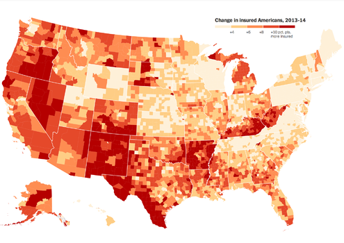
The organization realized early that it would need a detailed picture of just who was uninsured in the country and where they lived. The model they built underlies the maps and demographic summaries in The Upshot’s article today on who was helped most by Obamacare. Enroll, which is financed by charitable foundations, health care companies and private individuals, enlisted the help of data professionals who worked in the Obama campaign’s get-out-the-vote effort. It partnered with the data group Civis Analytics, which has worked extensively with political campaigns to find potential voters and persuade them to vote for particular candidates.
The group wanted to be ready for outreach efforts in 2013 before the major coverage expansion provisions of the Affordable Care Act went live in January of this year. It wanted to persuade people to sign up during the open enrollment period, which began last October.

To start, it conducted a huge phone survey of 12,000 adults around the country who use cellphones and land lines, asking people 10 basic questions in either English or Spanish. Then it folded in publicly available data about those individuals and their communities, using commercial databases and statistics from the census. It considered about 500 variables; the final model used a smaller number, 30, that together made a strong prediction. The goal was to create a score for each person that reflected the odds that the person would be uninsured.
Then Enroll started sharing the scores with its workers and partners working in local communities. It found that neighborhood data was more useful than individual scores. Outreach workers focused on groups at the ZIP code level. With door-to-door canvassing, it helps to pick the neighborhoods where the greatest number of door knocks will find a person who is uninsured. In addition to door-knocking, and mailing fliers, the organization and its partners also bought targeted advertising and pursued community-organizing activities, like educating members of the clergy in communities with a lot of churchgoing uninsured people.
“We started using the model initially to try to get to people at an individual level, and there was a degree of accuracy there,” said Gregg Ross, Enroll’s organizing director in North Carolina, one of 11 states where the group made a big push. “Once we started using it for this geographic targeting and coupling it with our knowledge of the communities, we were finding that upward of 80 percent of the people we contacted were uninsured.”
Ross’s high hit rate mirrored that of other Enroll workers and volunteers, and is one of the signs that the model is accurate. If the model was sending them to neighborhoods where they were not finding many uninsured people, it might suggest a glitch in the data. Over all, Enroll’s data team said that, at the neighborhood level, their door knocks last year varied by only about one percentage point from what the model was predicting.
Enroll then repeated the whole survey-and-model process this summer to capture 2014 numbers, though its survey group was smaller — about 8,000 people. Its objective was to measure its results — just how many people signed up in the places it was targeting with personal contact — and to help develop its strategy for the second year of open enrollment.
Its efforts also provide a window into where the Affordable Care Act is having the biggest impact on the uninsured rate around the country. That was the part that was particularly interesting to The Upshot. For the 2014 model, the most powerful variable was someone’s 2013 uninsured score. But Enroll also examined 200 other variables and ended up with a model that included last year’s score and about 15 other facts about each person.
Interactive Feature
The Affordable Care Act: Who Was Helped Most
A new data set provides a clearer picture of which people gained health insurance under the Affordable Care Act.
One of the reasons the Enroll data is so fascinating is because, more than any other public data source, it gives us a much more rich and detailed picture of who has insurance and how that is changing.
But that also means that it’s hard to check the Enroll data against other measurements for accuracy. It’s important to understand that a model like Enroll’s is different from simple observations of people’s personal characteristics and insurance status, like those measured by the Census Bureau. The census is working to capture this same type of detailed picture of insurance status and other demographic characteristics, but because of its huge sample size and careful process, its data is published slowly. A full picture of who had insurance in 2014 isn’t expected until September of next year. Enroll did crosscheck its 2013 findings against the 2012 census numbers and found sufficient overlap; 2012 and 2013 were very similar years for the uninsured rate.
The Enroll story is roughly consistent with several private surveys that have been published. Like large, random telephone surveys by Gallup and the Commonwealth Fund, Enroll measured a five-percentage-point drop in the uninsured rate between 2013 and 2014, or a reduction of about 10 million people. But its uninsured rates in both years were slightly lower than those of the other groups.
Enroll’s data team members said that they know the base file they used to make phone calls included fewer men, fewer Hispanics and fewer poor people than the census measures because those people were harder to find and survey. That undercounting may explain its lower uninsured numbers. Its state-level insurance rate changes were also roughly comparable to state-level survey results from Gallup, the only organization with 50-state numbers, though there are some discrepancies.
The differences between the other surveys and Enroll’s numbers mean that there may be some inaccuracies in the Enroll model. It may also mean that there are inaccuracies in the private polls. But there’s no reason to think that Enroll’s numbers are deliberately biased. Though many of the people working on the model were advocates for President Obama and are supporters of the Affordable Care Act, their organization’s motivation is to find the most uninsured people to target, not to paint a particular portrait of how the law is performing.
“If we built a systematic bias into it, we would literally be handicapping our own organization,” said Matthew Saniie, Enroll’s analytics and data director. “That’s not smart: One great story versus handicapping the efforts of thousands of people across the country doesn’t balance itself out.”
The Upshot
In a weekly e-mail newsletter, get the best of The Upshot's analysis about politics, policy and everyday life.
An earlier version of this article gave an incorrect figure for the number of people Enroll estimated gained insurance from 2013 to 2014. The estimate was 10 million, not 10 thousand.