
Top Wind Power Countries Per GDP (CleanTechnica Exclusive)


June 20th, 2013 by Zachary Shahan
Following up on my “Top Wind Power Countries In The World Per Capita” rankings and article, below are “Top Wind Power Countries In The World Per GDP” rankings for total installed wind power at the end of 2012 as well as newly installed wind power during the year 2012.
Top Wind Power Countries Per GDP 2012
These per GDP wind power rankings use 2012 GDP data from the International Monetary Fund (IMF) as well as the Global Wind Energy Council’s (GWEC’s) wind power capacity data [PDF].
Total Installed Wind Power Capacity Per GDP
As stated in my previous post, I think the total (aka cumulative) wind power capacity numbers are more important than the new (installed in 2012) numbers, since some wind power leaders may have had a slow year or may simply be taking wind power growth more slowly after reaching a certain “high” level of saturation. So, I’m starting with the total wind power installation comparisons. Here are two charts and a table showing leading countries for total installed wind power capacity per GDP:

Click & then magnify to enlarge. Image Credit: Zachary Shahan / CleanTechnica

This pie chart represents percentages of total world wind power capacity per GDP in countries with notable amounts of wind power. Click & then magnify to enlarge. Image Credit: Zachary Shahan / CleanTechnica

Credit: Zachary Shahan / CleanTechnica
As was the case last year, Portugal, Spain, Denmark, Cape Verde, and India are clear leaders in wind power capacity relative to GDP. Germany, China, and Ireland also held steady in the top 10.
However, Nicaragua and Romania were new to the top 10. Neither of those countries were even in the top 30 last year. I think that’s a good hint for what’s to come in the next section….
Newly Installed Wind Power Capacity Per Capita
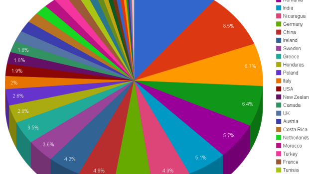
Who were the movers and shakers in new wind power installations per capita? Yep, Romania and Nicaragua top this list. Some other countries saw a strong rise in 2012, as well. Have a look:

Click & then magnify to enlarge. Image Credit: Zachary Shahan / CleanTechnica

This pie chart represents percentages of new world wind power capacity per GDP in countries with notable amounts of wind power. Click & then magnify to enlarge. Image Credit: Zachary Shahan / CleanTechnica

Credit: Zachary Shahan / CleanTechnica
Aside from Romania and Nicaragua at #1 and #2 (after not being on the list last year), Poland moved up from #9 in 2011 to #3 in 2012, Sweden moved up from #6 to #4, and China move down from #3 to #5. The remaining top 10 and their movements from the 2011 newly installed wind power leaders list are as follows:
#6: India (down from #4 in 2011)
#7: Ethiopia (not on the list in 2011)
#8: Tunisia (not on the list in 2011)
#9: US (up from #18 in 2011)
#10: Spain (up from #11 in 2011)
Clearly, several emerging wind power markets (Romania, Nicaragua, Ethiopia, and Tunisia) topped this list, as well as a few perennial wind power giants (China, the US, India, and Spain). And then there were two solid wind power per GDP leaders (Poland and Sweden).
As a reminder, you can see the 2010 and 2011 wind power rankings here:
- Top Wind Power Countries Per Capita 2011
- Top Wind Power Countries Per GDP 2011
- Top Wind Power Countries Relative To Electricity Production 2011
- Top Wind Power Countries Per Capita & Per GDP 2010
Also, you can see 2012’s per capita wind power leaders here, and you can see 2012’s absolute wind power leaders, regional wind power leaders, global wind power growth, and more on Page 2.
Keep up to date with all the hottest cleantech news by subscribing to our (free) cleantech newsletter, or keep an eye on sector-specific news by getting our (also free) solar energy newsletter, electric vehicle newsletter, or wind energy newsletter.
Google+
About the Author
Zachary Shahan spends most of his time here on CleanTechnica as the director/chief editor. Otherwise, he's probably enthusiastically fulfilling his duties as the director/editor of Solar Love, EV Obsession, Planetsave, or Bikocity. Zach is recognized globally as a solar energy, electric car, and wind energy expert. If you would like him to speak at a related conference or event, connect with him via social media. You can connect with Zach on any popular social networking site you like. Links to all of his main social media profiles are on ZacharyShahan.com.
Related Posts
British Columbia May Have a “Trillion Dollar Opportunity” with Geothermal Power →

Energy Storage Will Replace Many Peaker Spinning Reserve Plants →

Tesla Prepares For Australian Launch Of Model S →
Solar Manufacturers Doing More Business In-House →
-
http://drjagadeeshncda.blogspot.com/ Anumakonda Jagadeesh
-
nerox3
-
http://zacharyshahan.com/ Zachary Shahan
-
-
JamesWimberley
-
http://zacharyshahan.com/ Zachary Shahan
-
Dave2020
-
http://zacharyshahan.com/ Zachary Shahan
-
-
-